May 9, 2025
3 minute read
End of an era, dawn of the next
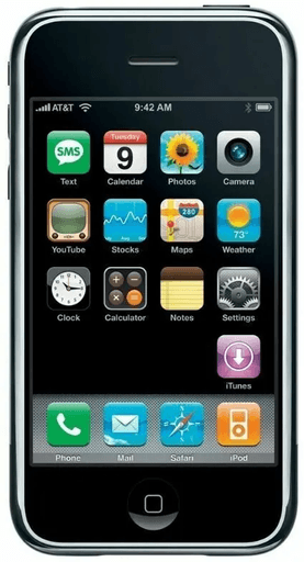
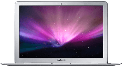
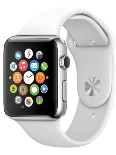
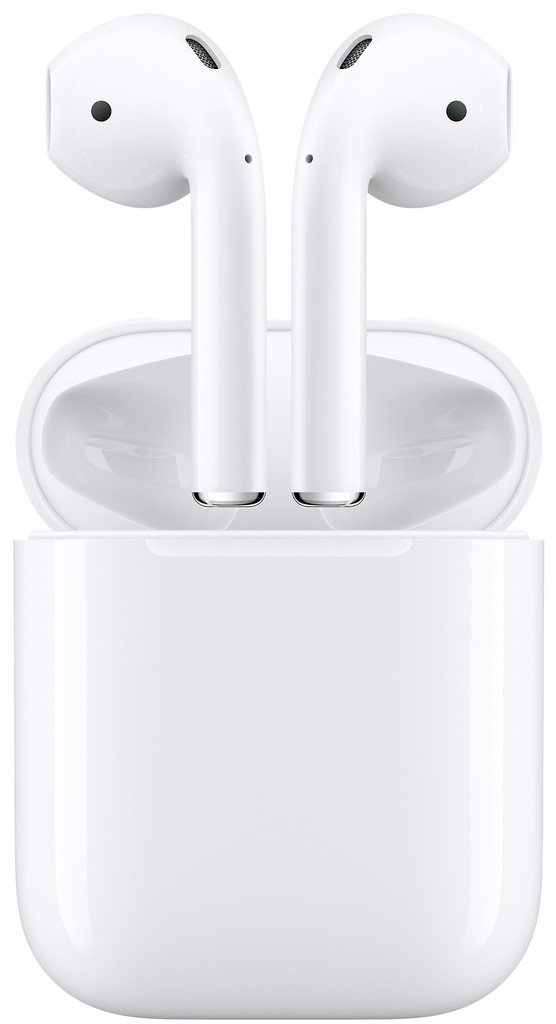
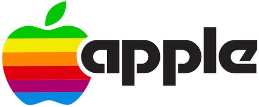
On August 27, 1999, Apple officially waved goodbye to their iconic rainbow logo in favor of a black silhouette. In the years to follow, Apple introduced the iPod (2001), iPhone (2007), MacBook Air (2008), iPad (2010), Apple Watch (2015), AirPods (2016) and Apple Vision Pro (2023).

This long run of successful products propelled Apple 300x from a $9.8 billion company to $3 trillion. Even still, Apple’s rainbow logo continues to resonate in the minds of consumers. In the early days, it proved instrumental in enabling Apple to seek out its core audience.
How it all began
While the origin of Apple's logo, depicting an apple with a bite taken out of it, has its own unique history and interpretations, today we’re going to focus exclusively on the impact color had on Apple’s brand image.
For perhaps obvious reasons, in 1977, Apple thought it would be a good idea to redesign their original logo…
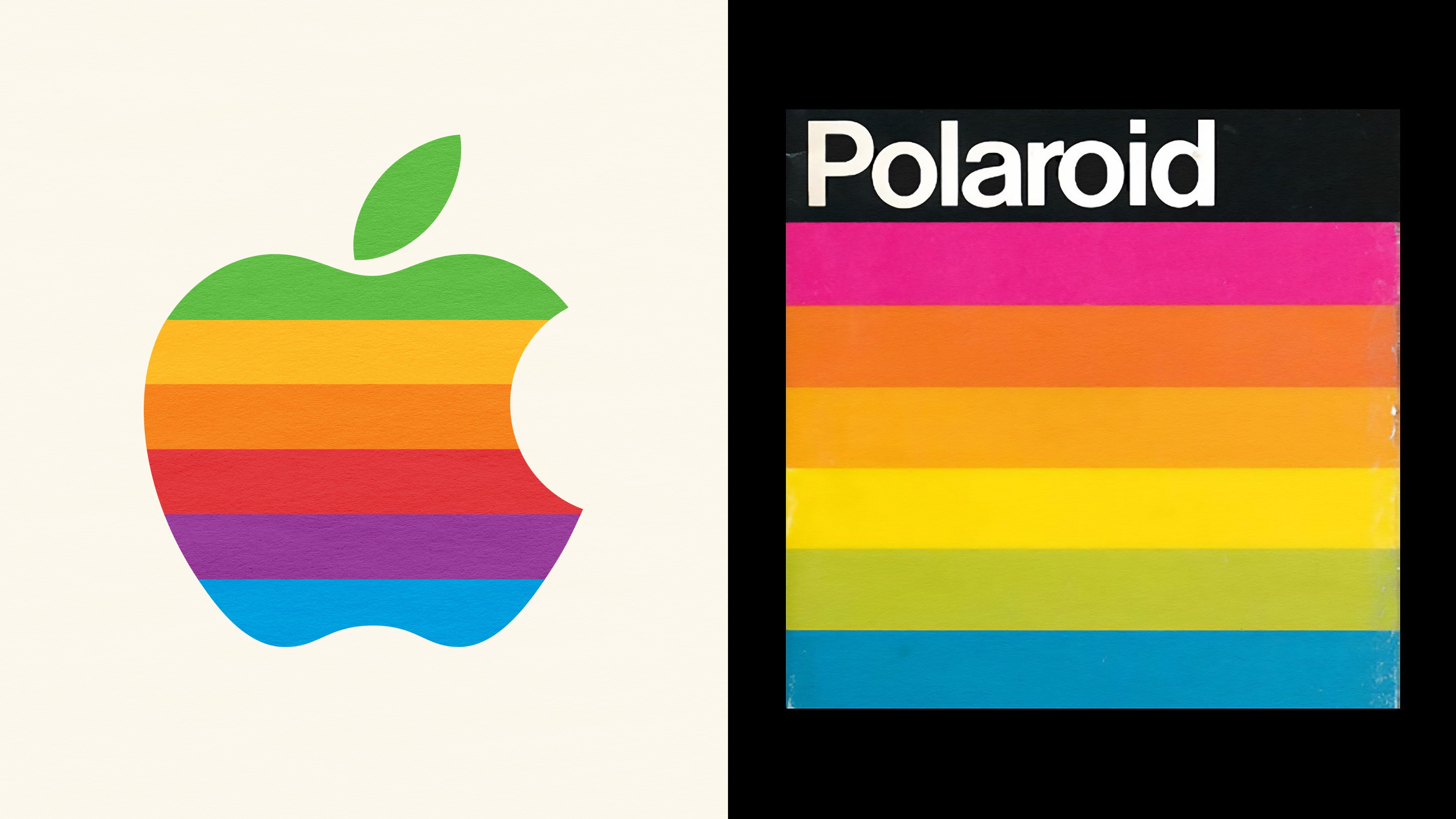
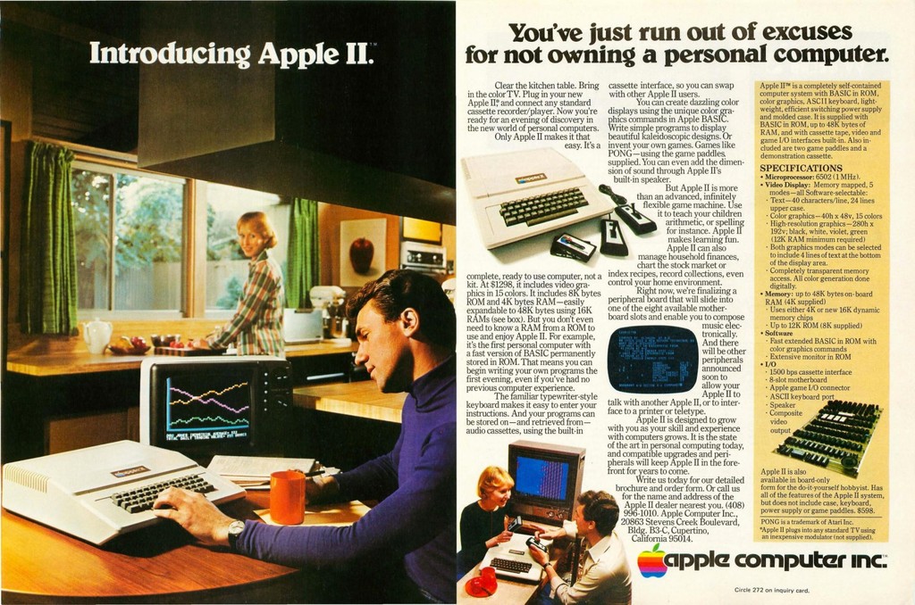
Steve Jobs was interested in a fresh logo that would complement the modern aesthetic of their products. At the time, the Apple II computer was their first computer with a color display, a milestone worth highlighting. And so, the rainbow-colored apple icon was born.
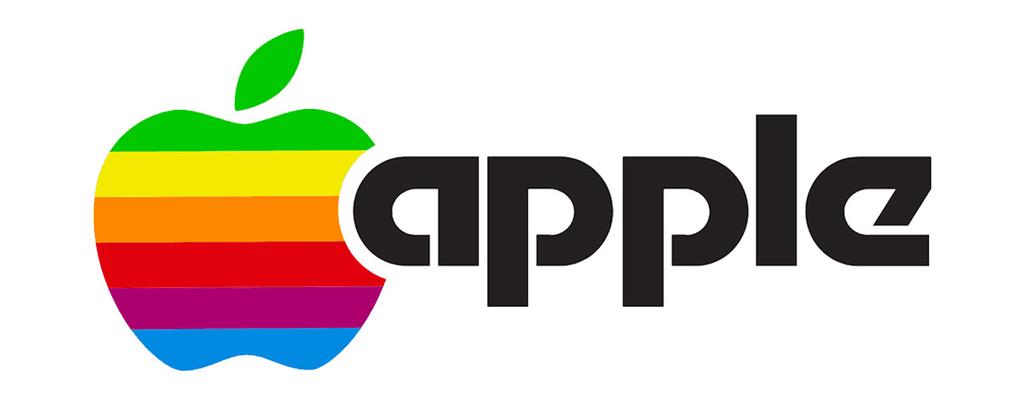
In 1977, the computer market was dominated by large corporations like IBM and DEC. These companies had extensive product lines and deep financial resources. In contrast, Apple was a small, fledgling company founded only a year earlier, in 1976, by Steve Jobs, Steve Wozniak, and Ronald Wayne.
Apple understood that to outpace IBM, they had to think different rather than compete on IBM's terms. Instead, they set sights on the emerging personal computer market, where they could embrace a more creative audience. Apple’s vibrant new logo positioned them as a force for good, but its symbolism and brand alignment go deeper than what meets the eye…
The original Steve Jobs
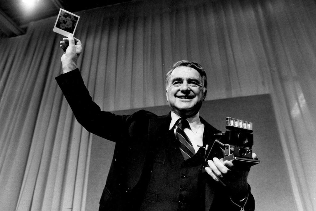
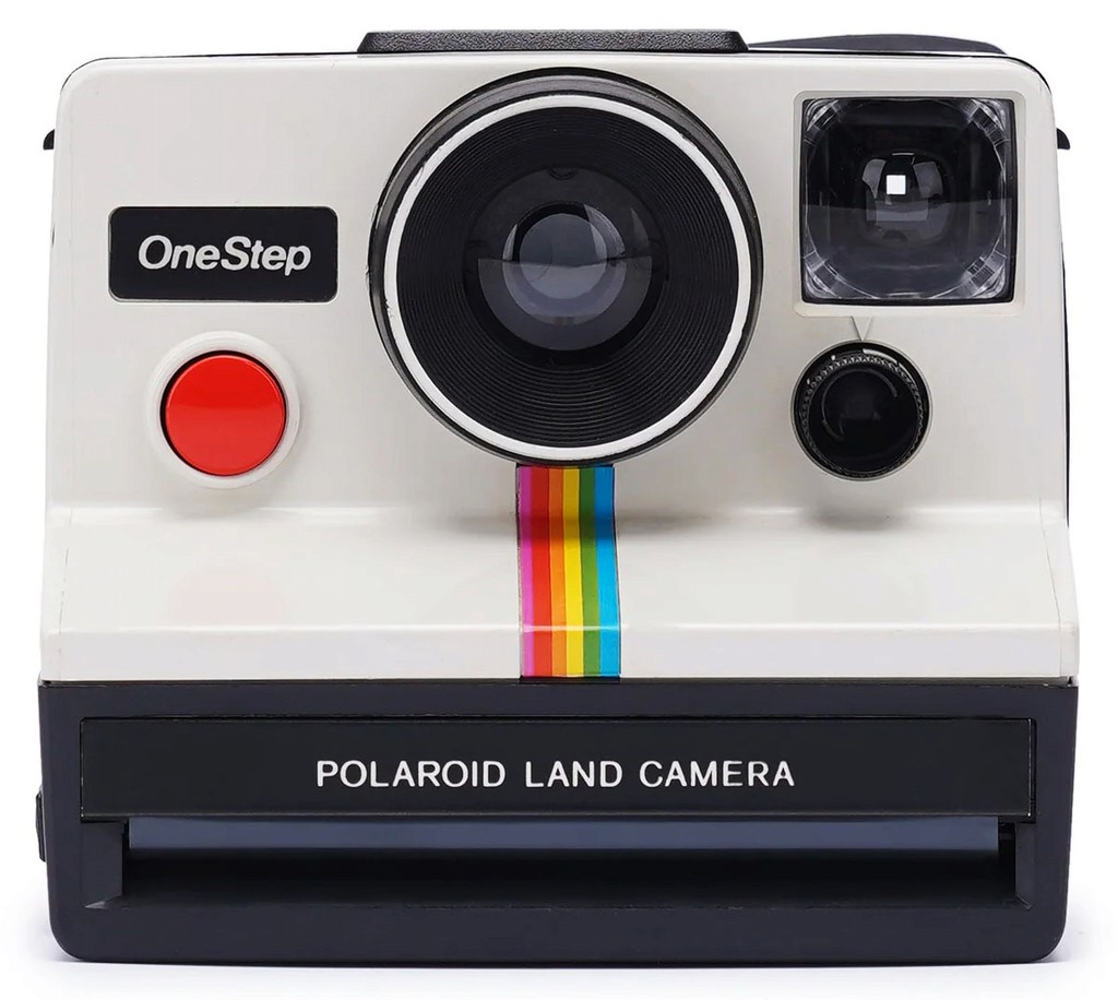
Before Steve Jobs, there was Edwin Land, the charismatic founder and CEO of Polaroid, who not only revolutionized the world of photography but also pioneered a culture of innovation that would heavily influence future tech leaders like Jobs. Land was a visionary who launched his career in 1929 with the invention of the first synthetic polarizer under his newly founded company, Polaroid.
Land's groundbreaking work led to the development of Polaroid instant cameras, which allowed people to take a photograph and see the results within minutes, a disruptive concept in the photography industry. The first of these cameras, the Polaroid Model 95, was introduced to the market in 1948 and became an immediate success. This innovation democratized photography, making it accessible and enjoyable for everyday people, not just professionals.
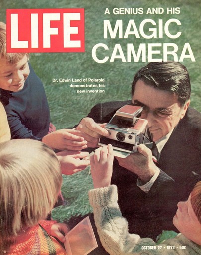
Like Jobs, Land was known for his showmanship and flair for the dramatic. He was famous for his spectacular product unveilings, which were meticulously staged to capture the audience's imagination. Jobs, who admired Land, adopted a similar style for Apple product launches, turning them into highly anticipated events that drew media attention and public interest.
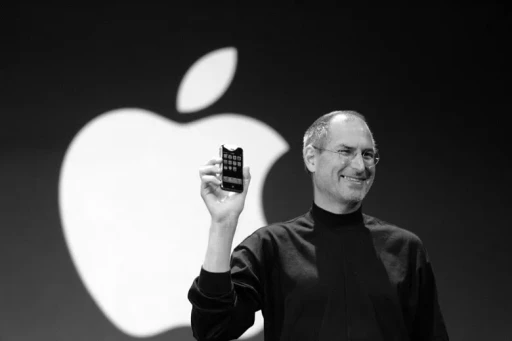
Land’s influence on Jobs extended beyond product design and presentation. He was a proponent of integrating the arts and sciences, believing that this intersection was where true innovation occurred. Jobs shared this belief, famously calling Apple at the intersection of technology and liberal arts.
Polaroid's influence
Steve Jobs, an enormous fan of Edwin Land, very likely influenced Apple’s decision to run with a rainbow logo, which held strikingly similar characteristics to the famous Polaroid logo. The use of color in design is not merely an aesthetic choice, it has the power to echo a greater story about a brand's values. For Apple, this strategic brand alignment with Polaroid subconsciously placed their small company in an exclusive tier of innovative disruptors.

Signaling change
For 21 years, Apple sported its rainbow logo before simplifying its chroma to one color and eventually beginning to use a black logo in 1998. At this junction in history, Apple was on the verge of bankruptcy and needed a rebrand to symbolize a new era as Steve Jobs would return to the company. The color black was chosen to depict Apple as a luxury brand, a quality Apple still maintains today.

Invaluable lessons
Color theory often explores deep-rooted psychological effects of color, but historical and cultural context can be just as powerful.
In 1977, Apple’s rainbow logo may have been the perfect choice for that point in history. It can also be argued that Apple made the right decision to switch to a subdued logo in 1998. In a world where styles and trends are always evolving, aiming for a timeless aesthetic can hinder your ability to stand out from the crowd. If you pay close attention to today's moment in history, you can invent your own version of the iconic rainbow for your brand…

Just as Apple aligned its brand with Polaroid's innovative technology, you too can be associated with groundbreaking experiences.
In today's crowded ecommerce landscape, growing your ecommerce business can feel like a David vs Goliath battle, akin to Apple's early days challenging IBM. Your store must leverage a unique, marketable advantage to stand out. By offering an innovative experience, you can distinguish yourself and cut through the noise.
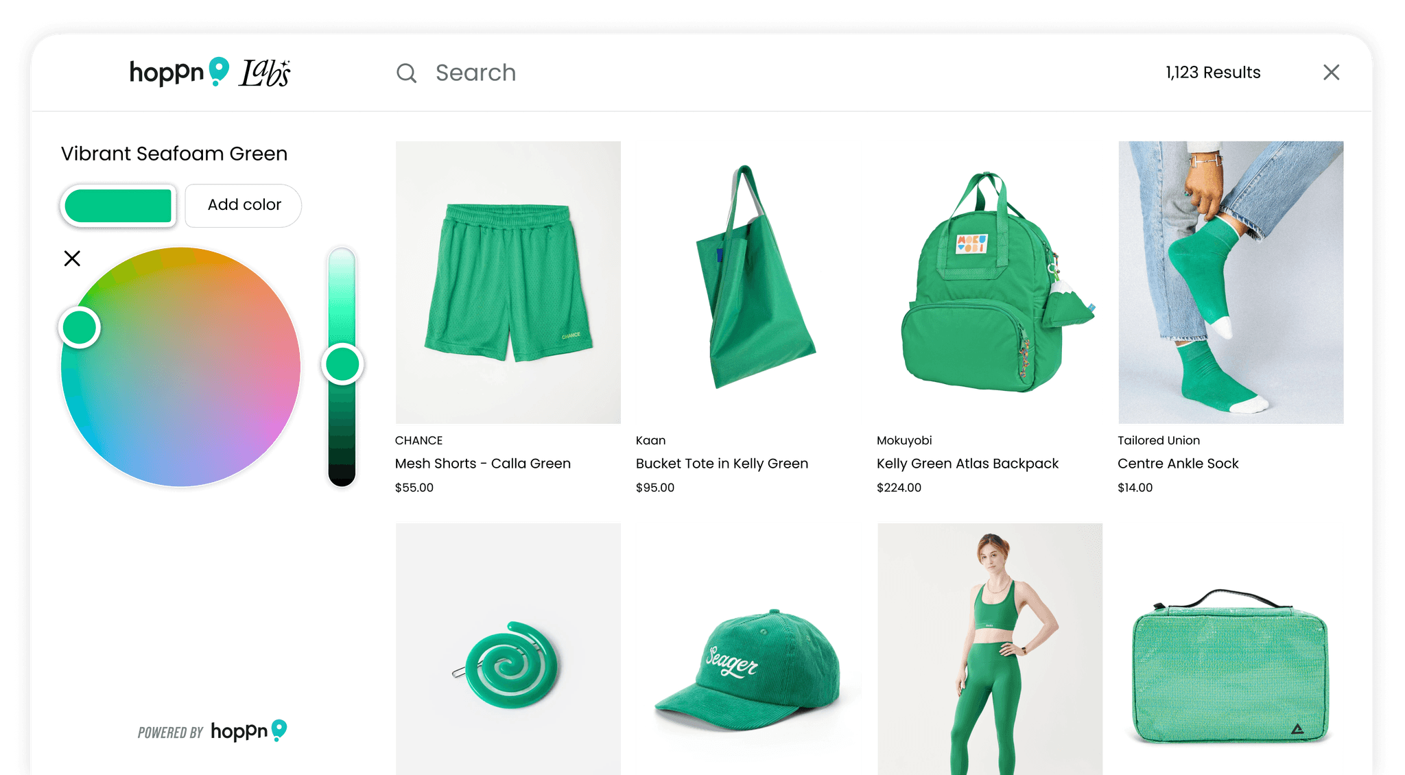
For instance, Hoppn Labs has patented a whole new way to search products by color using a color wheel, calling it the Infinite Color Search. As a Shopify store, it only takes minutes to transform your site into a destination that customers are excited to support. Get started today by installing Hoppn’s user-friendly, no-code Shopify plugin.

Similar articles