May 9, 2025
15 minute read

Choosing the right color for your brand's logo is an important decision that impacts how your business is perceived. Color not only attracts attention but also conveys specific messages and emotions. In this article, we'll explore the importance of color in branding, delve into the psychology of color, and provide examples of famous brands that have strategically used colors in their logos.
The importance of color in branding
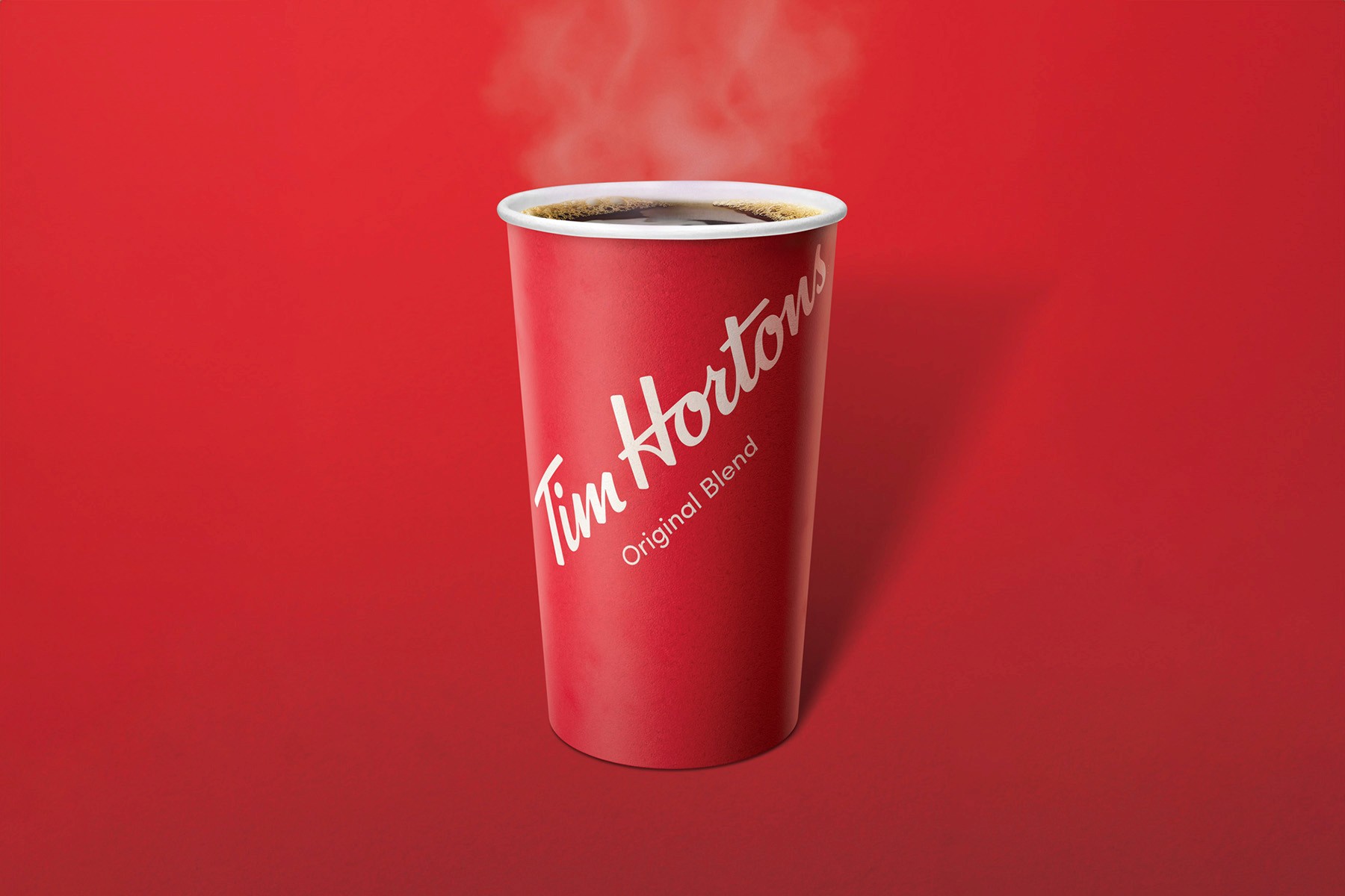
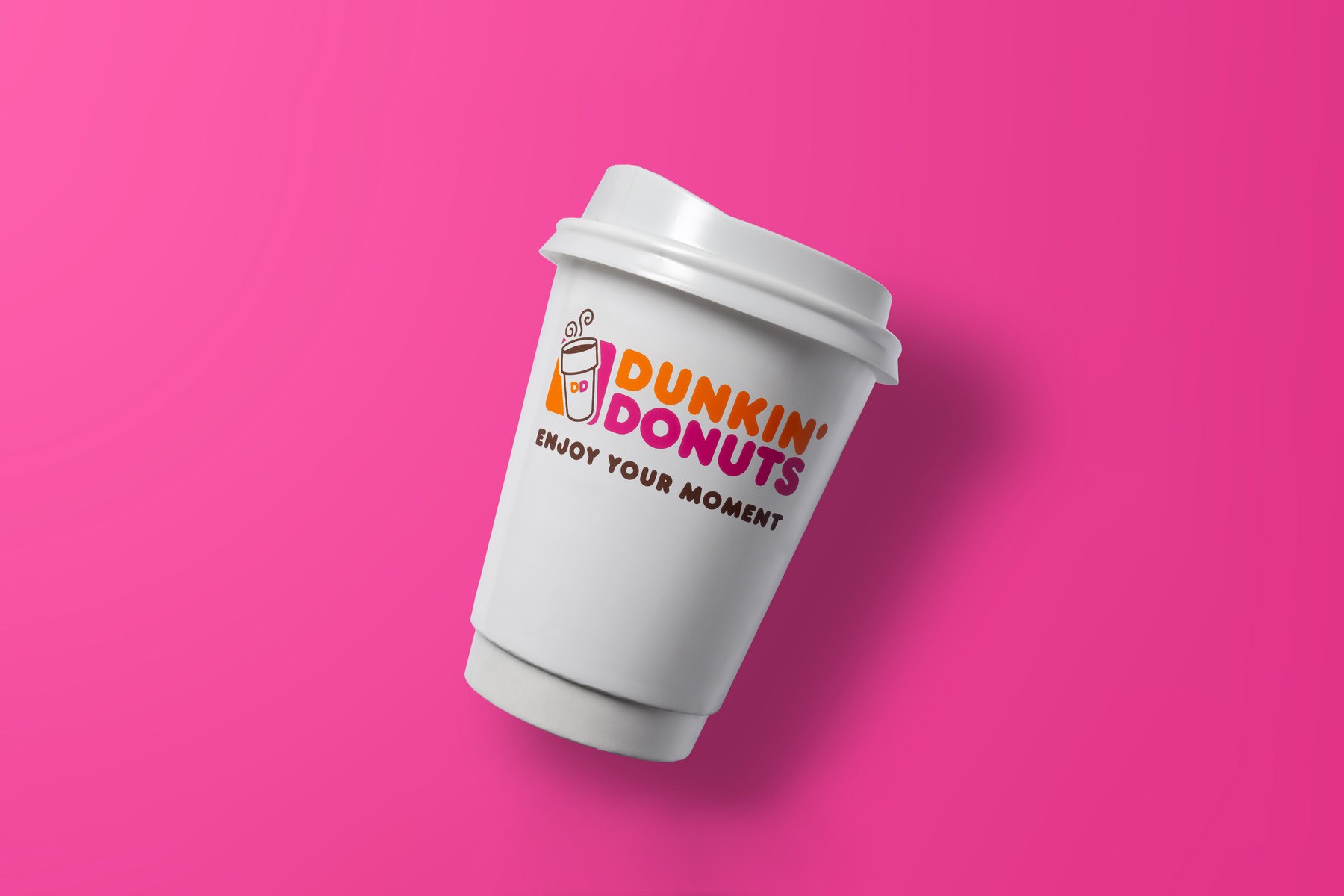
Color plays a pivotal role in brand identity. It can evoke emotions, influence perceptions, and drive consumer behavior. A study conducted by the University of Loyola found that consistent use of color increases brand recognition by up to 80%. When a brand uses the same colors across all its touchpoints—from logos and websites to advertising and packaging—it creates a cohesive visual identity that is easy for consumers to recognize and remember. Think of how quickly you can identify the vibrant red of Tim Hortons, the playful pink of Dunkin’, and the deep green of Starbucks. All of these brands sell the same product, yet their visual identity is significantly different. These are not just arbitrary choices but strategic elements that reinforce their brand values and distinguish them from their competitors.
The Psychology of Color
Understanding the psychology of color can help you make informed decisions about your brand's logo and visual identity. Just like your brand, color is incredibly nuanced. Even a subtle shift in hue can drastically impact how your brand is first perceived. In the following sections, we'll break down common colors and their associated meanings, along with examples from successful brands.
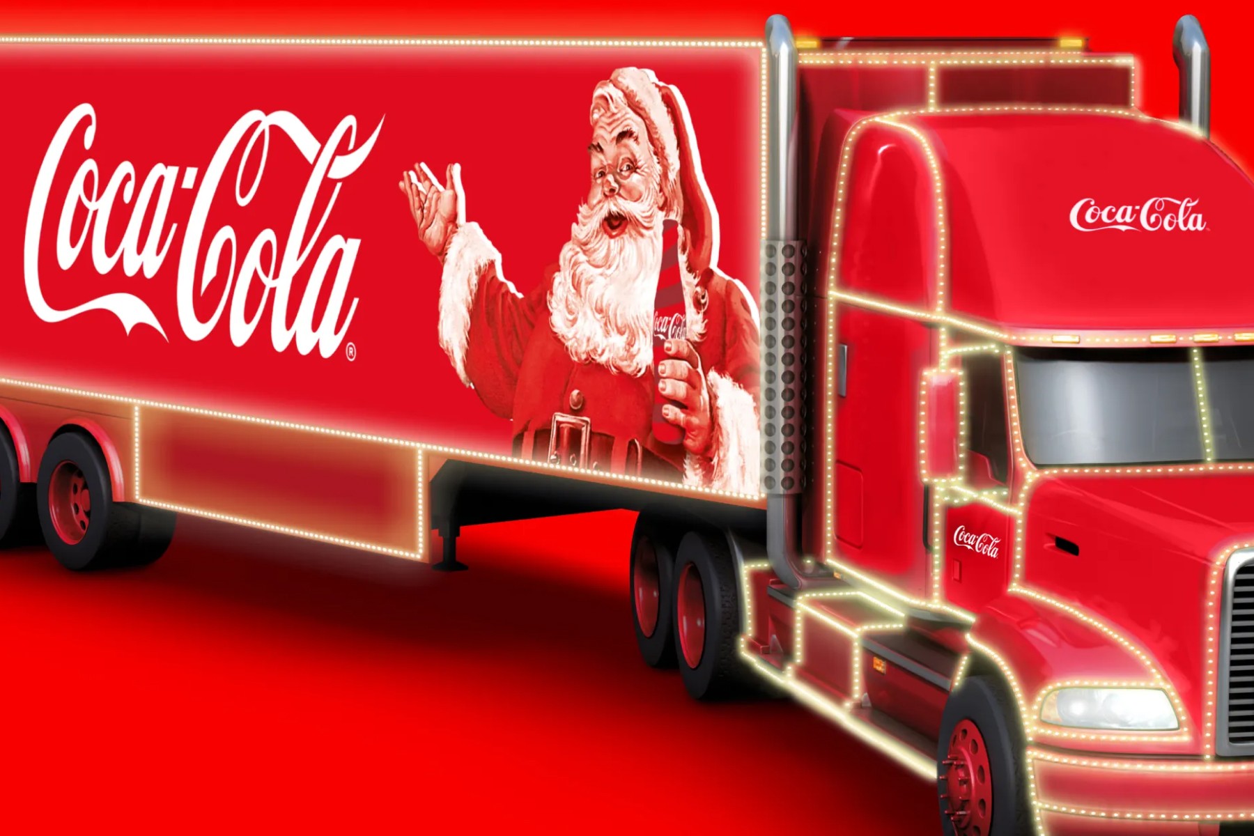
Red
Passion, Urgency, Hunger 🍓
Red is one of the most common colors used in business branding due to its powerful ability to grab attention and evoke strong emotions. While many colors are common in nature; green for plants, brown for dirty, blue for sky and water, red is less common. Yet, when it does show up, it really makes an impact. It can signify passion, urgency, and hunger, making it a versatile choice for various industries. From food and beverage to technology and retail, red helps brands create memorable identities and connect with their audiences on an emotional level.
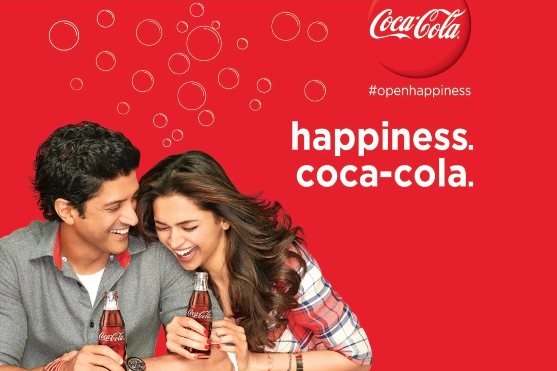
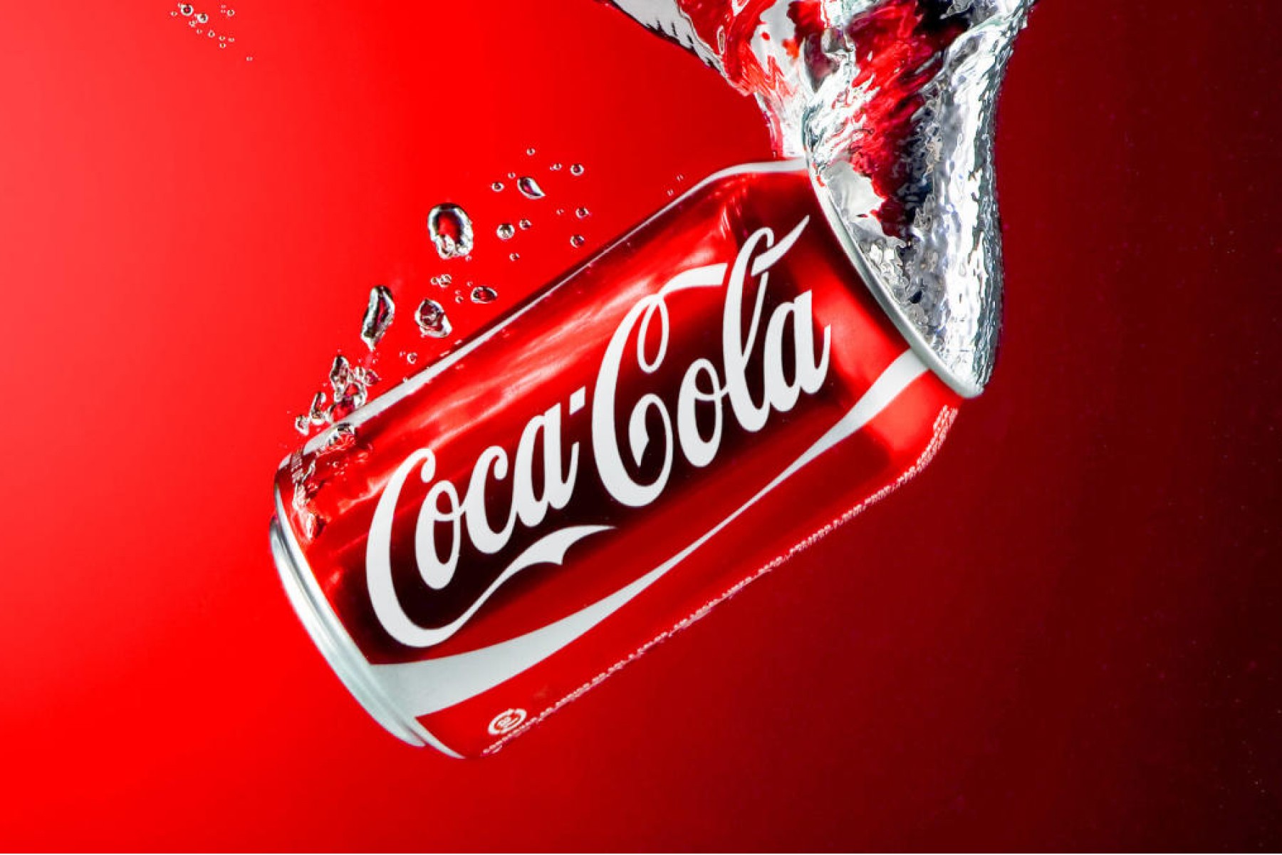
Coca-Cola is a quintessential example of a brand using red to its advantage. Established in 1886, Coca-Cola has a long history of utilizing its vibrant red logo to stand out in the marketplace. Coca-Cola markets their product alongside happy customers, associating their bright red logo with a feeling of happiness and positivity. Through extensive marketing and advertising campaigns, Coca-Cola has placed its iconic red logo everywhere, from billboards and television commercials to merchandise and global events, ensuring it remains a recognizable symbol worldwide.
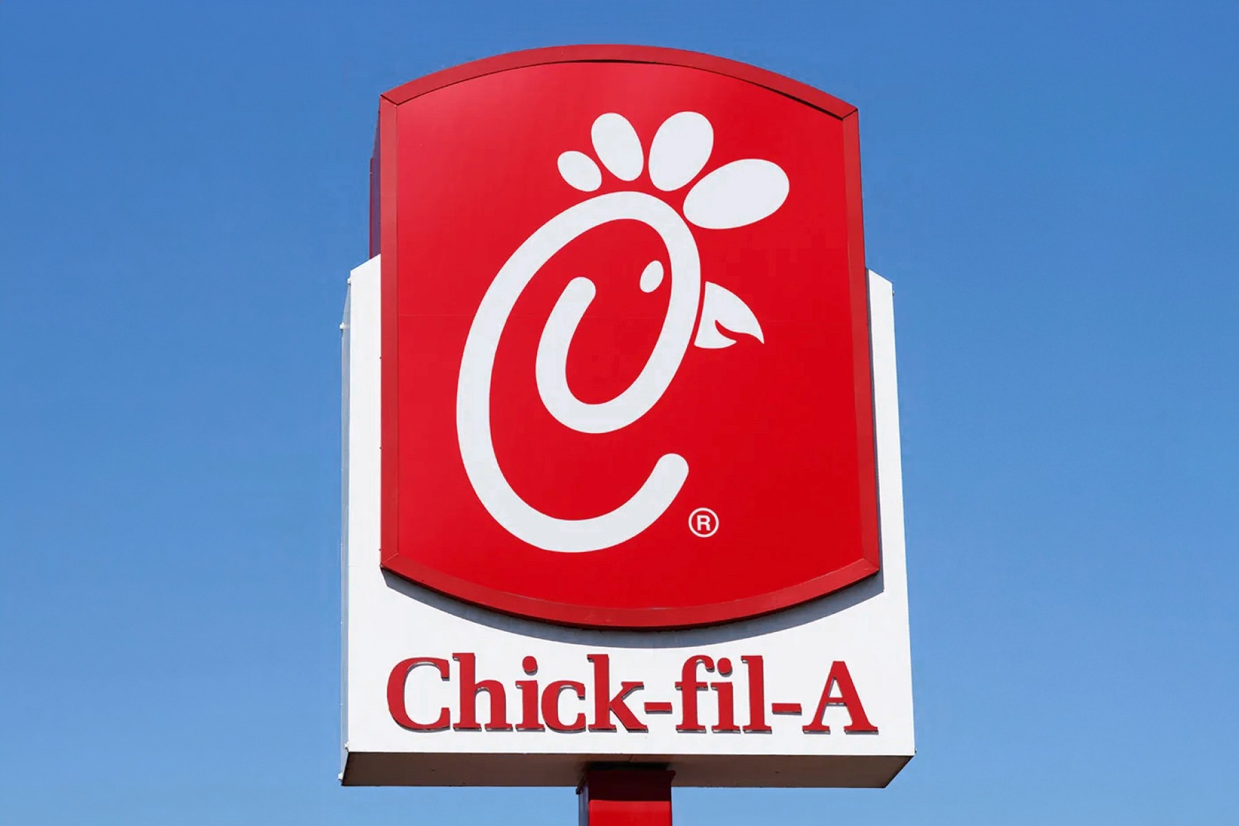
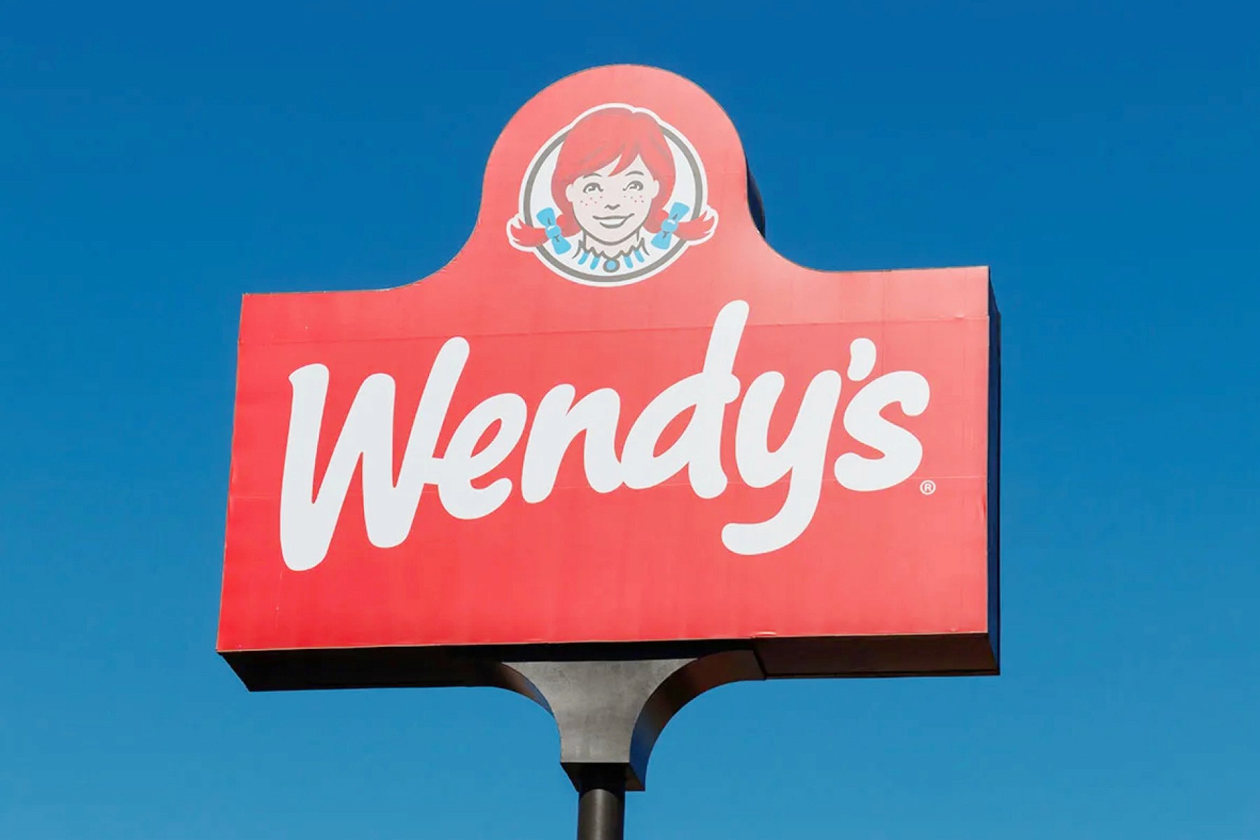
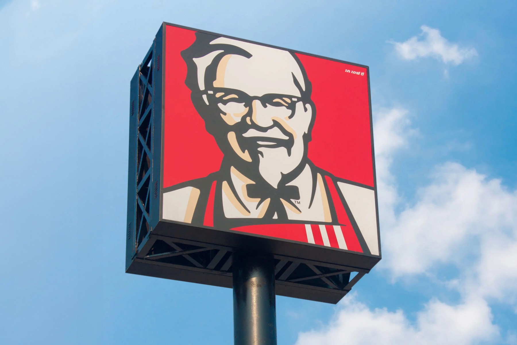
Fast food chains such as Chick-fil-A, Wendy's, and KFC frequently use red in their branding, as it is known to create a sense of urgency and stimulate appetite.
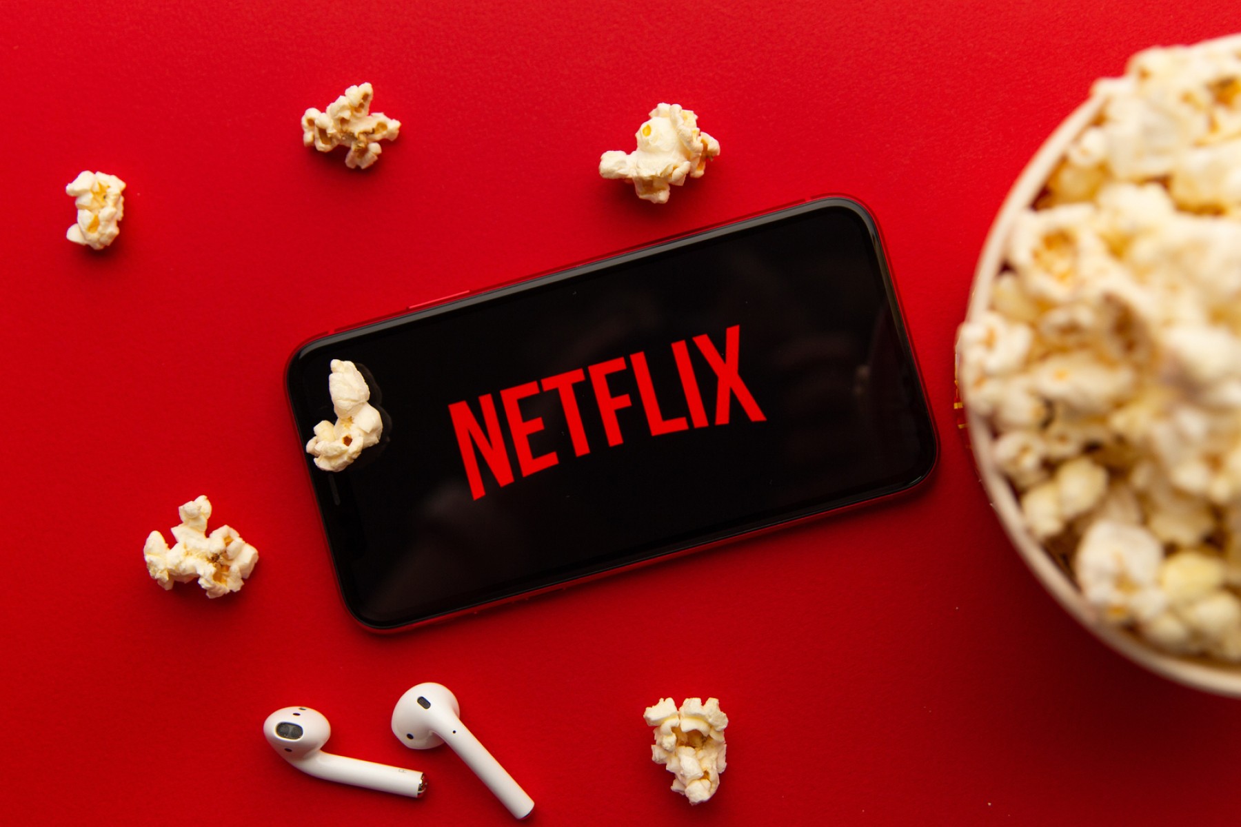
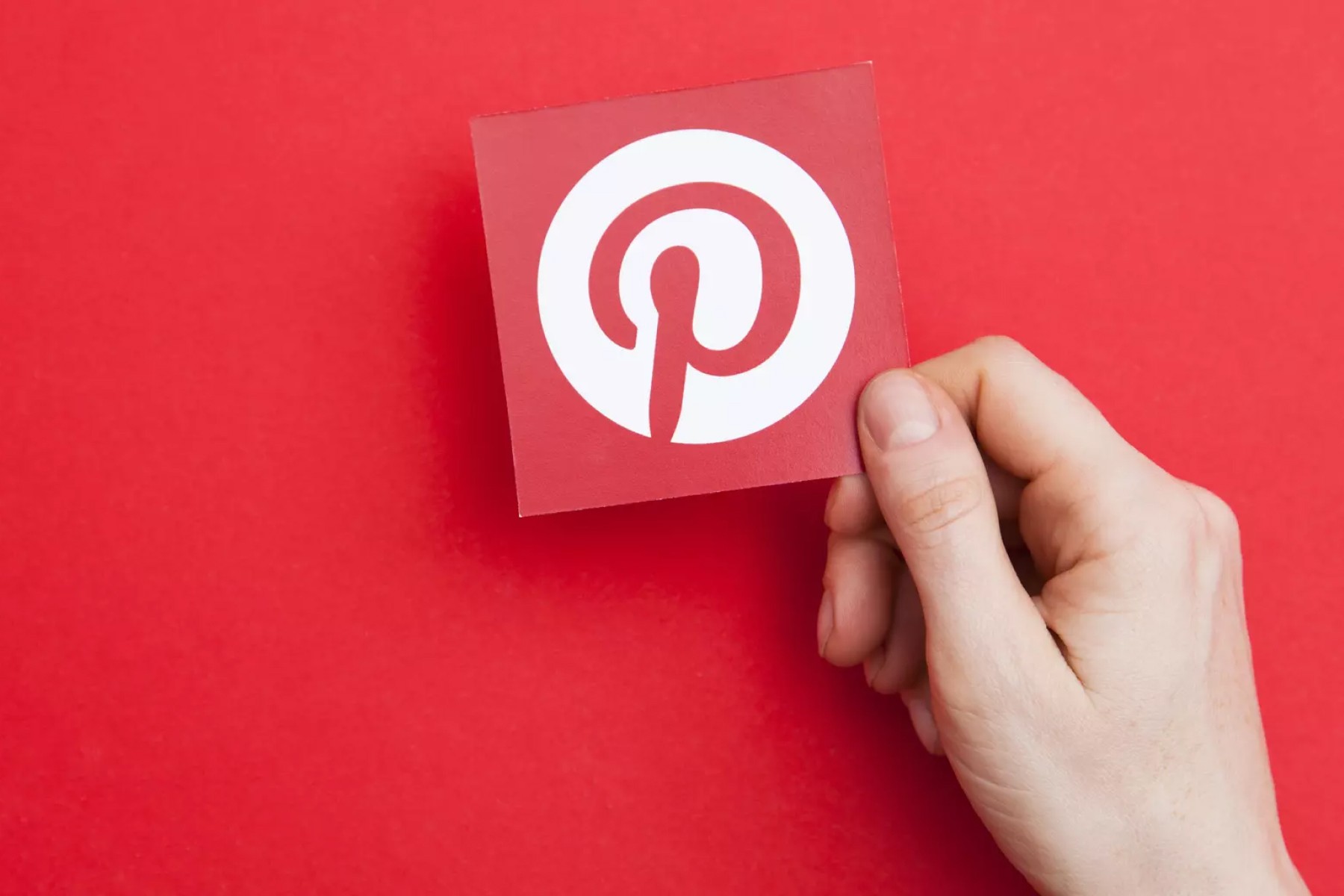
In the realm of entertainment and social media, YouTube, Netflix, and Pinterest utilize red to convey energy, passion, and cinema. Streaming services YouTube and Netflix opt for red in their branding as red has played a historically significant role in capturing the imagination. Think red carpet, red curtains, or red's ability to catch your eye in any setting. Pinterest uses red to evoke creativity and enthusiasm, aligning with its platform's focus on discovering and sharing inspiring ideas and content.

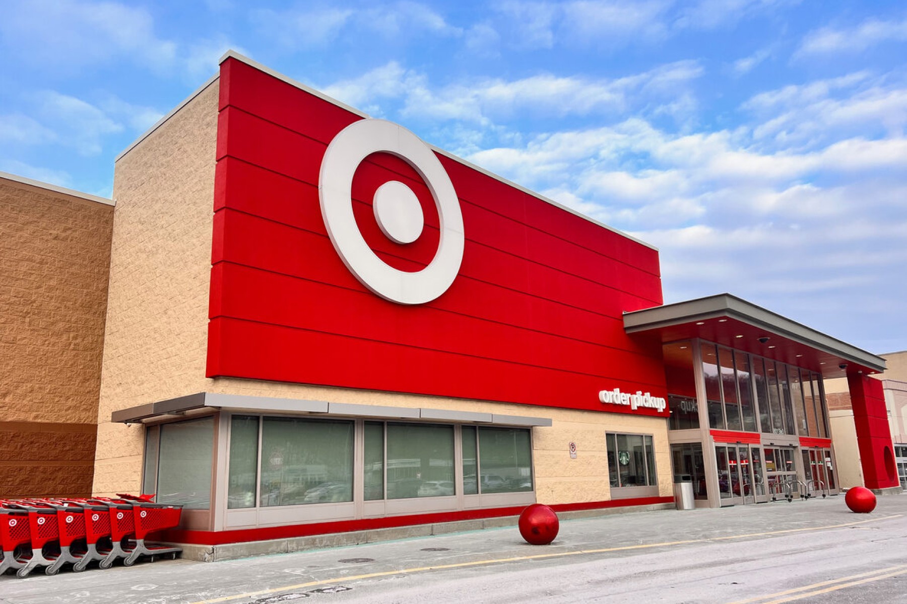
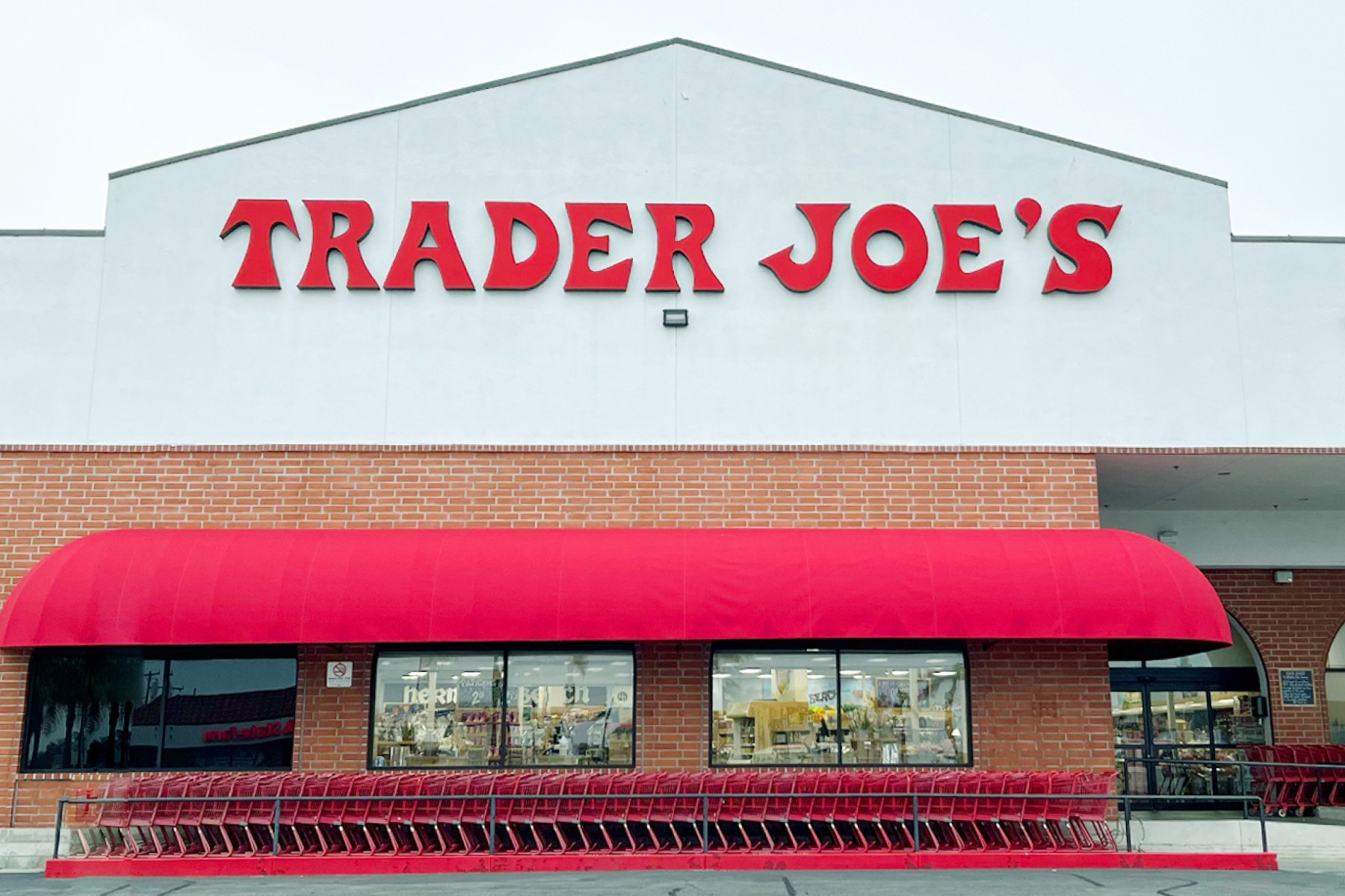
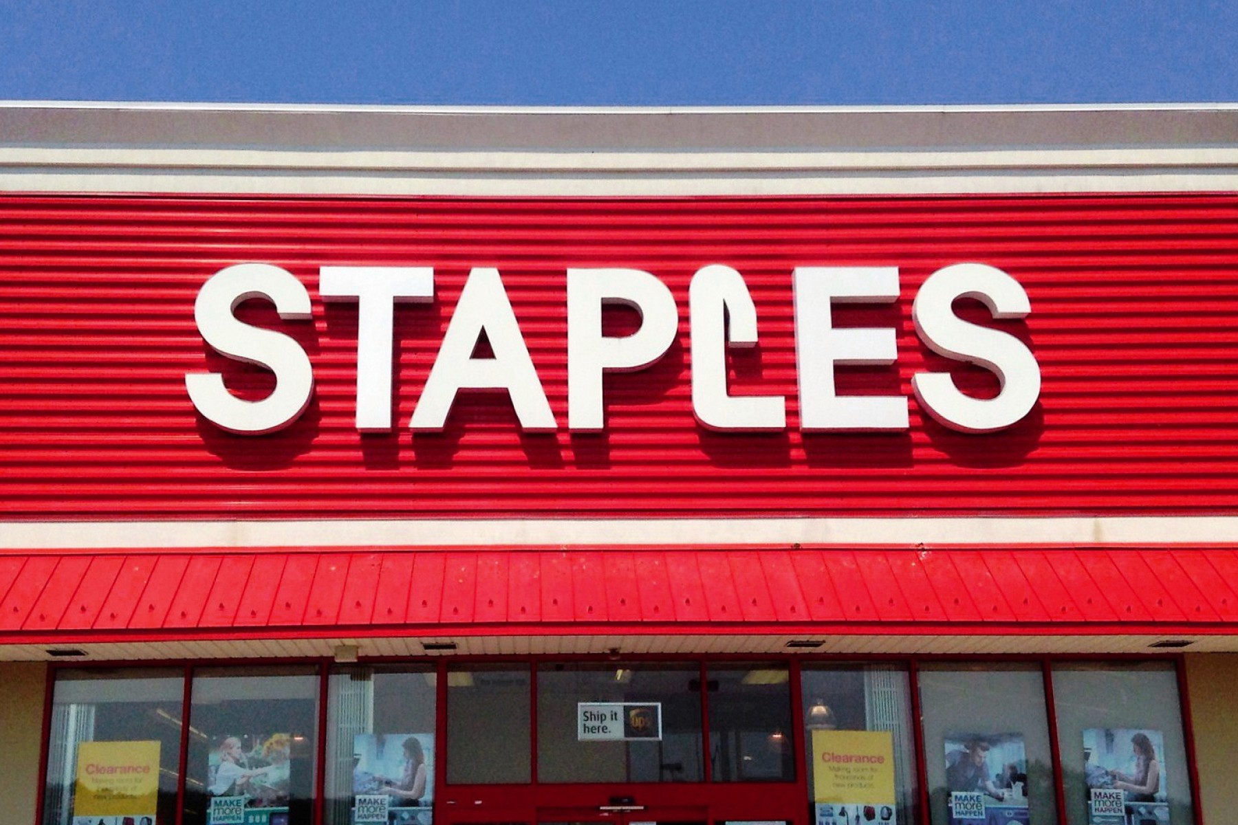
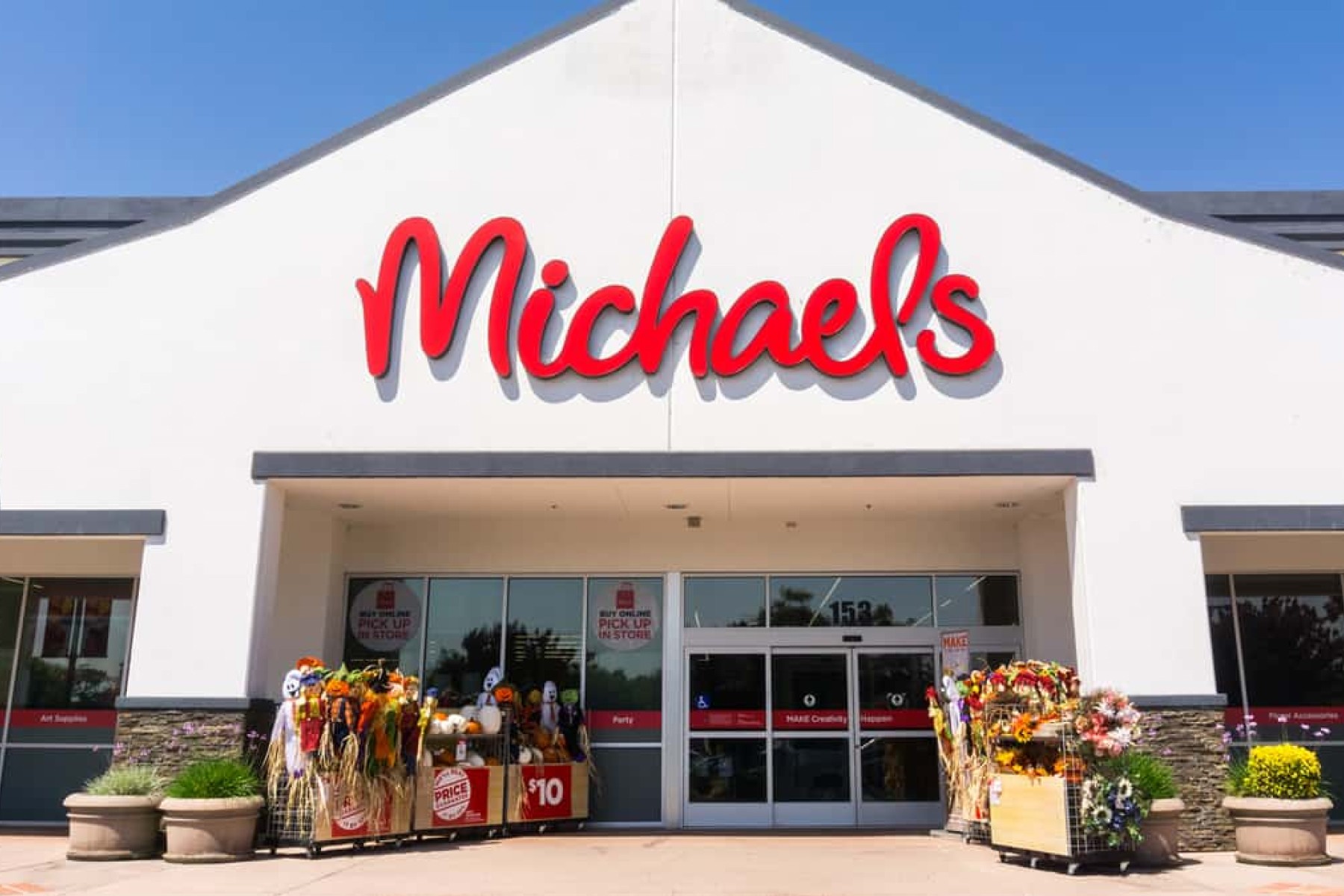
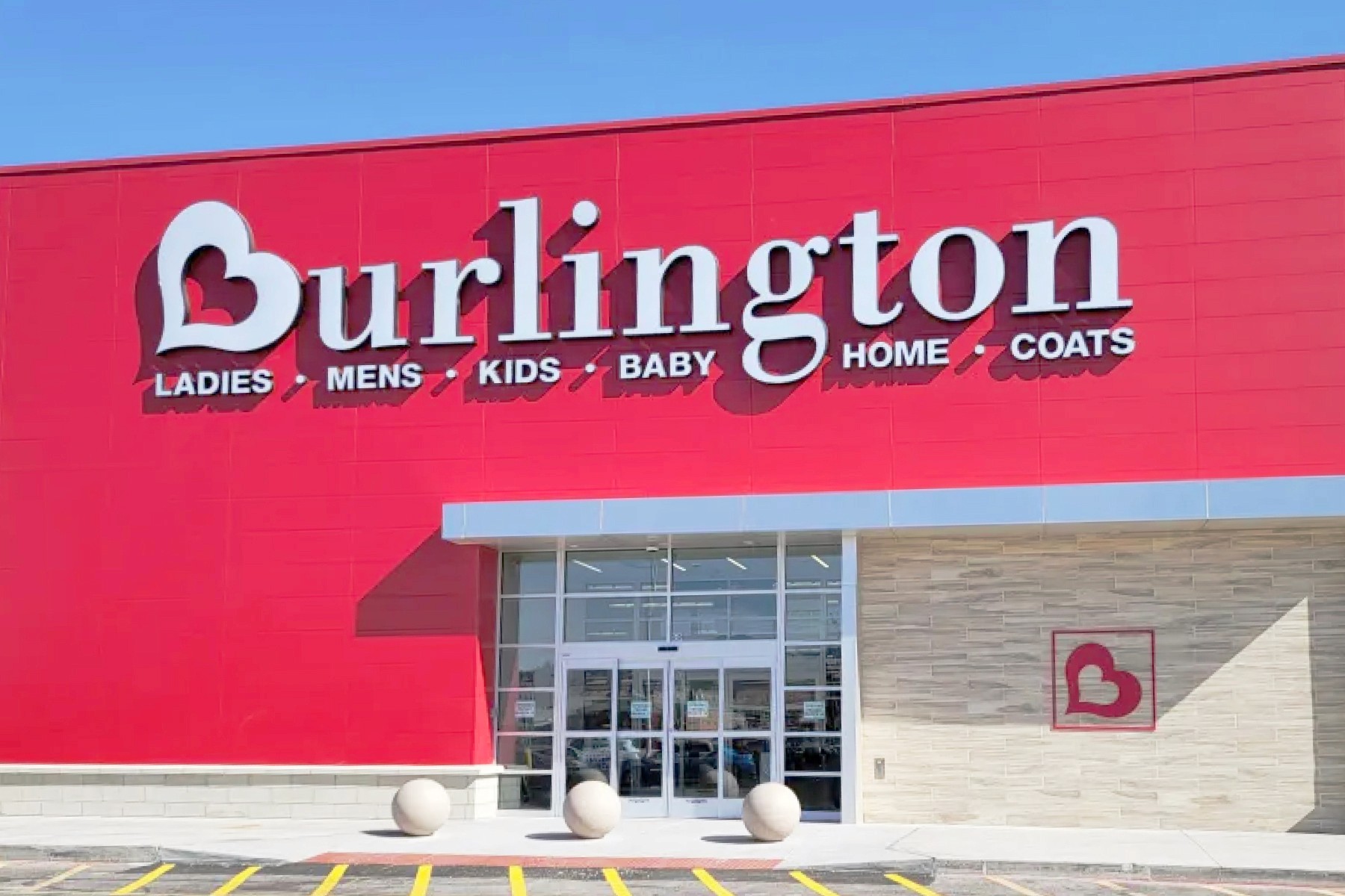
Retail brands frequently use red to create a strong, memorable presence. Target, Trader Joe's, Staples, CVS, and Michaels are just a few examples. Target’s bold red and white bullseye is simple yet highly effective in capturing attention, while the red heart of CVS helps convey a sense of warmth and care.


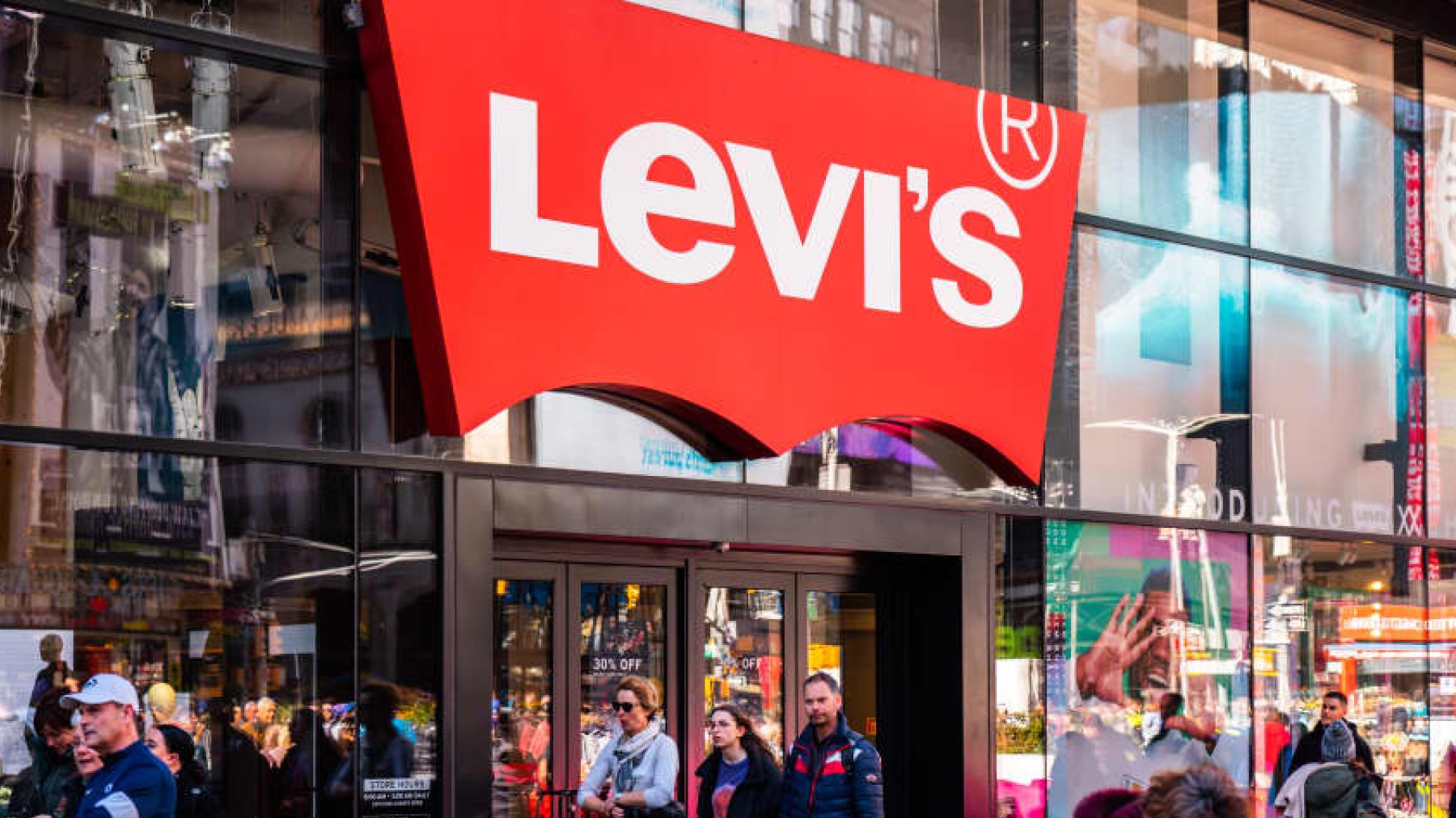
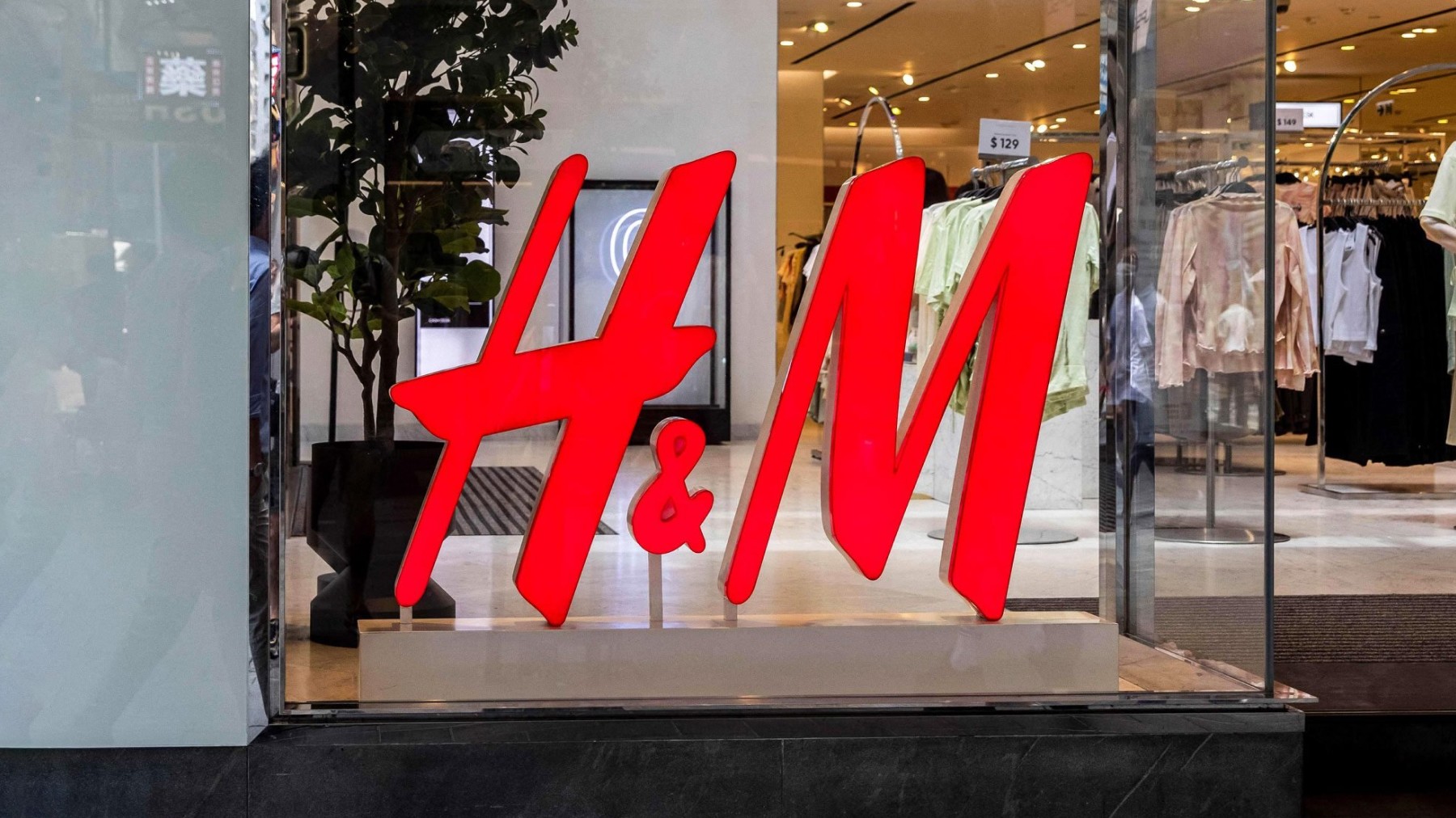
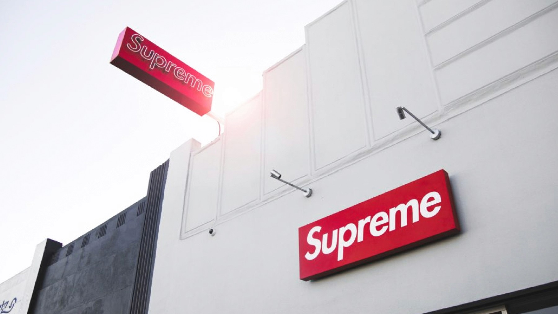
Fashion brands like Vans, Levi's, and Supreme use their iconic red logos to create bold and impactful identities. Although subtle in size, they leverage the vibrancy of the red by placing their logos on the exterior of each product sold. This helps to develop familiarity and trust with each brand. Other businesses, such as H&M, approach their use of red similar to the section above, where the bright red catches your eye and builds excitement.

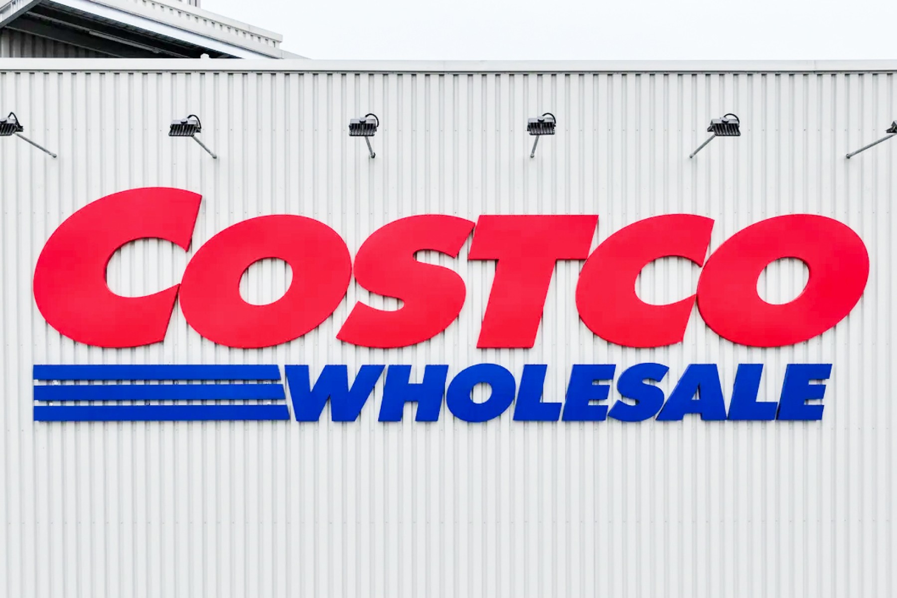
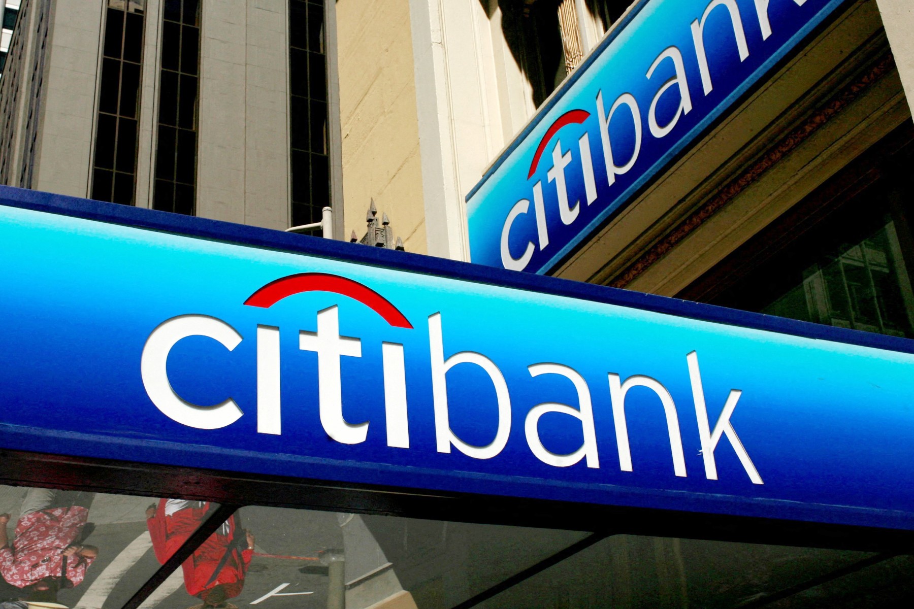
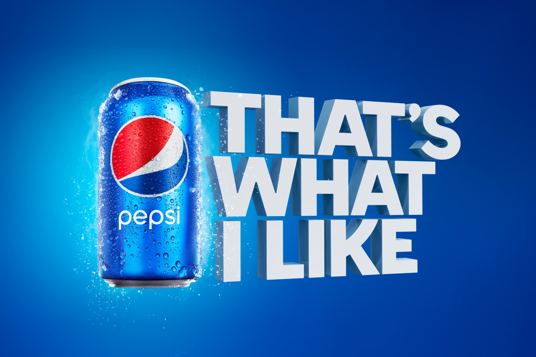
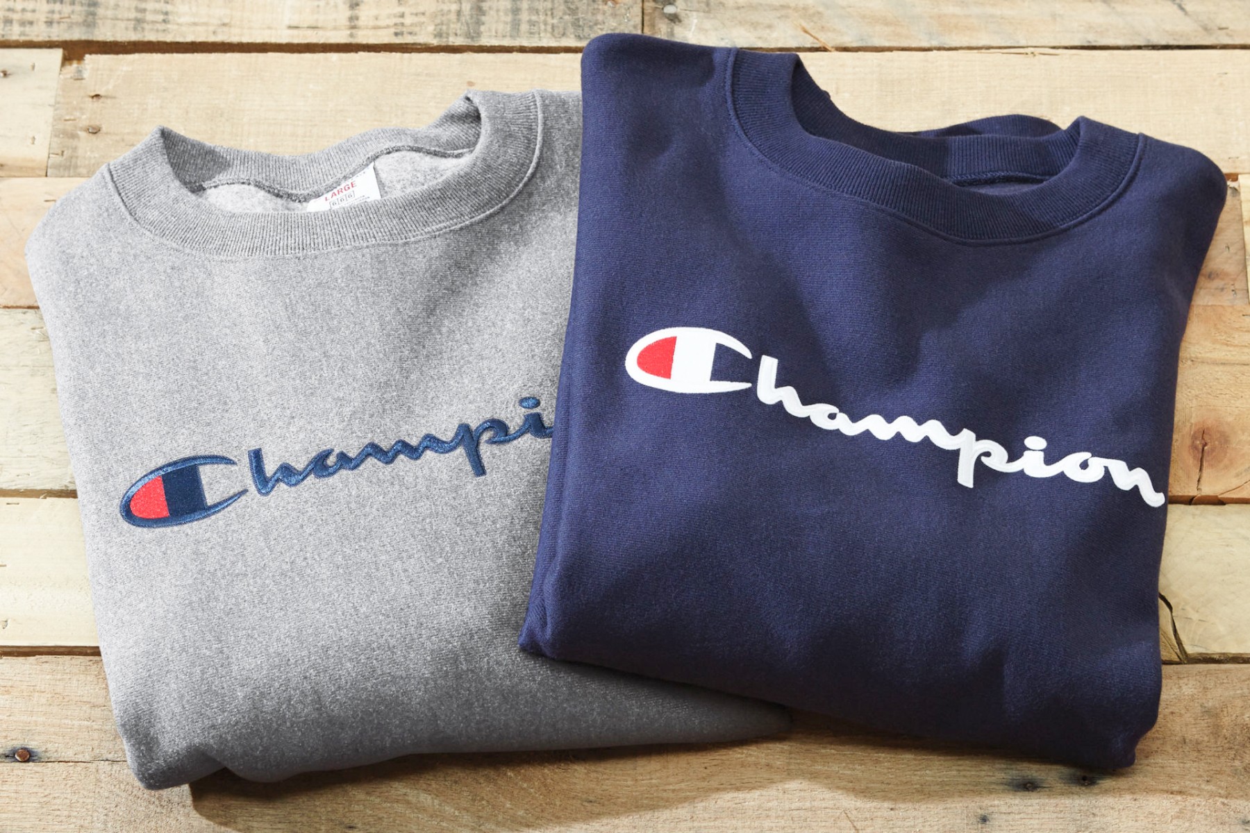
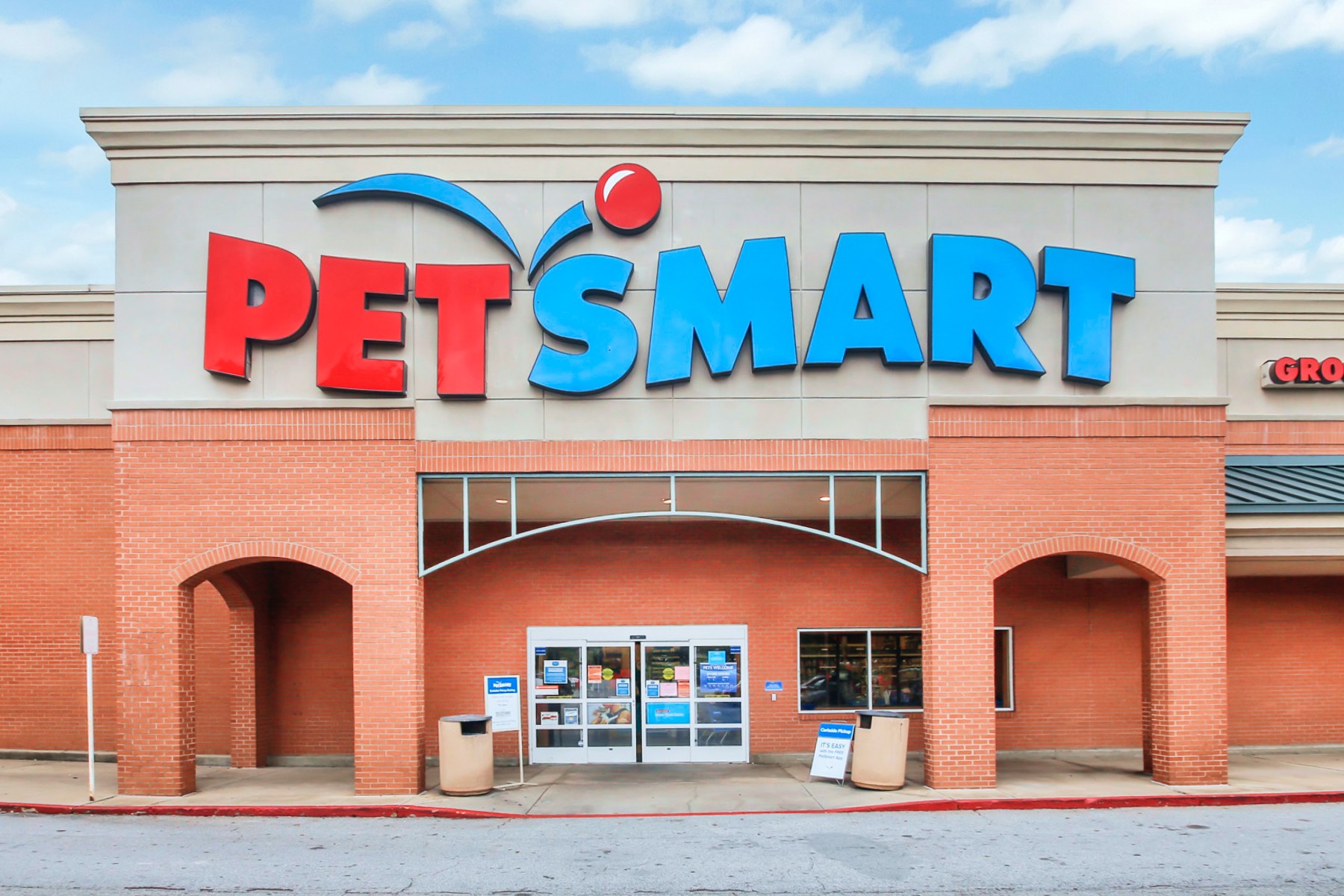
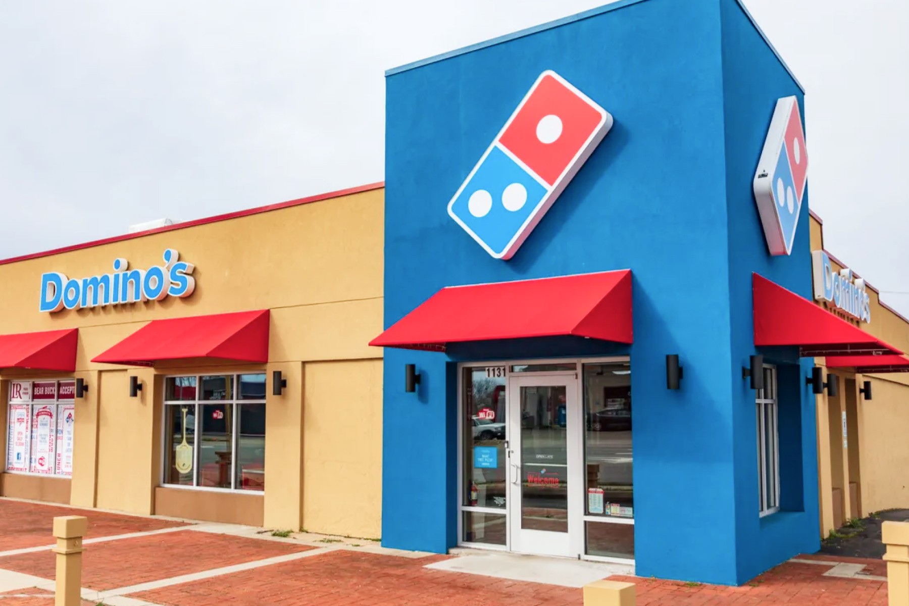
Some brands combine red with blue to leverage the strengths of both colors, creating a dynamic and balanced brand image. Costco and Citibank convey excitement and trustworthiness with a touch of patriotism, whereas Pepsi and Champion's use of red and blue pay homage to their Americana history. Domino's primary color was originally red, then adding blue in 1969 to communicate reliability in their delivery service and food quality. That, in conjunction with their domino logo, further demonstrate a sense of playfulness in their branding.
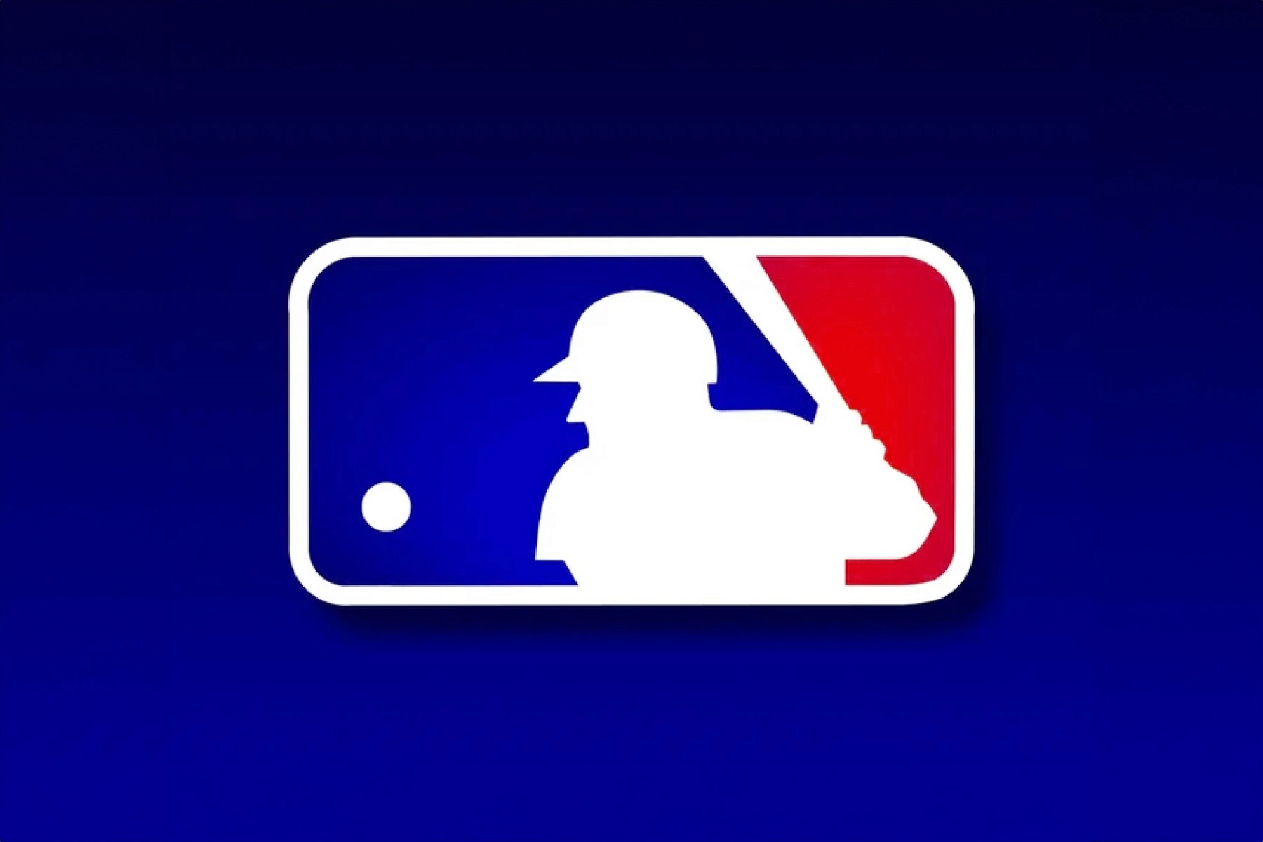
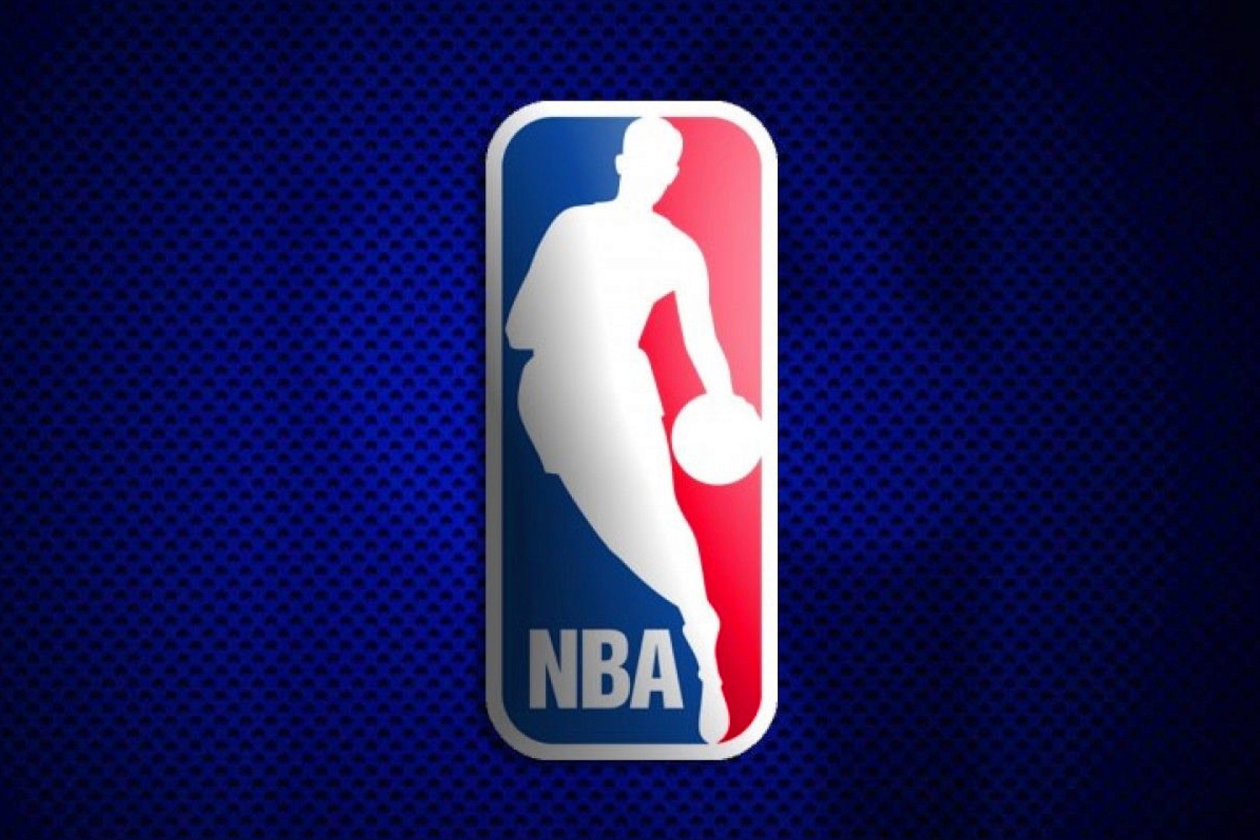
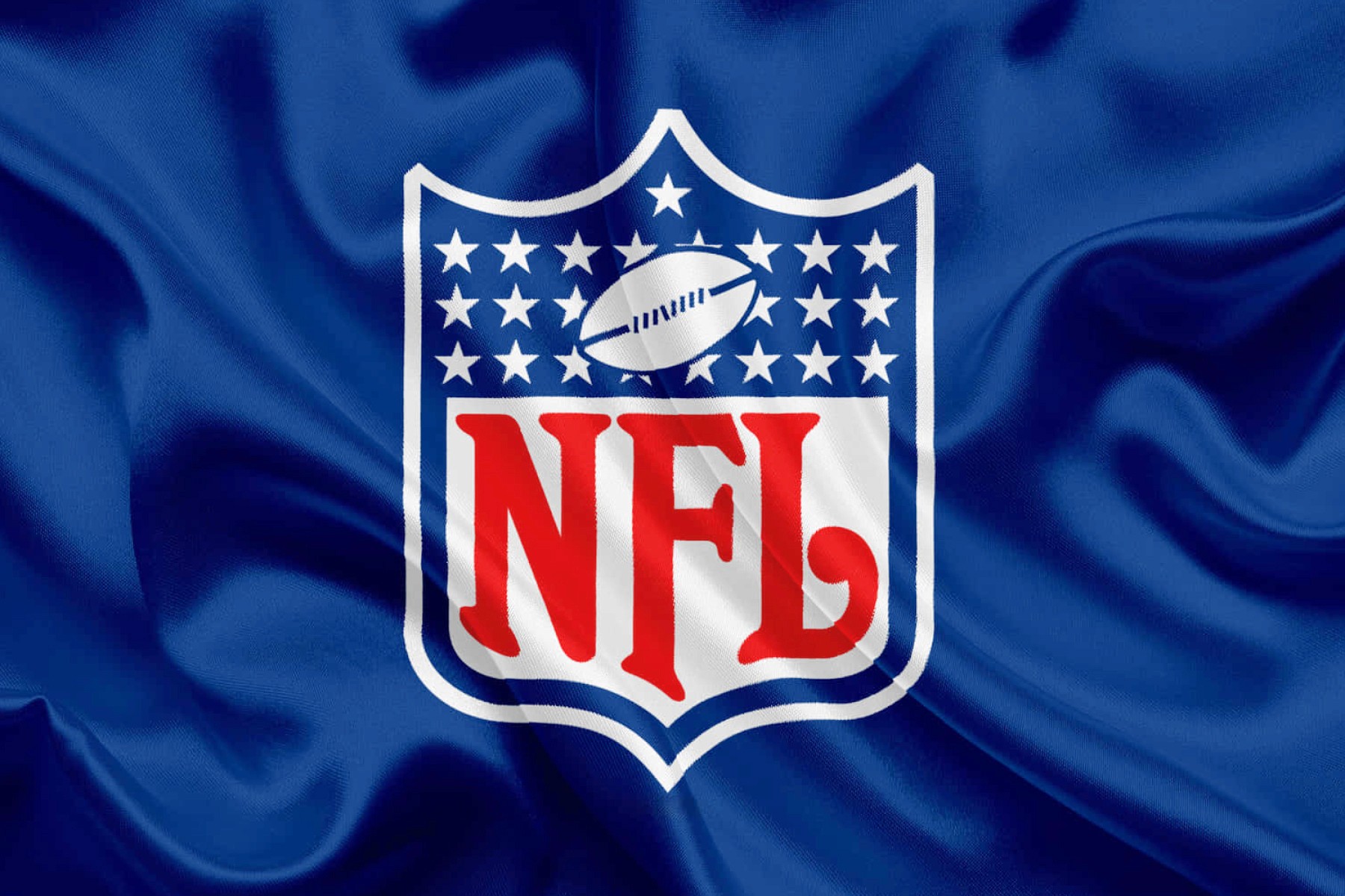
The use of red and blue is prevalent among major American sports leagues as well. The MLB, NBA, and NFL utilize these colors to represent the colors of the United States, creating a strong, patriotic brand identity that resonates with fans across the country.
Red is a powerful and versatile color in branding, capable of evoking a wide range of emotions and creating strong visual identities. Whether used alone or in combination with other colors, red helps brands stand out, connect with their audiences, and foster lasting recognition and loyalty. From iconic beverages and fast food chains to tech giants and fashion brands, the strategic use of red continues to play a crucial role in successful branding efforts across various industries.
Blue
Trustworthy, Calm, Professional 🌐
Blue is one of the most widely used colors in branding, known for its ability to evoke feelings of trust, calmness, and professionalism. Historically, blue has been a significant color, from ancient Egyptian artifacts to the medieval European dye trade. Psychologically, blue is perceived as serene and secure, often associated with the sky and the sea. Its versatility makes it a popular choice across various industries, helping create strong, memorable brand identities.
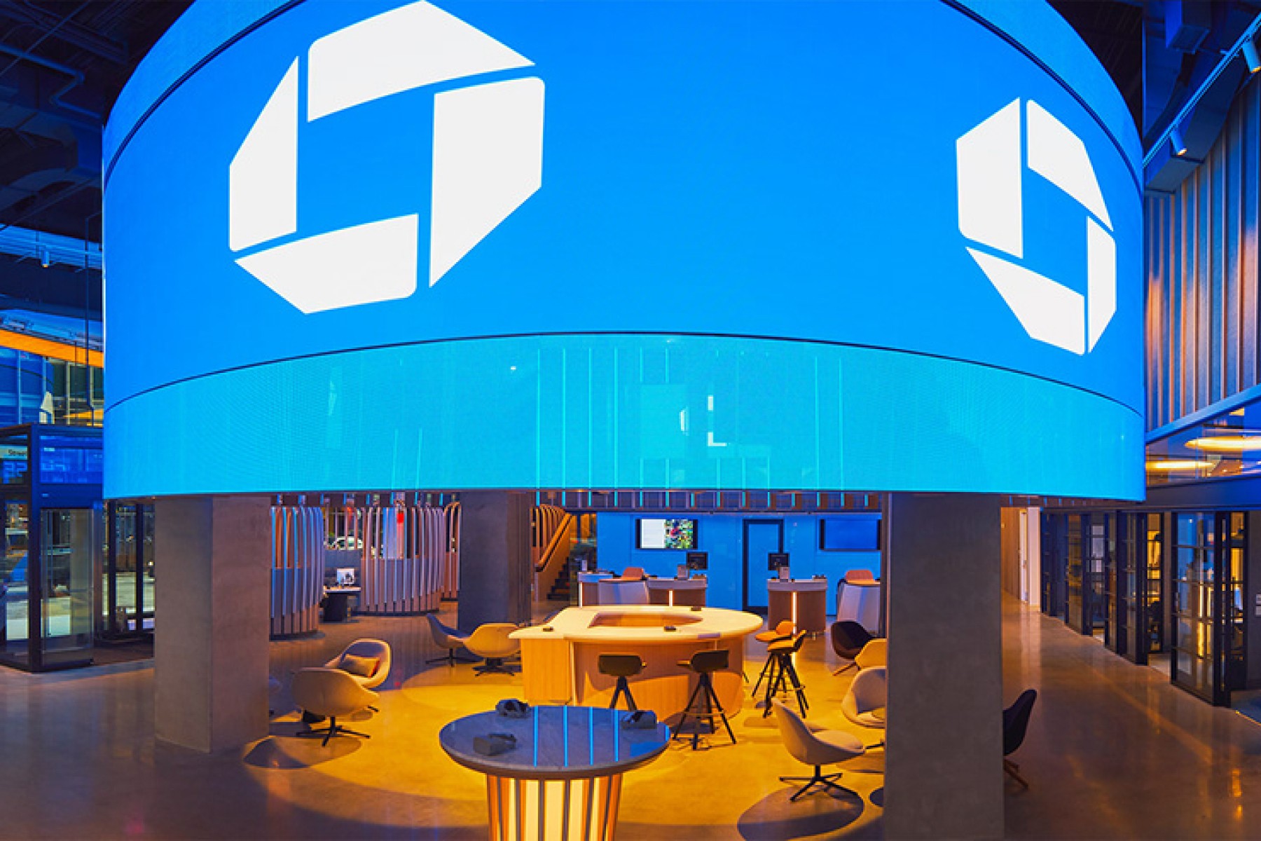
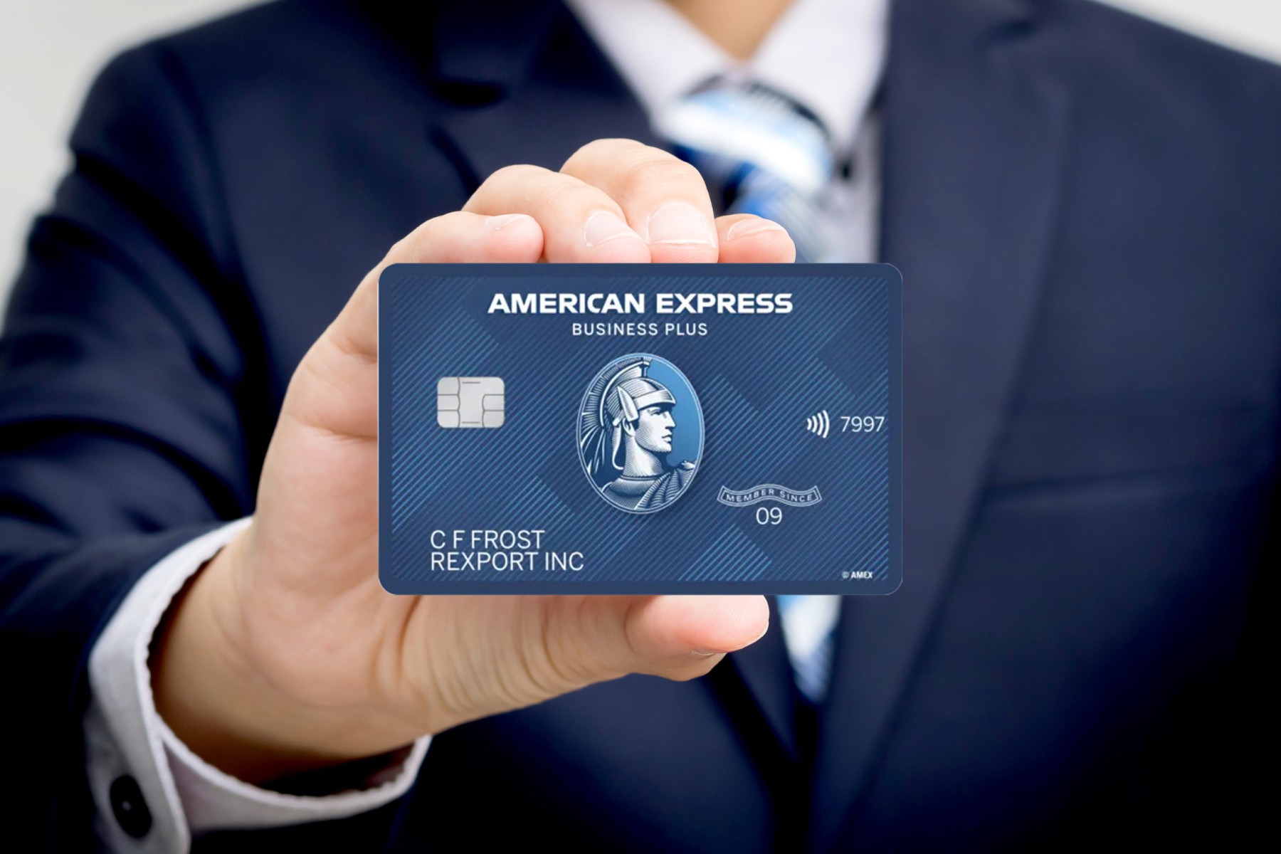
Finance companies leverage blue to build a sense of trust and security. Chase, Visa, American Express, PayPal, Venmo, and Goldman Sachs all use blue in their branding to convey stability and reliability.

In the technology sector, blue is a dominant color for brands like Facebook, Twitter, and LinkedIn. Facebook's blue logo conveys trust and reliability, essential qualities for a platform handling vast amounts of personal information. Twitter’s light blue branding suggests openness and accessibility, aligning with its mission to facilitate global communication (RIP). LinkedIn’s blue logo signifies professionalism and trust, fitting for a platform focused on career networking and development.
Insurance companies commonly use blue to communicate trust, care, and serenity. Allstate’s deep blue logo symbolizes protection and security, while Aflac and Progressive use light blue to convey reliability and friendliness. Pfizer, Blue Shield, and Kaiser Permanente use blue to show their commitment to health and well-being. Blue is often used in hospitals as well, as it relays a sense of calmness and sterility.

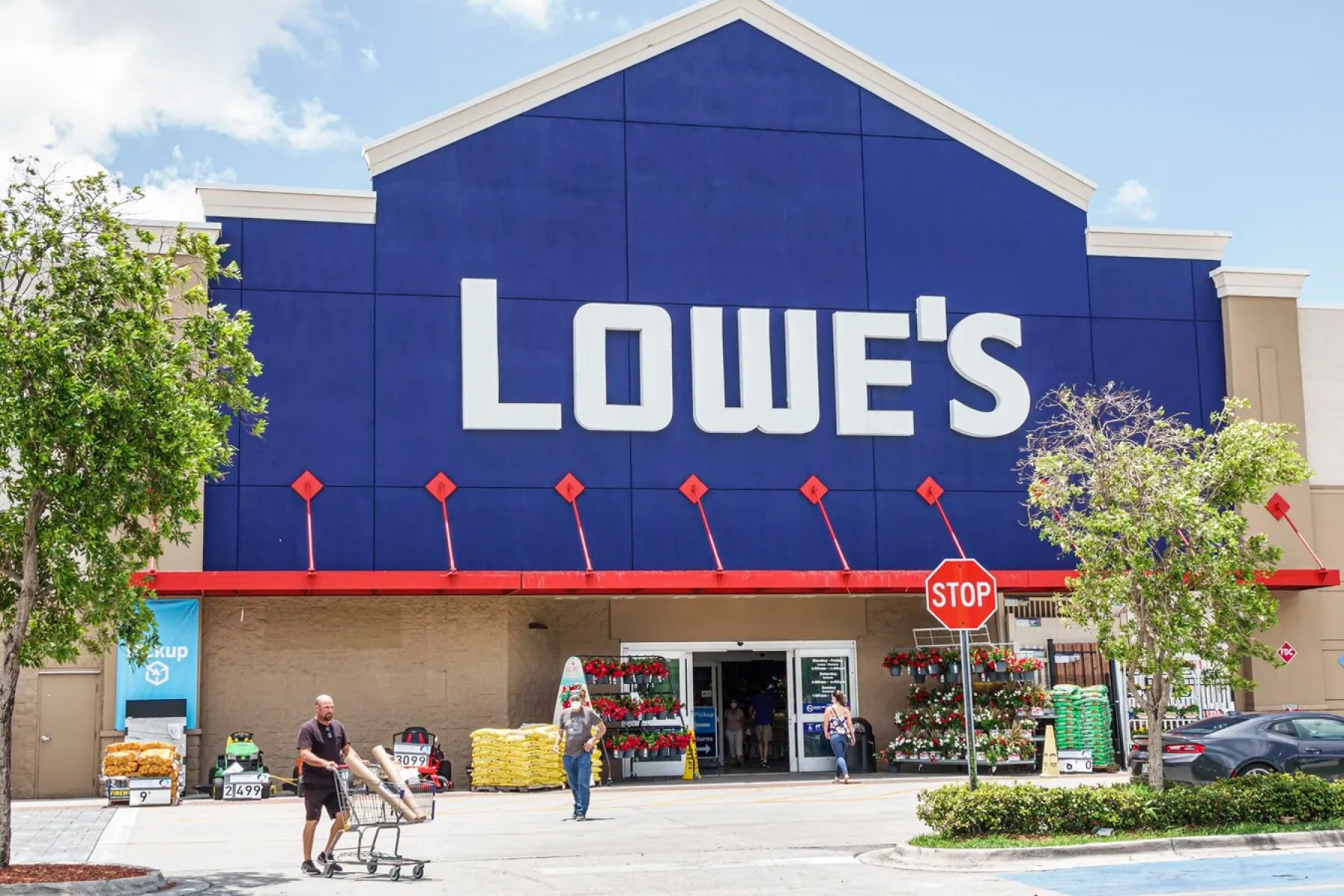
Retail stores like Walmart and Lowe's effectively use blue to convey reliability in their products and service, whereas a store like Goodwill uses blue to communicate trust. Bed Bath & Beyond uses blue to convey calmness and comfort, enhancing the shopping experience for home goods.


Blue is a powerful and versatile color in branding that evokes trust, calmness, and professionalism. Whether used by finance firms, technology companies, insurance providers, or retail stores, blue helps create strong, trustworthy brand identities. Its psychological impact makes it an enduring and effective choice for brands looking to connect with their audiences and foster lasting loyalty.
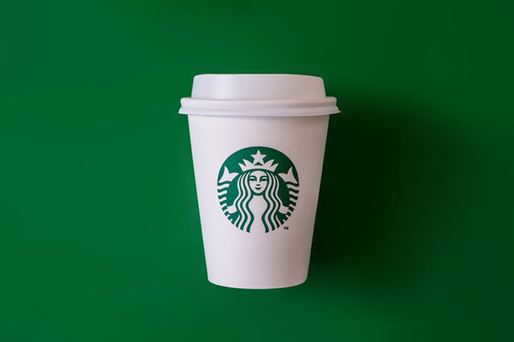
Green
Natural, Healthy, Tranquil 🐊
Green is often associated with nature, health, and tranquility. Its psychological impact is deeply rooted in its connection to the natural environment, evoking feelings of growth, renewal, and harmony. Brands that use green as their primary color aim to communicate their commitment to sustainability, health, and overall well-being. This makes green a popular choice for companies in the food and beverage industry, health and wellness sectors, and environmentally conscious businesses.
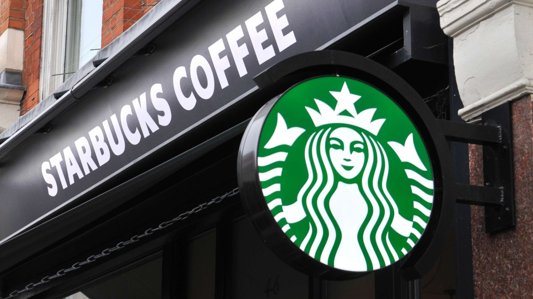
One of the most prominent examples of a brand using green is Starbucks. The deep green color of Starbucks’ logo is synonymous with the brand's commitment to high-quality coffee and environmental sustainability. Green evokes a sense of tranquility and relaxation, aligning well with their goal of creating a comfortable and inviting space for its customers. Whole Foods Market leverages the color to signify its focus on organic and natural products. The green color reinforces the brand’s commitment to health and wellness, appealing to consumers who prioritize healthy living and environmentally friendly practices.

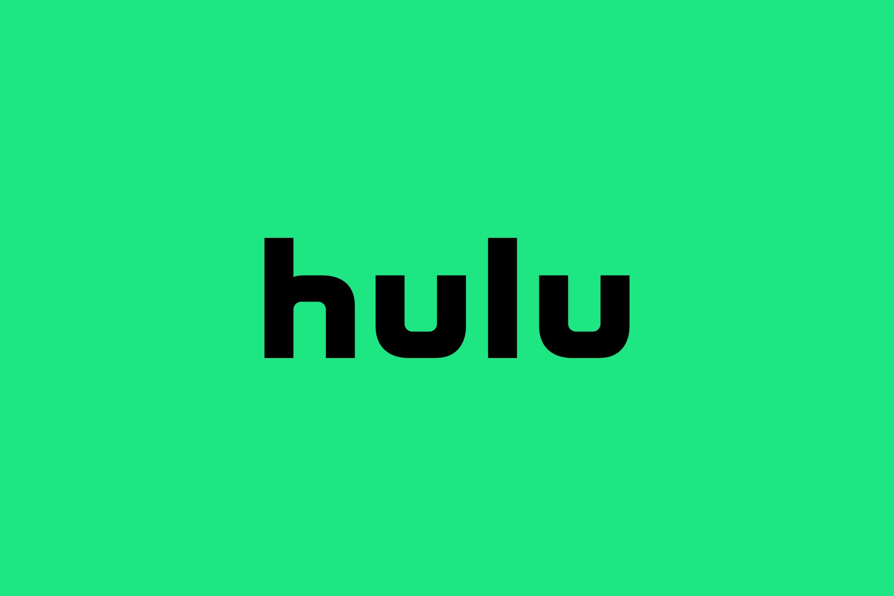
The versatility of green allows it to be used in various shades to evoke different feelings and messages. Lighter shades of green, such as those used by Hulu, Spotify, and Duolingo, can evoke feelings of freshness, innovation, and approachability. Hulu uses a bright green in its branding to convey a sense of modernity, making its streaming service appear fresh and engaging. Spotify's light green logo reflects its dynamic and energetic platform, inviting users to explore and enjoy music. Duolingo’s use of green, particularly in its owl mascot, suggests an approachable and friendly learning environment, encouraging users to embark on language learning with enthusiasm and ease.

Darker shades of green, on the other hand, can convey a sense of luxury and sophistication. Luxury car brand Land Rover uses a deep, rich green in its branding to evoke a sense of adventure and high-end quality. This shade of green suggests durability and reliability, key attributes for a brand known for its rugged and high-performance vehicles. Legacy brand Lacoste employs a dark green in its iconic crocodile logo to symbolize elegance and heritage. The deep green hue reinforces Lacoste's image as a premium fashion brand with a rich history, appealing to consumers who value timeless style and quality.
Overall, the strategic use of green in branding is a testament to its powerful psychological impact. By tapping into the feelings of health, tranquility, and sustainability that green evokes, brands can create strong, meaningful connections with their audiences. Whether it’s promoting organic products, financial growth, or environmental responsibility, green remains a versatile and effective color in the branding toolkit.
Yellow
Optimistic, Cheerful, Warm 🐝
Yellow is a vibrant and attention-grabbing color that brands often use to evoke feelings of happiness, optimism, and warmth. Historically associated with sunlight, yellow is a color that can stimulate mental activity and create a sense of cheerfulness, making it an ideal choice for brands aiming to create a friendly and inviting atmosphere. This makes yellow particularly effective in industries such as social media, entertainment, and food services. In this section, we will explore how different brands leverage yellow to convey their unique messages and connect with their audiences.
Snapchat and Bumble utilize yellow to signify creativity, energy, and approachability. Snapchat’s bright yellow logo and app interface reflect its dynamic and playful nature, appealing to younger audiences who value fun and spontaneity. The color choice enhances the platform's identity as a space for quick, casual interactions and creative content sharing. Similarly, Bumble uses yellow to project positivity and friendliness. Their yellow branding creates an inviting atmosphere that fosters confidence and optimism among its users. Not to mention bumble bees are yellow!

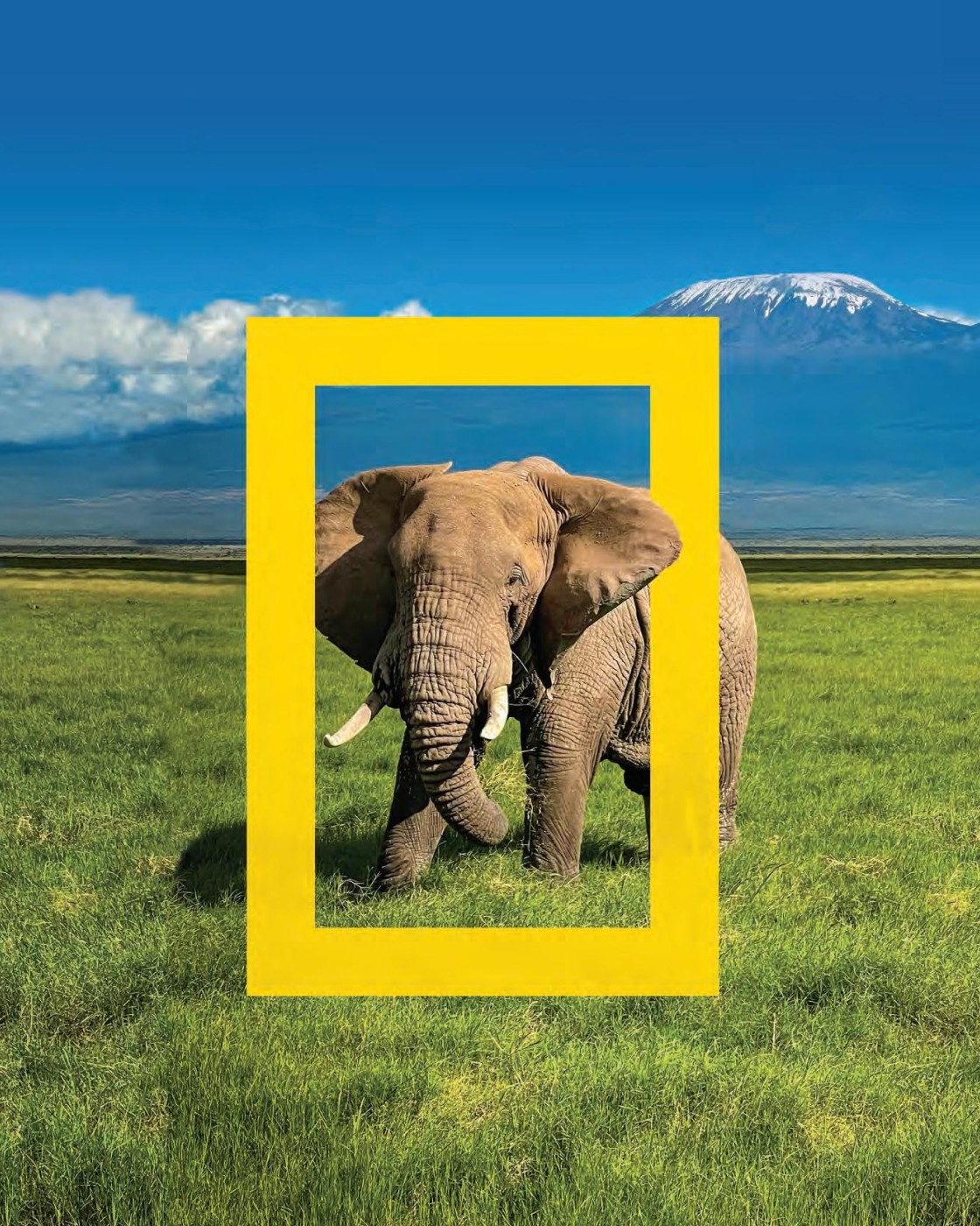
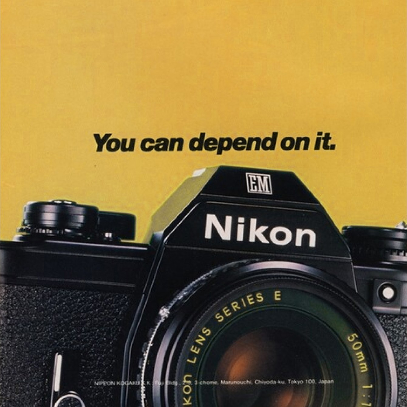
National Geographic and Nikon use yellow to convey exploration, knowledge, and innovation. National Geographic’s yellow rectangle is an adaptation of their iconic magazine borders, symbolizing curiosity and drawing viewers into a world of discovery and learning. Nikon, a leading camera manufacturer, uses yellow in its branding to highlight its commitment to innovation and high-quality imagery. Yellow is often projected through tungsten lighting, where the consumer can associate Nikon products with a "lightbulb moment." The vibrant yellow color captures attention and suggests a sense of creativity and excellence, appealing to both professional photographers and enthusiasts.
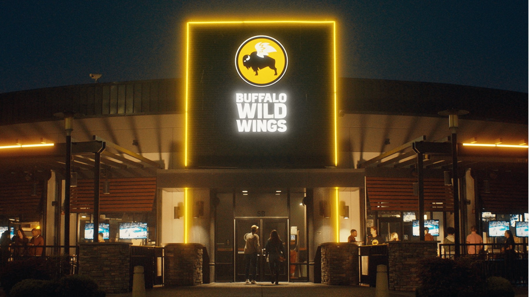
In the food industry, Buffalo Wild Wings and Waffle House leverage yellow to create a welcoming and energetic dining experience. Buffalo Wild Wings’ use of yellow, combined with black, evokes excitement and enthusiasm, fitting for a lively sports bar environment . Waffle House’s yellow branding creates a warm and inviting atmosphere, making customers feel at home and nostalgic for comfort food in a friendly setting.

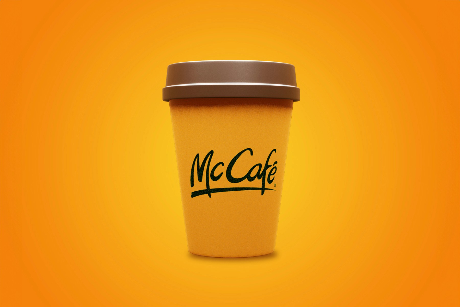
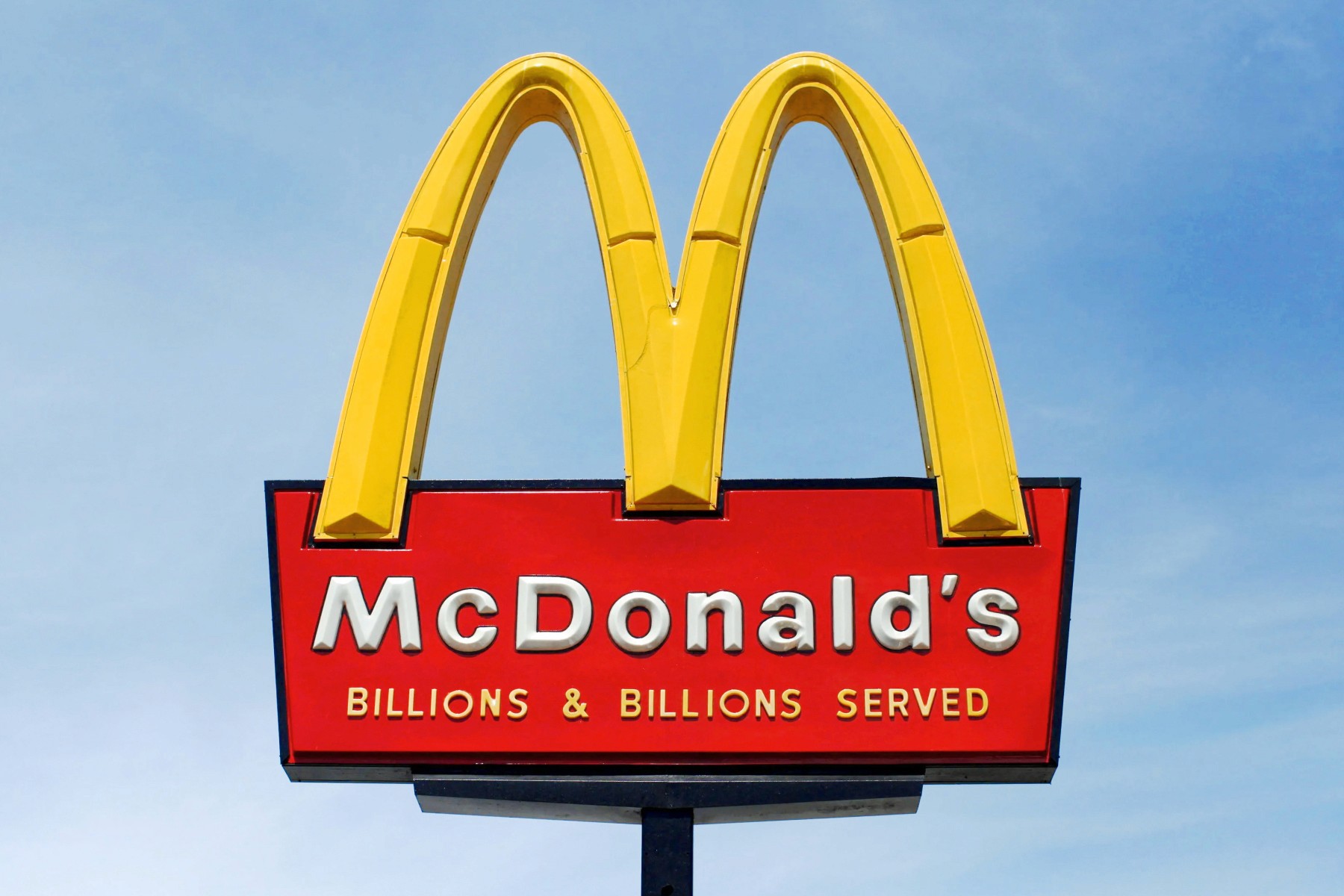
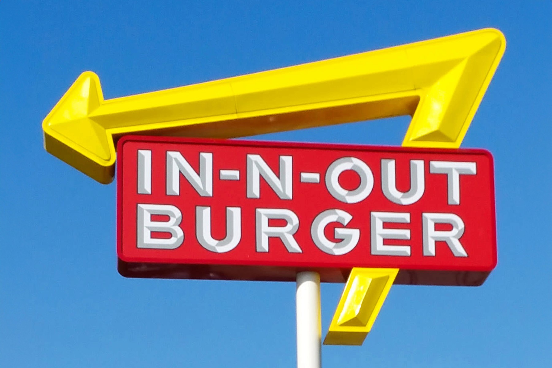
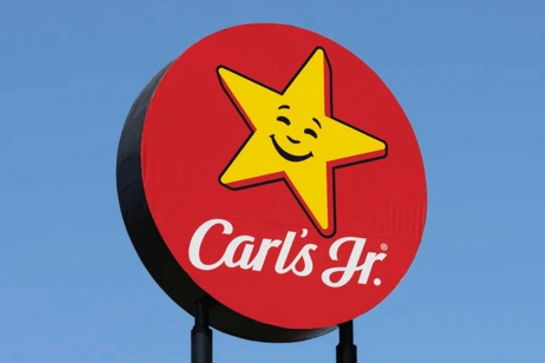
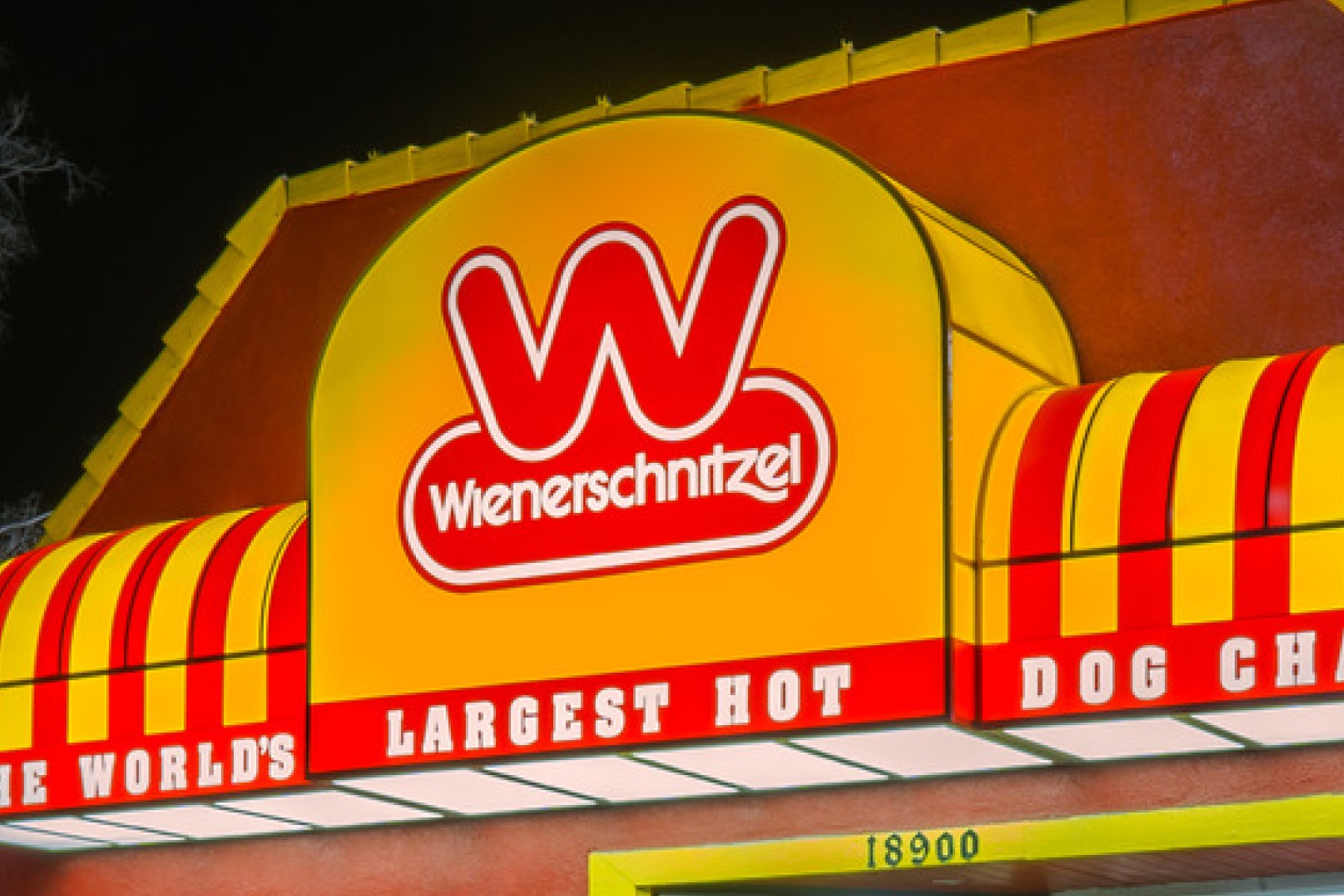
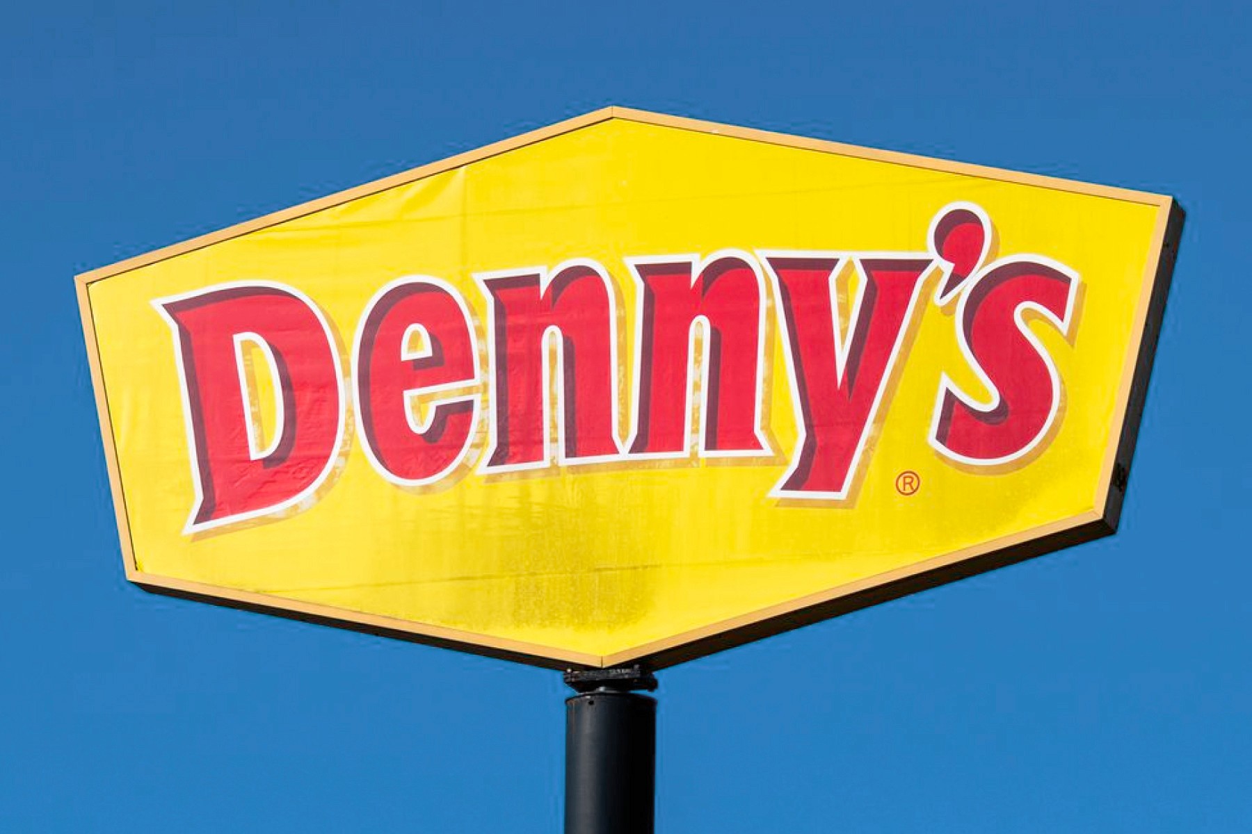
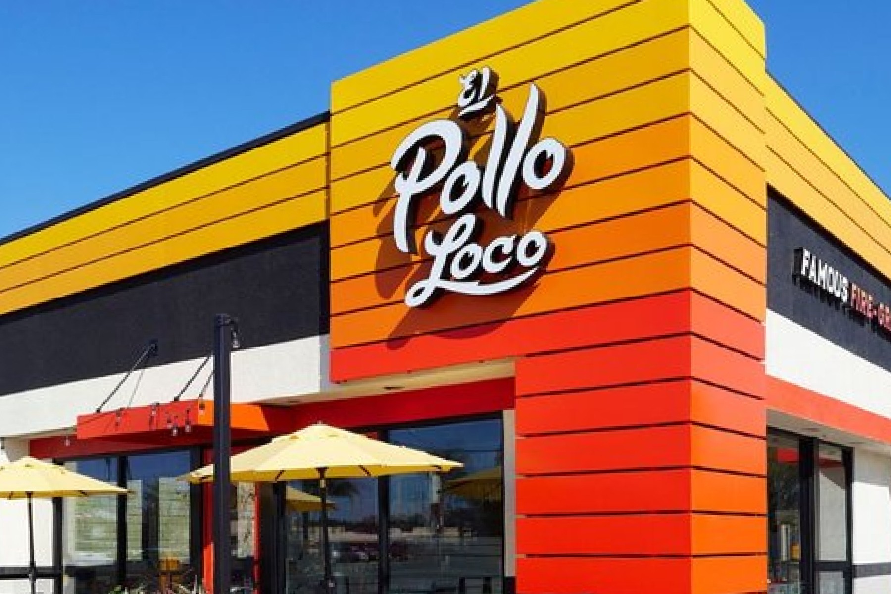
If you've been reading along thus far you know that red grabs your attention and stimulates hungar, making it a fitting choice for fast food restaurants. Often times these chains like to pair that red with yellow to maximize their visual impact. Whether they're suggesting a welcoming touch, a happiness boost, or a french fry with a side of ketchup, yellow and red is an iconic combination that will stand the test of time.
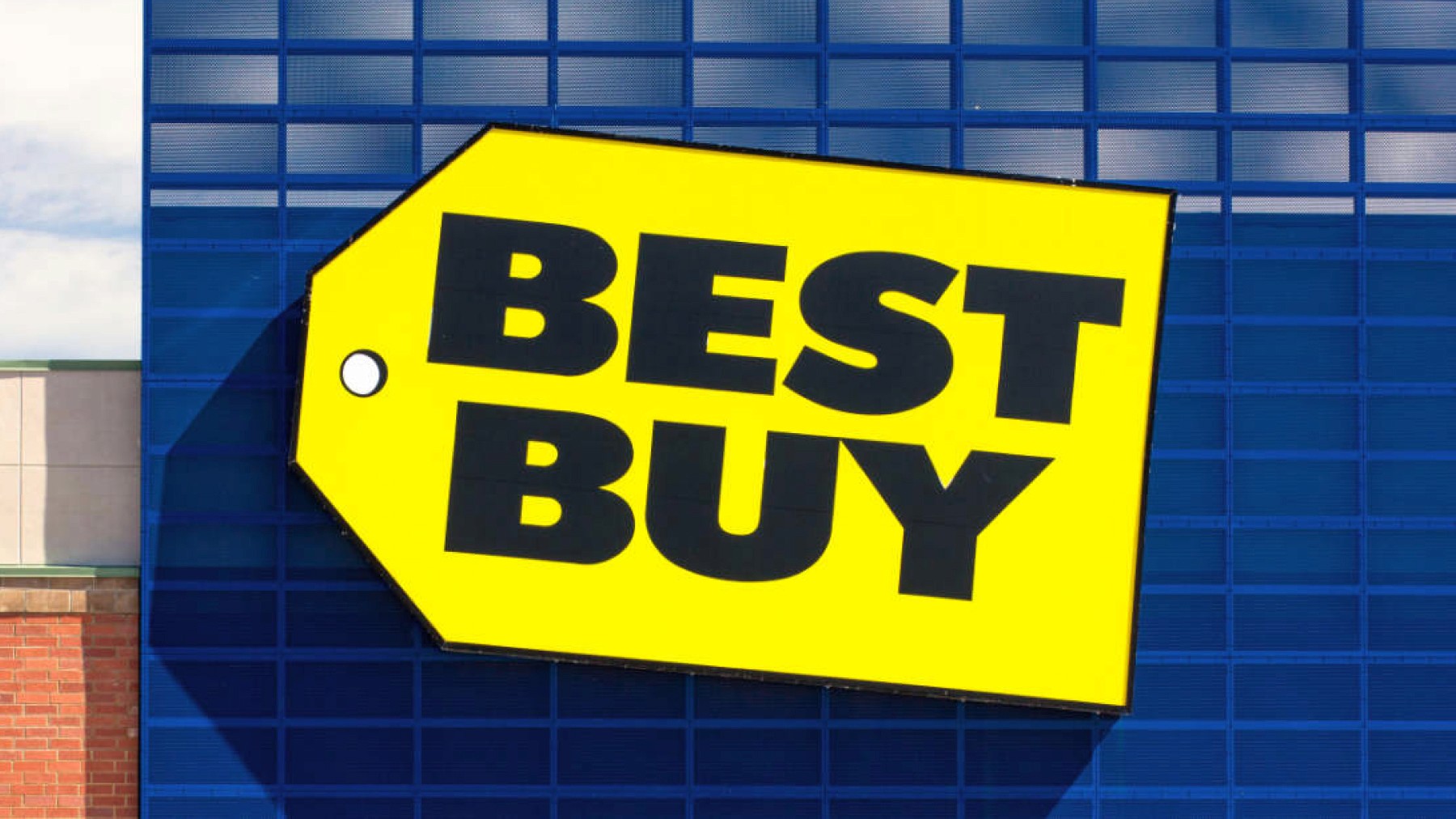
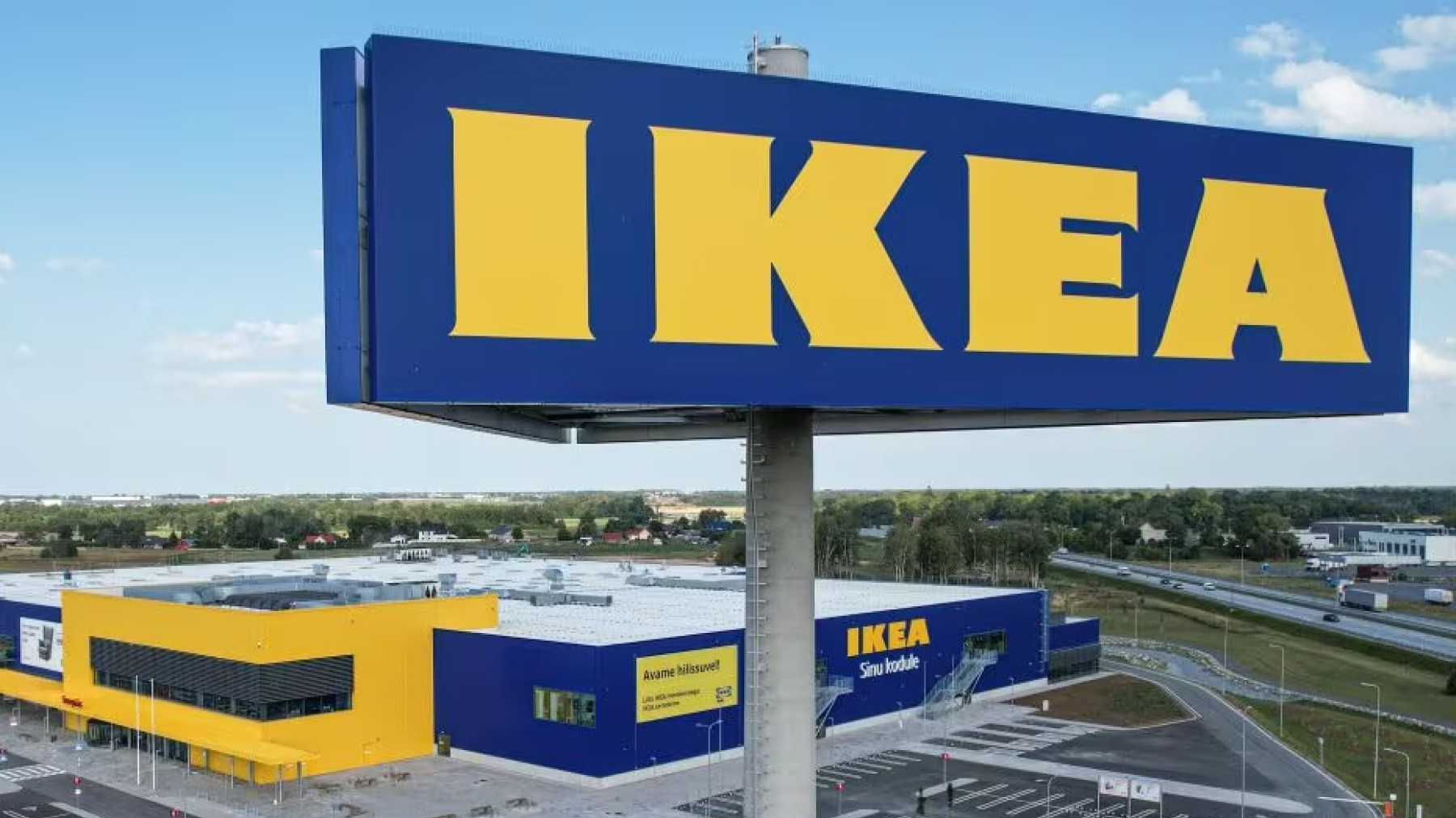
Other popular brands, such as Best Buy, combine yellow with blue to convey excitement and trustworthiness, whereas IKEA uses yellow and blue to reflect its Swedish heritage. Yellow and green is also a popular choice among brands. John Deere being a agriculture technology business uses green to reflect it's industry and yellow for the energy that powers their machinery. Subway uses yellow and green to emphasize freshness, appealing to customers seeking a healthier alternative.


Ultimately, yellow is a striking color that evokes feelings of happiness, energy, and warmth. Whether used alone or in combination with others, yellow remains a versatile and effective choice for a wide range of industries, from social media and entertainment to food services and retail.
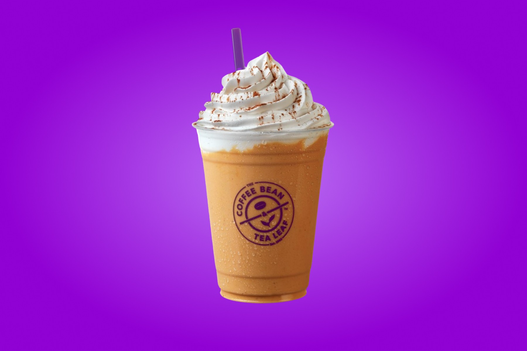
Purple
Luxurious, Creative, Wise 🦄
Purple is a color that has long been associated with luxury, creativity, and wisdom. Its rich history dates back to ancient times when purple dye was rare and expensive, often reserved for royalty and the elite. In modern branding, purple continues to evoke feelings of sophistication, imagination, and exclusivity. This makes it a popular choice across various industries, from food and beverages to beauty and technology. We'll explore how different brands leverage purple to communicate their unique messages and connect with their audiences.
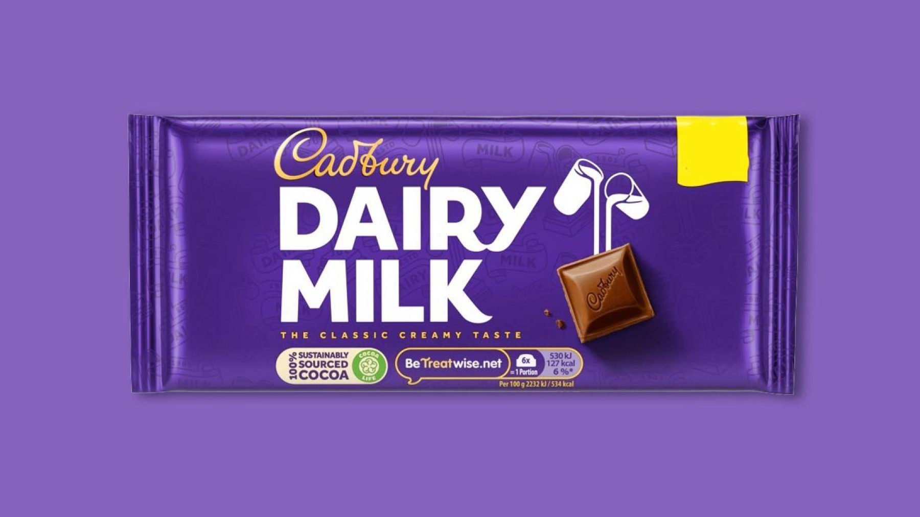
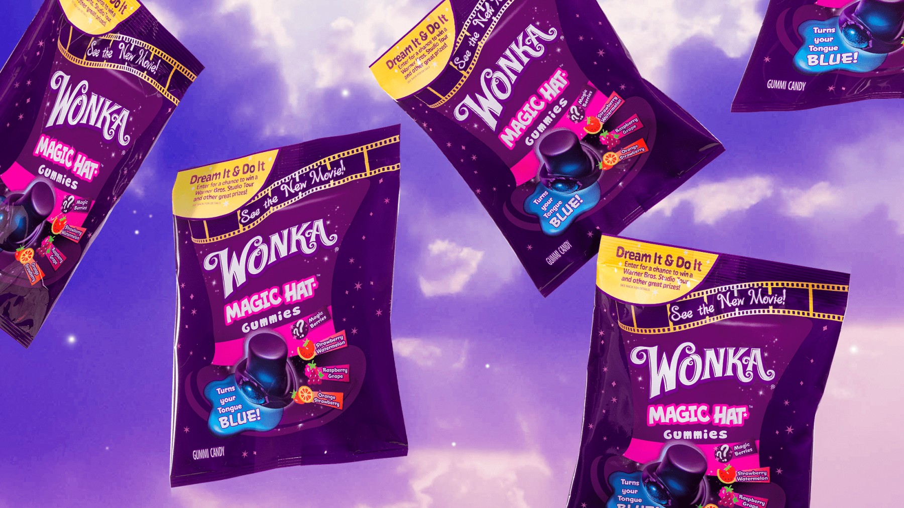
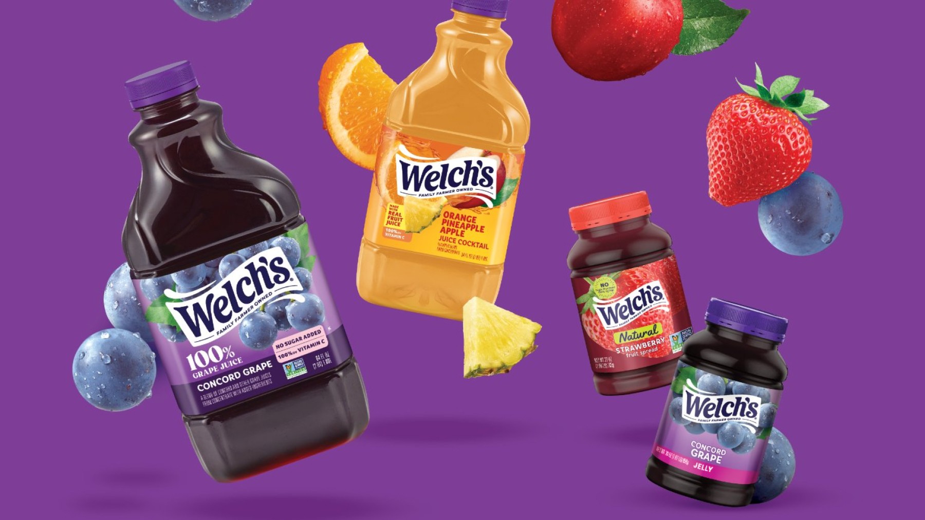
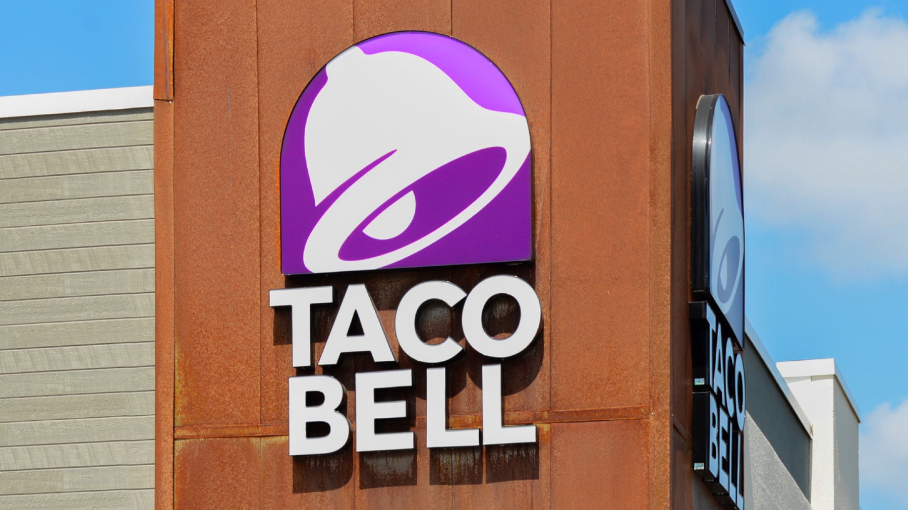
In the food and beverage industry, purple is used to convey indulgence, quality, and wonder. Cadbury’s deep purple packaging evoke a sense of premium quality, reinforcing its image as a high-end chocolate brand. Wonka on the other hand, uses purple to appeal to children with its whimsical and imaginative branding. Welch’s deep use of purple emphasizes the rich, natural flavors of its grape products. Sometimes, however, there are exceptions to these rules. Taco Bell's use of purple is bold and distinctive, distinguishing them from their competitors.
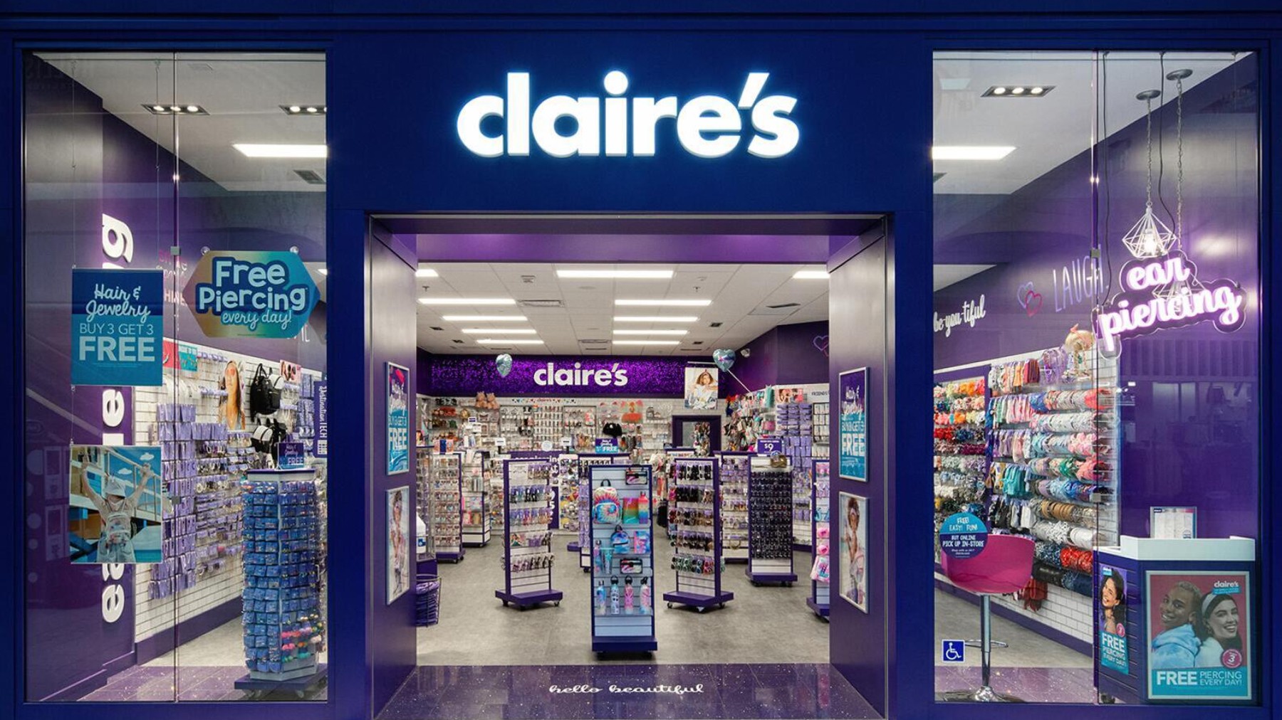
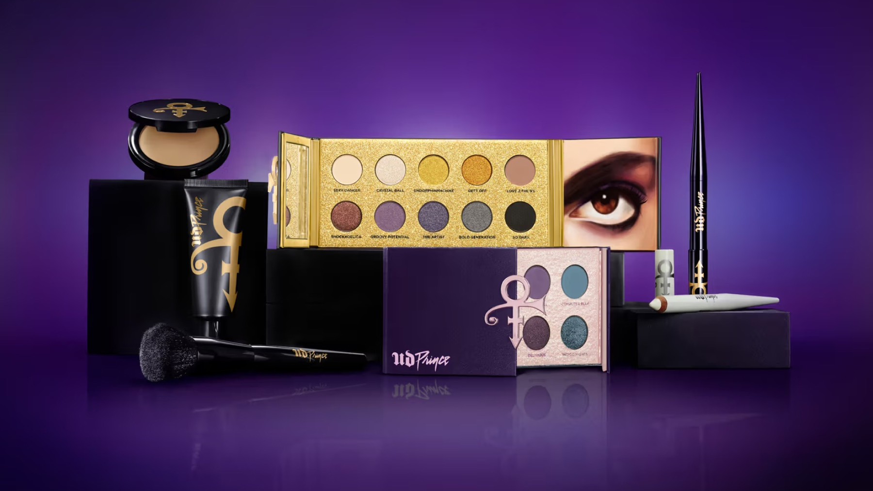
In the beauty industry, purple is often used to signify luxury and creativity. Claire’s uses purple in its branding to appeal to a younger audience, suggesting a sense of fun and imagination while maintaining an air of sophistication. Urban Decay employs various shades of purple in its branding to reflect its bold and creative approach to makeup, appealing to consumers who seek unique and high-quality beauty products.
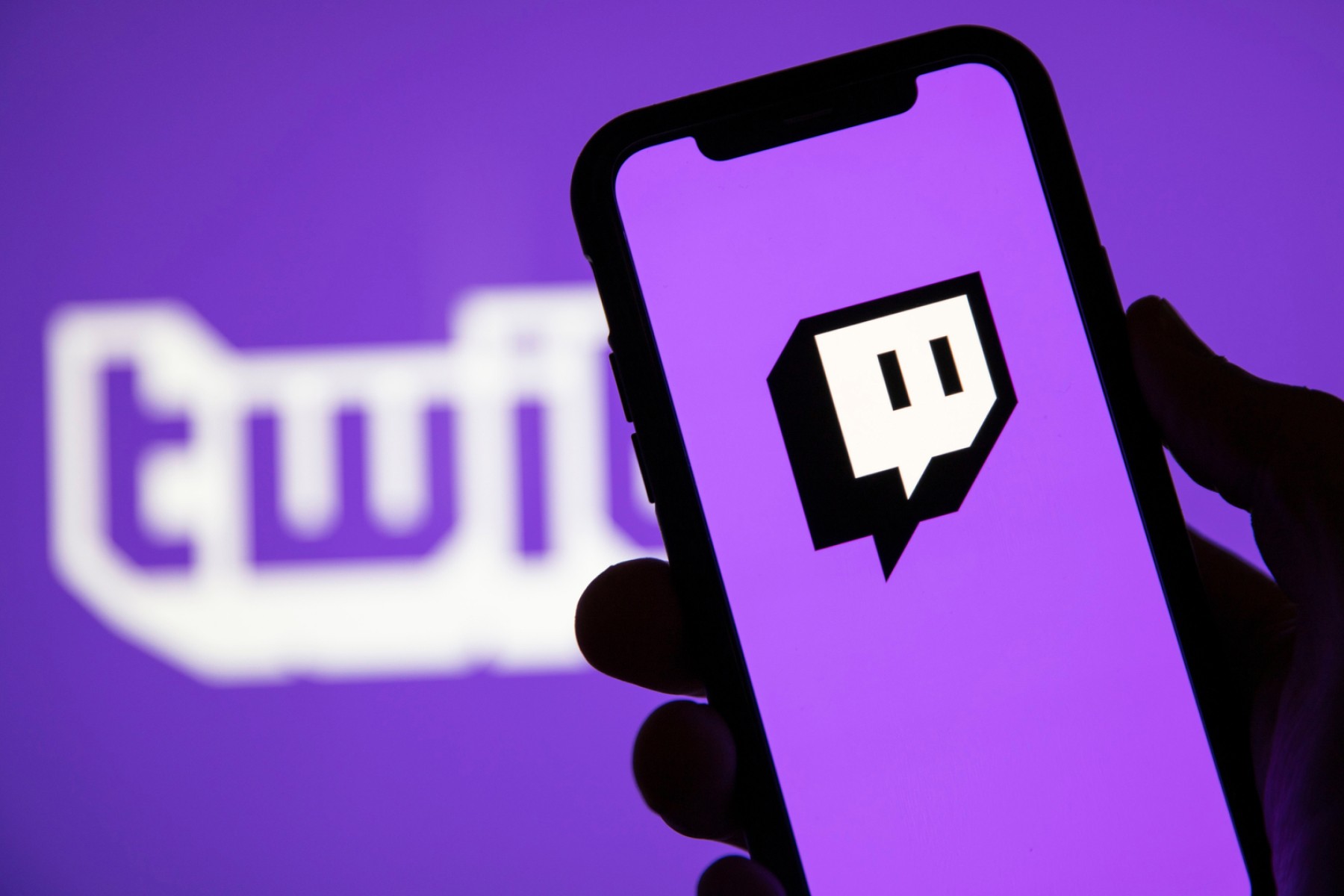
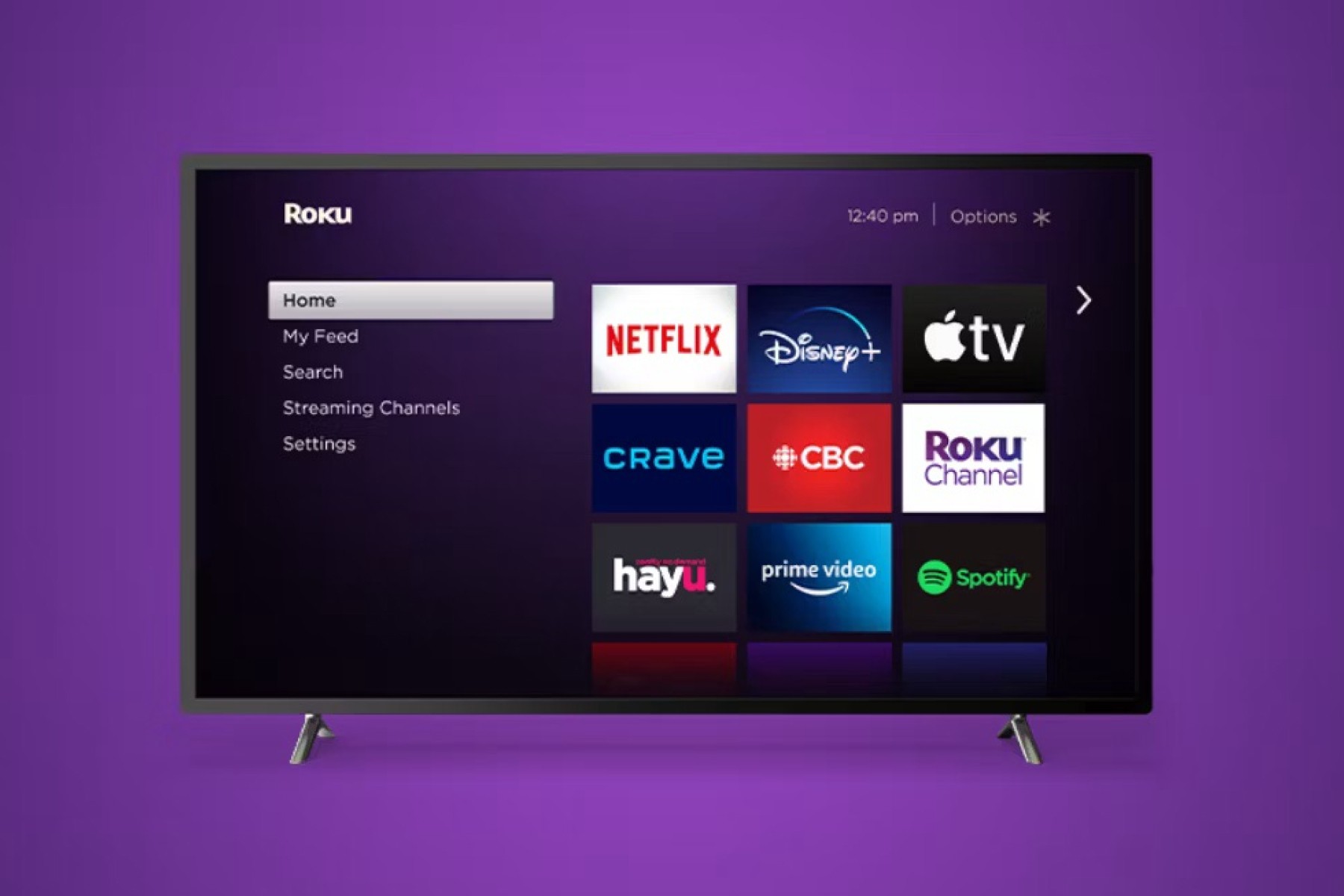
Tech companies like Yahoo, Twitch, and Roku use purple to convey innovation and creativity. Sometimes the color choice of a business happens serendipitously, as purple originally became Yahoo's color by mistake. According to founder Jerry Hang, the grey paint that decorated their early office space ended drying a shade of light lavender, and stuck with it since. Nowadays, Yahoo’s uses purple to separate itself from competition and reflects its long-standing commitment to being a forward-thinking and helpful internet company. Twitch’s purple branding also stands out in the tech landscape, appealing to a vibrant and creative community of gamers and streamers. Roku uses purple to suggest innovation and creativity, aligning with its mission to provide cutting-edge streaming technology.
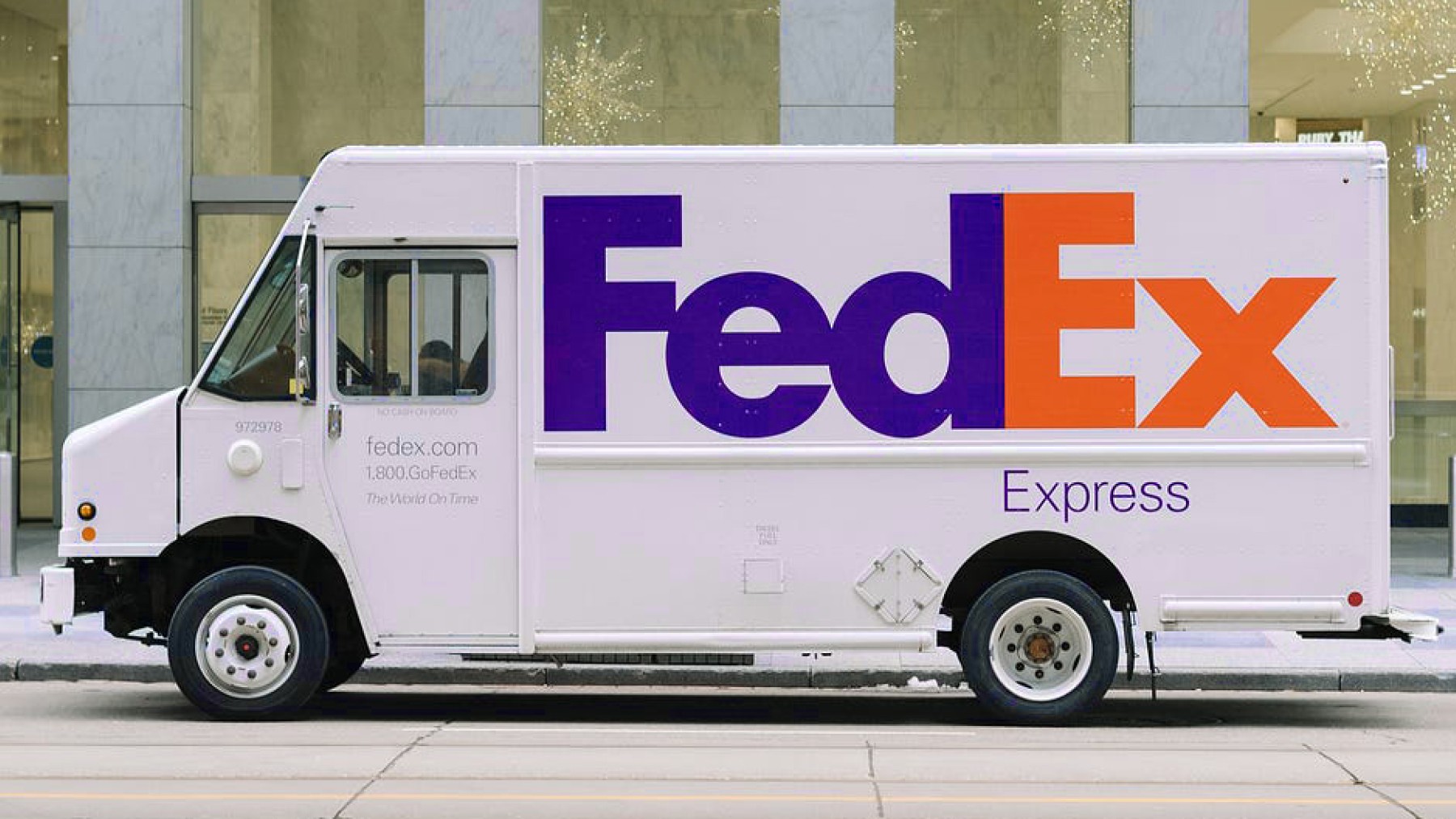
Brands like FedEx and Instagram use purple in combination with other colors to create a balanced and impactful identity. FedEx uses purple to suggest trust and sophistication while orange adds urgency and speed. Instagram’s use of purple in its gradient logo, alongside pink and orange, evokes creativity and excitement, enhancing the platform’s appeal as a dynamic and visually engaging social media network.

In summary, purple is a less common, but still effective color in branding that evokes feelings of luxury, creativity, and sophistication. From indulgent chocolates and whimsical confections to innovative tech platforms and bold beauty products, the strategic use of purple allows brands to create memorable brand identities.
Orange
Enthusiastic, Playful, Energetic 🍊
Orange is a vibrant and energetic color often associated with enthusiasm, creativity, and friendliness. This makes orange particularly effective in various industries, from retail and entertainment to finance and automotive services.
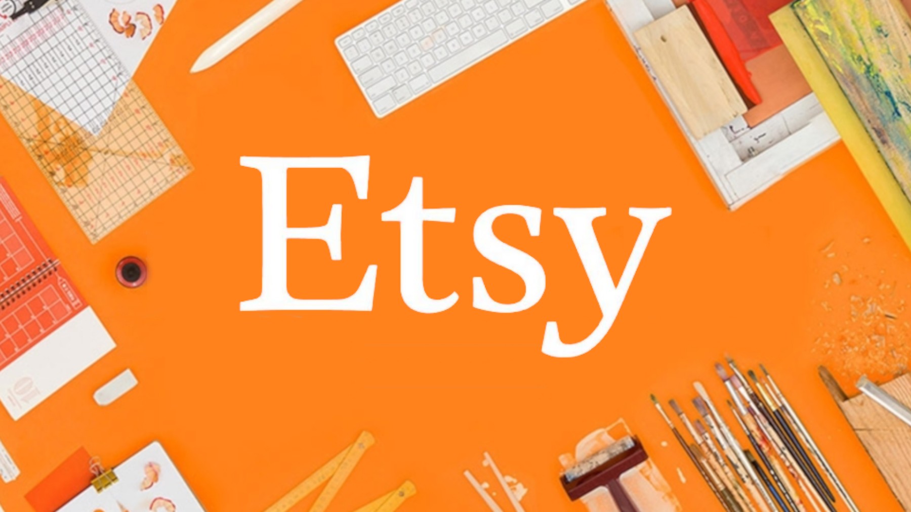
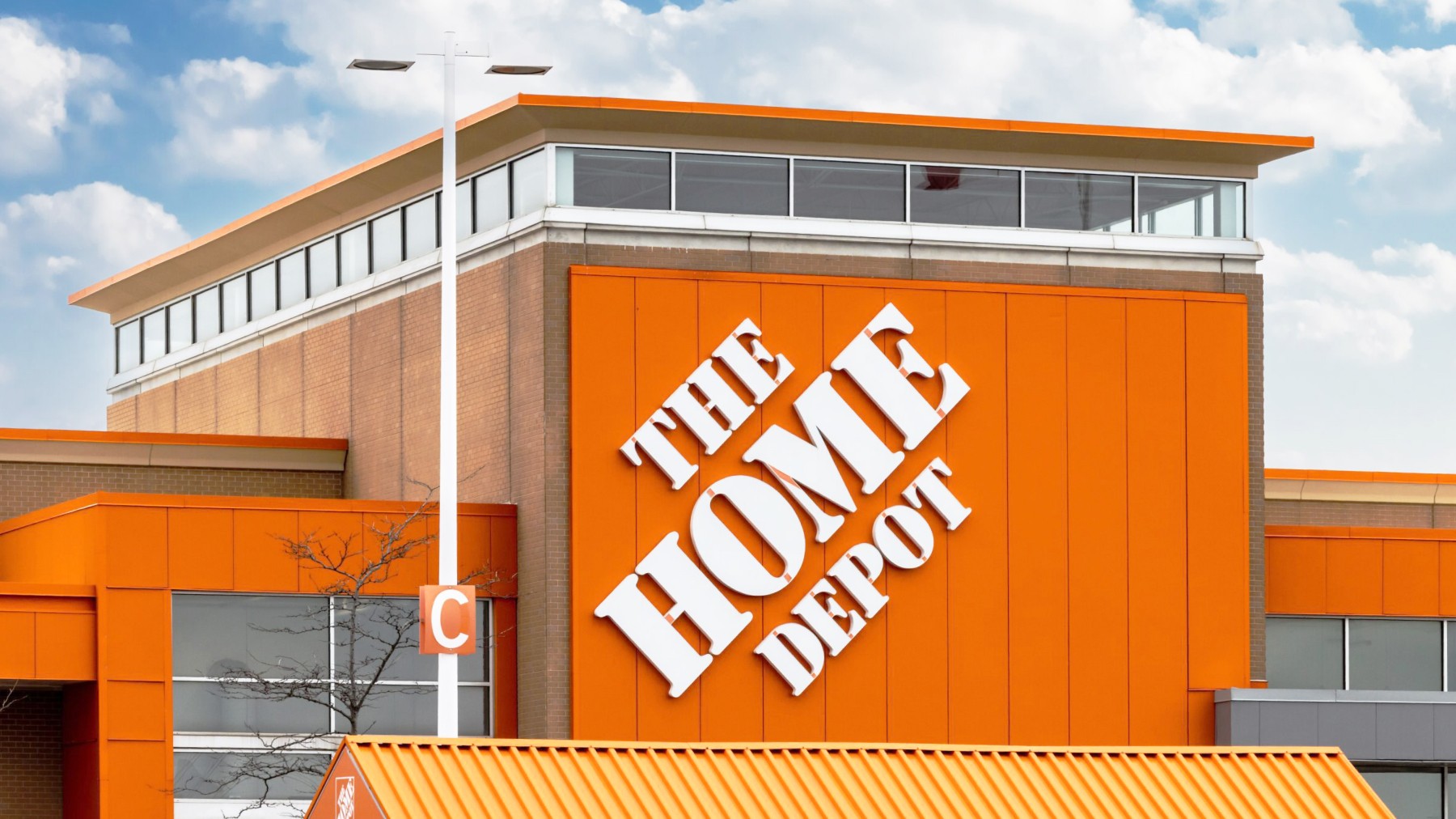
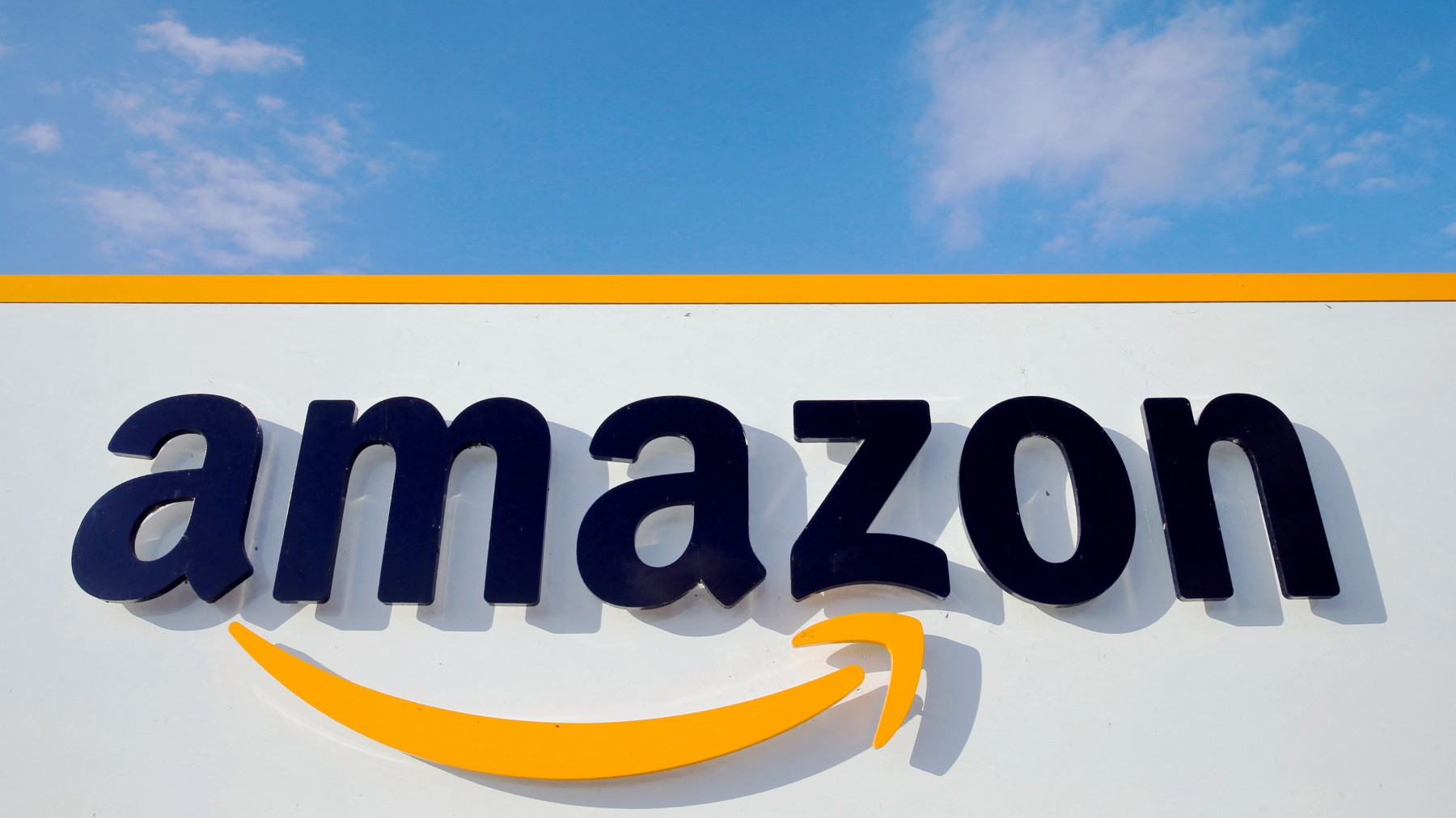
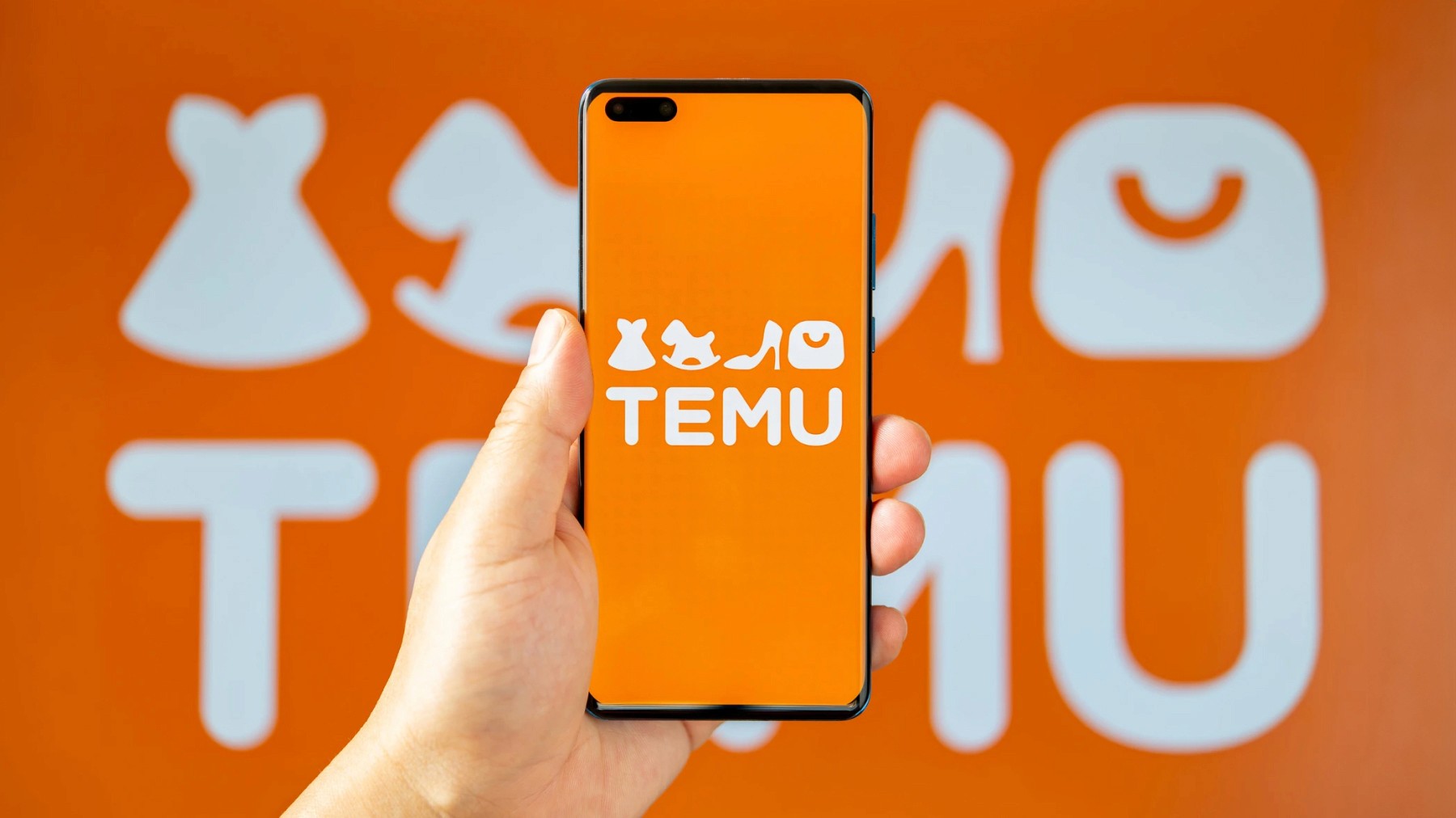
In the retail industry, companies like Etsy, Home Depot, Amazon, and Temu use orange to create a strong and inviting brand presence. Etsy's use of orange reflects its creative and crafty marketplace, appealing to consumers looking for unique, handmade items. Home Depot’s bold orange resonates as a common color in construction, fitting for a brand that empowers DIY enthusiasts and professionals alike. Amazon incorporates a subtle orange arrow-shaped smile in its logo, suggesting speed and reliability, while also evoking a sense of warmth and friendliness. Temu, with its vibrant orange branding, communicates its dynamic shopping discounts prevalent throughout the app. Interestingly, Temu likely chose this color because of it's familiarity with Amazon, looking to compete as the "everything store."
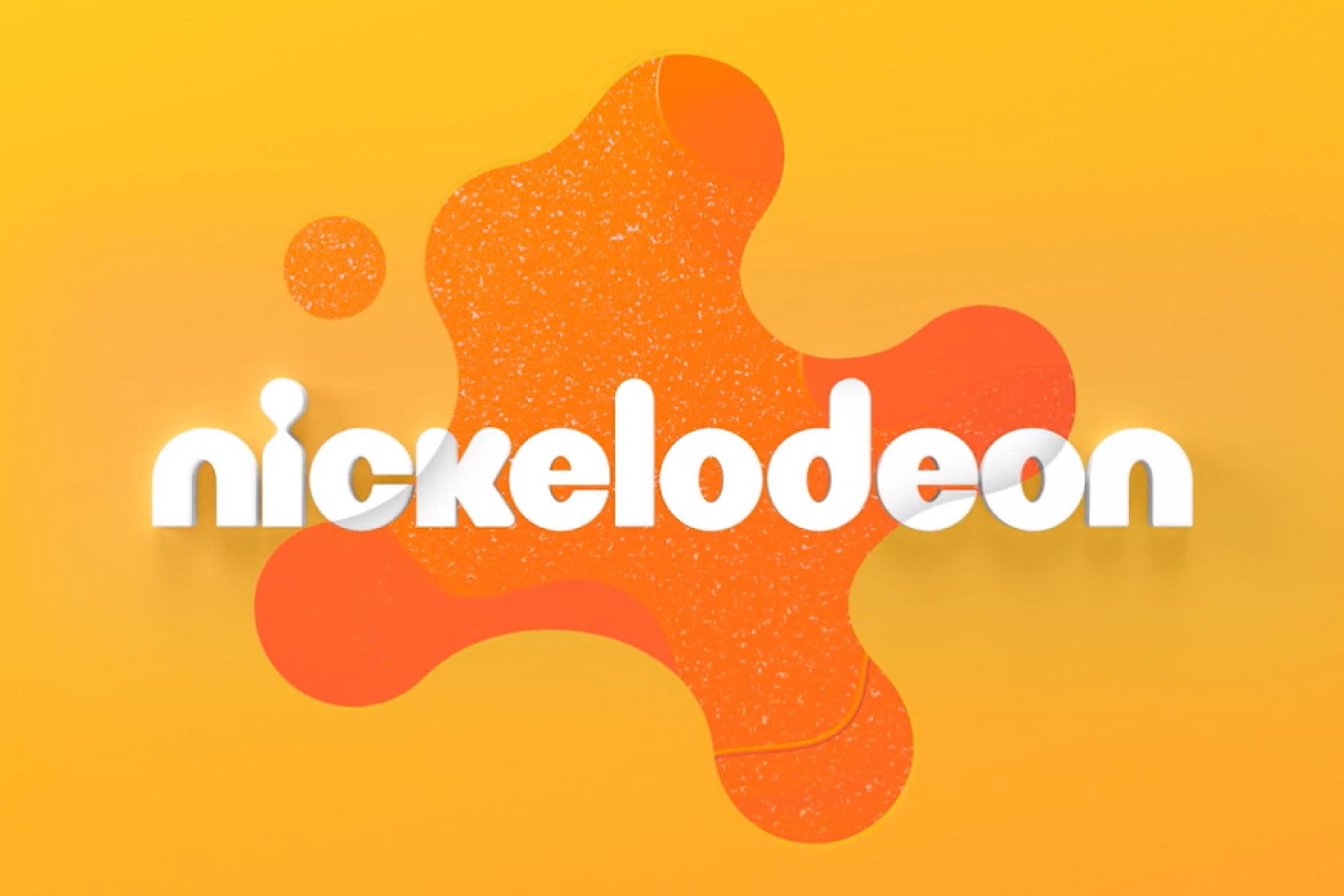
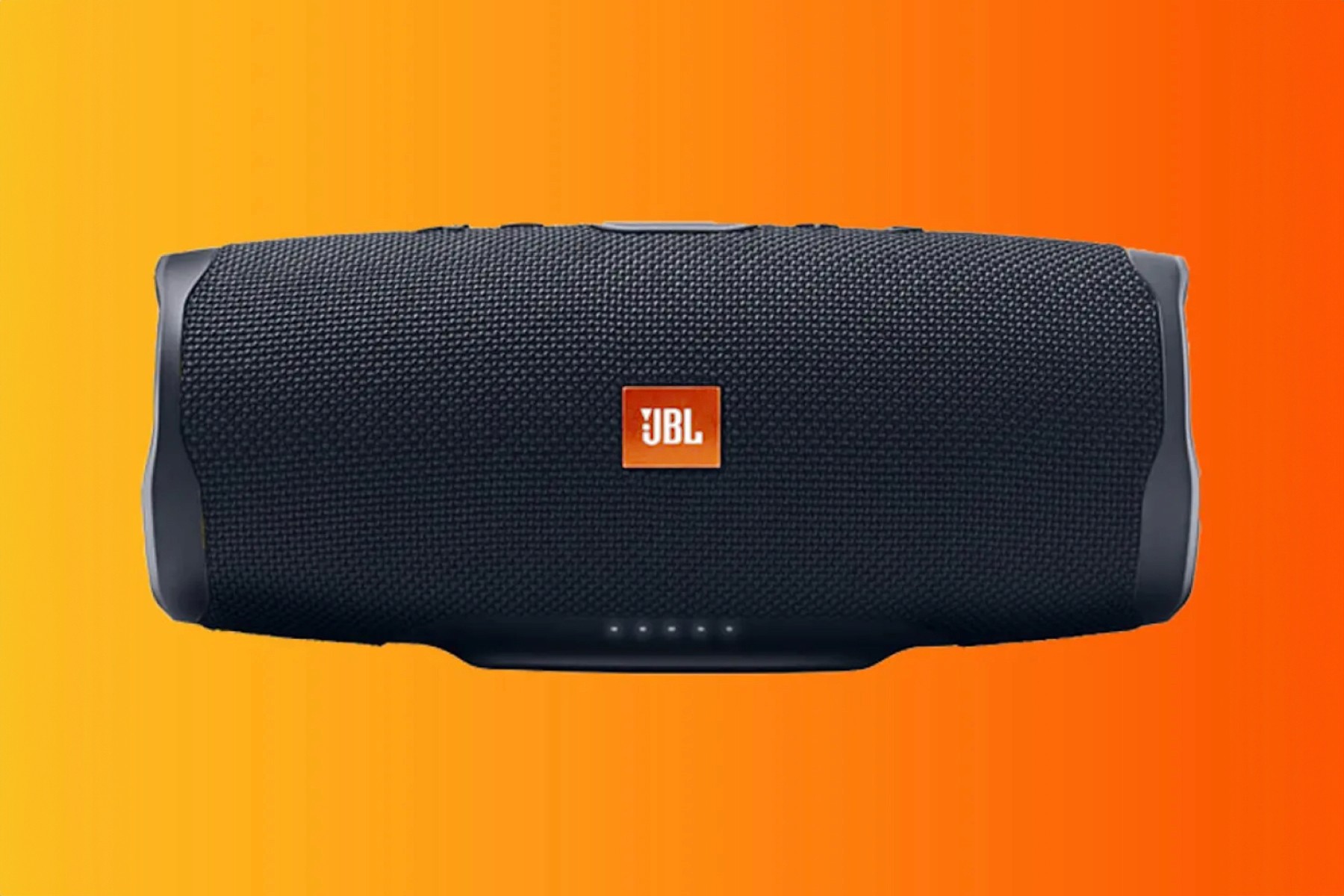
Entertainment and music brands like Nickelodeon, JBL, and SoundCloud leverage orange to convey excitement and creativity. Nickelodeon’s bright orange logo is instantly recognizable and synonymous with fun, appealing to children and families with its silly and lighthearted programming. JBL, known for its audio equipment, uses orange to stand out in the tech market, suggesting a level of boldness in their sound experiences. SoundCloud’s use of orange reflects its platform’s energetic community, encouraging creativity and interaction among artists and listeners.

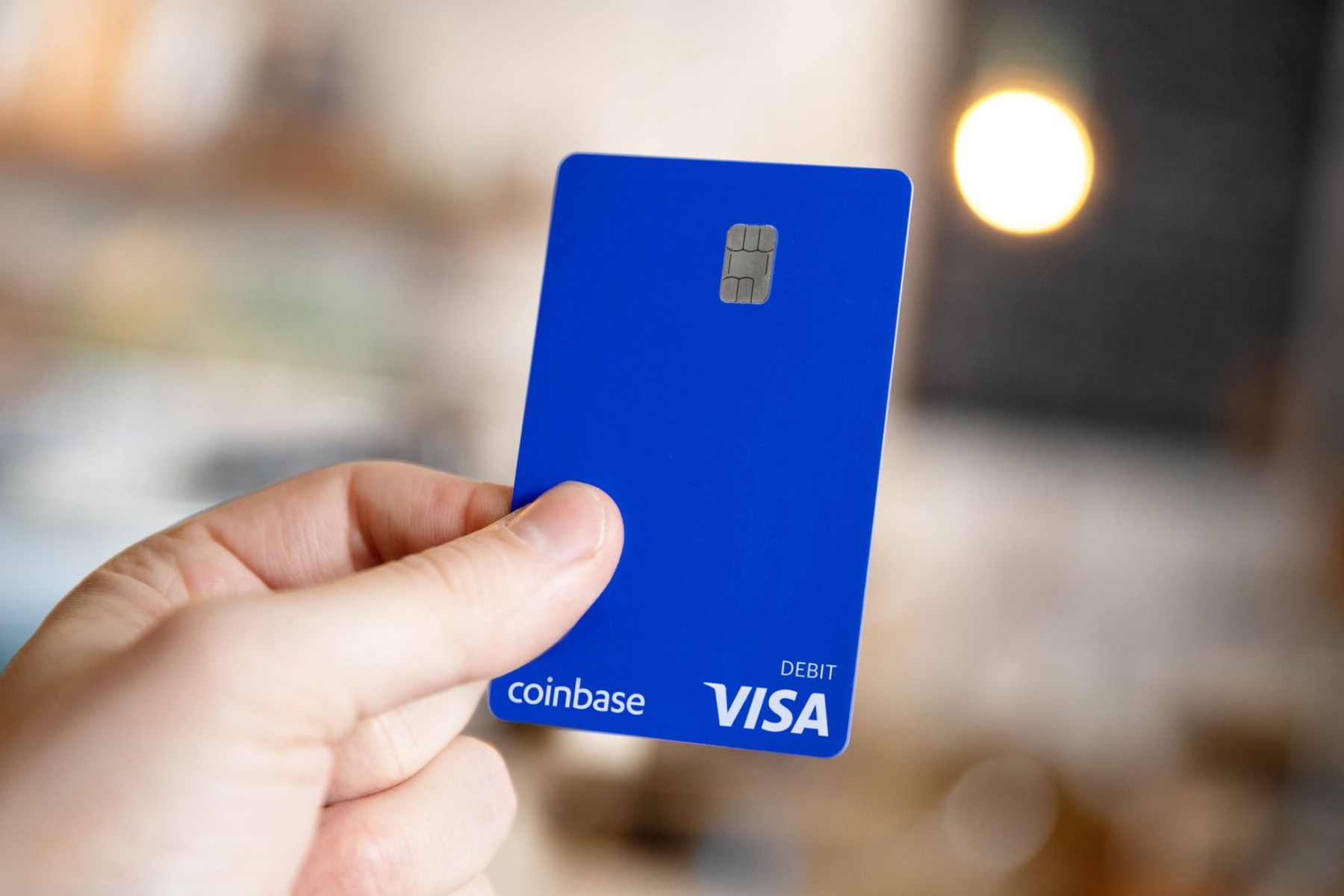
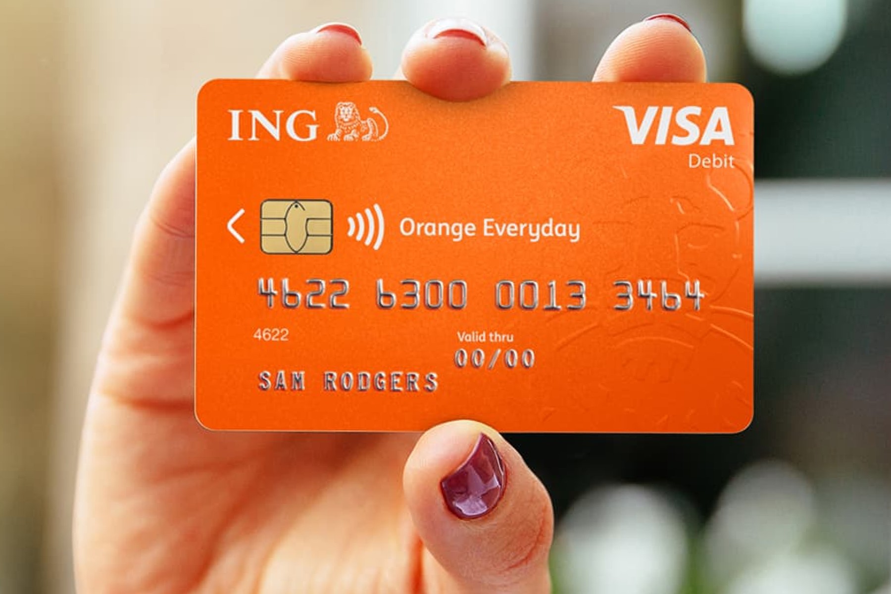
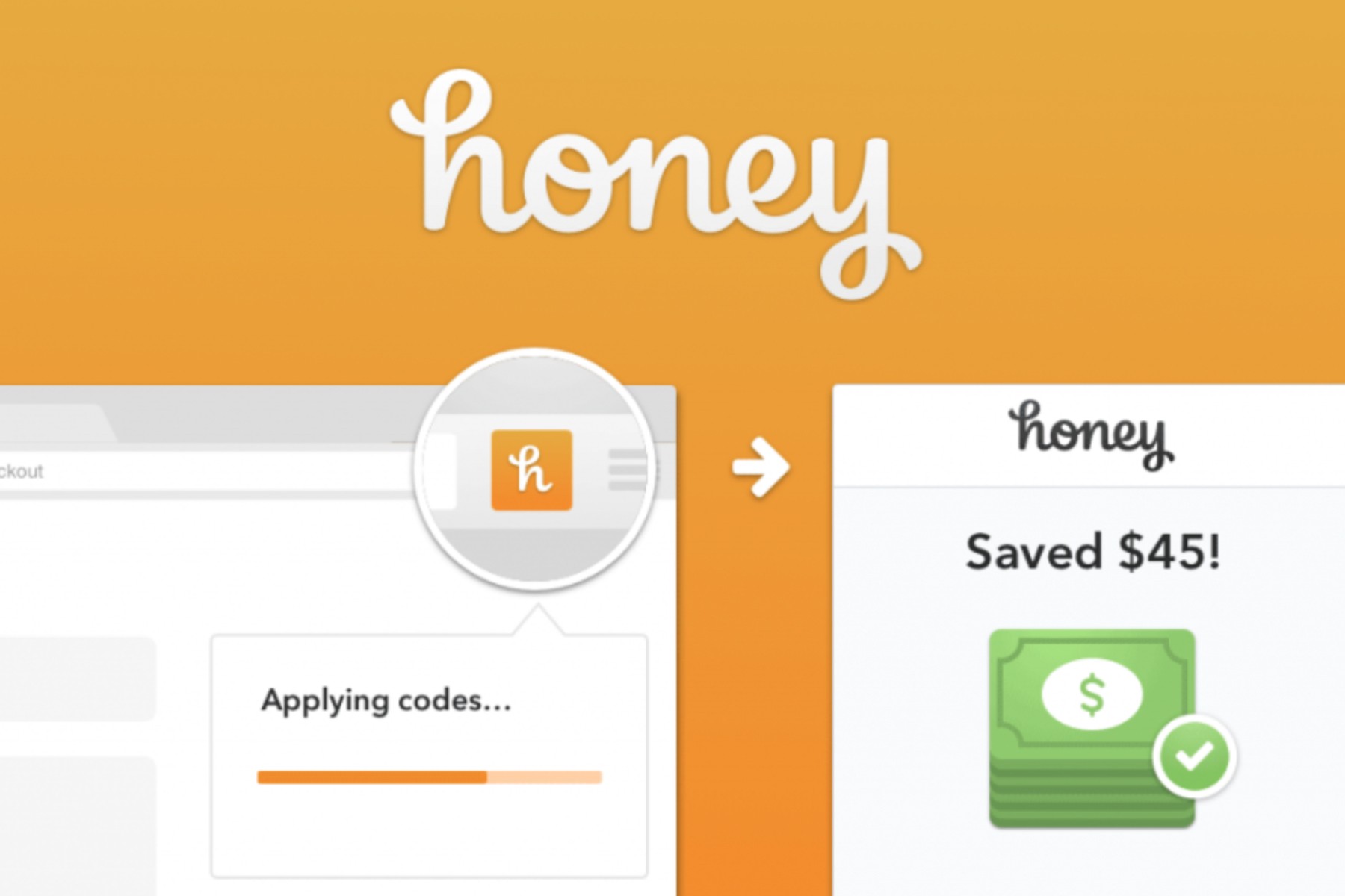
In the finance sector, brands like Bitcoin, ING, and Honey use orange to communicate innovation and accessibility. Bitcoin’s use of orange highlights its pioneering and disruptive nature in the financial world, suggesting a bold and forward-thinking approach. Appropriately, orange isn't too far off from gold, which coins are often associated with. ING employs orange in its branding to evoke a sense of warmth and friendliness, aligning with its mission to make banking more approachable and user-friendly. Honey, the online coupon and deals platform, uses orange to convey savings and excitement, making the process of finding deals feel fun and rewarding.

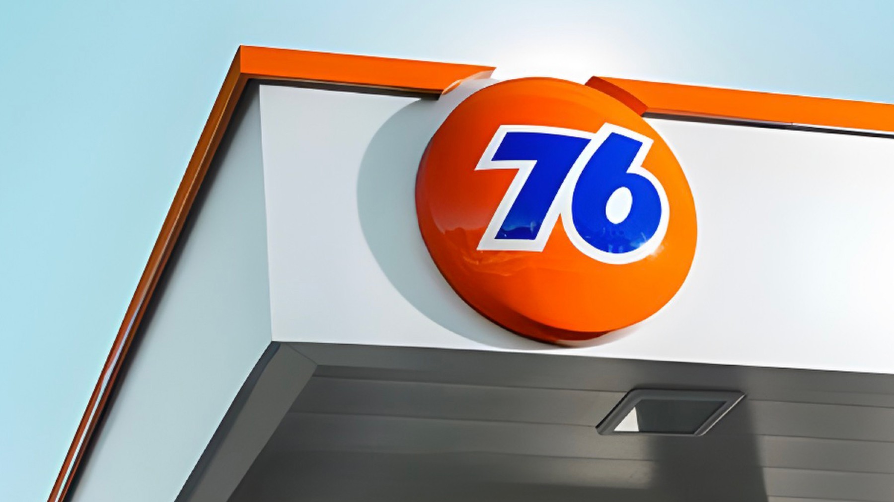
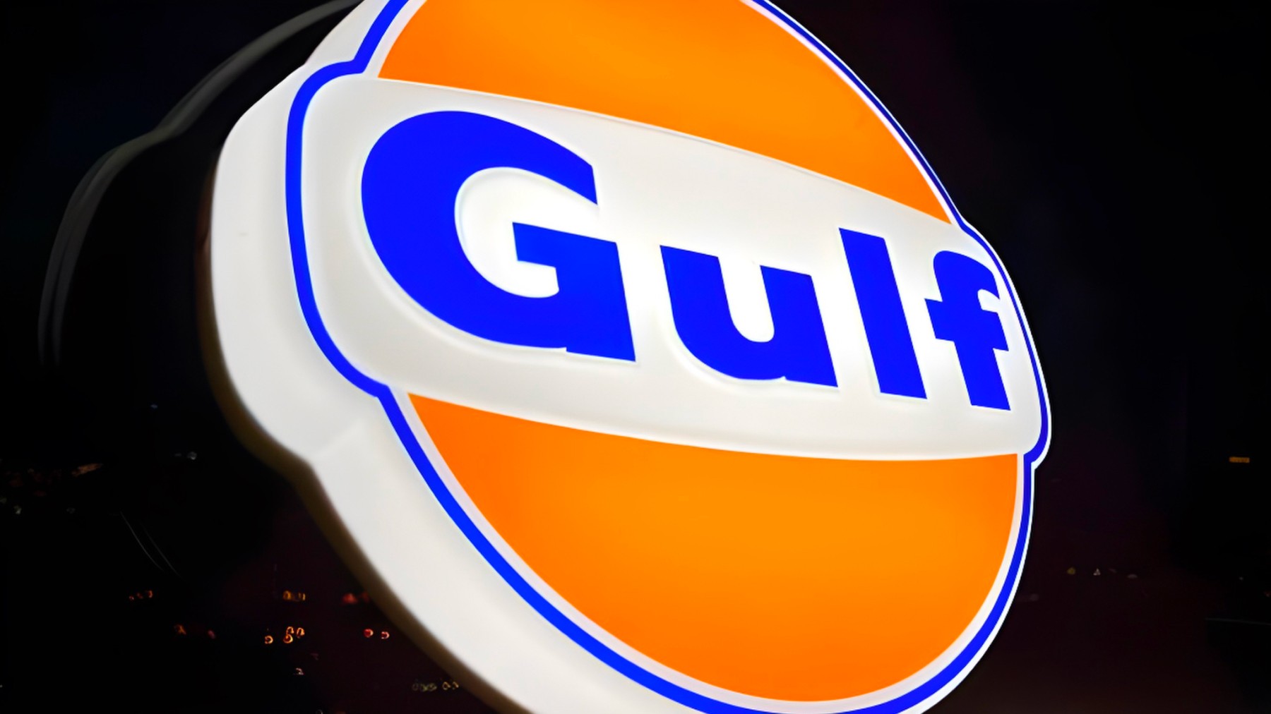
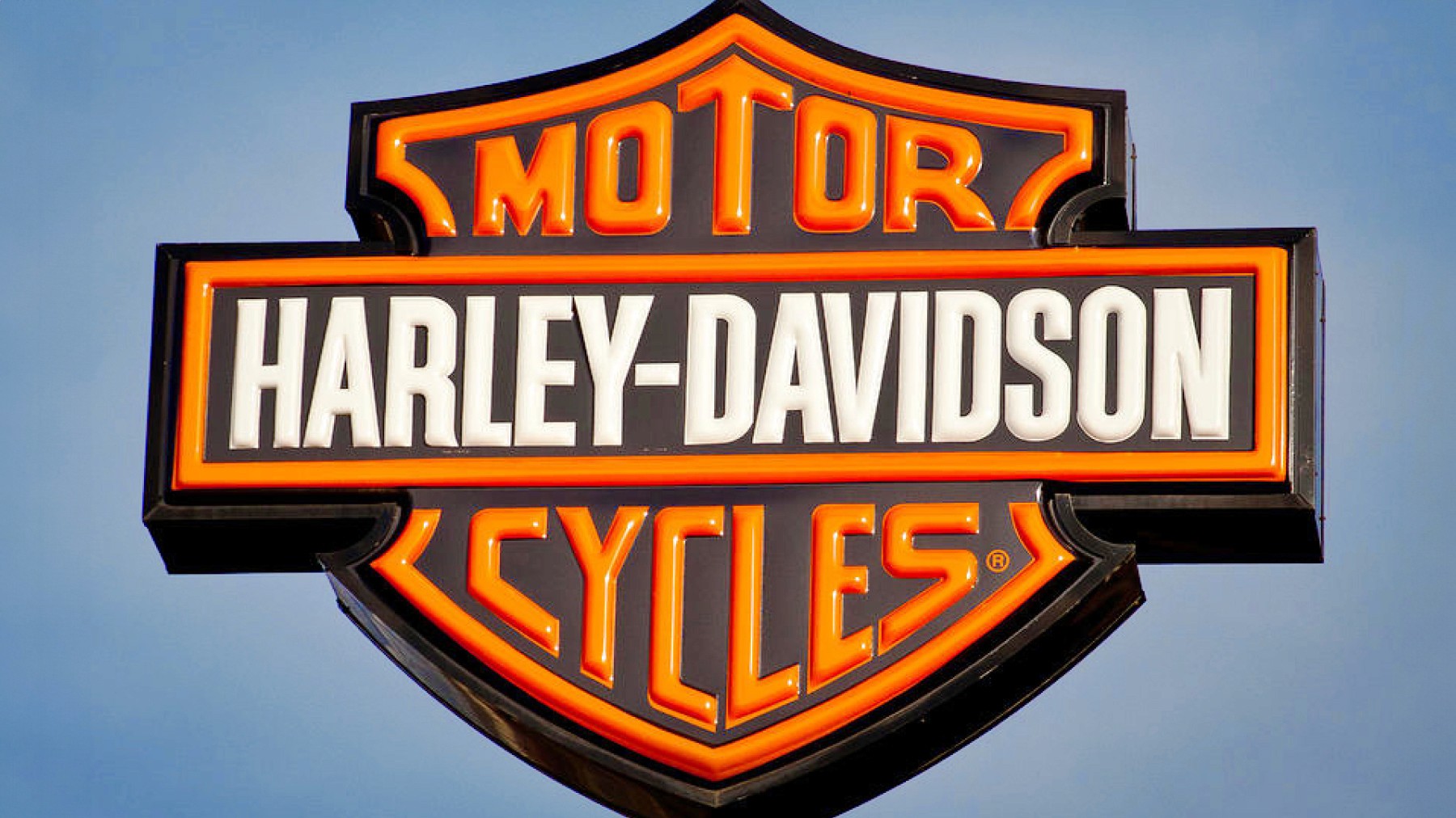
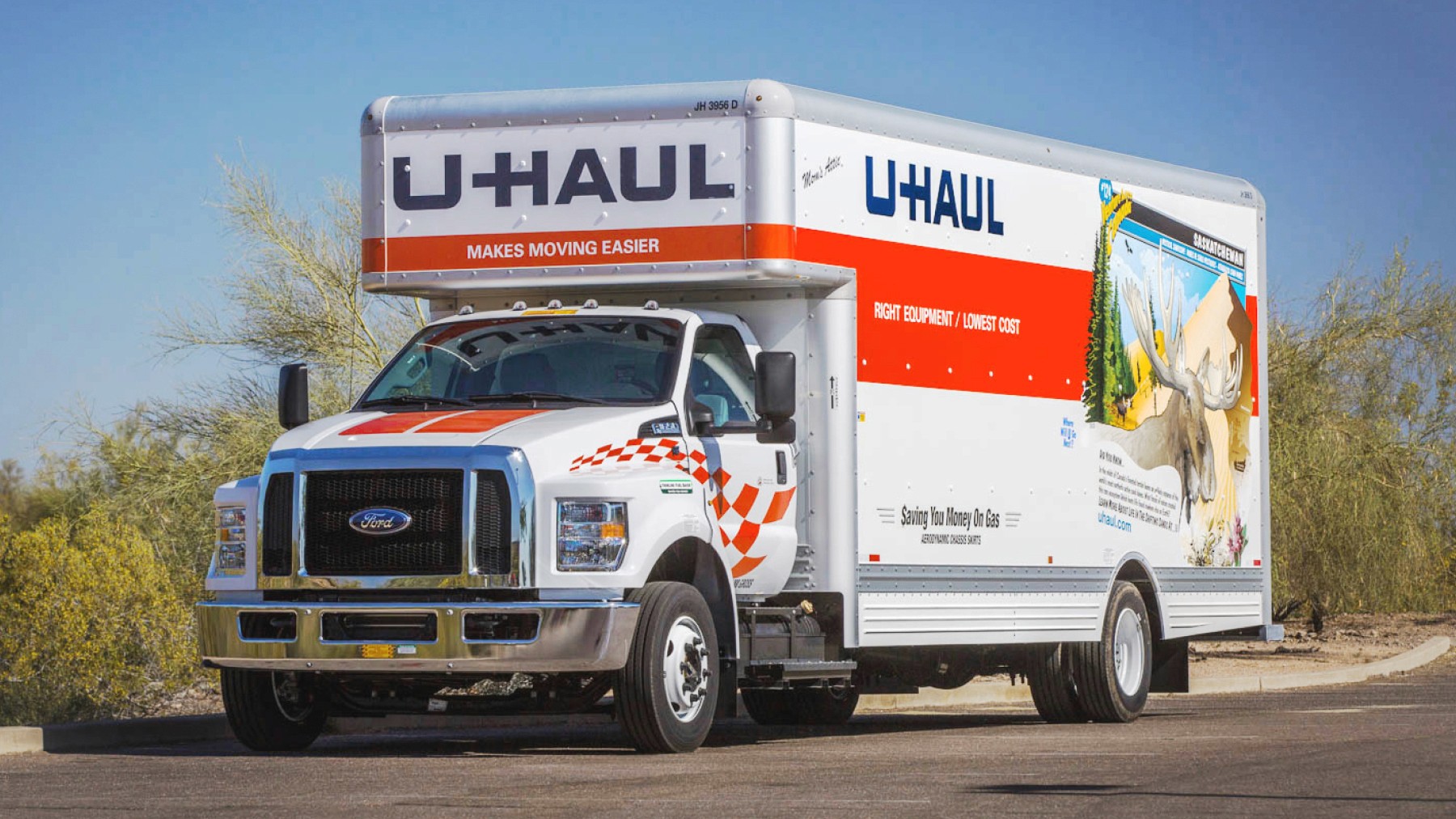
Orange is also common within the oil industry, as petrol is often orange in nature. Oil companies such as 76 and Gulf combine this use of orange with blue to further communicate a sense of trust. Harley-Davidson incorporates orange to signal adventure and freedom, aligning with its brand image of powerful, timeless motorcycles. Additionally, U-Haul’s use of reddish-orange makes their trucks and services easily recognizable among their competition.
The strategic use of orange in branding leverages its psychological associations to create strong, memorable identities. Whether used alone or in combination with other colors, orange helps brands connect with their audiences through feelings of enthusiasm, creativity, and friendliness.
Grayscale
Sophisticated, Timeless, Classic ☕️
Grayscale, encompassing shades of gray along with black and white, is often used in branding to convey sophistication, neutrality, and timelessness. These colors evoke feelings of balance, stability, and professionalism, making them a popular choice across the technology, automotive, and luxury fashion industries.
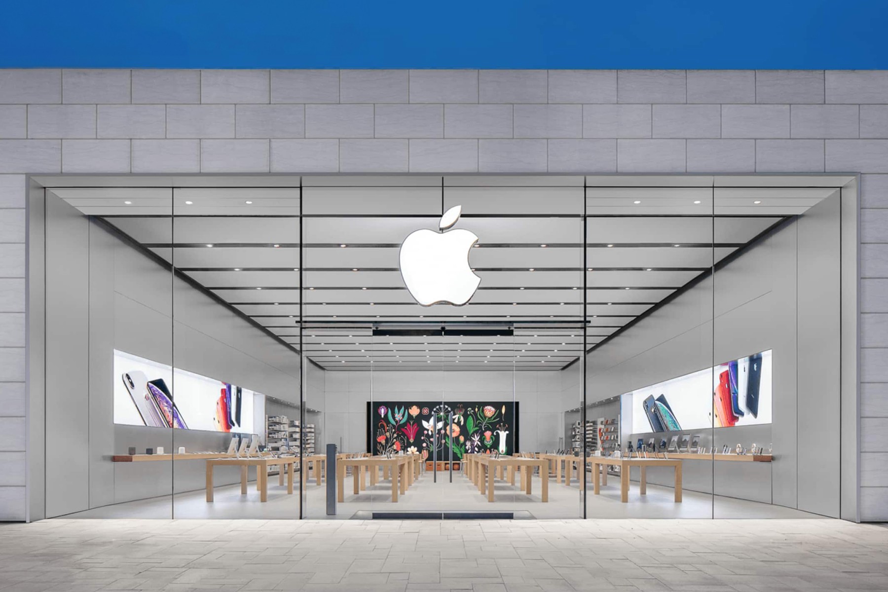
In the technology sector, brands like Apple and Wii use gray to emphasize their sleek, modern, and innovative identities. Apple's use of gray, especially in its product design, underscores the brand's commitment to simplicity, elegance, and high quality. As a business that heavily relies on screens, the minimalist gray tones of their products allow for their vibrant, lively screens to shine through. Similarly, the Wii's use of gray in its branding and console design reflects a sleek and modern approach, appealing to gamers who value cutting-edge technology wrapped in a clean, understated aesthetic.

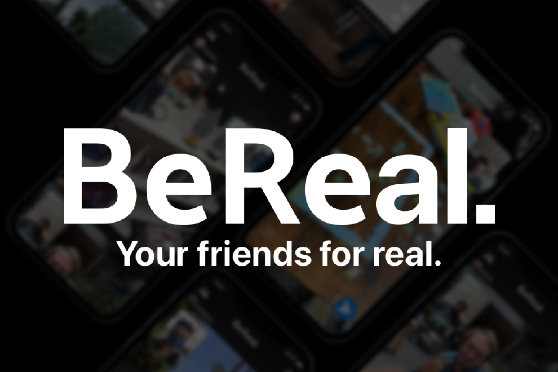
Black on the other hand, is an intense color frequently used by technology brands to convey authority, elegance, and innovation. X’s black branding exudes mystery and intensity, aligning with its daring and unapologetic approach as a free speech sounding board. BeReal uses black to project simplicity and authenticity, making its social media platform stand out as straightforward and genuine. Sony's use of black highlights its commitment to high-quality, premium electronics.

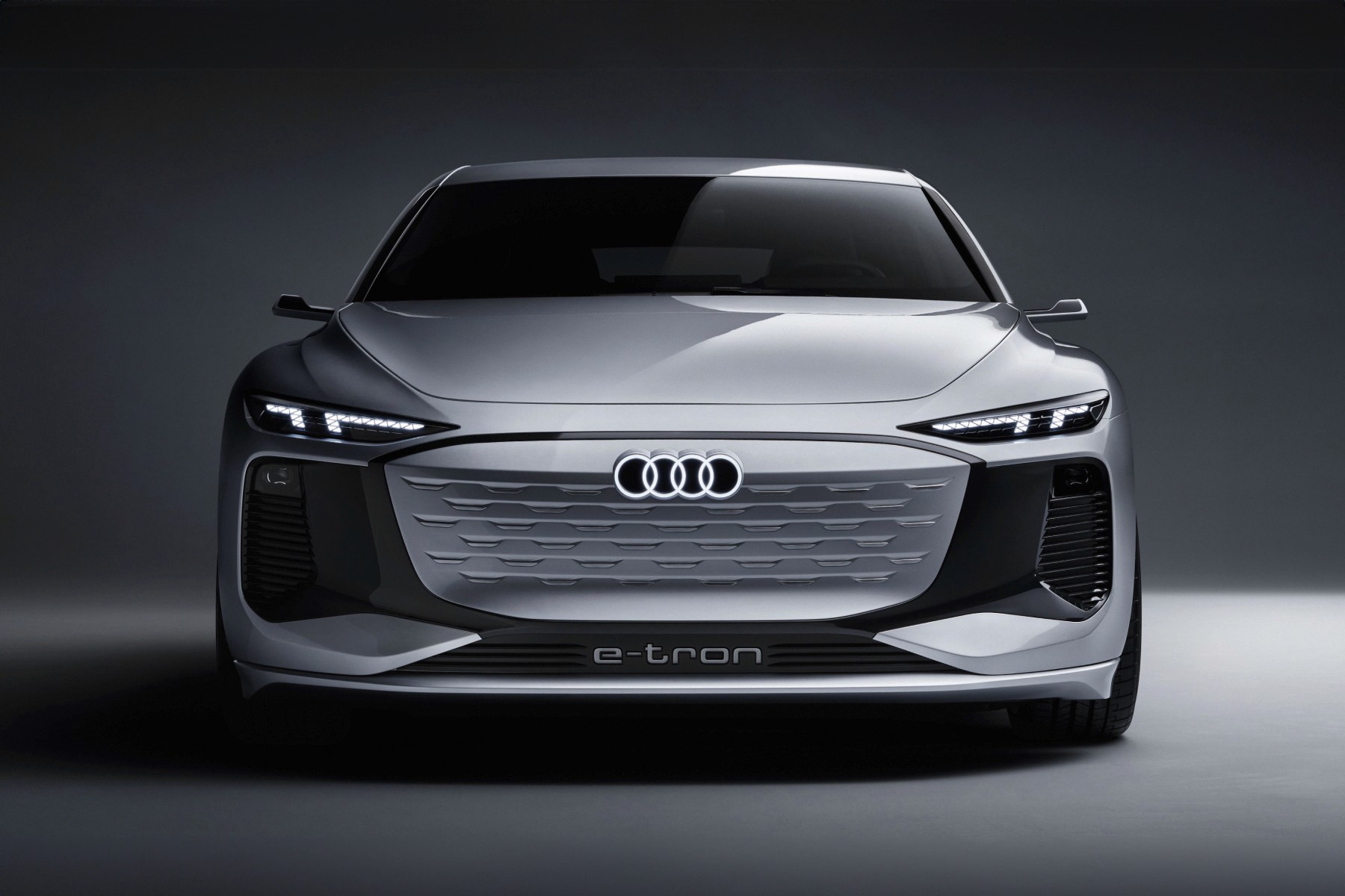
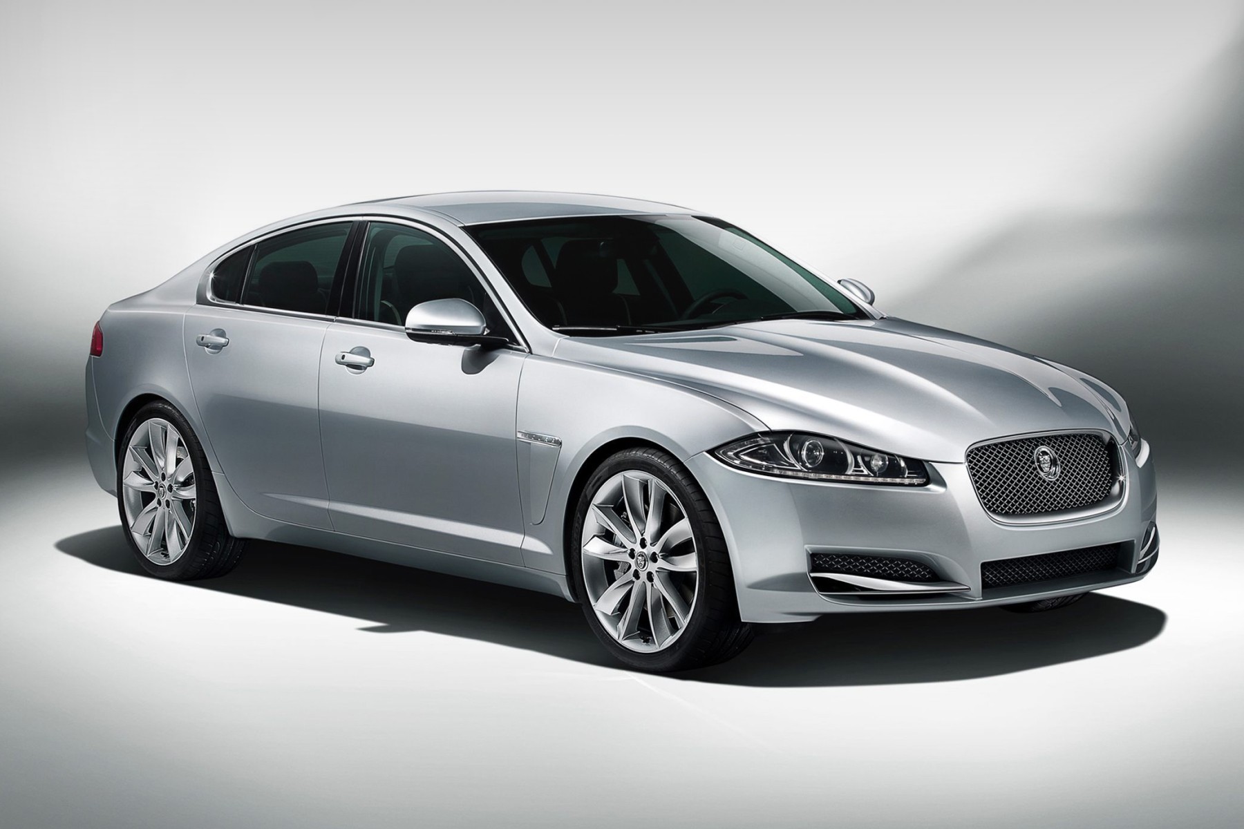
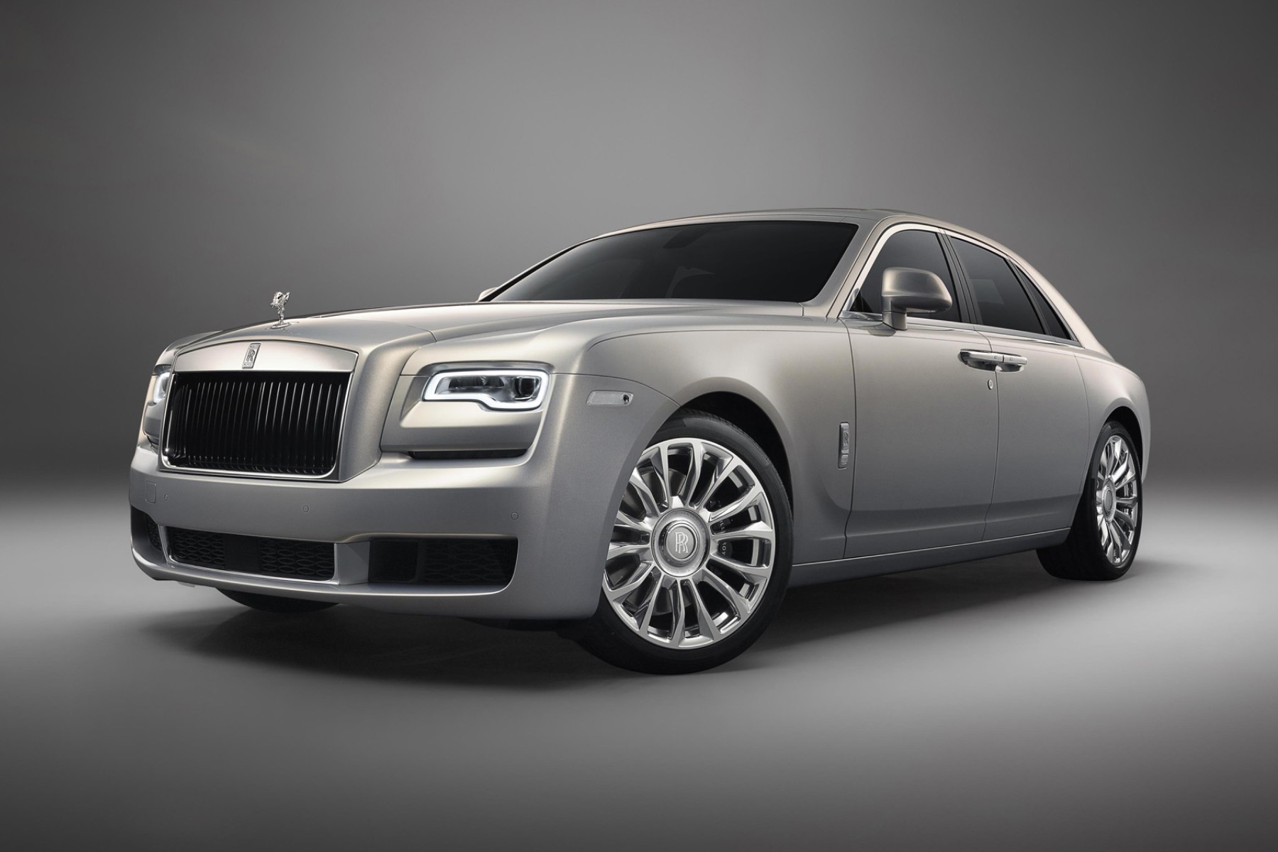
In the automotive industry, brands like Mercedes, Lexus, Audi, Bentley, Jaguar, and Rolls-Royce leverage greyscale to convey luxury, reliability, and performance. This use of greyscale highlights their reputation for engineering excellence and emphasizes their sleek, timeless aesthetics. By removing color, these brands direct focus on form, appealing to customers who seek the pinnacle of luxury and performance in their vehicles.


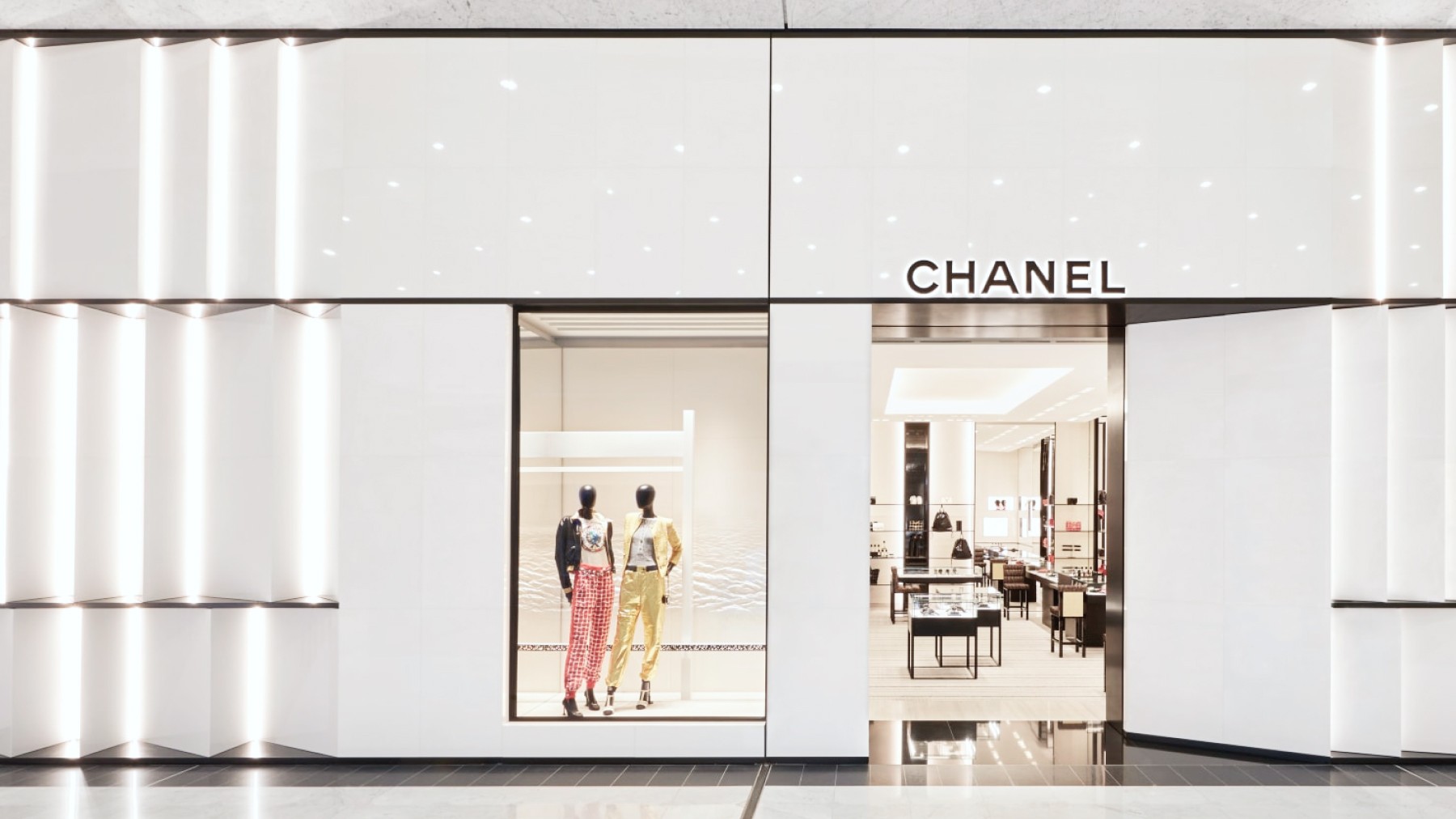
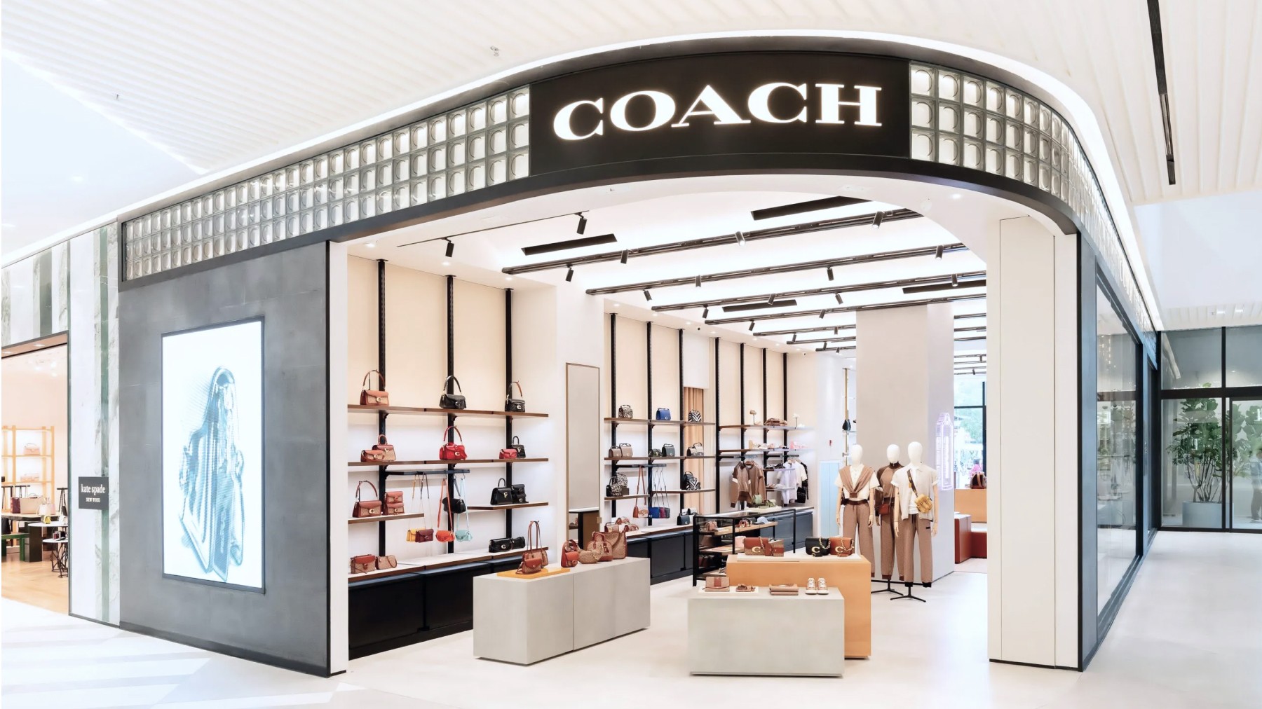
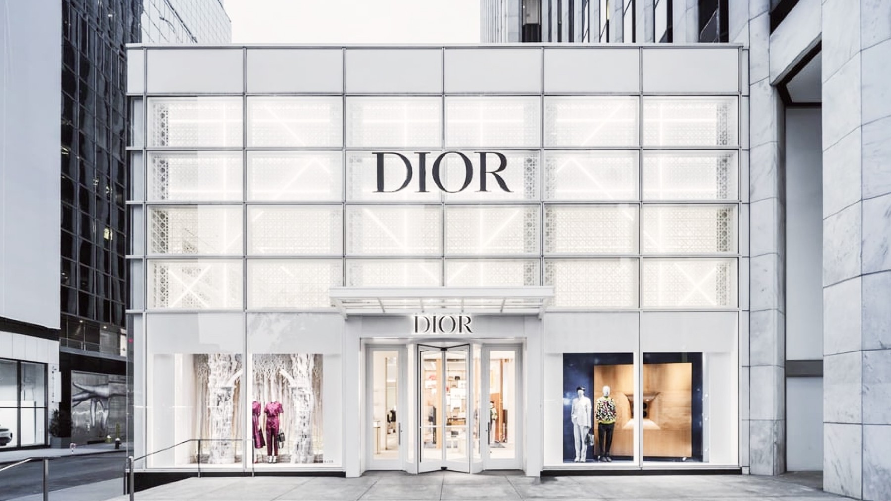
Similar to the luxury vehicles, luxury fashion brands use greyscale to project sophistication, elegance, and timeless style. Brands like Chanel, Coach, Louis Vuitton, and Dior effectively use black and white in retail to project luxury, exclusivity, refined taste, and a modern approach to fashion.

When used properly, the strategic use of greyscale can help create desirable and elegant identities. Whether used alone or in combination with other colors, greyscale helps brands connect with their audiences through feelings of sophistication, reliability, and timelessness. From technology and automotive to luxury fashion, the effective use of grey, black, and white allows brands to position themselves in a field of their own.
Multi-color
Creativity, Collaboration, Inclusivity 🎨
A stark contrast from the previous section, some brands opt for multiple colors in their branding in order to convey diversity, inclusivity, and creativity. By incorporating a range of colors, these brands can communicate various messages simultaneously, appealing to a broader audience and showcasing a dynamic, multifaceted identity. Let's looks into how these different brands leverage multiple colors in their branding to create memorable and impactful logos.
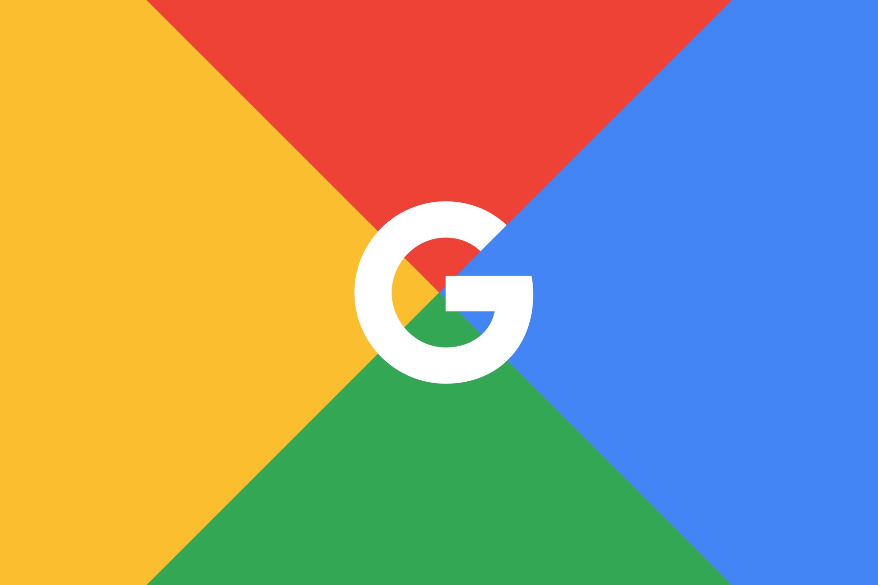
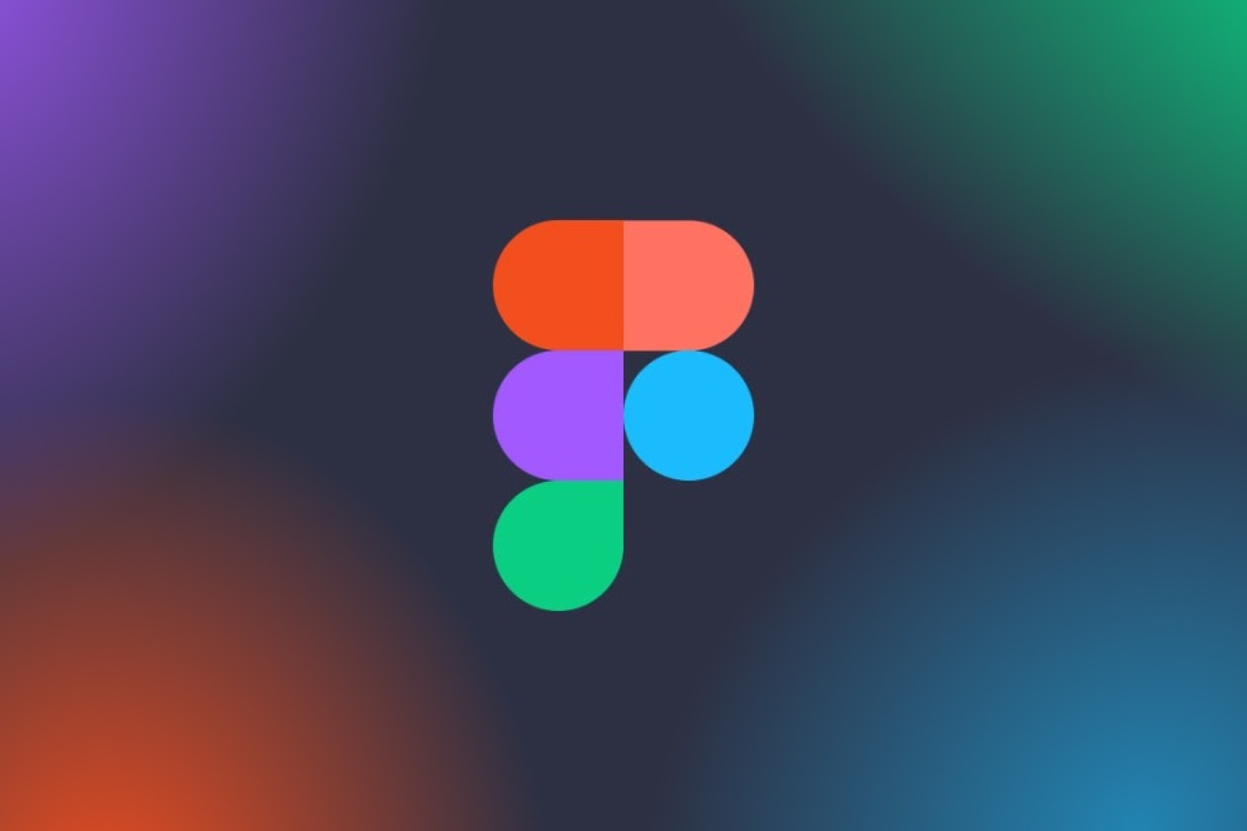
Certain tech companies effectively use multiple colors to represent creativity and innovation. Each of these four colors, commonly red, yellow, green, and blue, represent inclusivity and collaboration across teams. This versatility is key to companies such as Google, Slack, and Figma, where their business is centered around productivity tools.

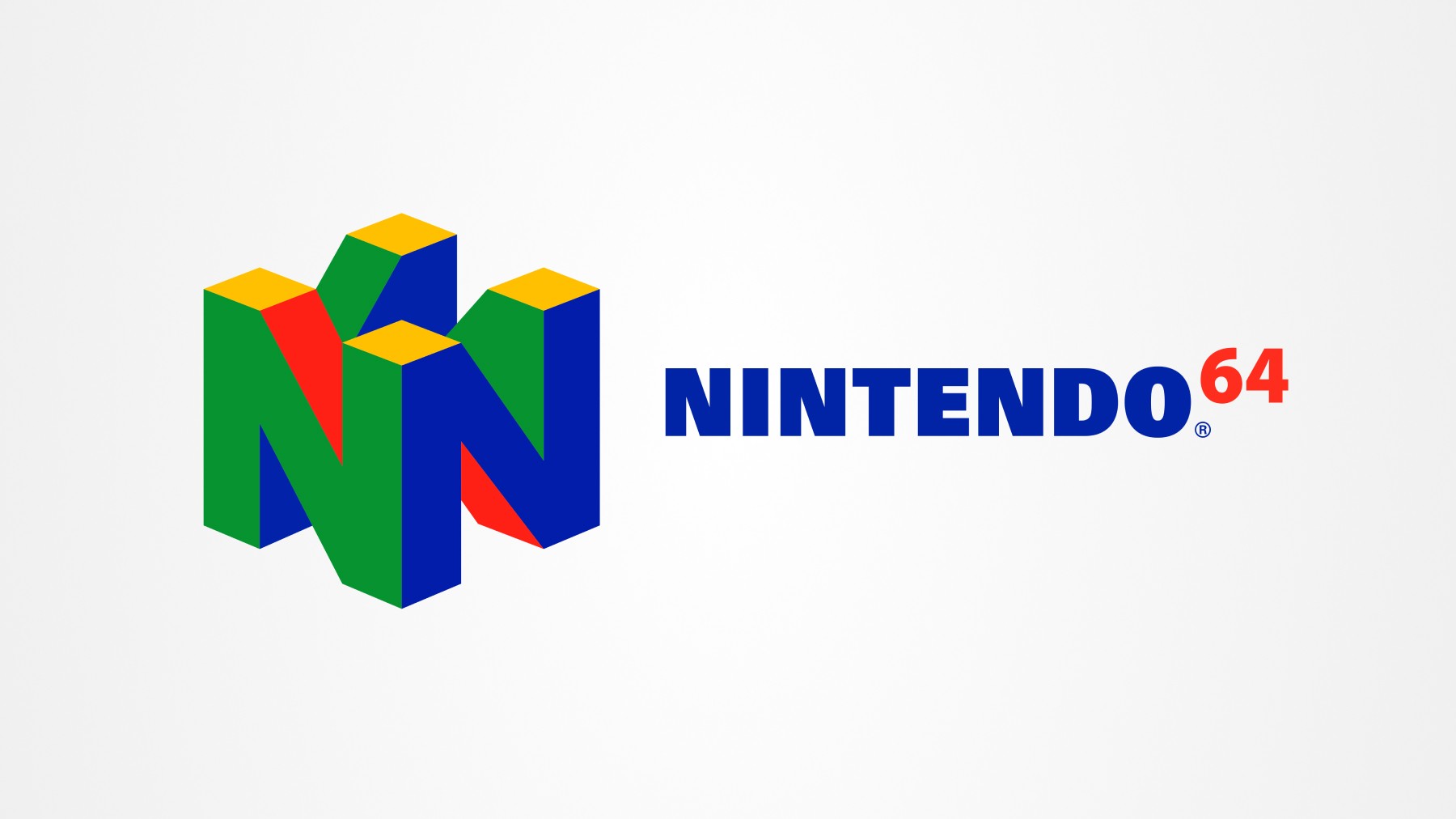
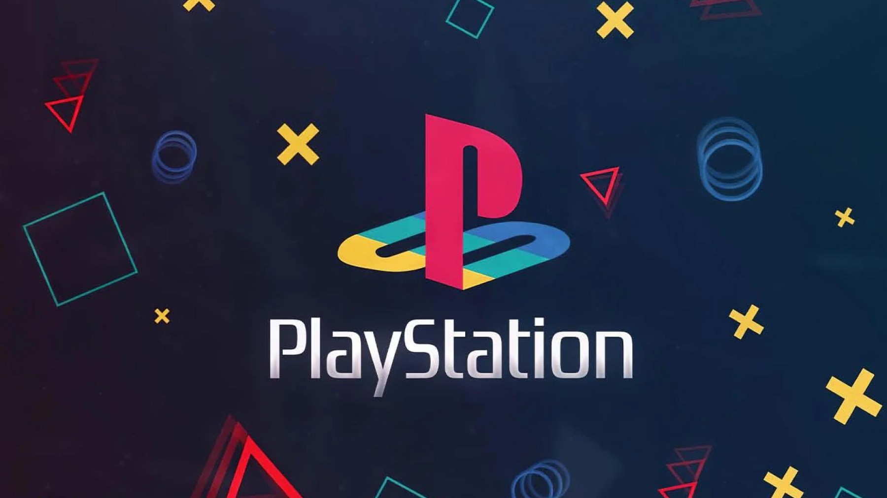
In the gaming sector, brands like Nintendo 64 and PlayStation use multiple colors to highlight their creative and dynamic nature. Nintendo 64’s colorful logo reflects buttons used on its controllers. and build excitement in its gaming experiences. Similarly, PlayStation’s vibrant logo fittingly brings a sense of playfulness to the gaming community.
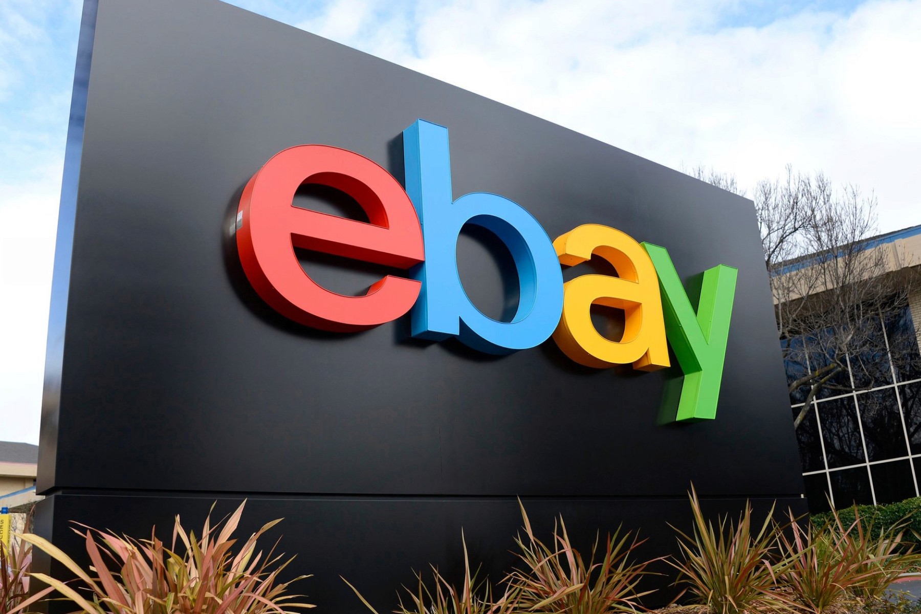
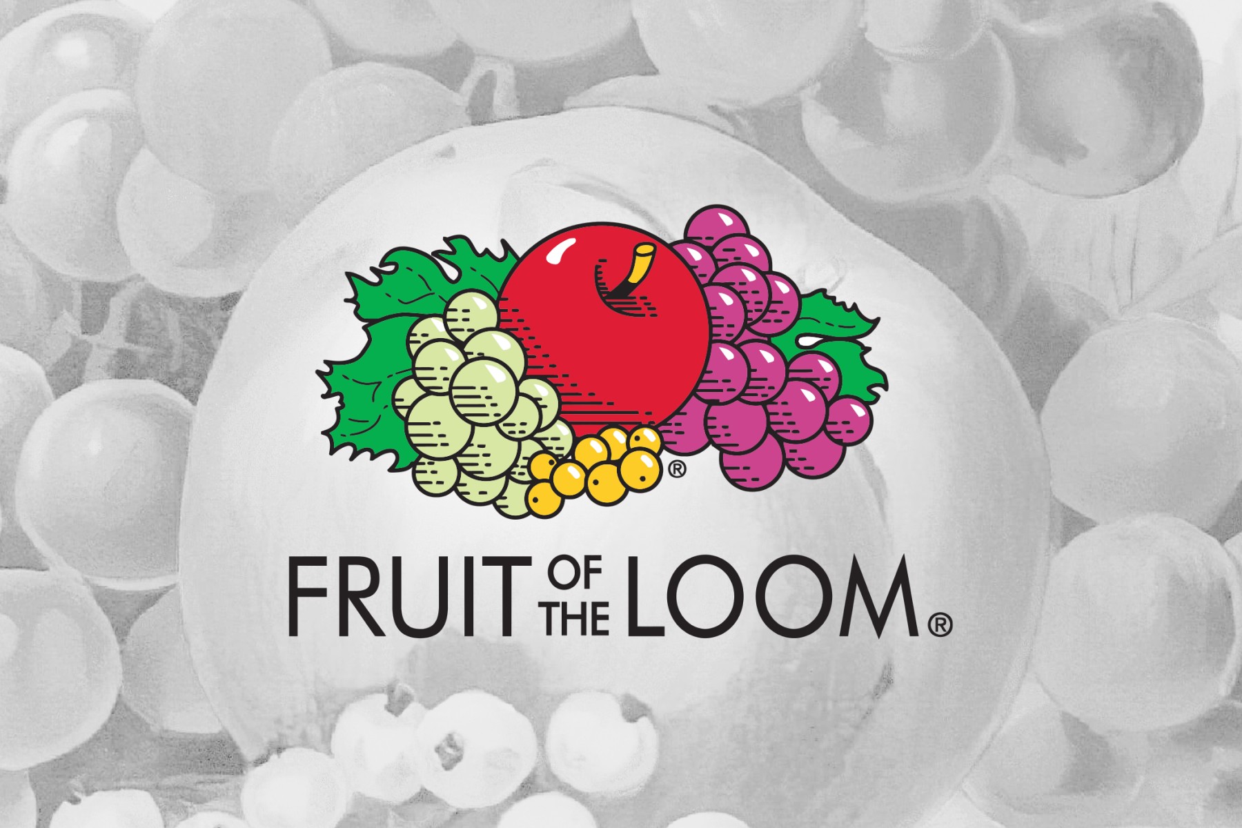
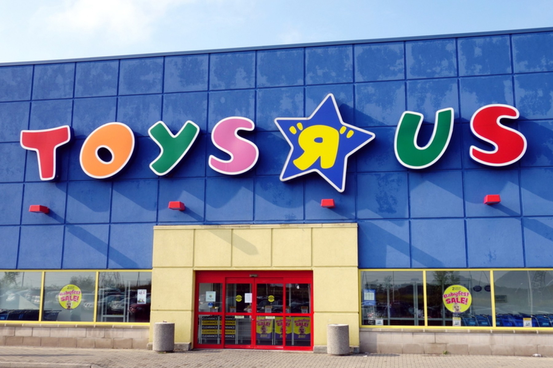
Retail and entertainment brands like eBay, Fruit of the Loom, and Toys "R" Us also use multiple colors to create a fun and engaging brand image. eBay’s multicolored logo signifies the variety and diversity of items available on its platform, making it a go-to marketplace for all types of products. Fruit of the Loom’s rainbow-colored logo represents the variety of fruits in its emblem, as well as the color variety of its apparel products. Toys "R" Us employs a colorful logo to evoke joy and excitement, perfectly aligning with its target audience of children and families.
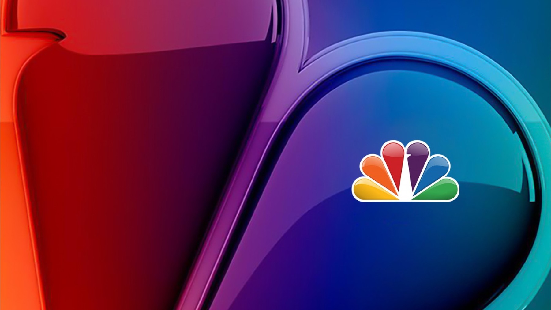
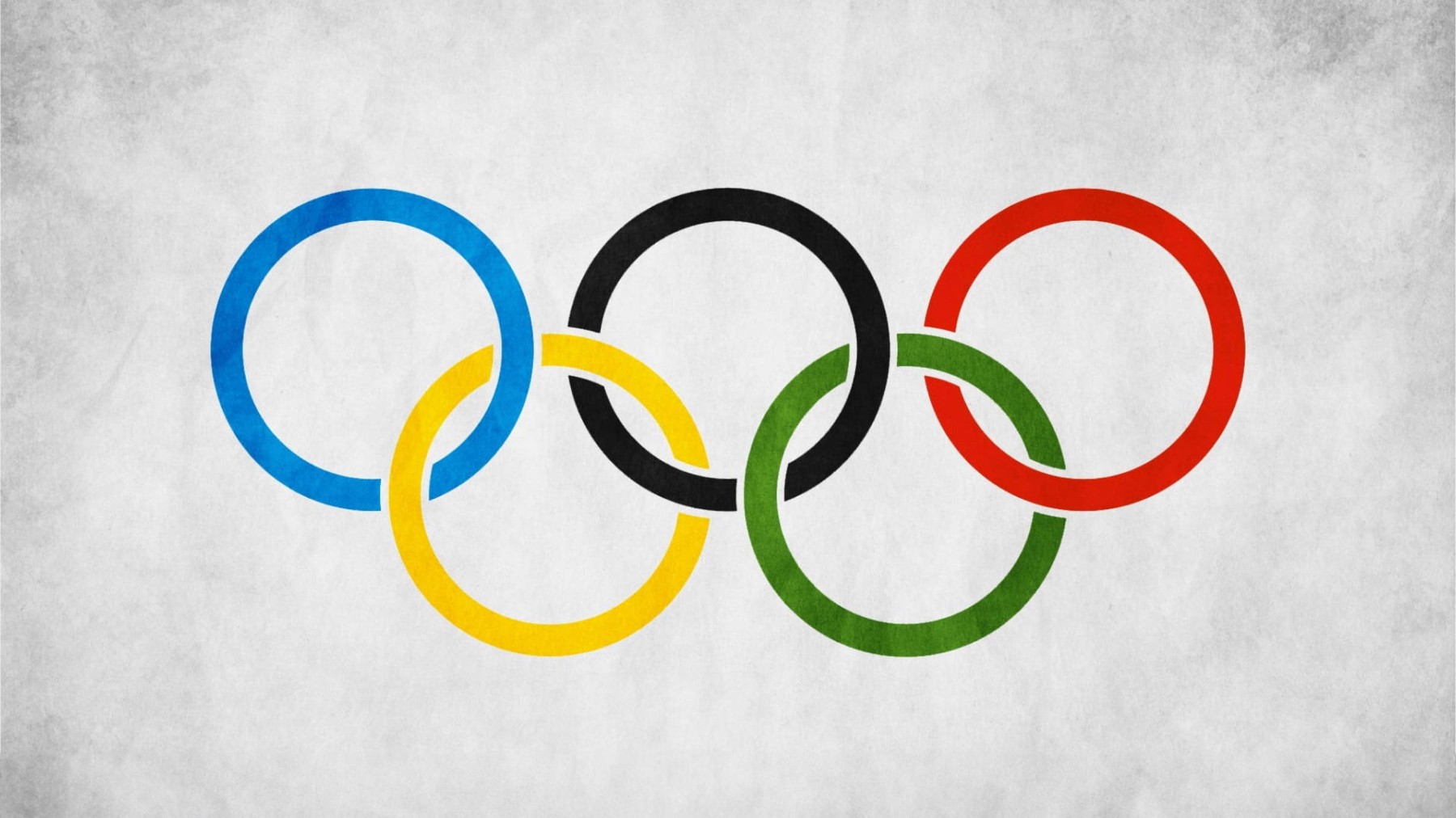
NBC and the Olympics use multiple colors to promote unity and diversity. NBC's iconic peacock logo, with its spectrum of colors, symbolizes the wide range of content it offers and its appeal to a broad audience. The Olympic rings represent the coming together of athletes from around the world, symbolizing unity and international cooperation.
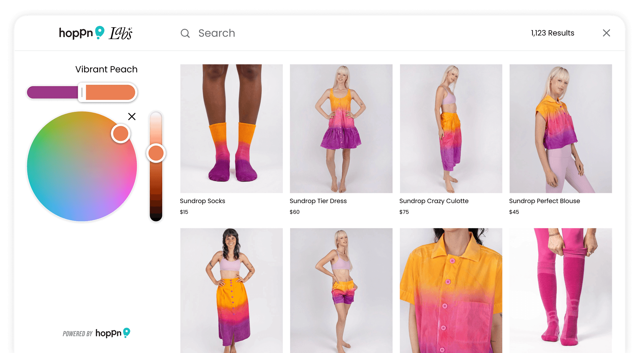
One brand that utilizes multiple colors especially well is Hoppn, the startup behind the patented Infinite Color Search technology. This innovative approach to search allows you to select any one or two colors and find products that perfectly match.
By using multiple colors, these brands effectively communicate their diverse offerings, creativity, and inclusivity. This approach allows them to create vibrant identities to stand out and resonate with a wide range of audiences.
Conclusion
Choosing the right color for your brand's logo is a strategic decision that goes beyond aesthetics. It involves understanding the psychology of color, considering your target audience, and aligning with your brand's values and message. Whether you opt for a single color or a two-toned logo, the right choice can enhance your brand recognition, evoke the desired emotions, and set you apart from the competition.
By understanding the significance of color in branding, you can make informed decisions that will help your brand resonate with customers and thrive in a competitive market. Hopefully this article was insightful and helped you on your journey towards building a meaningful and worthwhile business!

Similar articles