May 9, 2025
2 minute read
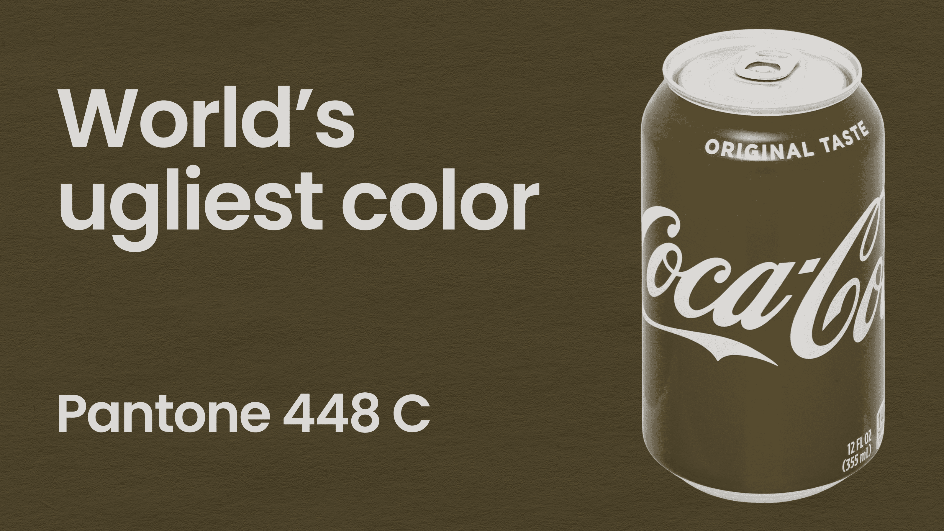
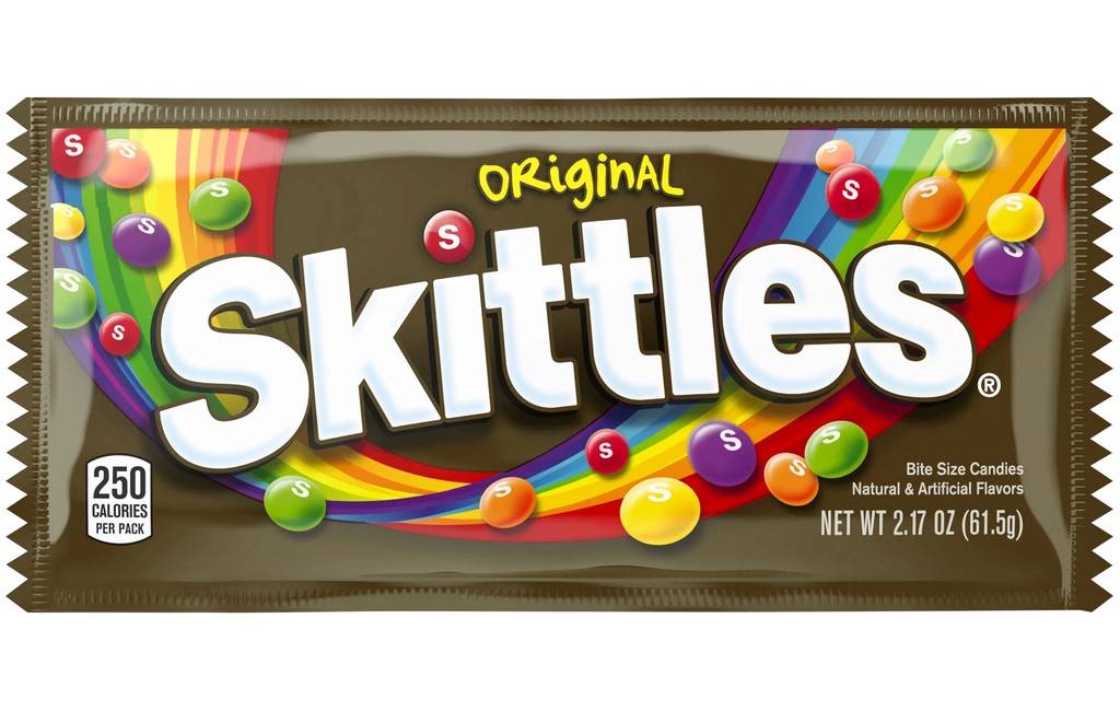
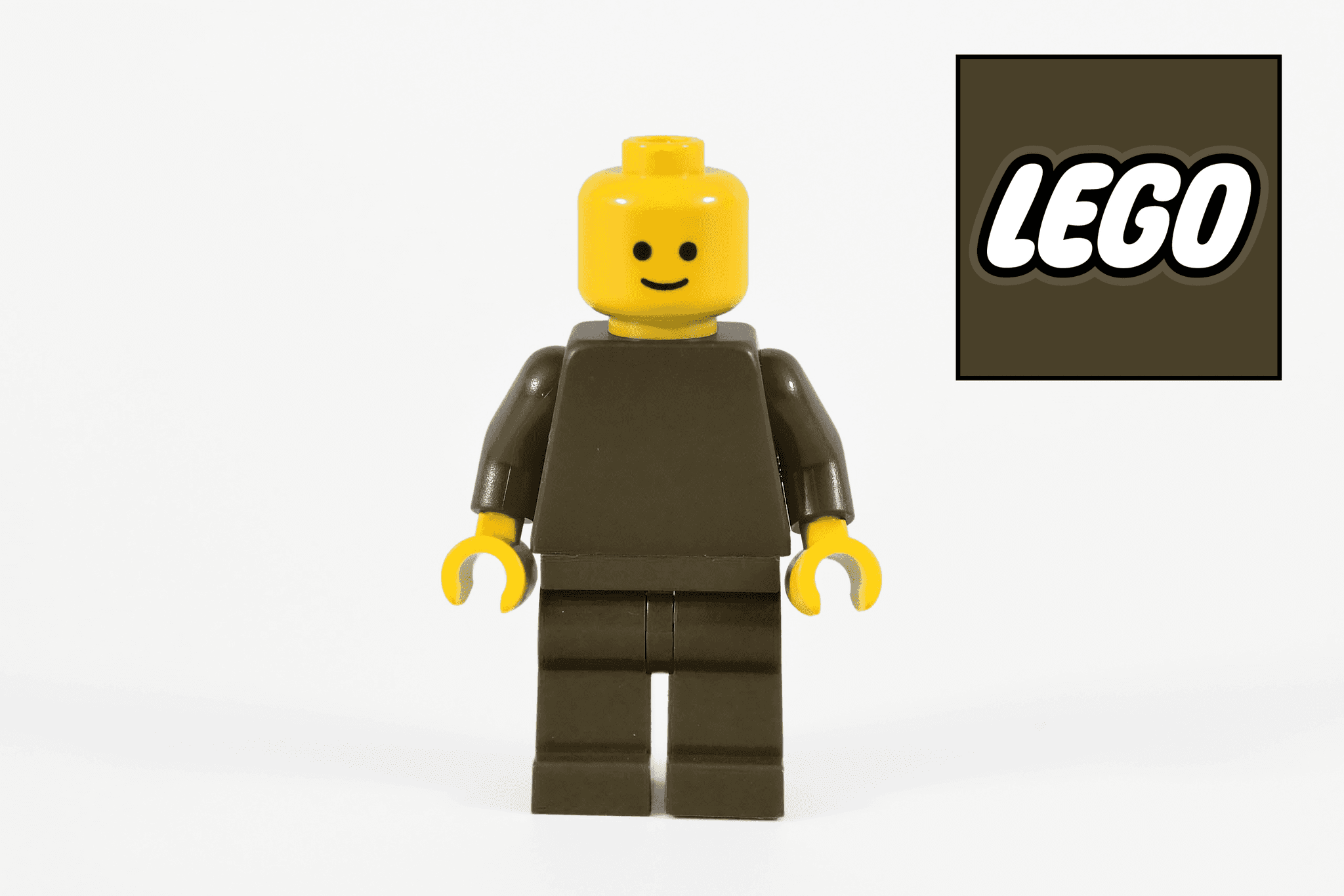
In a land of colorful rainbows… Pantone 448 C, a murky, dark brown, has no trouble defending its title as world's ugliest color.
Studies suggest that the bulk of humanity is hard-wired to rejoice at the thought of Pantone 448 C leaving this earth in a swift and sudden demise. Despite its unfortunate appearance, this unloved color is here to stay – and actually for a very noble cause…


448 C
How ugly colors save lives
In 2012, Australian government officials were looking to deter smoking by making all cigarette packaging as unappealing as possible.
To find the most unattractive color to use on plain packaging for tobacco products, market research firm GfK Bluemoon conducted several studies. Through extensive surveys and focus groups, involving over a thousand smokers, Pantone 448 C was consistently described with terms like "dirty," "tar," and "death."
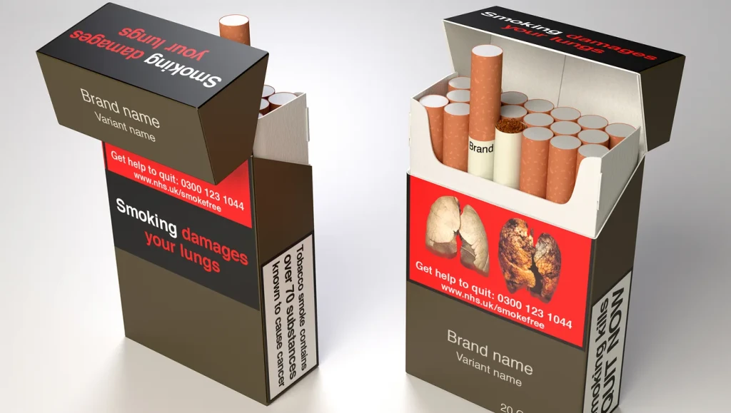
Over the period studied, cigarette sales decreased by 7.5%, demonstrating the power of color in demarketing efforts. Not long after, In December 2012, Australia became the first country to implement plain packaging laws requiring all tobacco products to be sold in Pantone 448 C branded packaging.
The success of Australia's initiative inspired other countries to adopt similar measures. Countries such as the United Kingdom, France, Ireland, and New Zealand followed suit, using Pantone 448 C or similar drab colors on cigarette packs.
This may be the ugliest color in the world, but like a comedian wielding the power of bathos, Pantone 448 C is so anticlimactic it’s humorous, and for that reason, totally passes the “vibe check”.
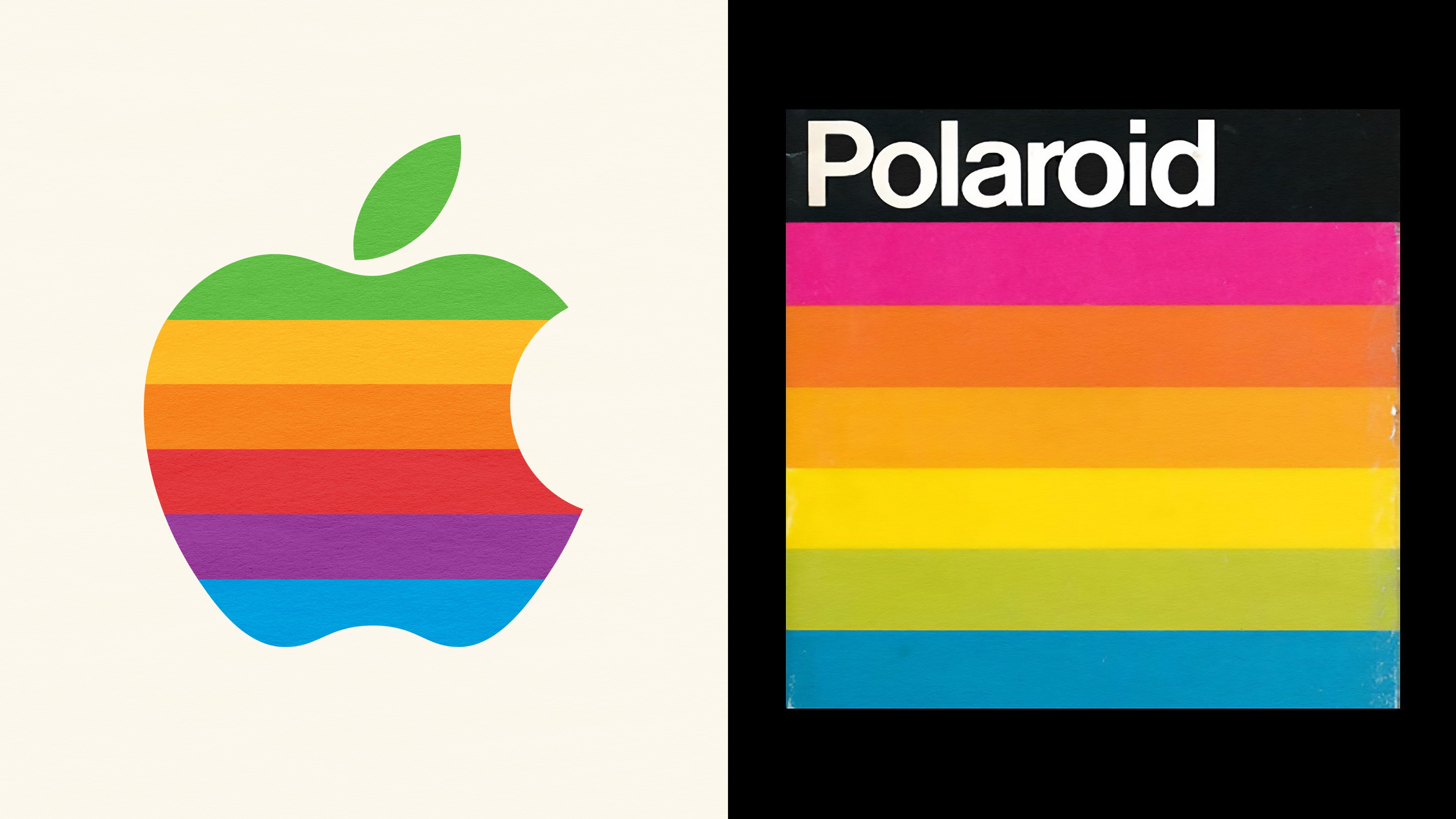
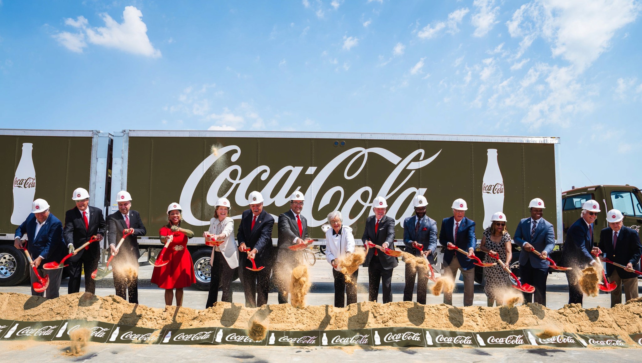
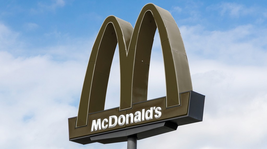
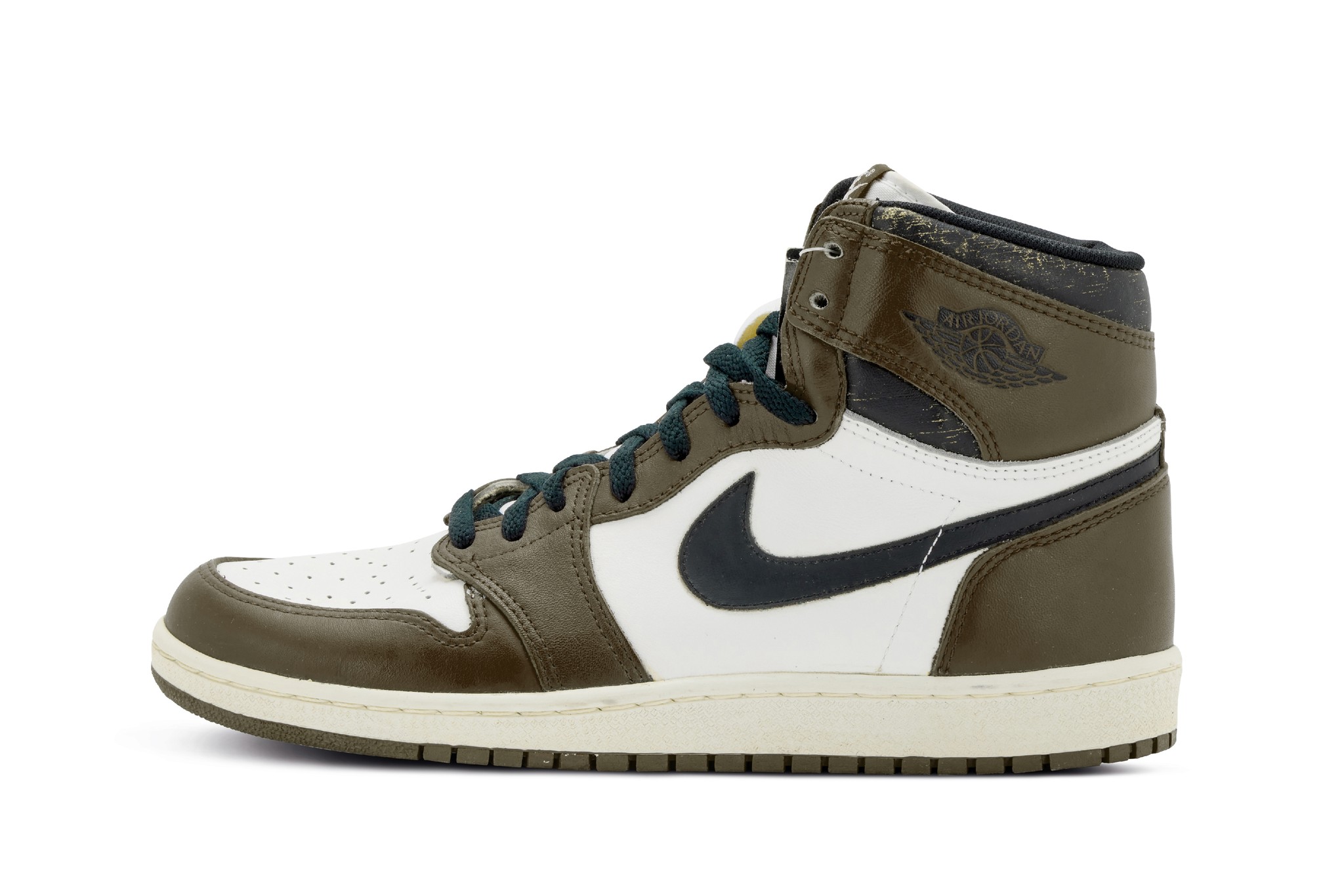
To pay tribute to its legacy, we decided to reimagine iconic brands in the world’s ugliest color! We hope you eventually forgive us…


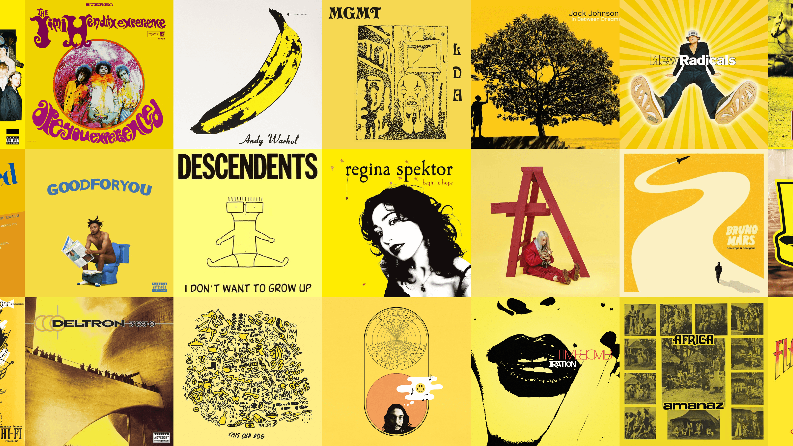
Color’s impact on sales
Color wields immense power in shaping buying decisions. When used cleverly, it can curb sales of harmful products like tobacco or skyrocket sales by making choices irresistible. Whether in food and beverage, fashion, decor, or art, color can dramatically impact sales. So next time you see a product flying off the shelves, remember: it might just be the magic of color at work.
In today's crowded ecommerce landscape, brands who neglect the impact of color in sales are leaving money on the table.
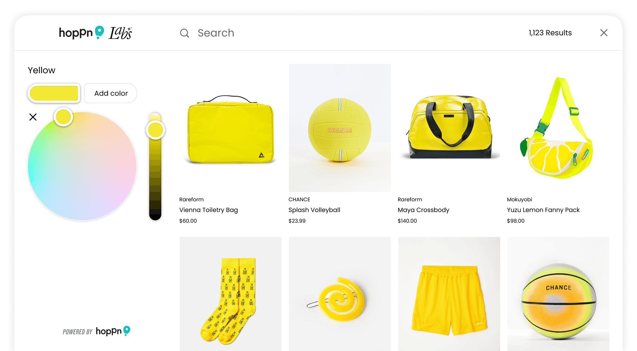
There's a fine line between the infamous Pantone 448 C and the beloved shades of olive green that customers adore. Shoppers' color preferences are far more nuanced than the broad filters ecommerce sites offer.
That's where Hoppn Labs comes in with their groundbreaking Infinite Color Search. This innovative color wheel lets customers find products in the exact hues they crave. For Shopify store owners, transforming your site into a color-search paradise takes just minutes. Install Hoppn’s user-friendly, no-code Shopify plugin today!

You may also like