May 9, 2025
5 minute read
The psychedelic style of the 1960s ushered in an aesthetic that pushed boundaries and explored new artistic expressions. One of the most captivating aspects of this visual revolution was the use of vibrating colors that one might characterize as trippy, in a far-out kind of way, man.
Vibrating colors
Color vibration occurs when two colors have similar lightness but high chromatic contrast. The close proximity of these colors creates a visual vibration or shimmering effect that can be jarring or uncomfortable to look at. When these colors meet, they create a sense of movement and depth that can make a still image appear to pulse with energy.
Here are some of the most memorable color contrasts from the '60s…
#FF5B11
#FF5A11
#7EAA01
#15A9CF
#FFCF02
#FFBEE2
#E6EE01
#6BFCFF
#FF241B
#4884FF
Vibrating colors generator
Make your own trippy color combinations with our free tool.
Artists of the psychedelic '60s
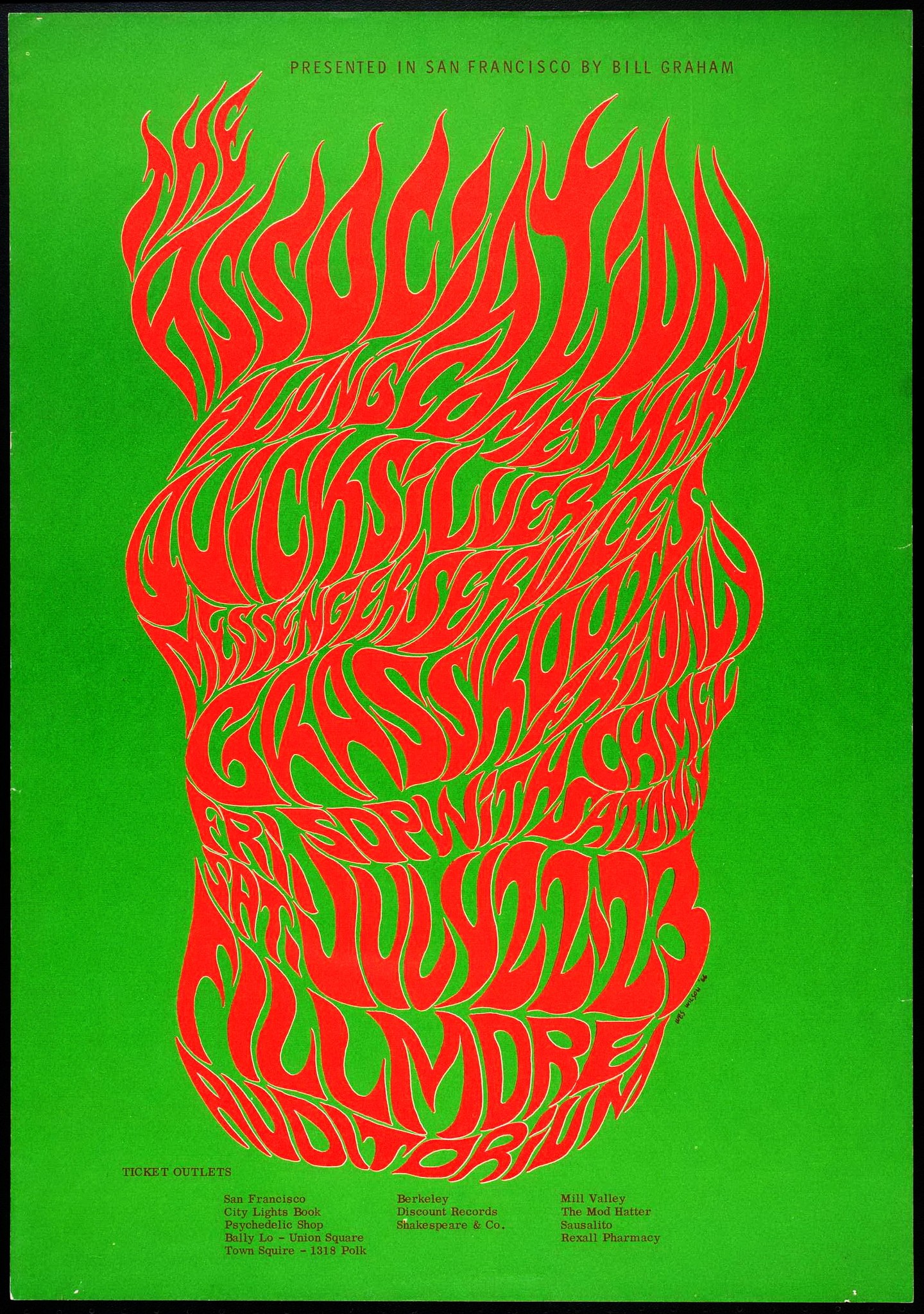
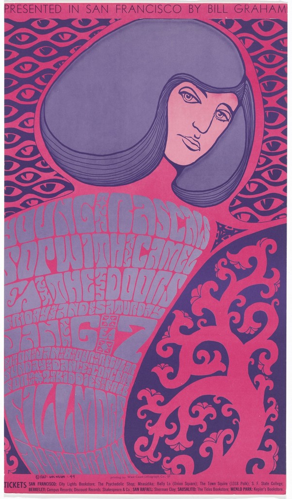
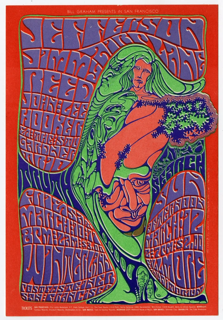
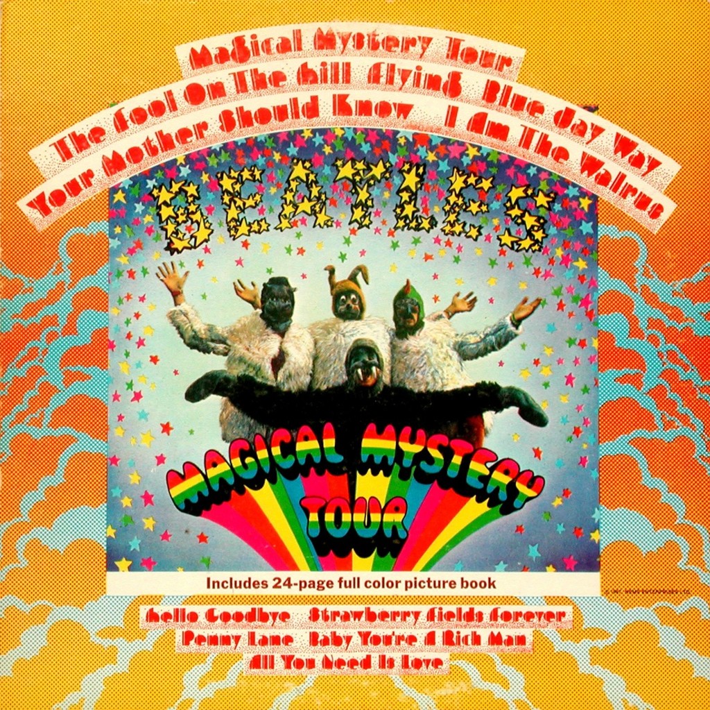
Artists such as Victor Moscoso, Wes Wilson, and John Van Hamersveld mastered the use of vibrating colors to produce posters, album covers, and other visual media that epitomized the era's aesthetic. This effect reflected the counterculture's desire to break away from the mundane and explore new realms of consciousness.
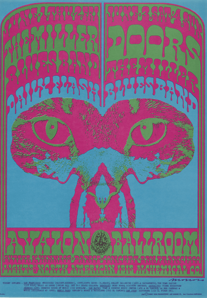
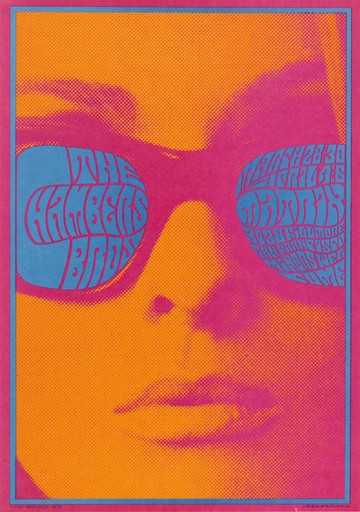
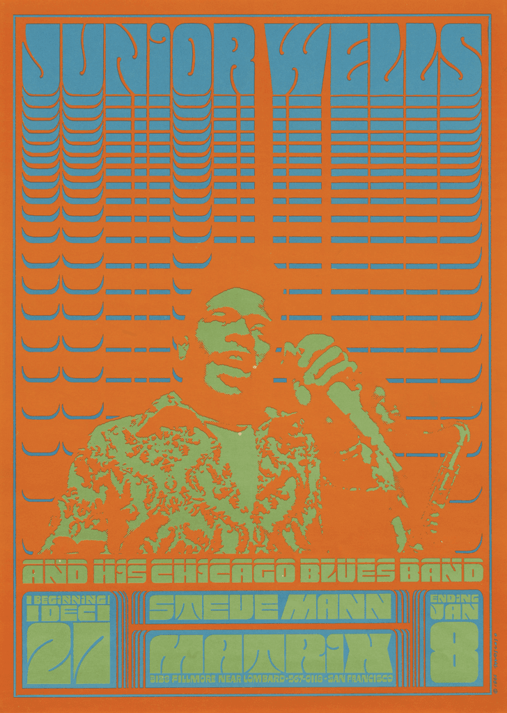
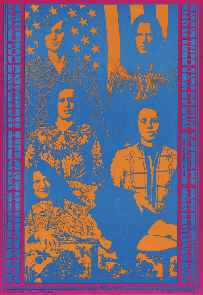
Victor Moscoso
Wes Wilson
John Van Hamersveld
What is chroma?
Chroma denotes the strength or vividness of a color relative to a neutral gray of the same lightness. Inspired by this psychedelic style, let’s attempt to create our own vibrating colors using Blue and Yellow.
#0000FF
#FFFF00
In the RGB color space, this blue and yellow have the same lightness value of 50%, despite the yellow appearing significantly lighter than the blue. This happens because RGB is not perceptually uniform. To show the real difference in lightness, we can use the Oklab color space, which is designed to be more accurate to human vision. By converting these colors to black and white in Oklab, we can see the true difference in their lightness.
#575757
#F4F4F4
To accurately create a vibrating color palette, you must first convert the RGB colors to Oklab before altering the chroma. In the perceptually uniform Oklab color space, it is revealed that the deep blue has a lightness value of 37%, and the yellow is 96% light.
By averaging these values, we can set the blue and yellow to an Oklab lightness value of 67%. Now, these colors are precisely the same in lightness, emphasizing only the differences in chroma. And there you have it, vibrating colors!
#74A0FF
#B0B000
Here are those same colors with an Oklab chroma of 0%…
#A3A3A3
#A3A3A3
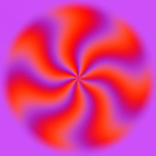
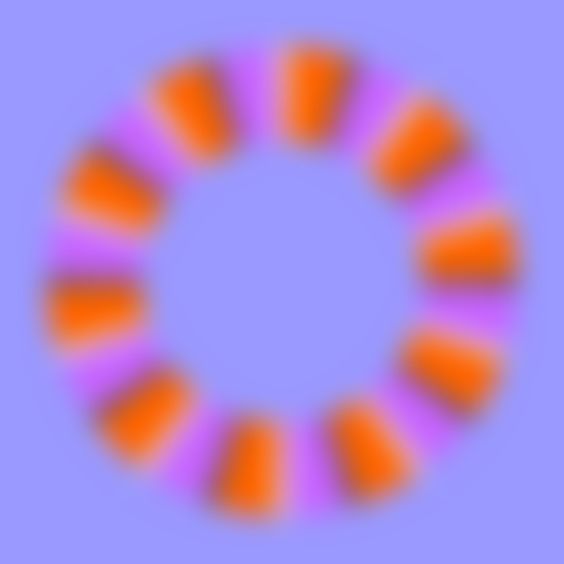
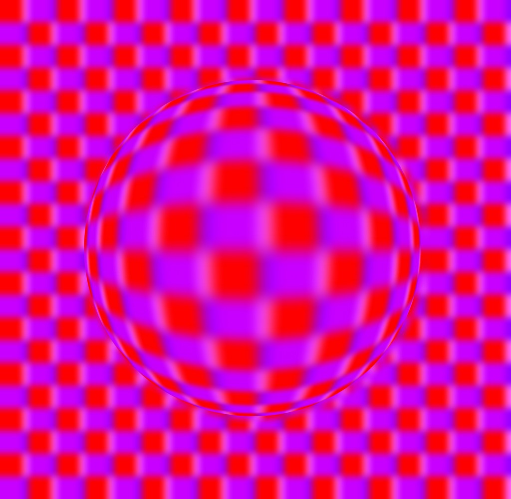
Optical illusions
You now have the tools to bring vibrating visual illusions to life! The right palette can trick your brain into seeing mesmerizing movement. Artist Aiyoshi Kitaoka is renowned for this effect:
Vibrating colors in a modern setting
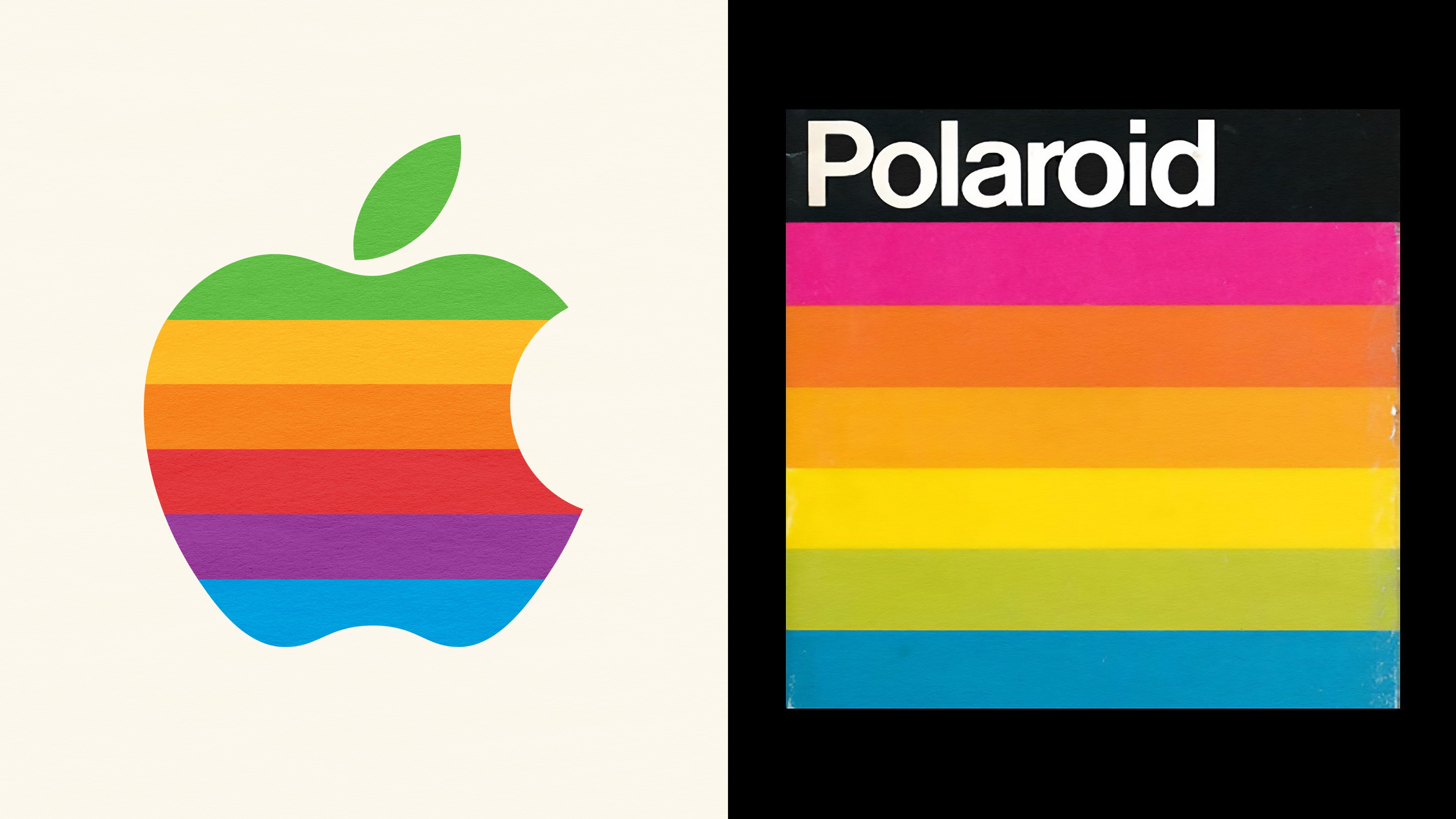
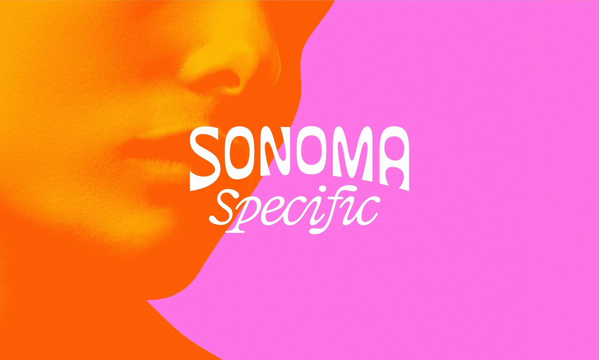
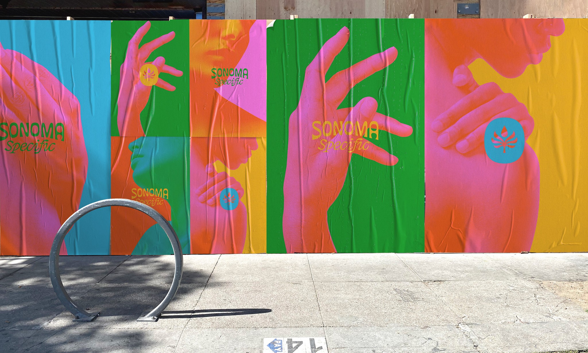
The legacy of this pioneering art style continues to influence modern design today. Here's an example of chromatic contrast in modern branding courtesy of design studio Stout Design Inc.
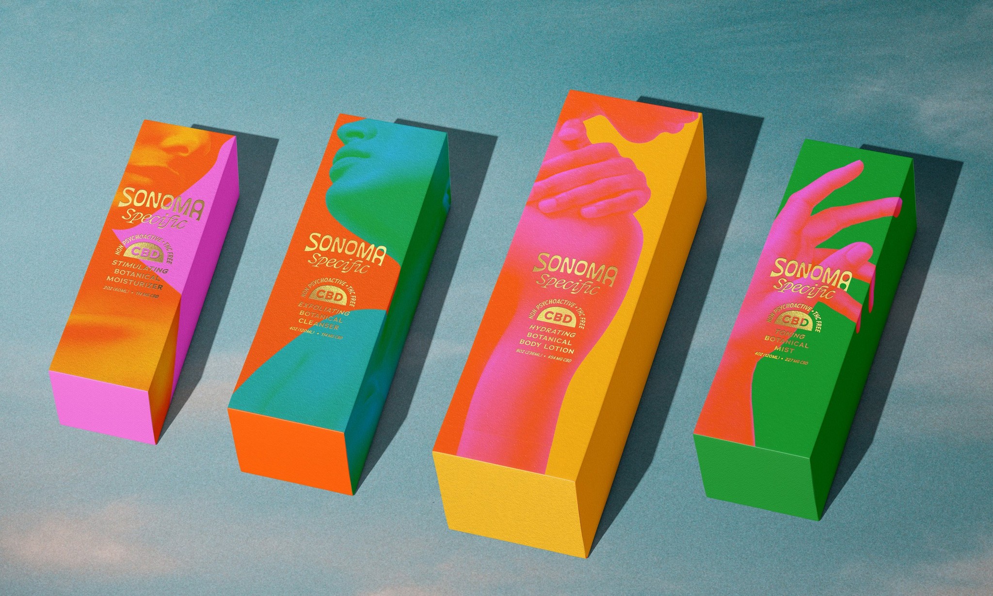
Contemporary designers often use this effect sparingly to freshen up this style while aiming to keep the text legible.
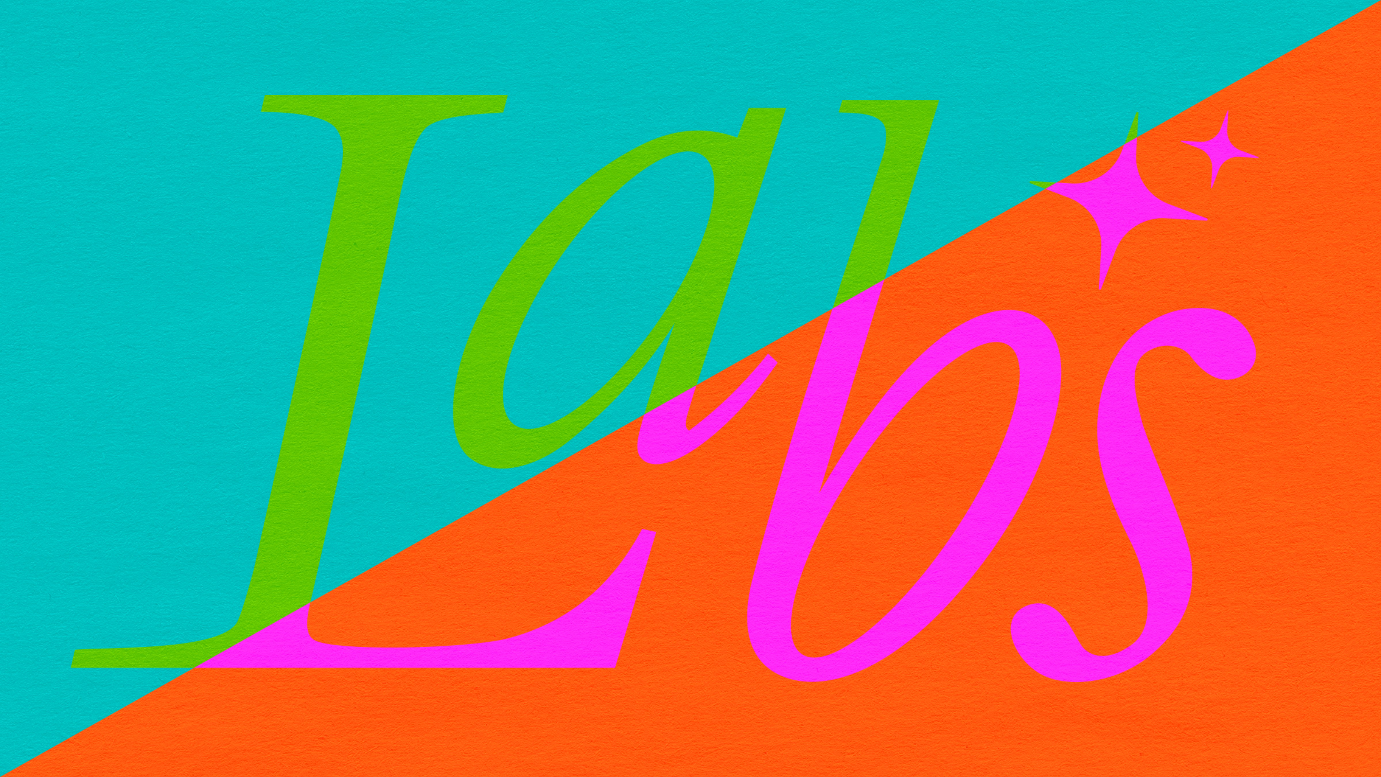
Our take on vibrating colors
On the positive side, vibrating colors can create a sense of dynamism and energy, breathing life into the design. Reviving this trend can be a powerful way to stand out in advertising, fashion, decor, art, and more.
However, there is a negative aspect to consider. The intense contrast can also lead to visual discomfort or fatigue, especially if overused or applied inappropriately. Even while completing this blog, we had to take several computer breaks to avoid headaches! It's important to consider the accessibility of the design for viewers with color vision deficiencies and epilepsy, as some may be particularly sensitive to this style.
Overall, striking a balance is crucial. Vibrating colors should be used sparingly to enhance the design without overwhelming the viewer. When administered in small doses, we’re personally big fans of this style!
Vibrating colors for your next design
Here are some of our trippy color combinations to inspire your next design. Feel free to send us your work or tag @hoppn on Instagram.
#E6EE01
#FFBEE2
#FFDC44
#FFCEDB
#E1E3E4
#5FFFF6
#51FA00
#52E9FF
#00D2C2
#5BC1FF
#97CC00
#A8AEFF
#FF8BBB
#CCB701
#FF6EC8
#FE8730
#FF009A
#CC7B00
#FB27D3
#00B47E
#FB27D3
#00A92D
#AD004F
#006C6E
#036EEF
#008D62
The possibilities are nearly endless
There are 16.7 million unique RGB colors. When considering the number of unique two-color matchups without double counting, there are an astounding 140 trillion combinations.
140,737,488,355,328 to be precise…
Each two-color palette carries its own style, history, and emotion that impacts the viewer. In a world where 85% of shoppers consider color the primary factor in their buying decision, consider how a bold two-color matchup can impact the experience.
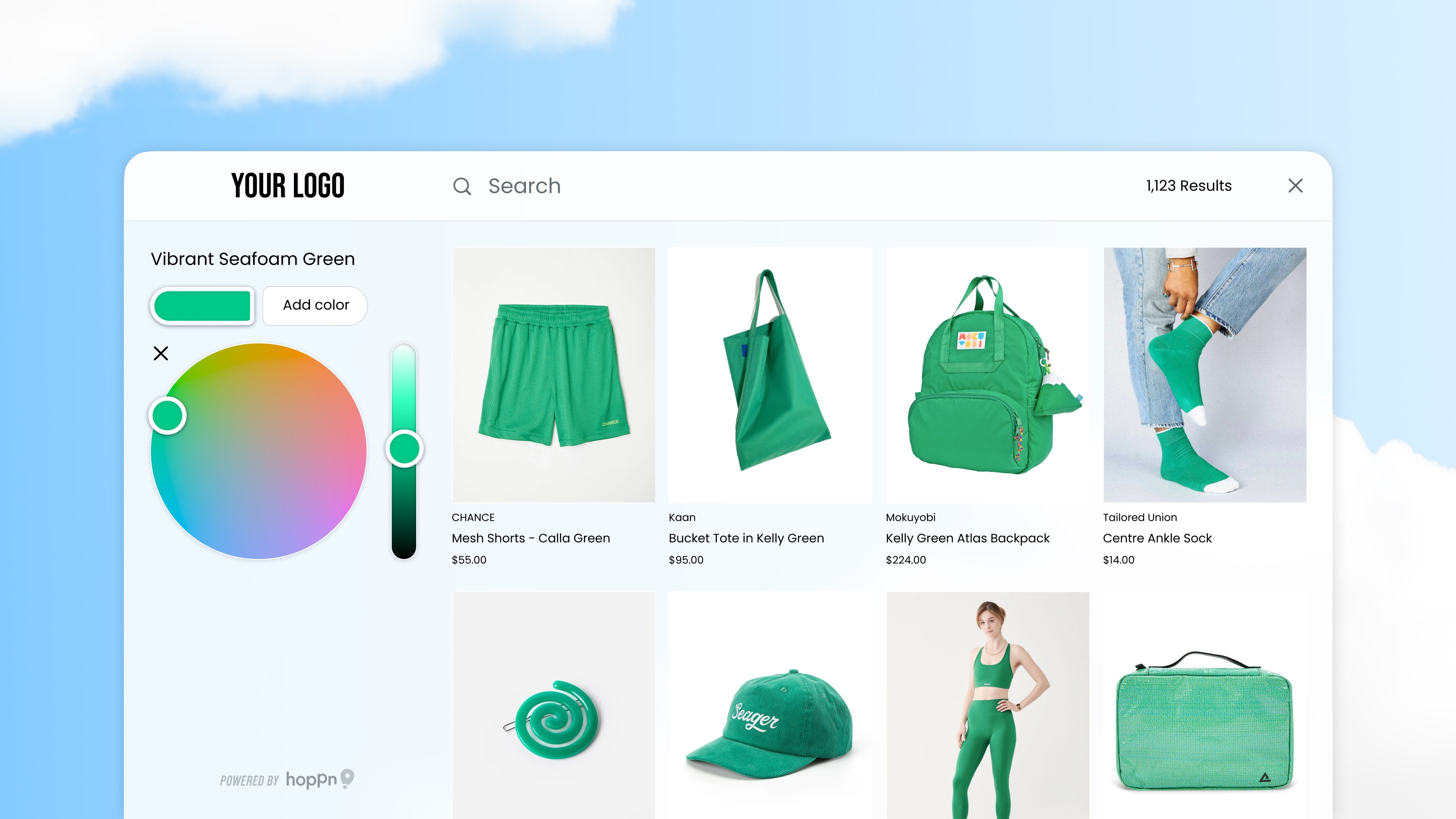
Two-color search is the future of shopping
The majority of fashion, decor, and art pieces that people purchase have more than just one color in their design. Despite this, ecommerce color filters can only broadly surface products by a simple color name. When a shopper wants to find a product in their favorite vibrating color scheme, it's nearly impossible!
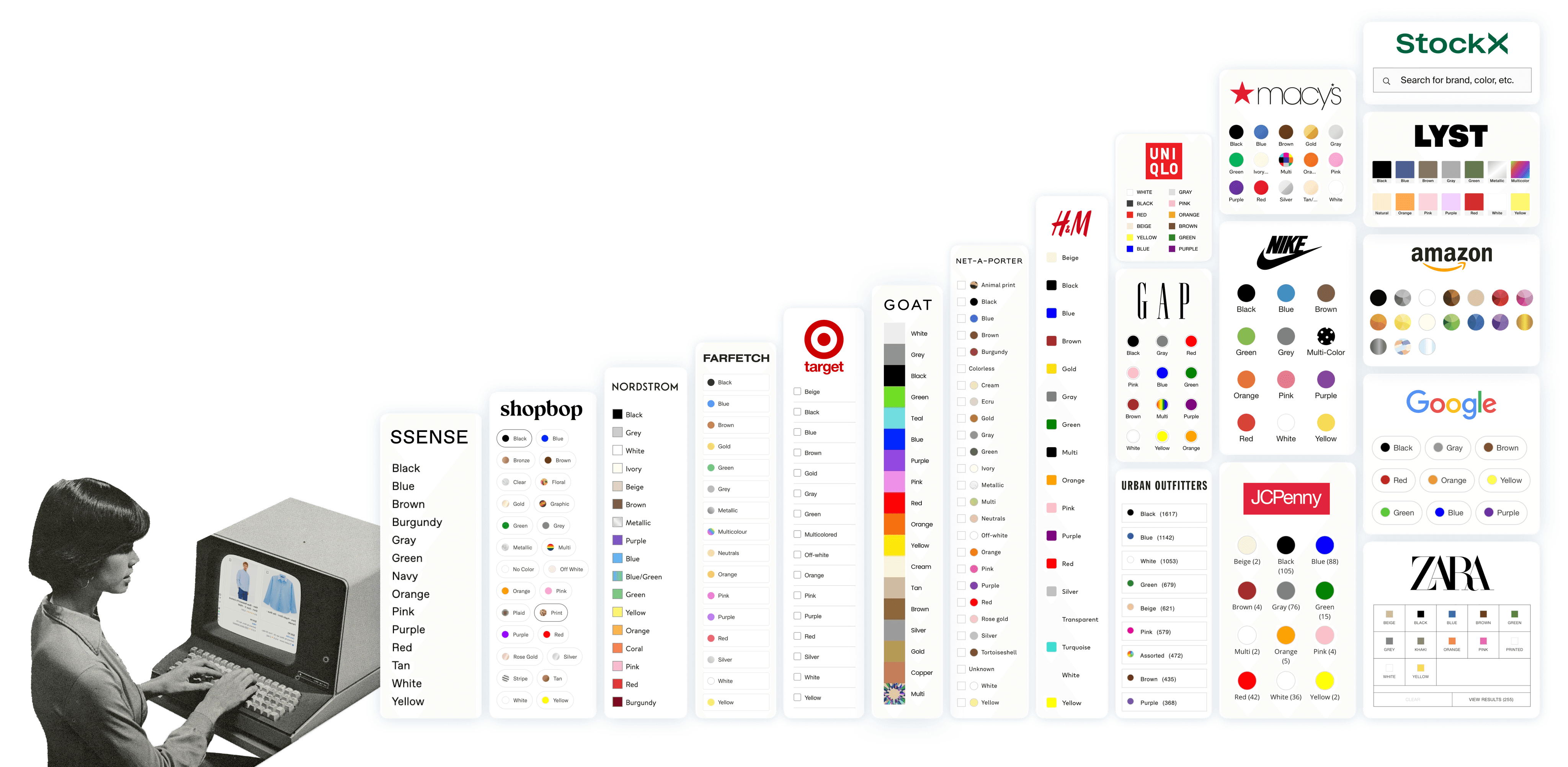
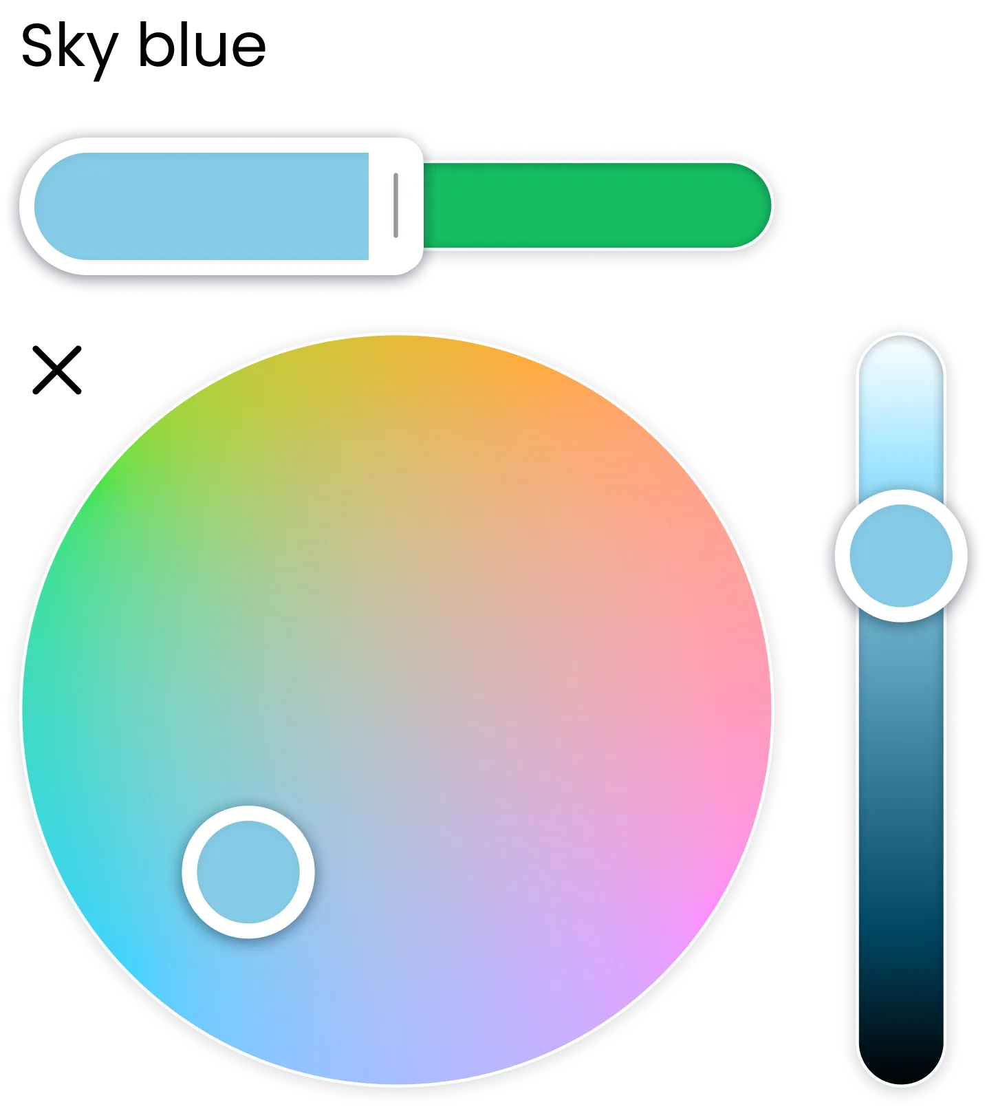
Thankfully, Hoppn Labs has invented a whole new way to search products by color using a color wheel, calling it the Infinite Color Search.
Shopping for designs with vibrating colors has never been easier. The Hoppn color wheel allows you to alter the chroma without affecting the lightness. Shoppers can now select any two-color matchup and instantly see results.
If you run an online business, it only takes minutes to transform your site into a destination customers are excited to support. Get started today by installing Hoppn’s user-friendly, no-code Shopify plugin.