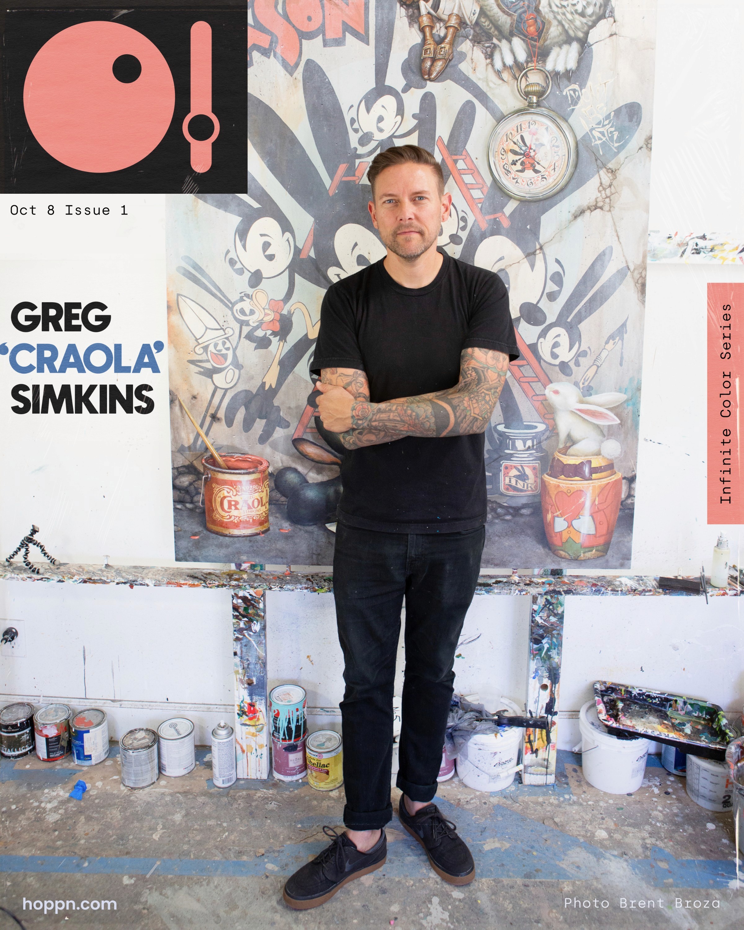
Oct 8, 2025
5 minute read

What role does color play in your work?
"Color is everything! It is the very first thing that catches your eye when you see one of my paintings. It is through the shaping and almost sculpting of color that I am able to create the scenes and tell the stories that I do. It evokes mood and depth and can help push a narrative along. I’d say that color is HUGE when I work."
At what stage in the design process does color enter?
"I tend to sketch all my ideas in a small sketchbook with a black ballpoint pen. It is the best way to save ideas, and later I just take a picture of the idea and throw it into my iPad or computer and start rearranging these messy little sketches into some sort of composition. At this point, I begin gathering reference images, photography from nature mostly, and start thinking about the mood of the piece. This is where the first instance of color begins to surface."
and what do your background colors usually convey about the time of day or mood in a scene?
"The colors chosen here help me get into the piece much quicker and guide what I mix for the background, which often sets the tone for the overall atmosphere."
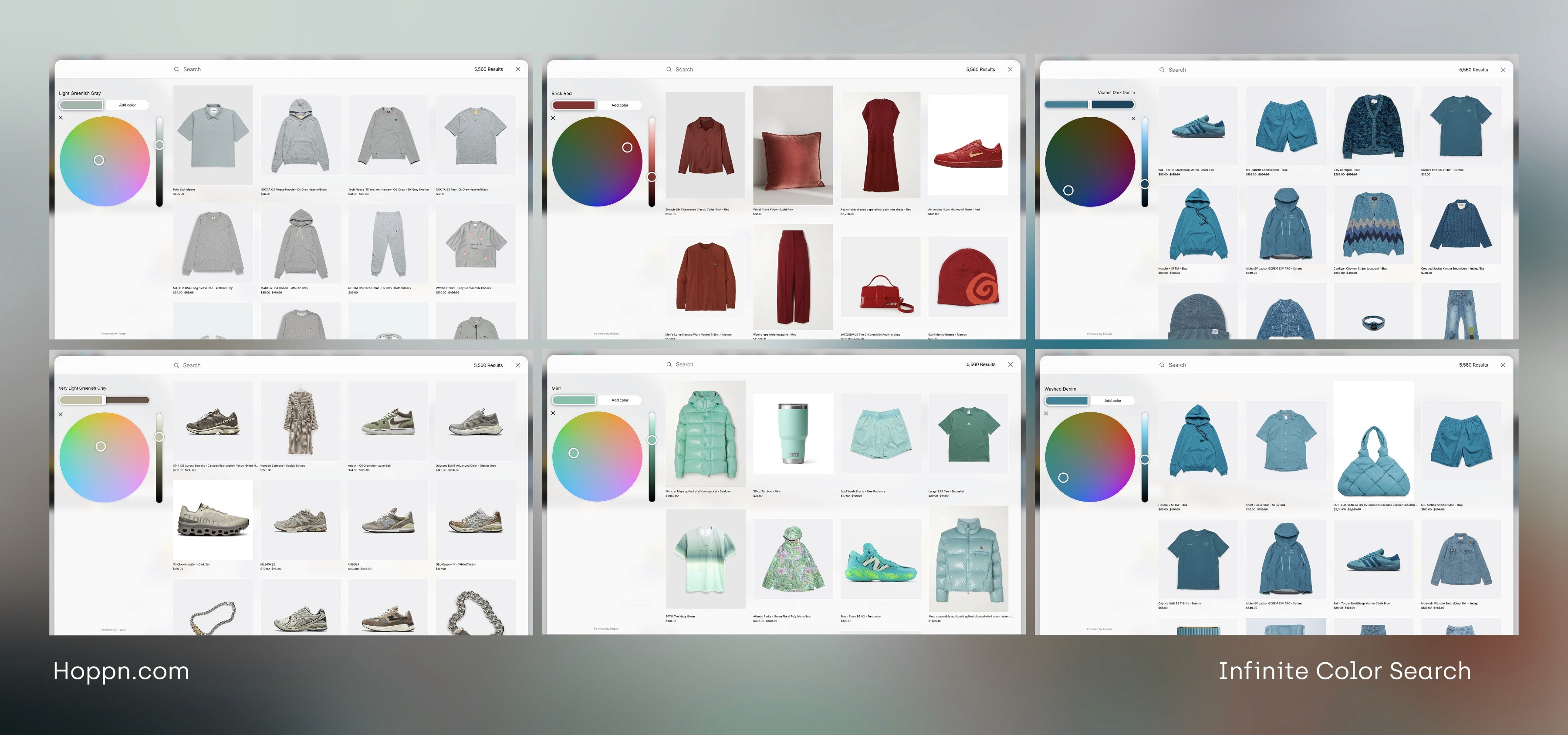
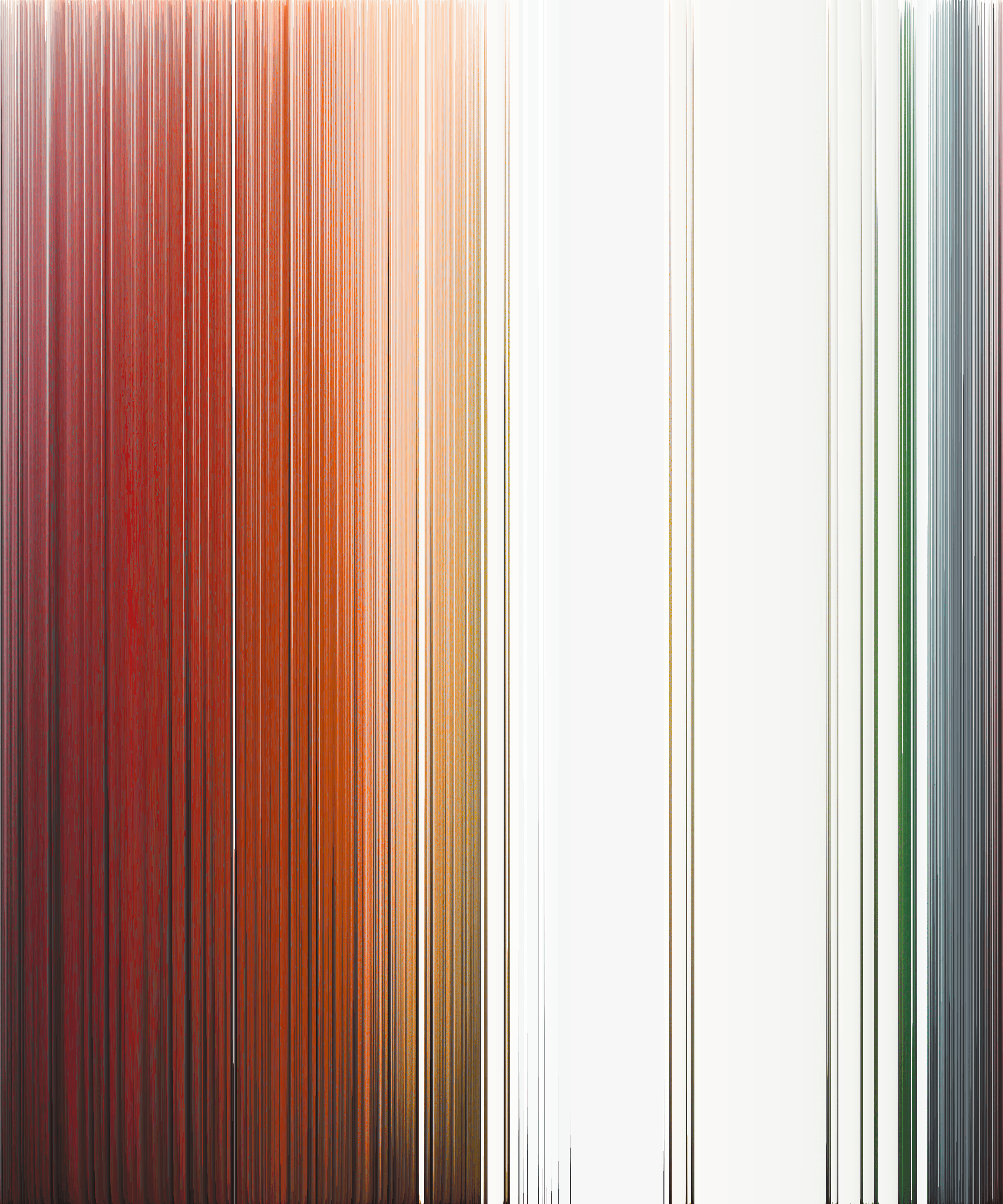
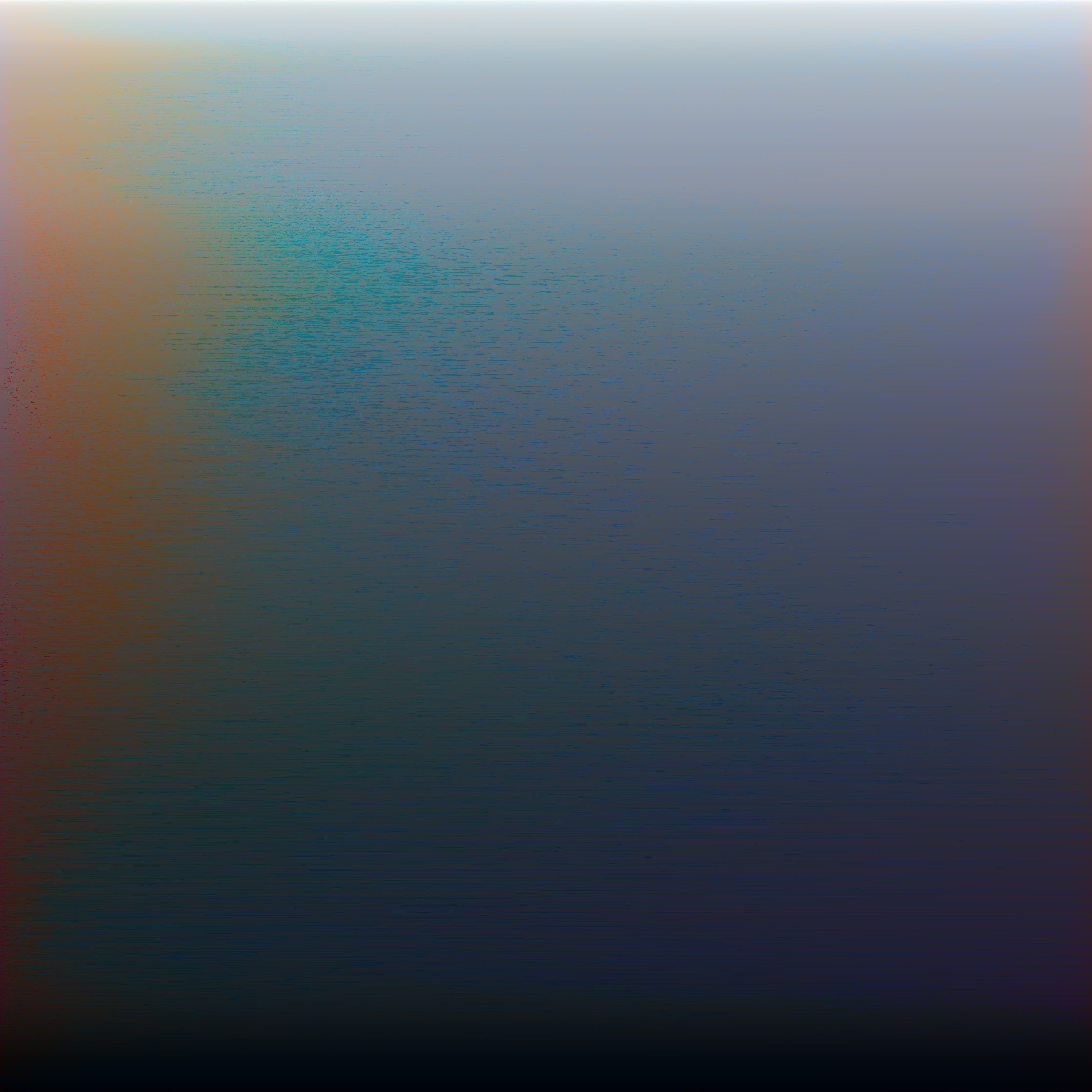
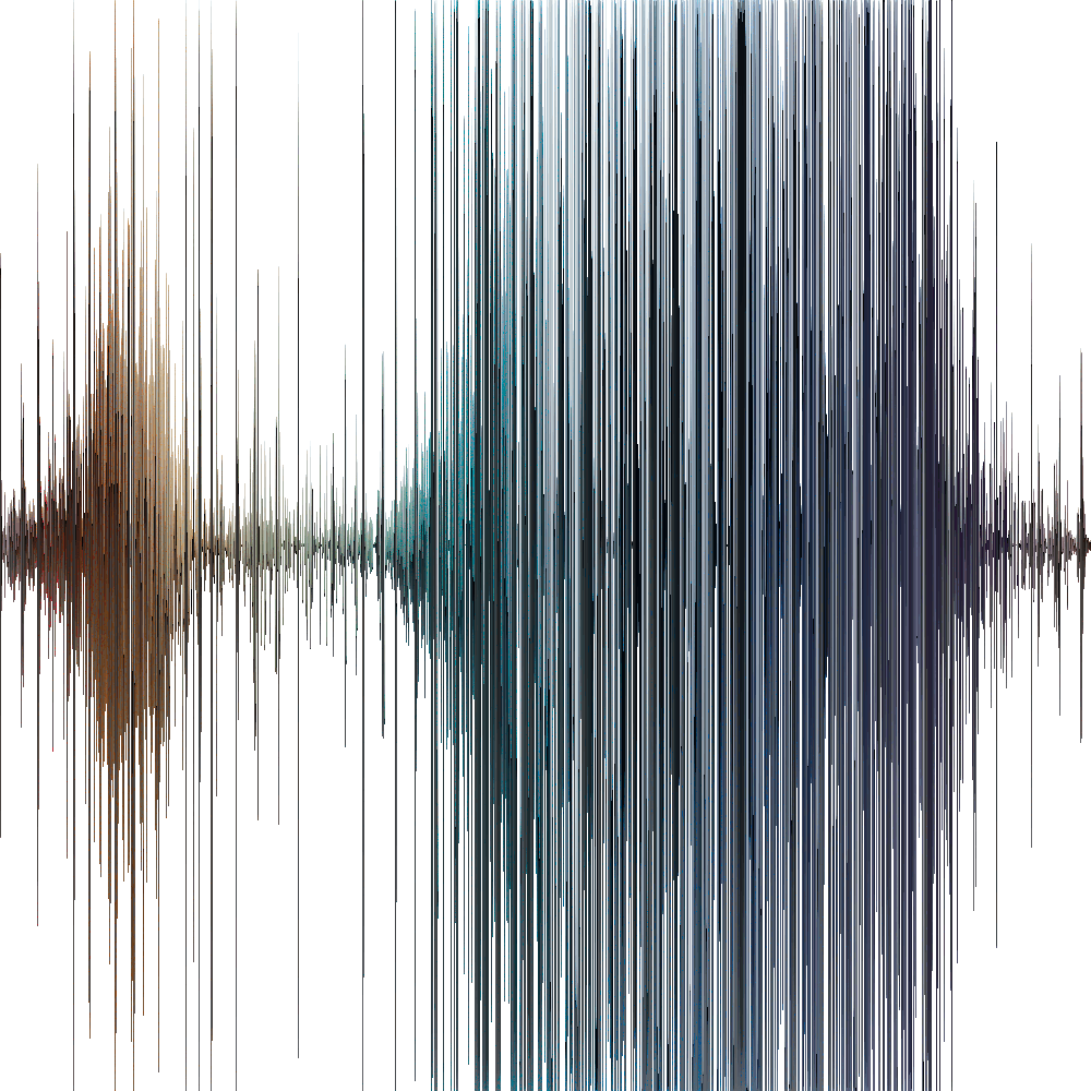
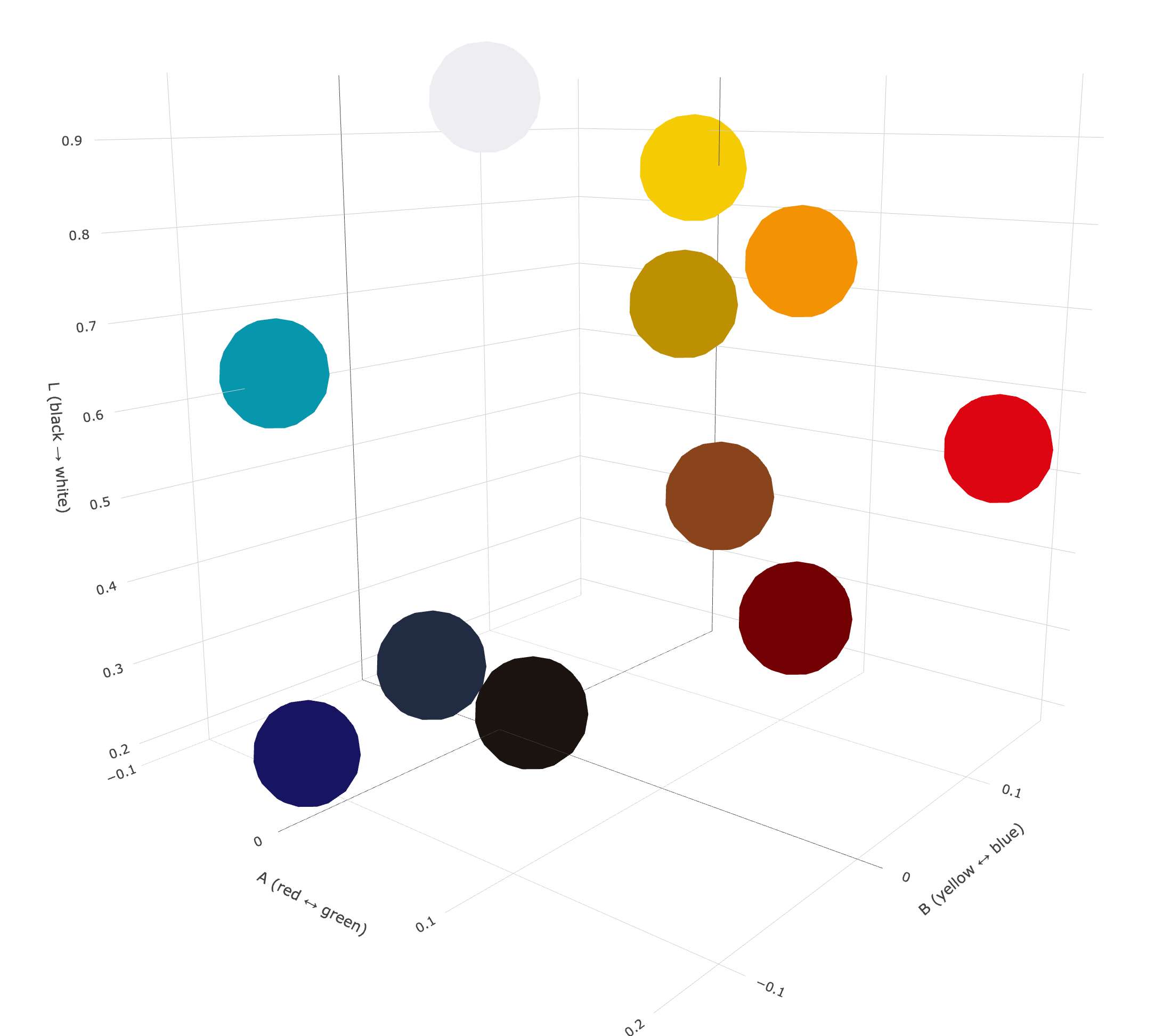
3D color analysis by Hoppn.
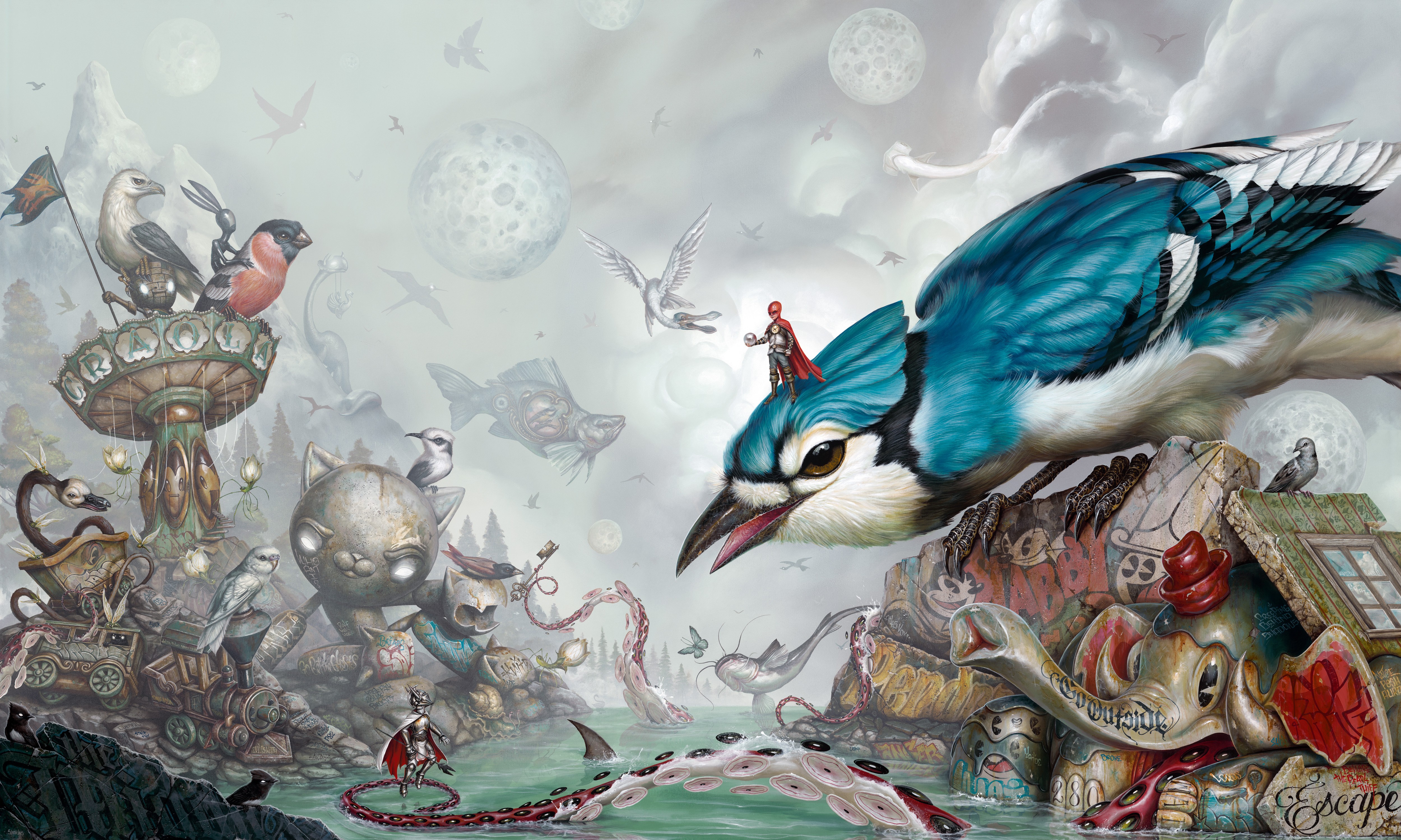
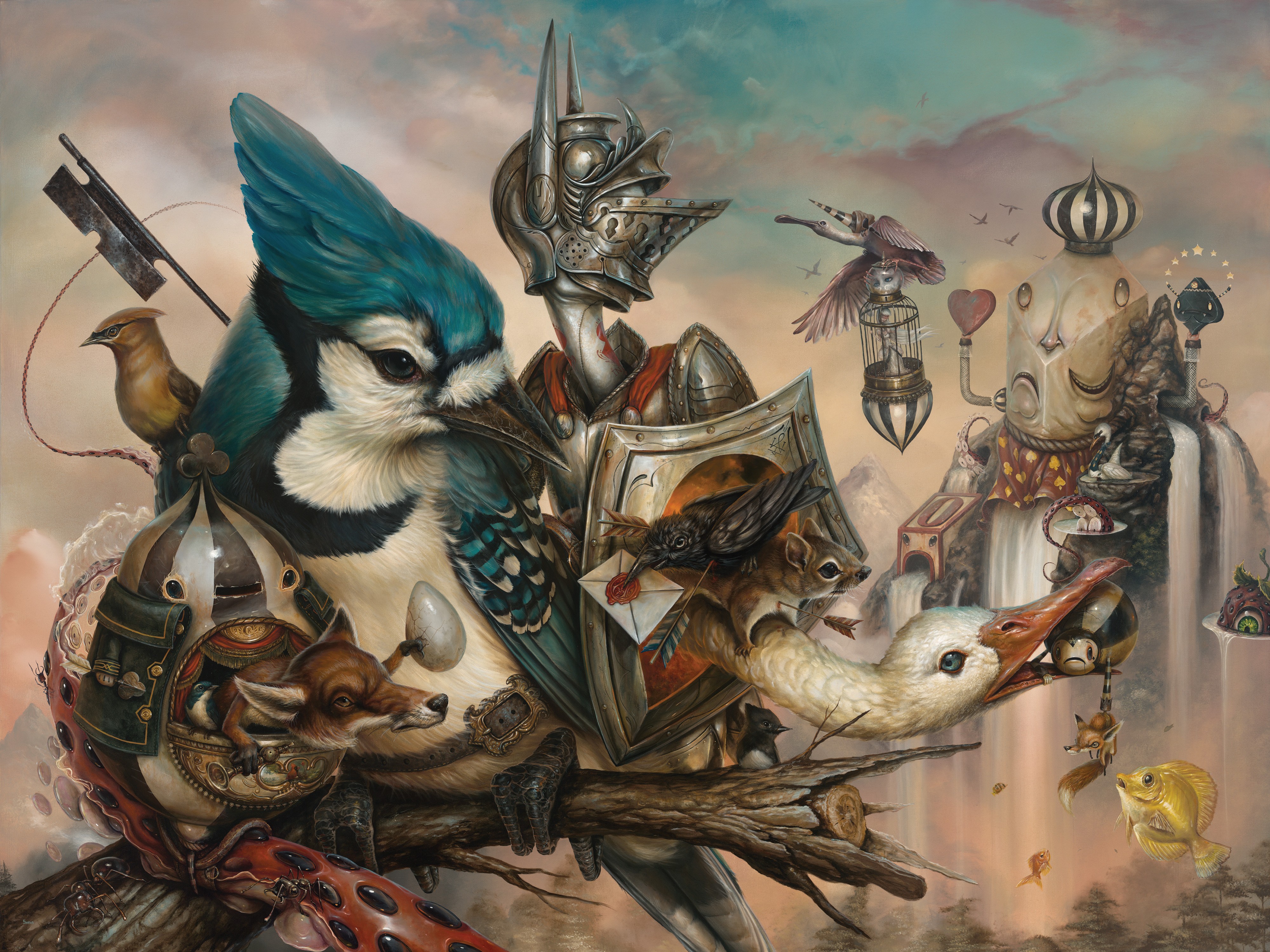
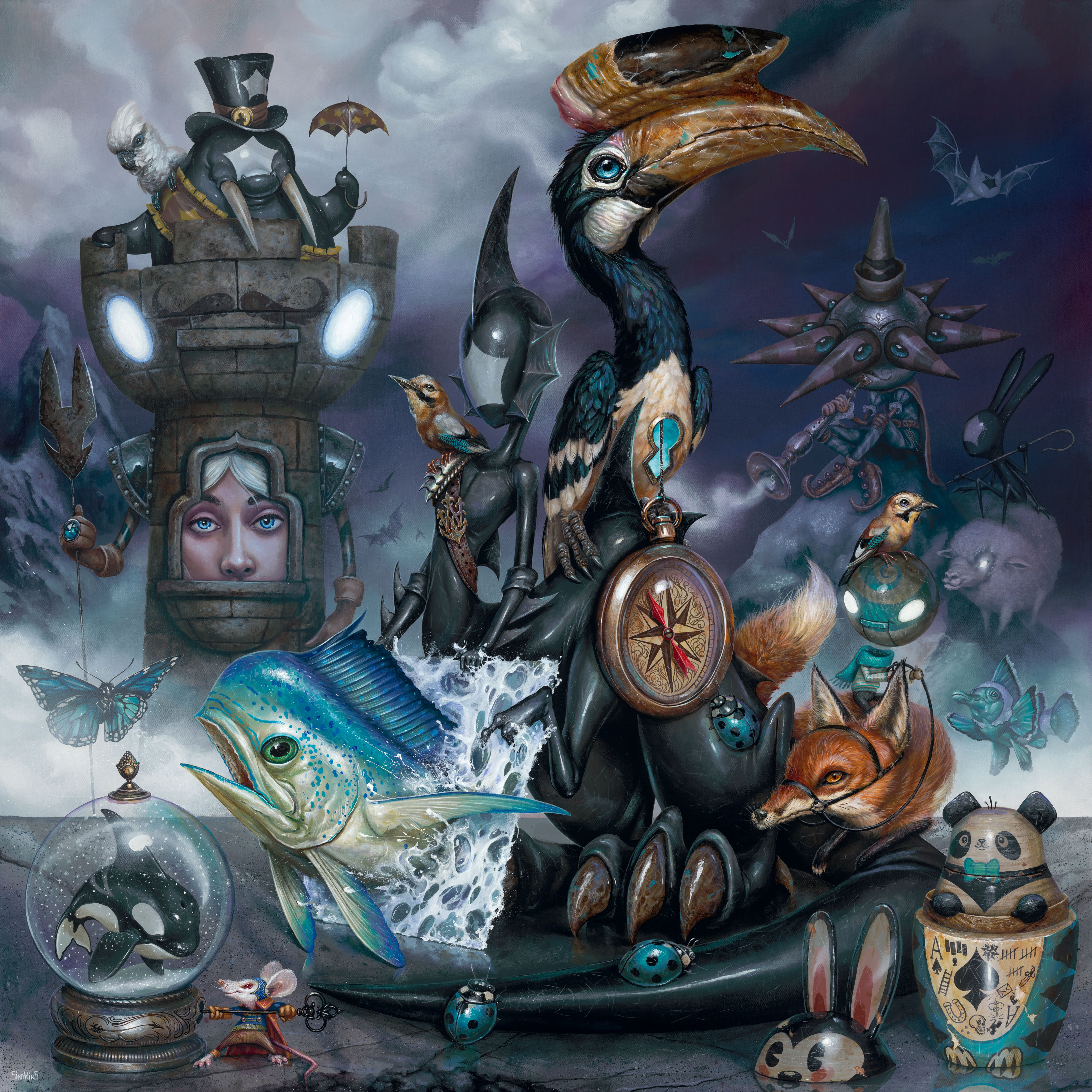
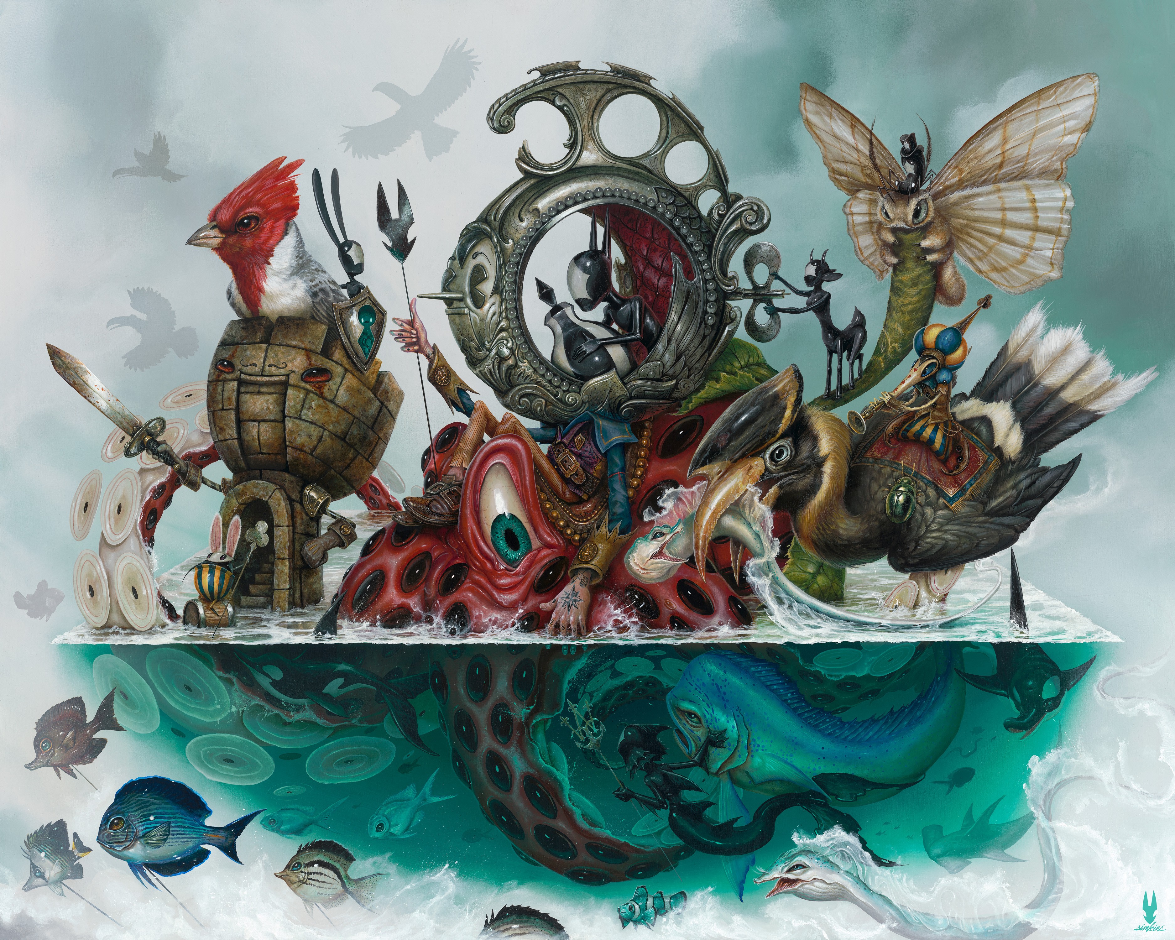
At VEFA Gallery’s surrealist exhibit, you shared with us your piece Piper’s Pass, where you described creating atmospheric depth by desaturating distant scenery. How does lighting design shape and guide your color palette?
"It’s very important. The use of color allows that push and pull. Setting things off in the distance can be achieved simply by understanding how color works as well as contrast and atmospheric perspective. I generally stay more muted the further back a scene goes, and then get way more saturated the closer a piece gets to a mid to foreground and then go darker and more muted again for the closest pieces of the painting."
What influenced your color preferences early on?
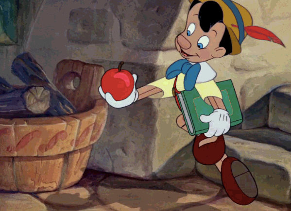
"I was always drawn to the rendered backgrounds in old Disney movies. From Fantasia, Pinocchio, Alice in Wonderland and you name it! All those old cartoons sucked me in. They were all huge influences on what I do to this day. Animated movies and cartoons spoke to me at an early age and created an escape and an outlet for my imagination. It was always the colors that grabbed me first."
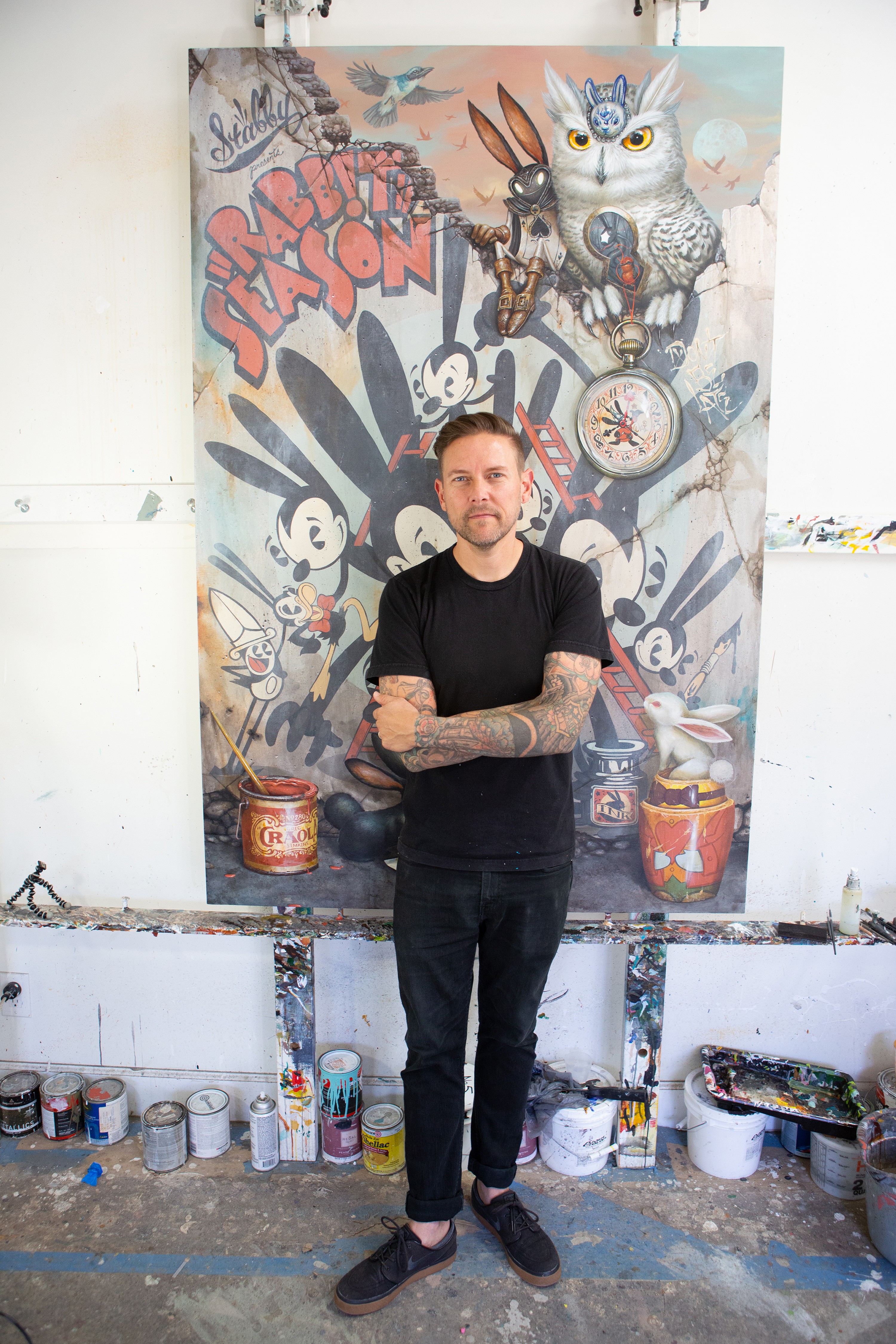
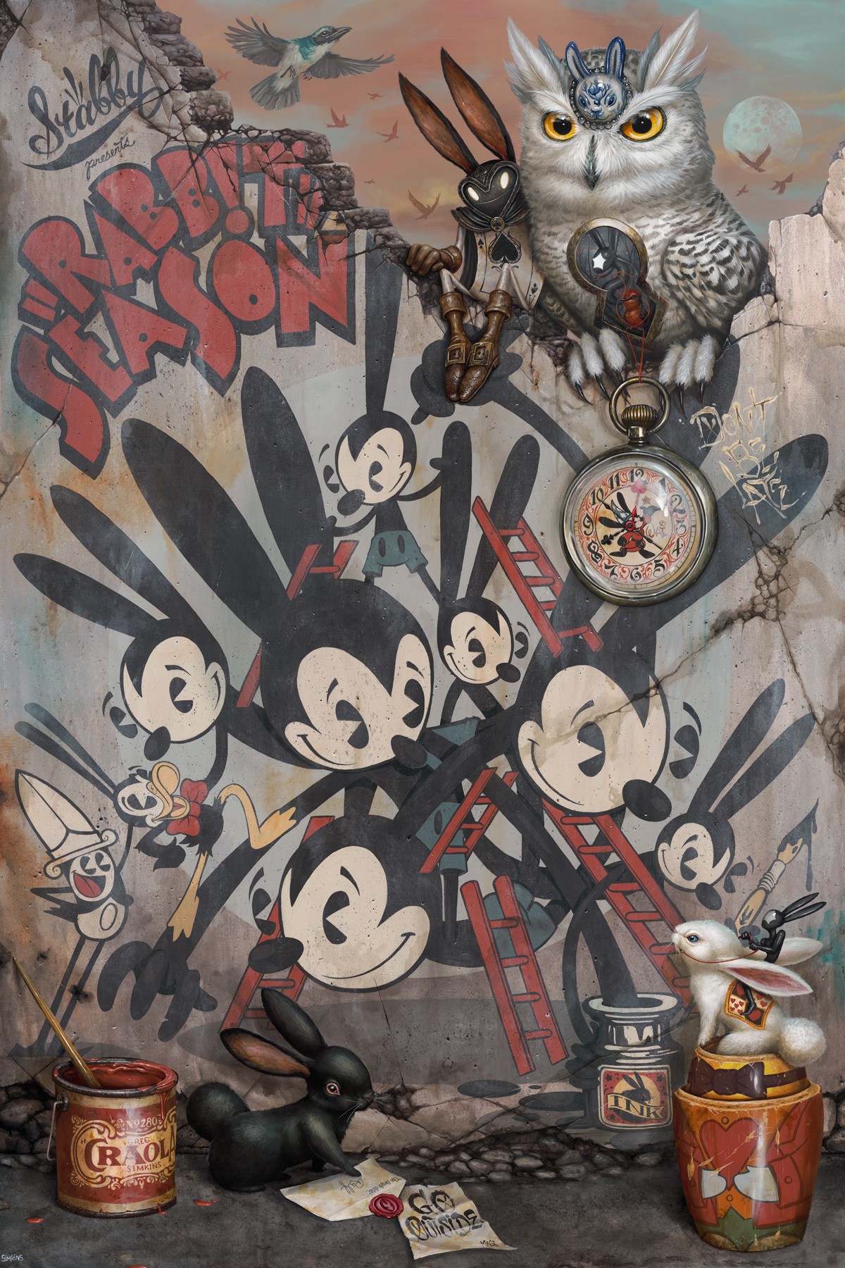
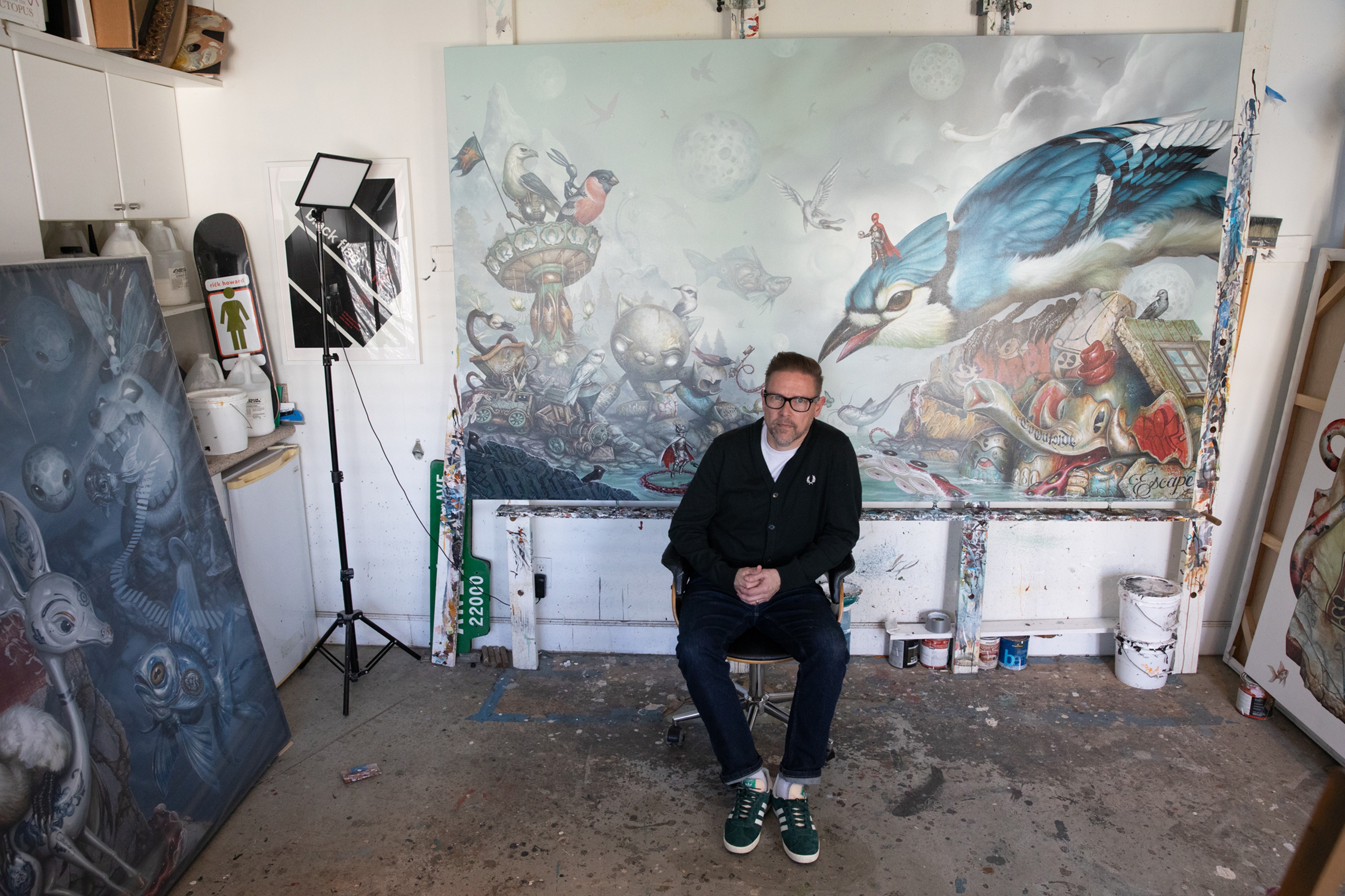
Photo: Brent Broza

What single word best represents your color palette style?
You’ve been making art your entire life. At what point did you find your color style?
"I’d say I snuck up on my color style probably just after college. Of course, I had been using color for years before that, but not to the degree I did once I began working as an illustrator. Putting images into series that were to be dropped at different seasons really made me think about color and how to group pieces together. Once I picked up acrylic paints, I really made an effort to use a small palette and allow colors to slowly work their way in."
Over your career, how has your use of color evolved?
"Once I began showing in galleries and putting together bodies of work, I discovered that I would use certain palettes for certain solo shows. I would keep the same colors around me and have them roll from one painting into the next so as to make the pieces “speak to each other”. The colorways let the viewer know that these pieces go together and to pay attention as to what underlying story may be unfolding."
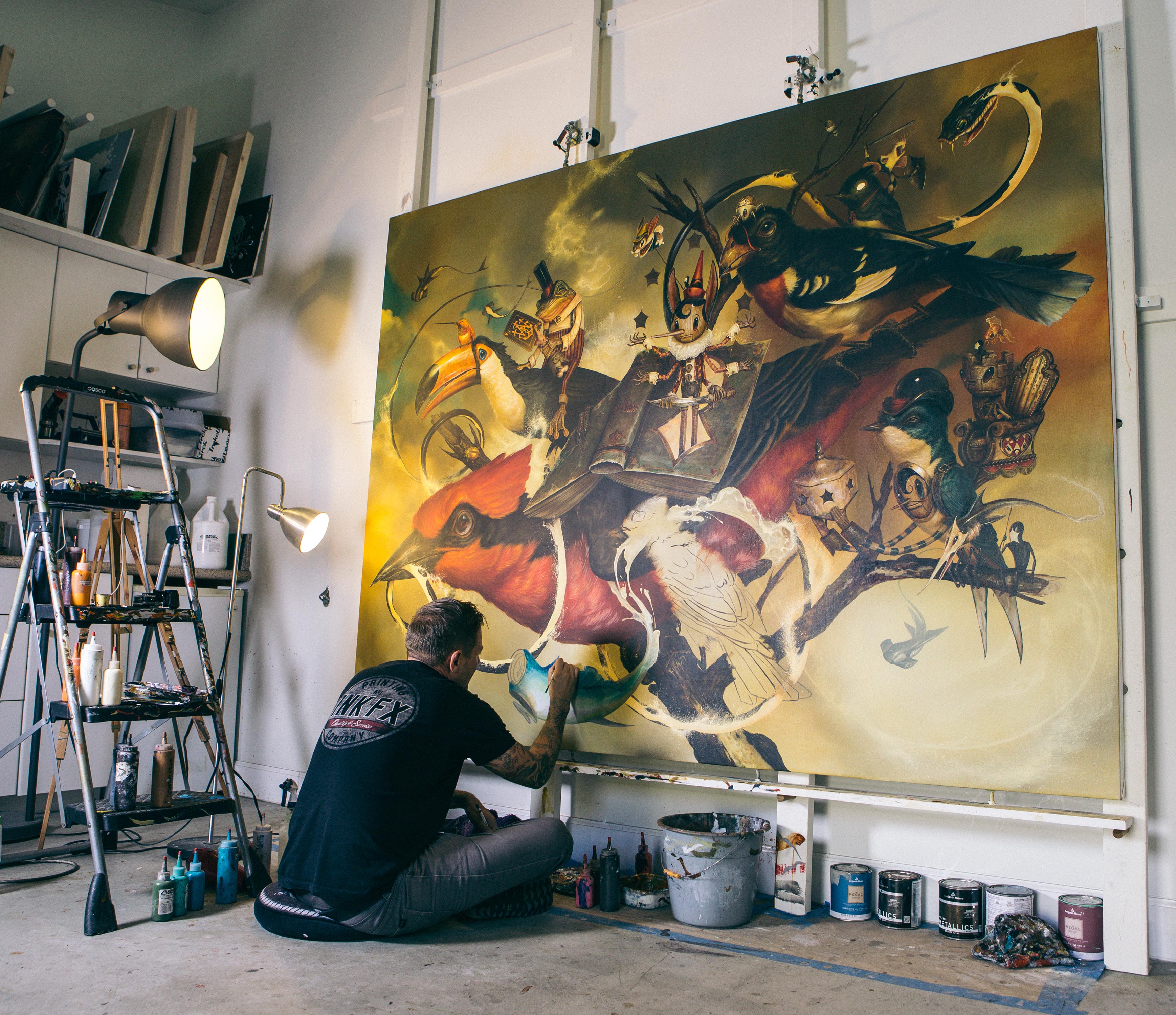
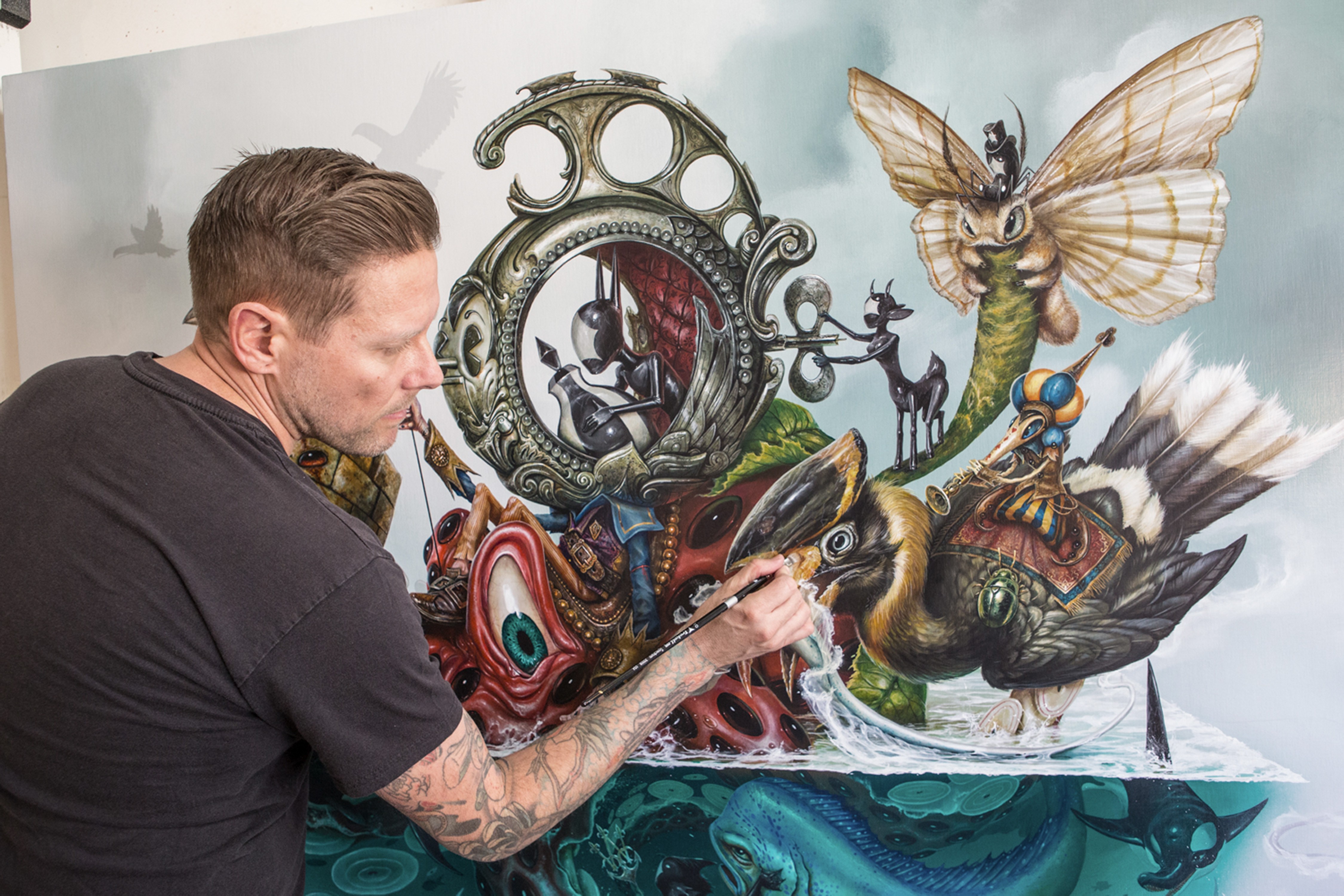
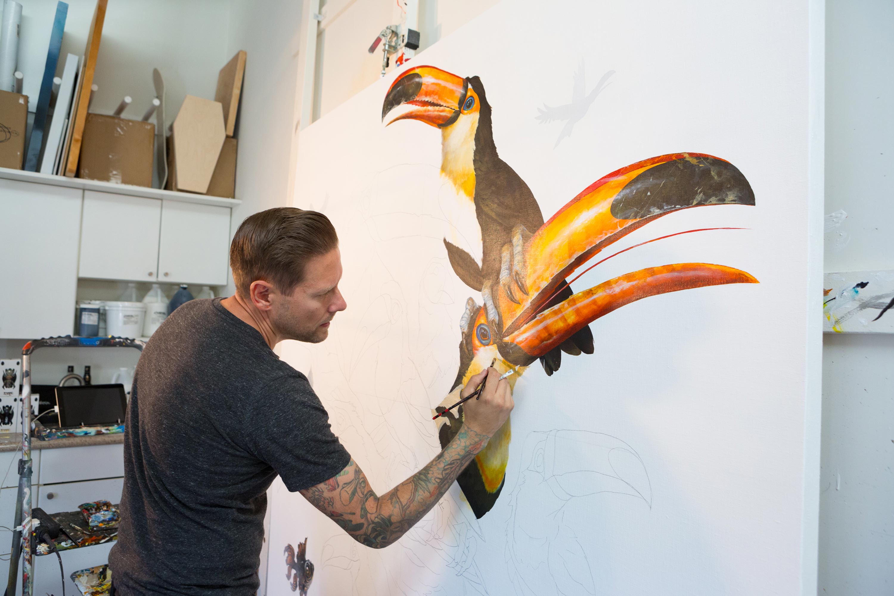
Photos: Brent Broza
What color or combination of colors do you want to use in your next piece?
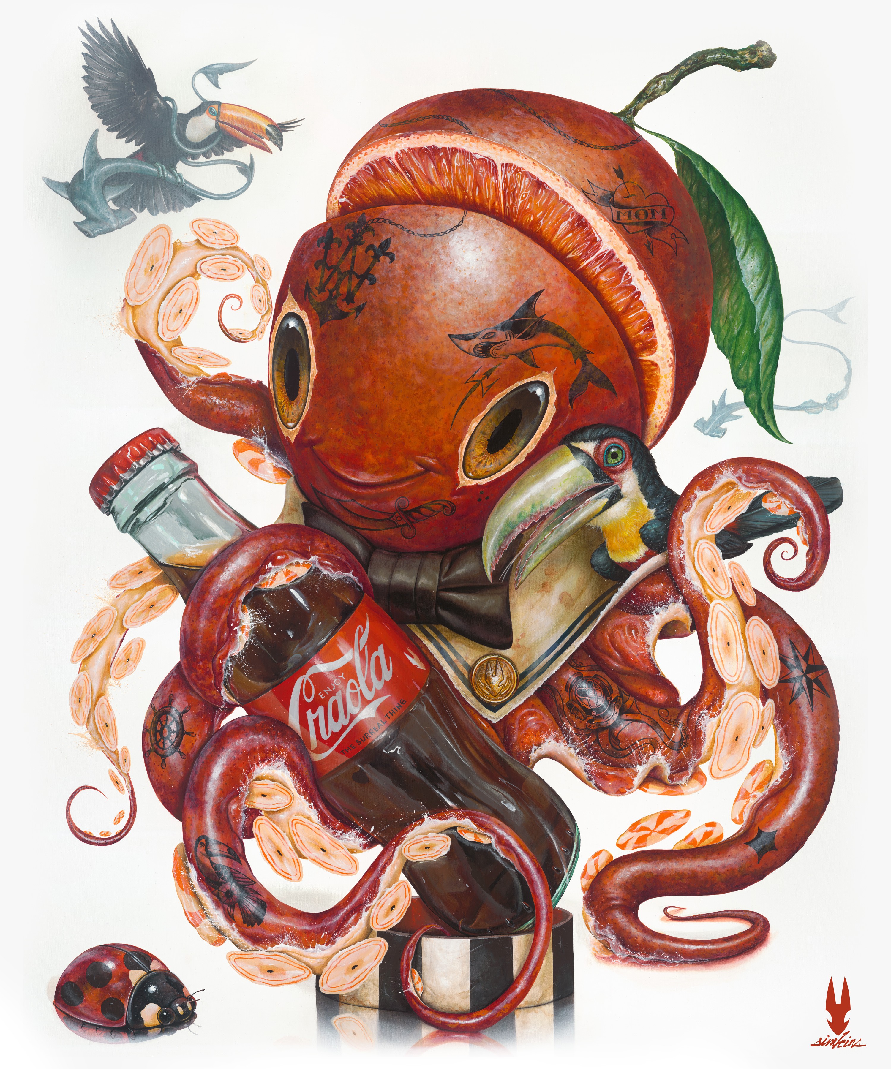
"I want to go back to a colder or “cool” palette. I have been working with a rust color palette on the last few pieces, Yellow Iron Oxides, and Red Iron Oxide washes going over everything to create a really warm atmosphere. I love this palette but lately I have been thinking of a snowy setting for a scene, like something out of Narnia and I want to play with my cool palettes again. We’ll see how that warm to cold push and pull goes."
What specific colors best represent your work
"This is my Artist Signature Series acrylic paint bundle with Nova Color Acrylics. My favorite palette is included in this set, and it represents everything I use to paint with and mix with to create other colors."
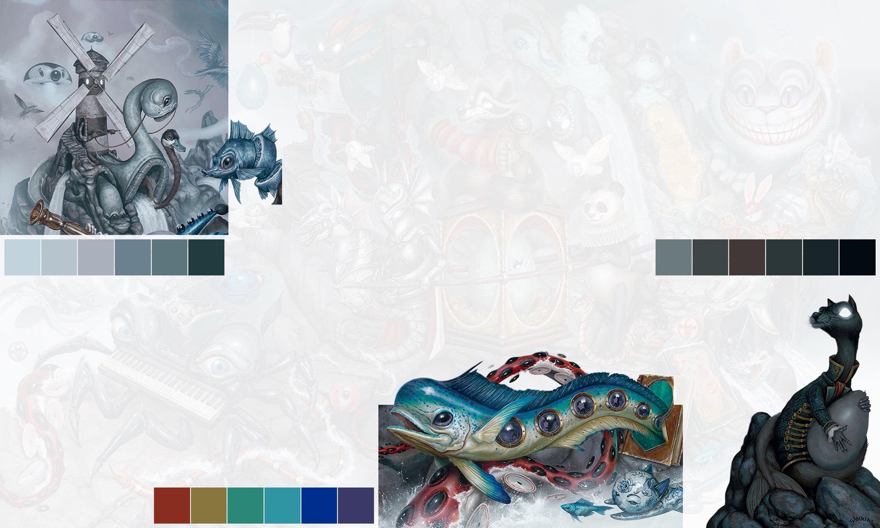
Phthalo Blue (red shade), Carbon Black, Payne's Gray, Phthalo Turquoise, Titanium White, Cadmium Yellow Medium, Indian Yellow, Cadmium Red Medium, Transparent Red Iron Oxide, Transparent Yellow Iron Oxide, and Yellow Ochre.
Who would you like to collaborate with on a future project?
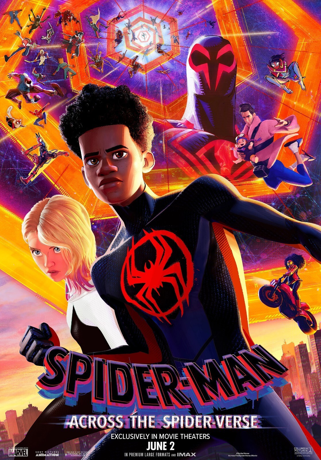
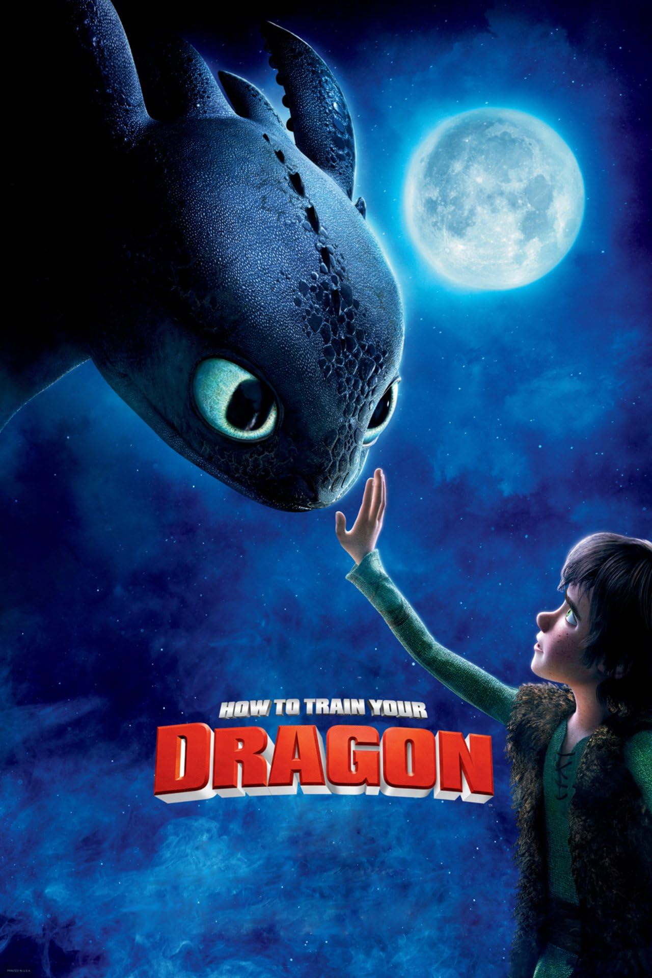
"I love what DreamWorks puts out. The “Spider-Verse” movies and “How to Train Your Dragon” films are amazing and so vibrant. I would really like to see movies and projects like old Disney come back around, I’m forever nostalgic.
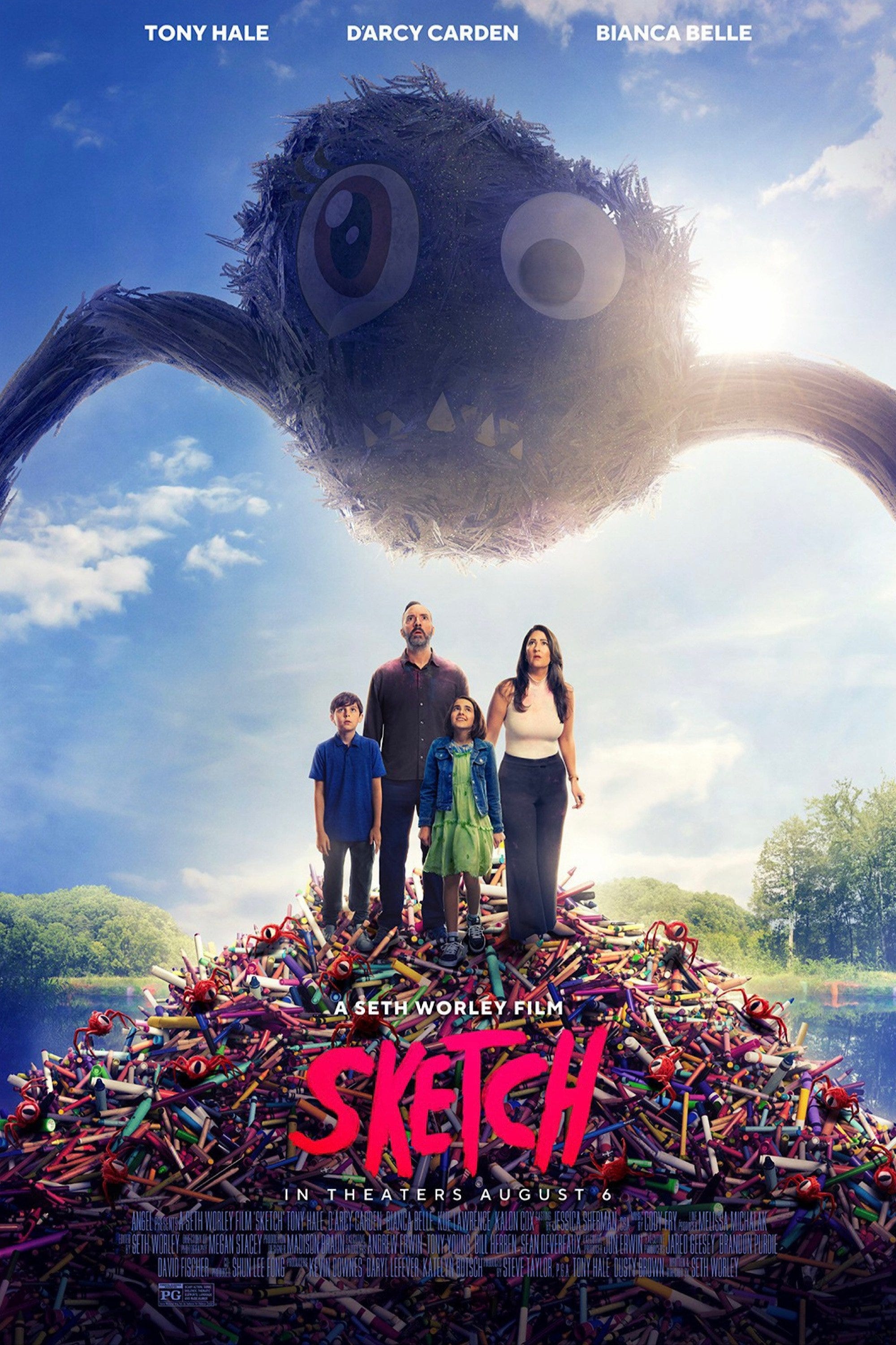
There’s a movie called “Sketch” by Angel Studios that I keep seeing previews for that looks like it came from my childhood brain and has a kid’s sketches coming to life in the real world! Those kinds of stories, along with any hero’s quest or portal-to-other-world type of films, always grab me.
As far as brands, I’m always up to collaborate with companies that I feel I would use in my own life. I really am happy with my partnership with Trekell paint brushes and Nova Color Paints and have enjoyed collaborating with a huge group of companies putting toys out there, as well as projects with a variety of bands. It’s always fun to hear what ideas collaborators want to put out, and I’m always game for that conversation."
What can we learn from Craola's meticulous approach to color?
The world of color is complex, with infinite possibilities. If you'd like more from INFINITE COLOR SERIES, let us know by sharing and tagging @hoppn.
At Hoppn, we're leading the industry in color-based search for ecommerce. If you're curious, poke around our website! For more on all things color, visit our fun page for free creative tools and educational blog articles.