Sep 16, 2025
3 minute read


In design, colour does a lot of heavy lifting. It sets the tone, defines the brand, creates emotional pull — often before a single word is read. And yet, for something so central, shopping with colour remains surprisingly unhandy. It’s subjective, inconsistent, and notoriously difficult to search for in a way that feels intuitive to how creatives actually think.
Ahead of our upcoming workshop on colour, we spoke with the founders of Hoppn, Bridger and Carson Hart, a team building tools to make shopping with colour feel less like a technical constraint and more like a creative flow. Their approach is about making colour easier to explore, navigate, and use across e-commerce.
In this interview, they share what first drew them to the world of colour, how their thinking has evolved, and why reimagining the way we search for colour could shift how we shop altogether.

What first sparked your interest in color and its use?
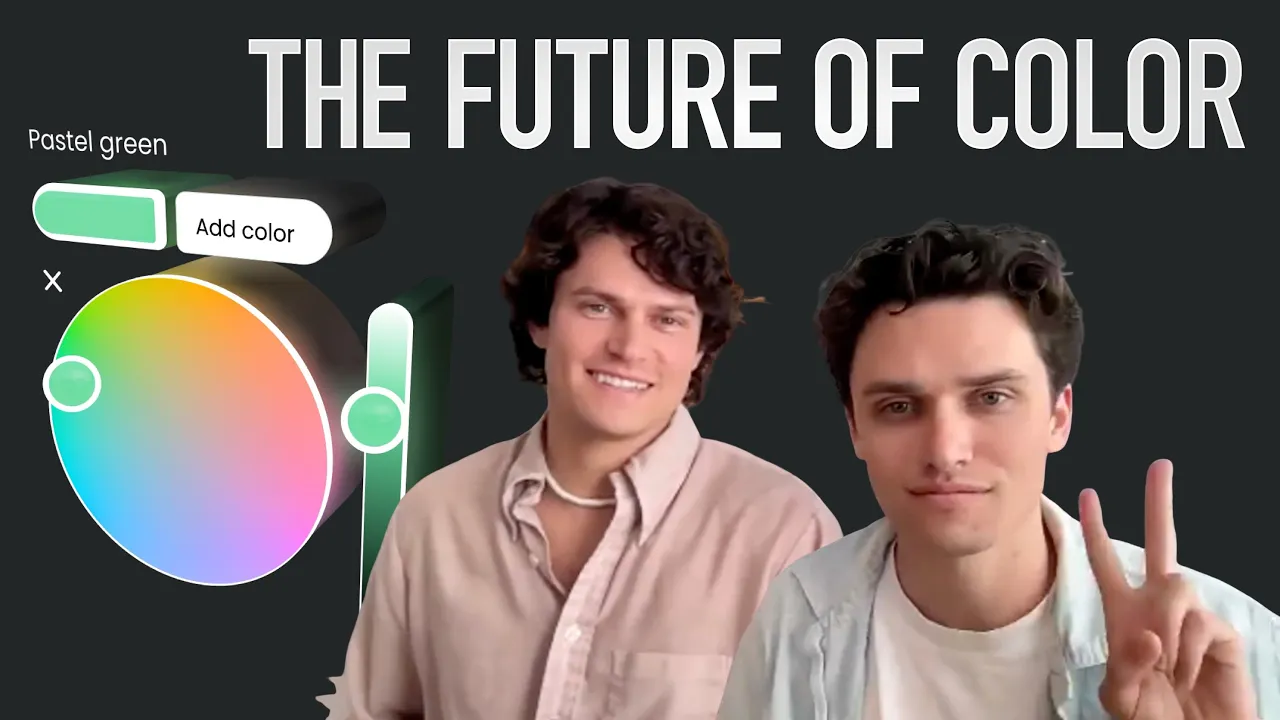
Bridger Hart: “Our parents designed the house we grew up in, and when I was 8 years old they let me choose the color of my bedroom walls. With no color swatch to reference, I used words to describe a neon lime green color! To my surprise my walls were painted a muted greenish gray – far too sophisticated for my age. In hindsight their color selection was easily a better choice, but had it not been the green I envision, I likely would have chosen blue!
This was my first real lesson in the nuance of color. Even within 'green,' a small shift can change everything.”
How has your understanding of color evolved over time?
Bridger: “As a former VFX artist and cinematographer, color and lighting is critical. Imagine a dress dyed in indigo. This dress can be well lit, revealing its chromaticity, or it can be hidden in shadows where it looks charcoal. When it is photographed, light filters through a lens, past a sensor, converted into an image profile, and displayed on a computer screen with varying levels of brightness. Everything about color is complex and there is always more to learn. There are illusions that trick your brain into seeing color in all sorts of funny ways. While color is complex, the generic solution of filtering products by “Green” and “Blue” is not enough. We need to be able to find products intuitively based on the exact color we desire.”
“We need to be able to find products intuitively based on the exact color we desire.”
What inspired you to focus on color search innovation for your startup?
Bridger: “We always strive to be the best in the world at what we do, and from our experience with color, we saw enormous potential for improvements. Given our unique background and early obsession with color, we were able to form a team perfect for bringing color search into the 21st century. Every shade in our favorite products is chosen with intention by the artists and designers who create them. Our dream is to celebrate their craft by making it easy for shoppers to find the colors they love, everywhere they shop.”

Who can benefit most from your innovation: designers, product developers, brands?
Carson Hart: “Since launching Infinite Color Search, we’ve noticed how it benefits a broad variety of people, from general consumers to industry professionals.
Shoppers can find what they want instantly, saving them time through a memorable and intuitive user experience. Stylists, often particular for a hyper-specific shade, consider this tool to be a game-changer for their career.
Businesses are also noticing significant improvements to their workflow. Bo Bridges Gallery, for example, uses Infinite Color Search internally when creating custom presentations for their clients. Natalie Martin, a popular high-end dress company, scrapped their current color solution for ours when they realized that we automate all the color tagging for them. Their dresses are often multi-color, which makes color attribution especially difficult.
And for the first time ever, designers get insights into the exact colors, shoppers desire. When Mitchell Black, a wallpaper business, noticed their shoppers were searching for teal wallpaper, they released a new teal collection to accommodate for that discrepancy.
Color has the ability to help everyone, but first, we need to spread the word! If you know of any Shopify businesses that could benefit from Infinite Color Search, let's talk!”
“And for the first time ever, designers get insights into the exact colors, shoppers desire.”
A More Intelligent Approach to Colour
What Hoppn is building is more than just a tool — it’s a reframing of how we interact with one of design’s most fundamental elements. Their work speaks to a future where technology supports the creative process, rather than dictating it.
If you’re curious about use of colour in practice, watch the workshop recording below. It’s open to designers, product developers, brand teams — or anyone interested in thinking more deeply about colour.


