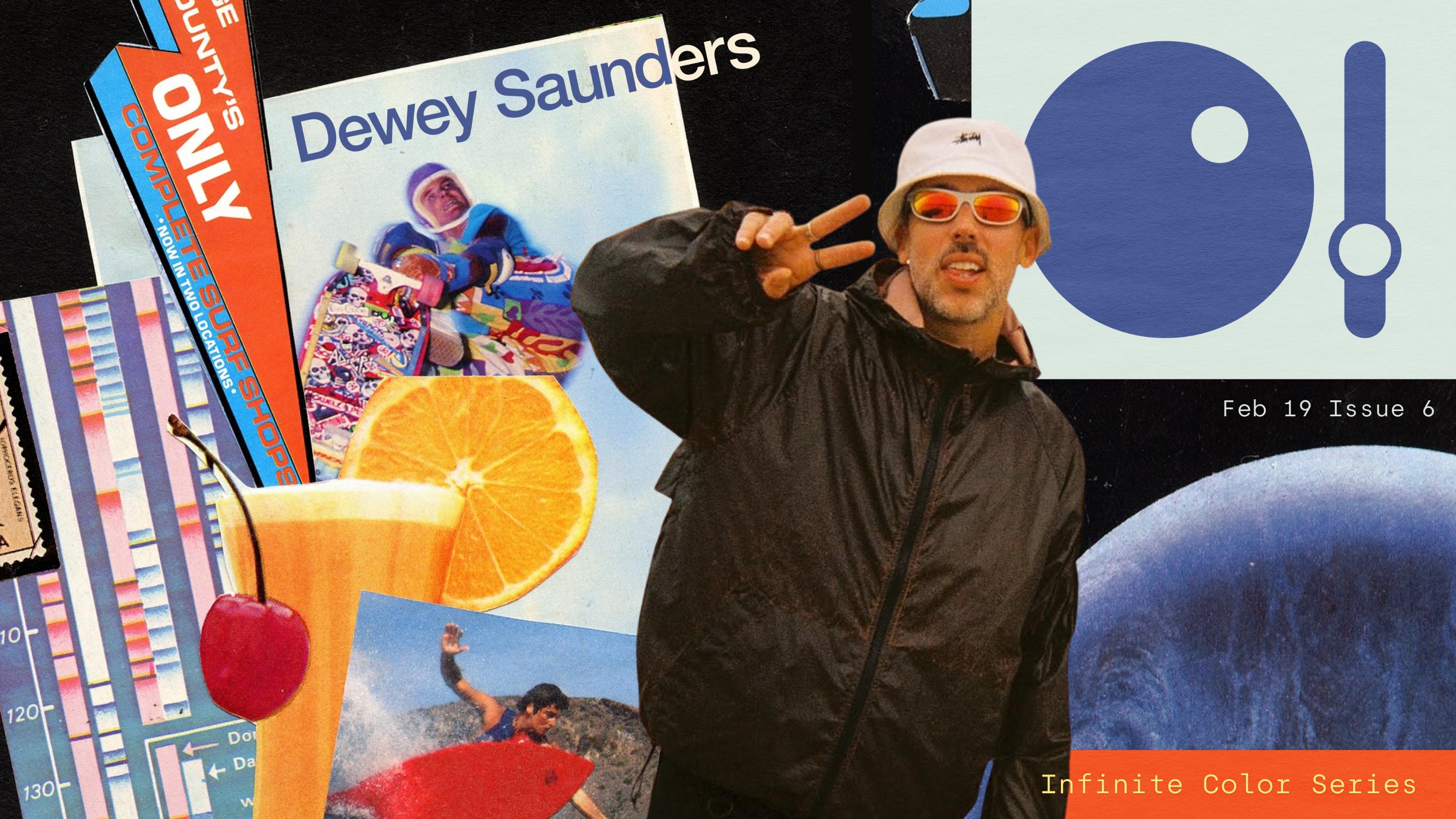
Feb 19, 2026
4 minute read
What role does color play in your art?
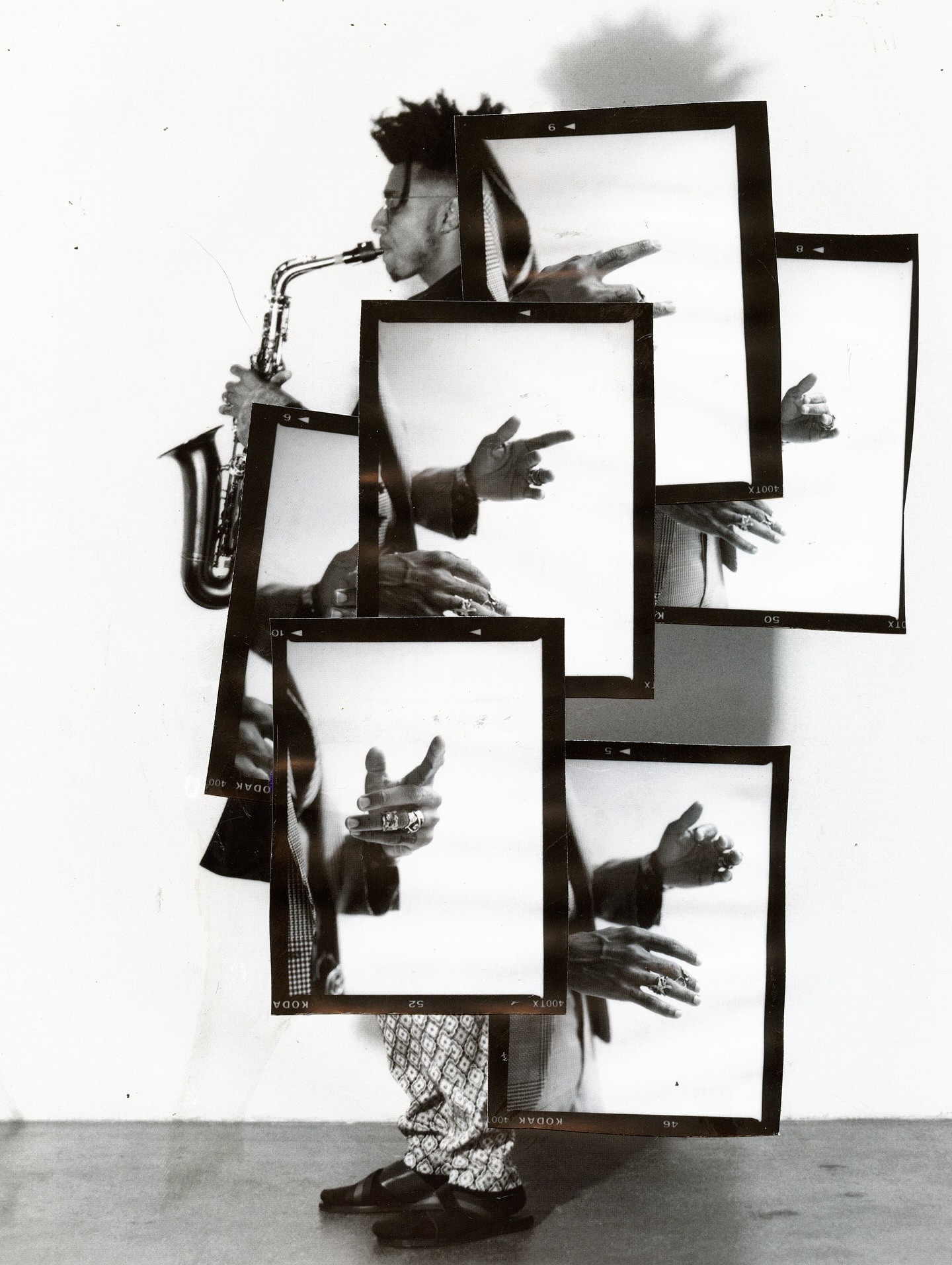
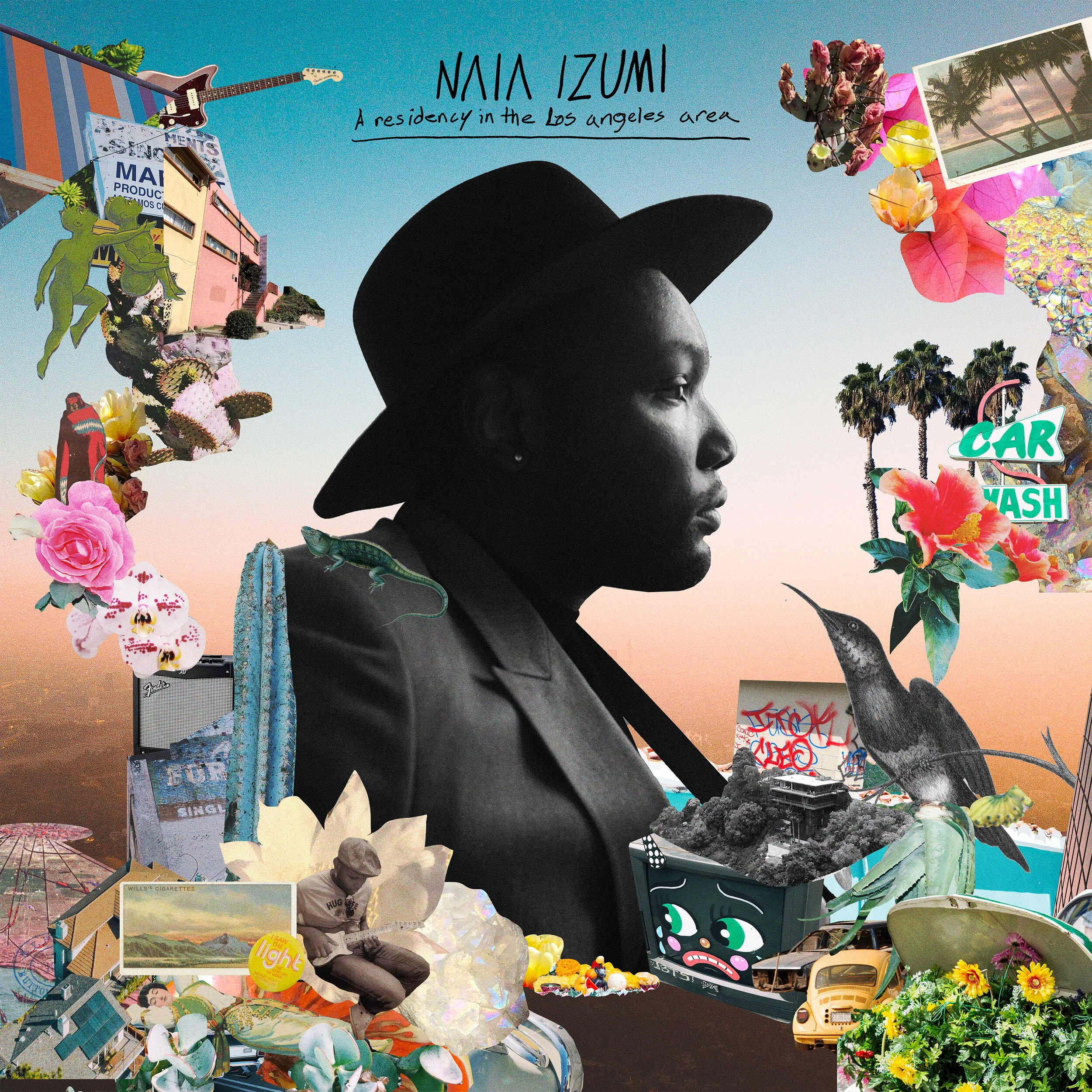
"Color is the balancing agent in the chaos when I'm doing collage work, it's really the main tool to control the composition and to lead the eye in certain directions. Color can come first or be applied last as a treatment but its the most important element in my personal practice."


"It's my main pillar when making artwork, and it happens on a subconscious level. Looking at my works as a whole, the glowing gradients and color palettes are prevalent."
What unexpected thing influenced your color preferences early on?
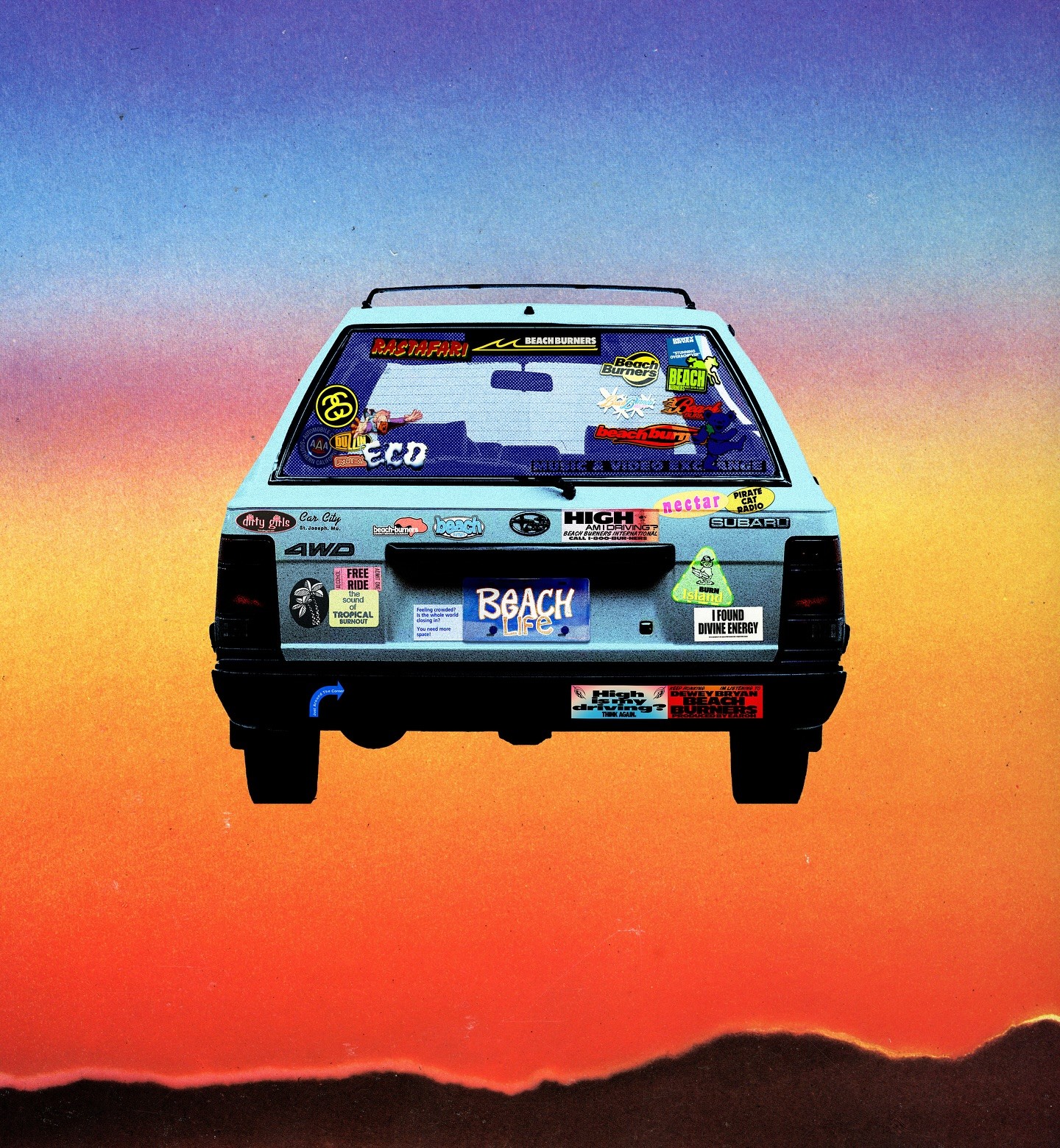
"I love scanning in old magazines and taking color palates from ads and paper textures - there are so many advanced design schemes and techniques from the pre computer era that I am fascinated by and try to incorporate within my milieu."

Over your career, how has your use of color evolved?
"Over time the colors get a little less saturated but that goes in cycles too. I like to play with minimal earth tones with a splash of bright color or black and white designs with a neon tone, it depends on project. Either way - its a constant evolution learning about color theory and how to wield the spectrum for unexpected results."
What's the next color palette on your mind?
"I'm designing my studio’s branding right now and sticking to black and white but might do a splash of neon green - or something that feels fresh and timeless like a dusty yellow. Maybe #c8d12c on a black background would be tight - and separate my studio brand a bit."
When inspiration strikes and alters the color palette, does it change the emotion of the work?
"Last minute color changes definitely shift older pieces for me, sometimes I will dig up old collages or designs and apply new color treatments for a radical new perspective. It’s amazing how color can influence the mood and feel of a piece instantly, something that I play with and manipulate to make the viewer relax and feel at ease."
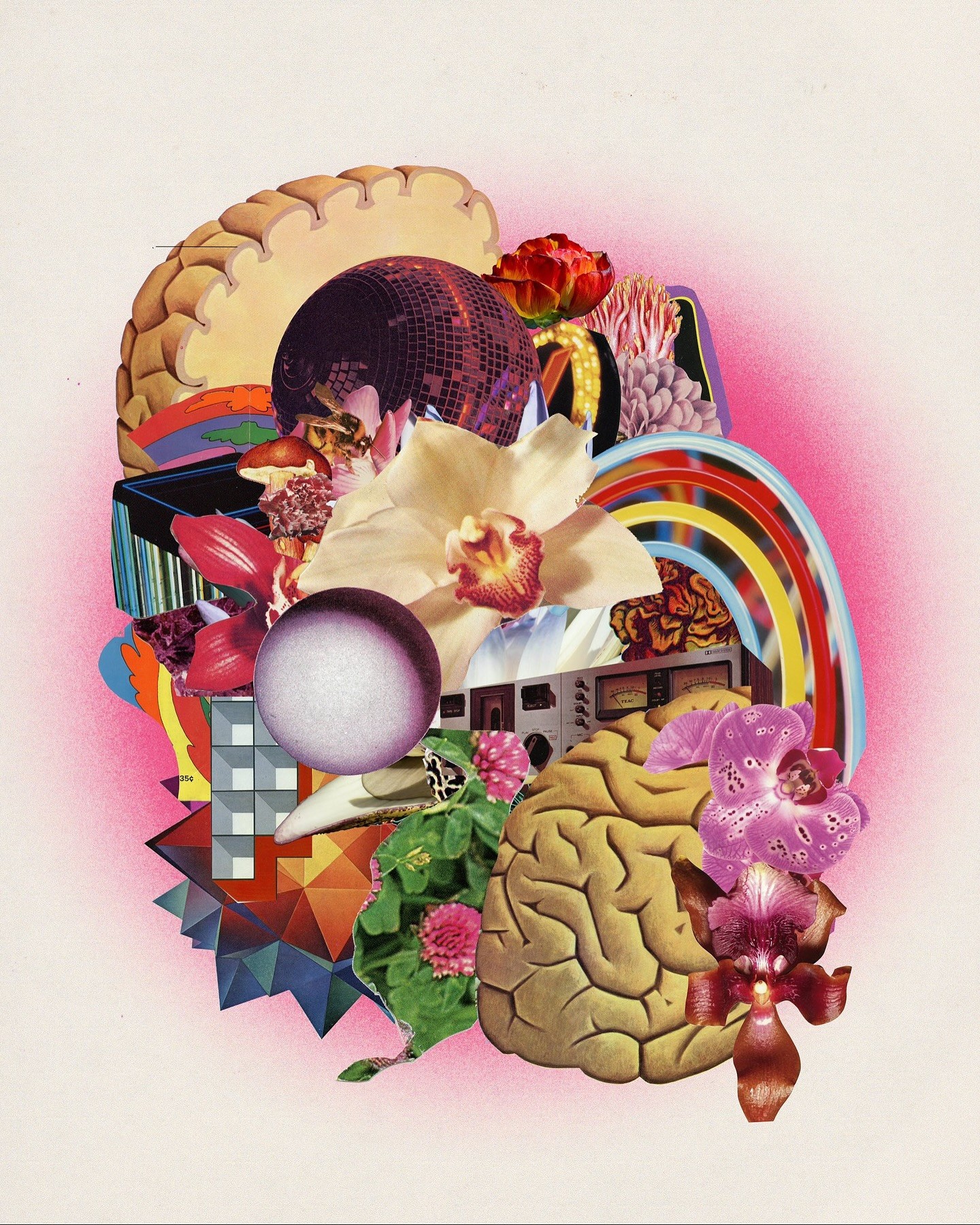
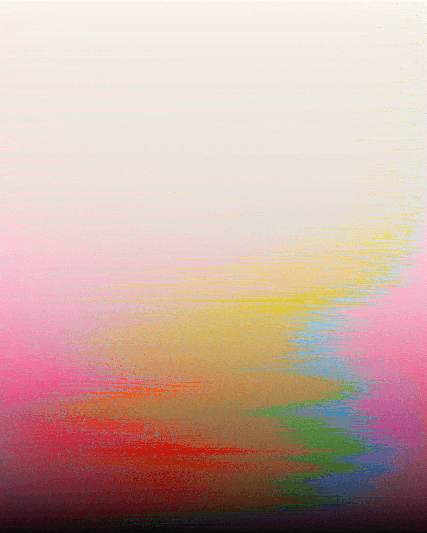
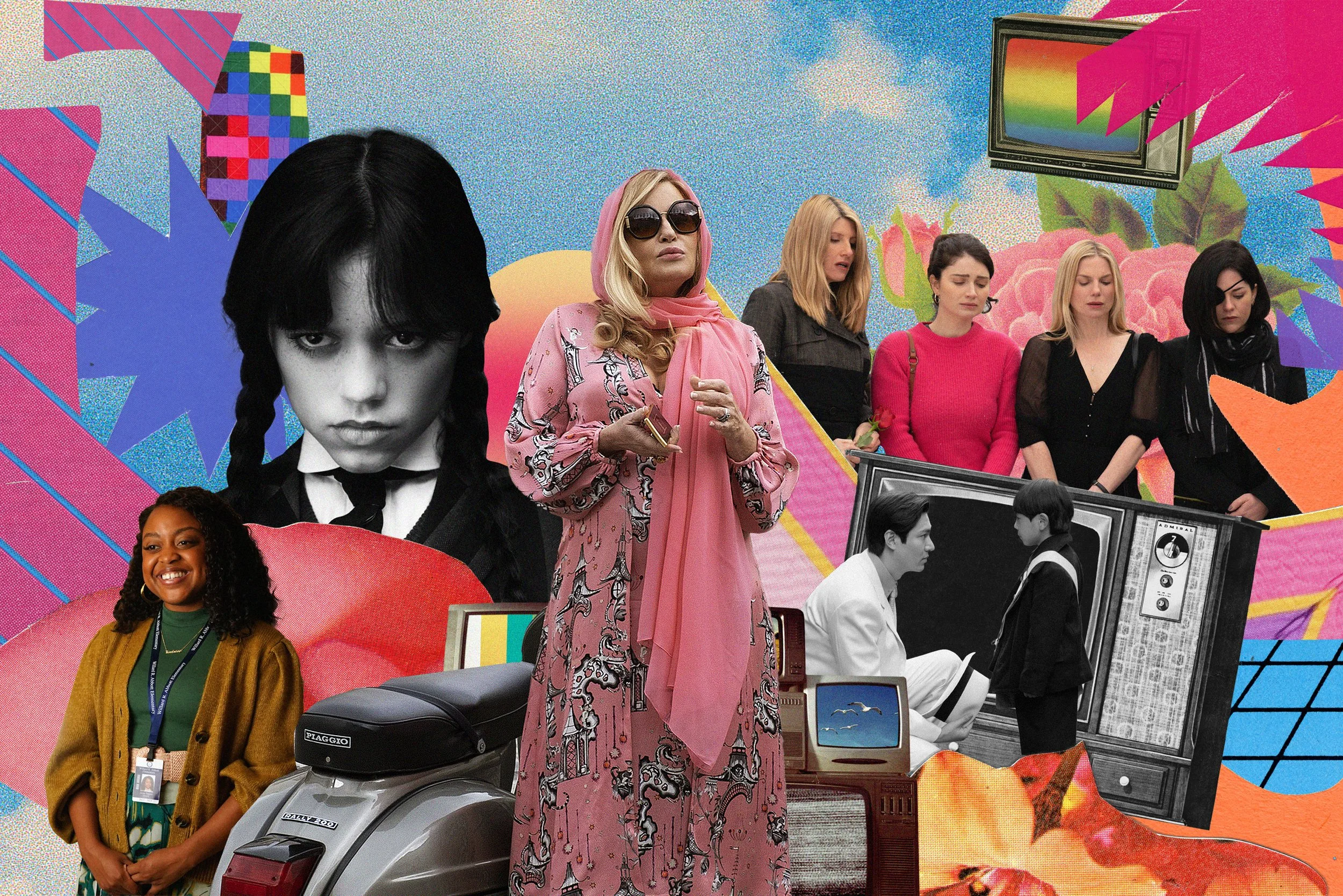
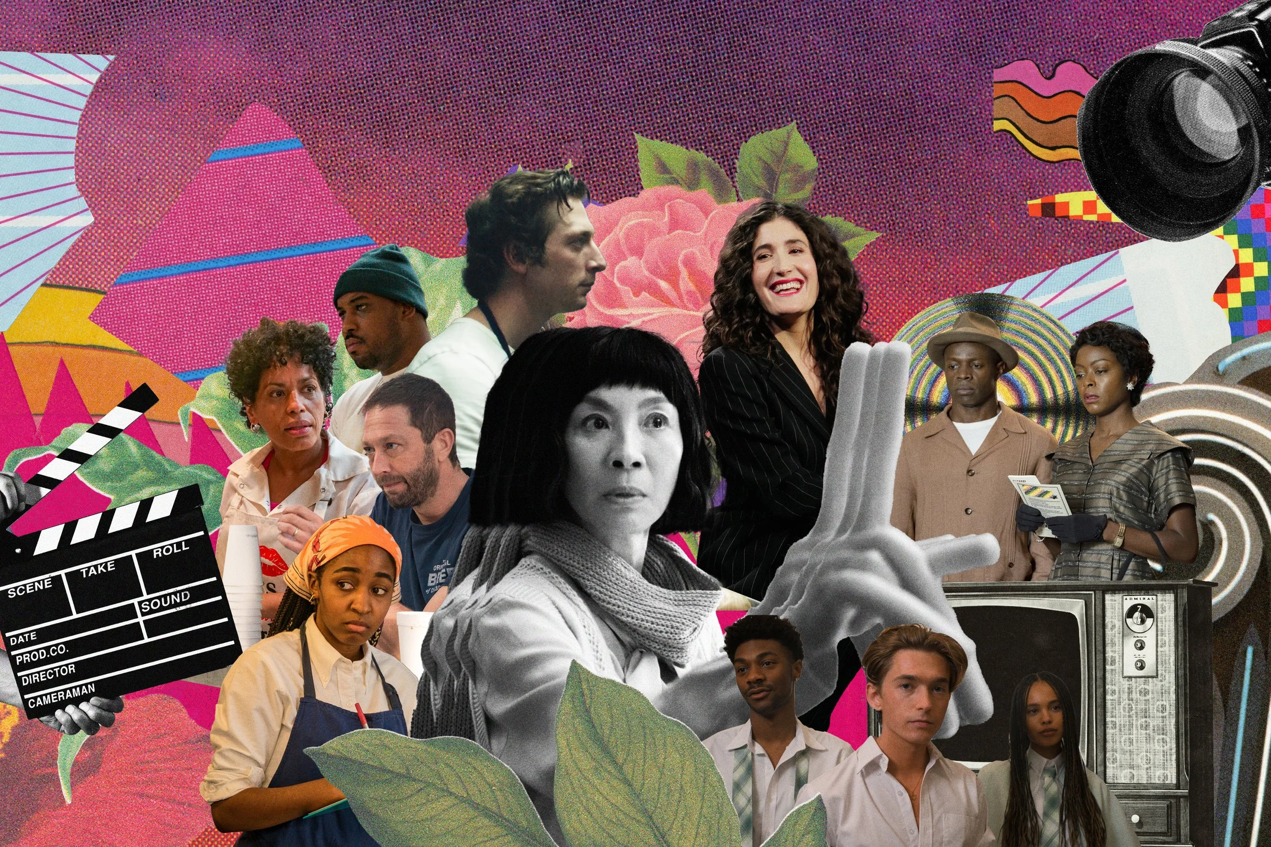
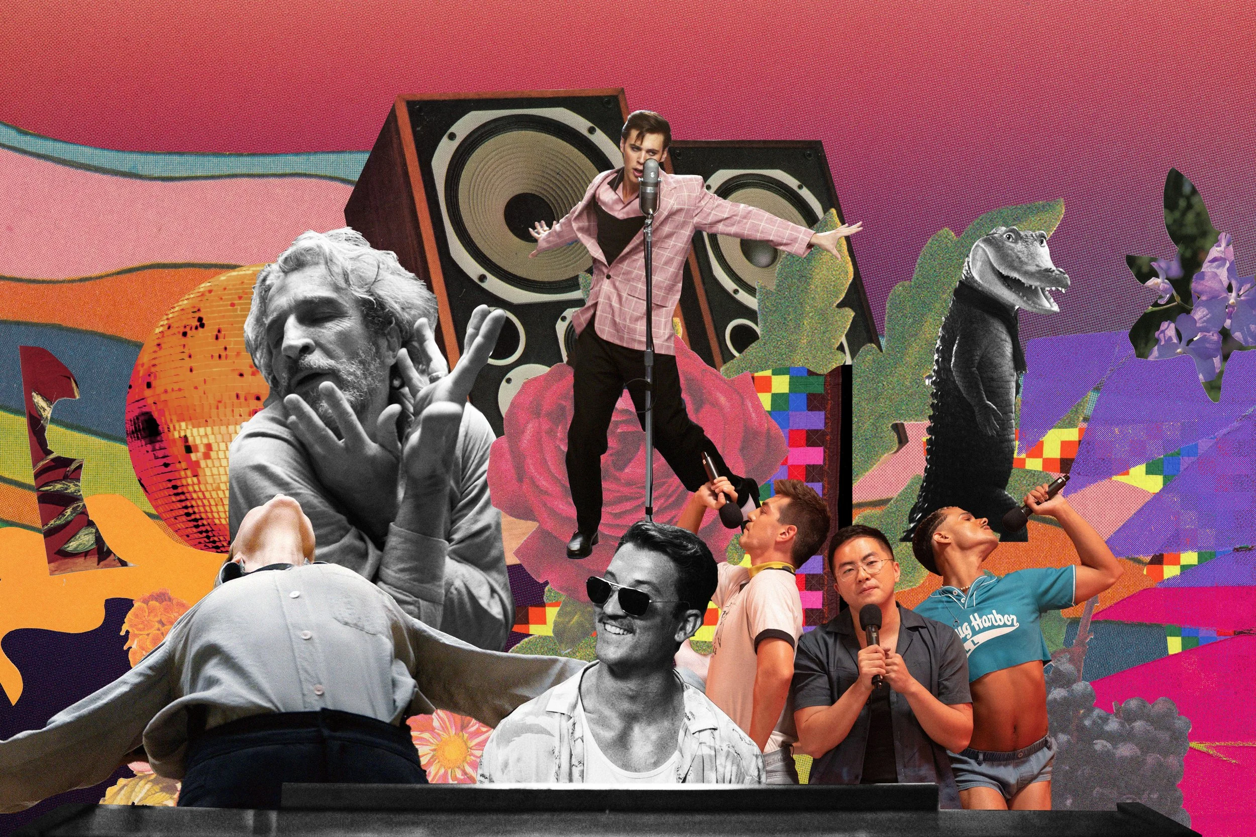
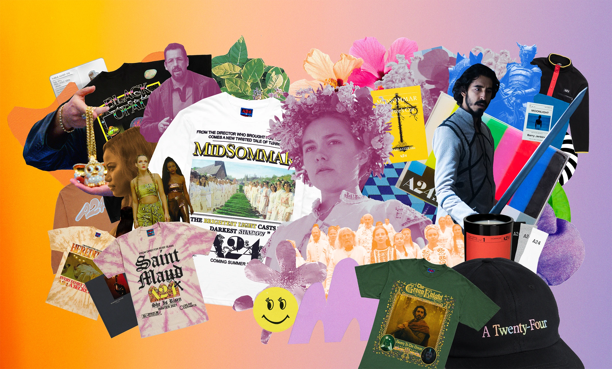
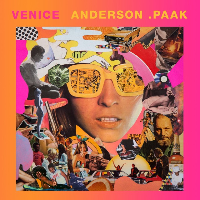
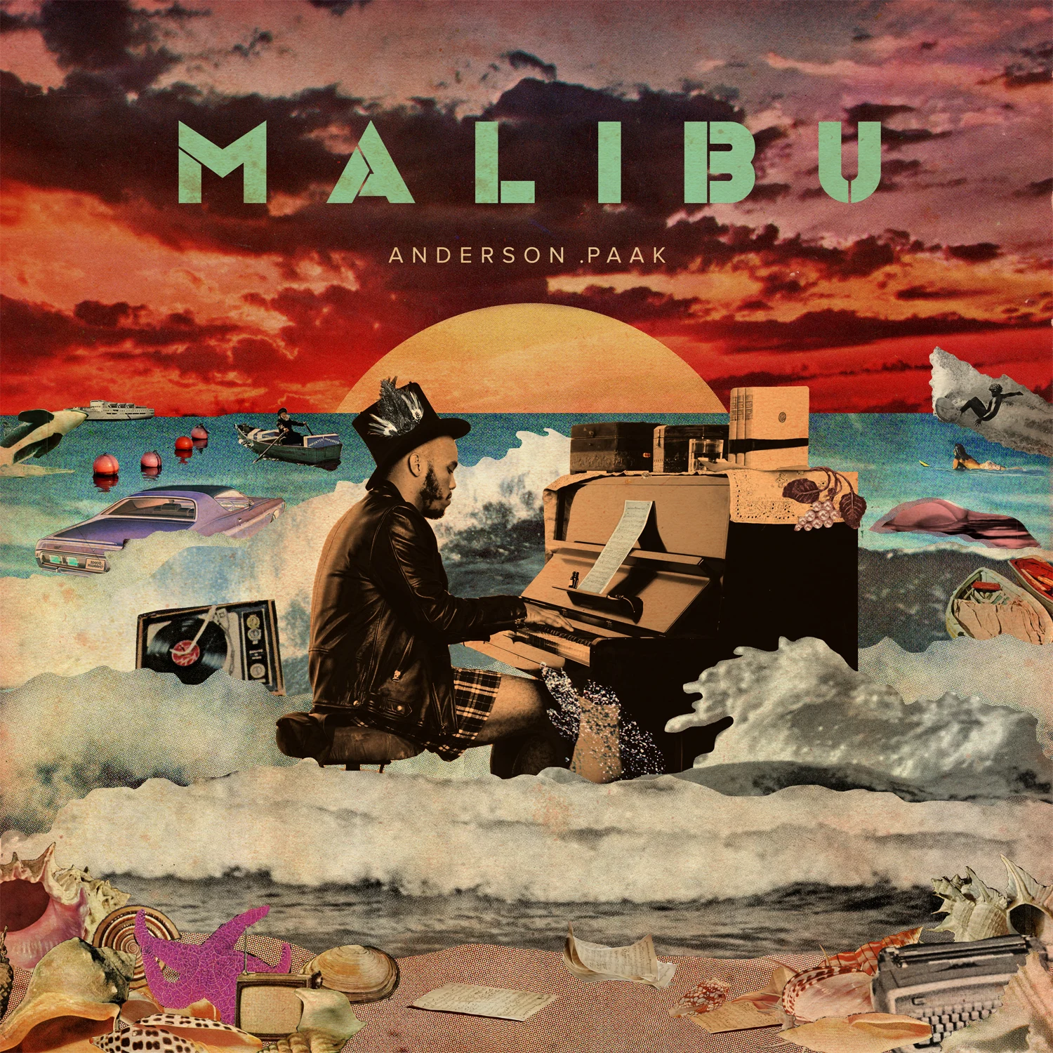
"My color style came early on, maybe in 2013/2014 when I started spraypainting gradients that felt like sunsets. I also have this earth tone more mature palette that comes around every so often but I've been running with the warm hues, pinks, sunset oranges and purples for a while."
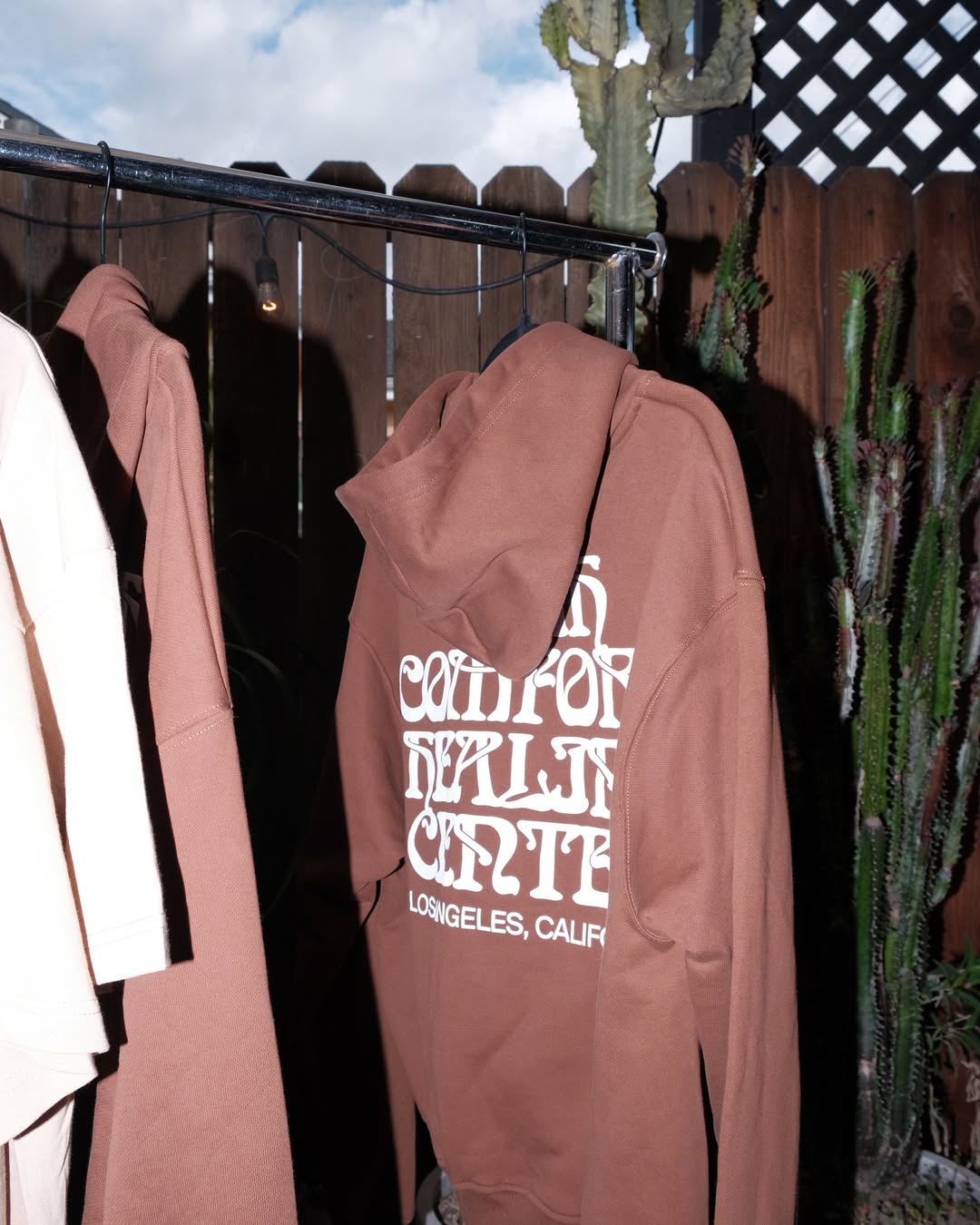
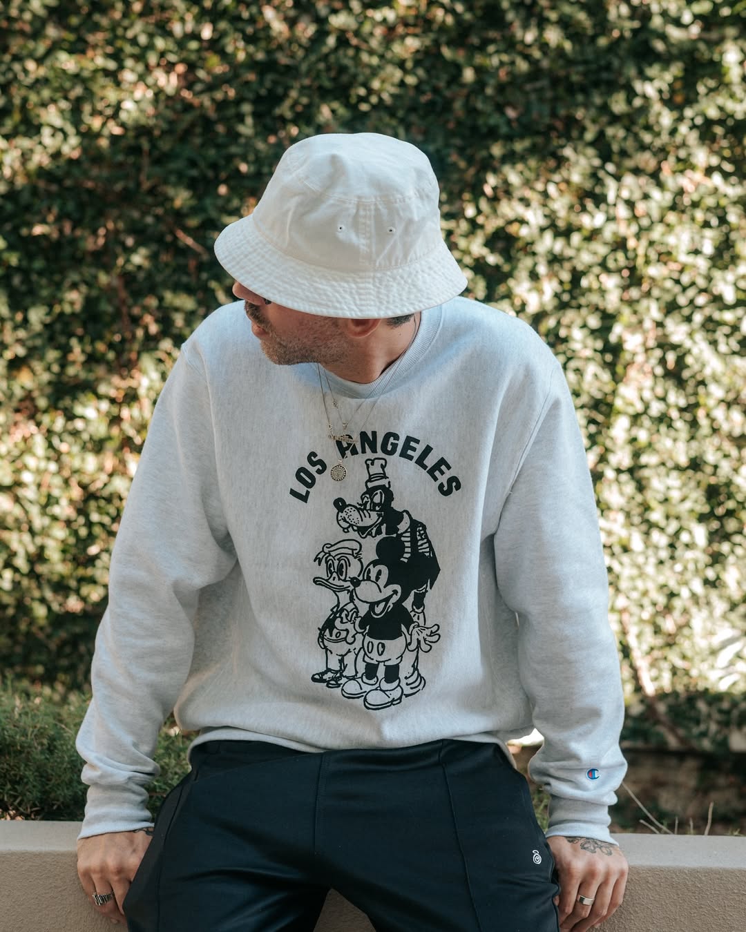
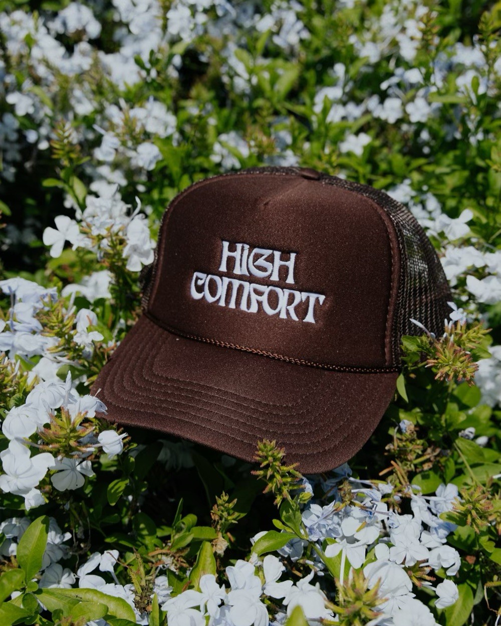
How do you approach color choices for your brand High Comfort versus fine art?
"My fashion palate is very different, usually 1-3 color designs and muted choices for garments. I like making clothes as a different expression from my tropical psychedelic collage work - but it might be interesting to create a line that feels like my collages."

A single word that represents your color style.
"Radiant."
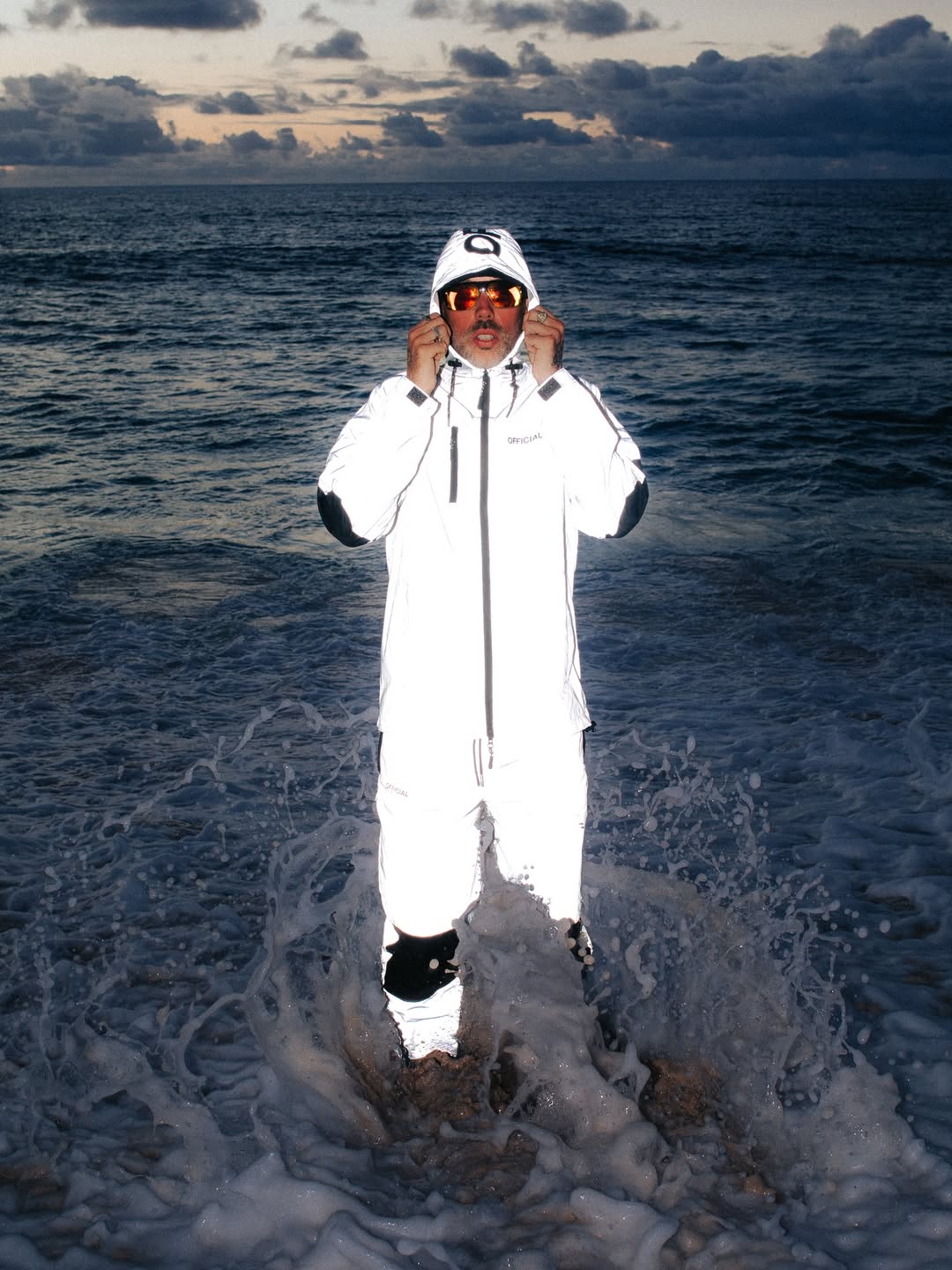
Luminous
light
from
within
the
image.


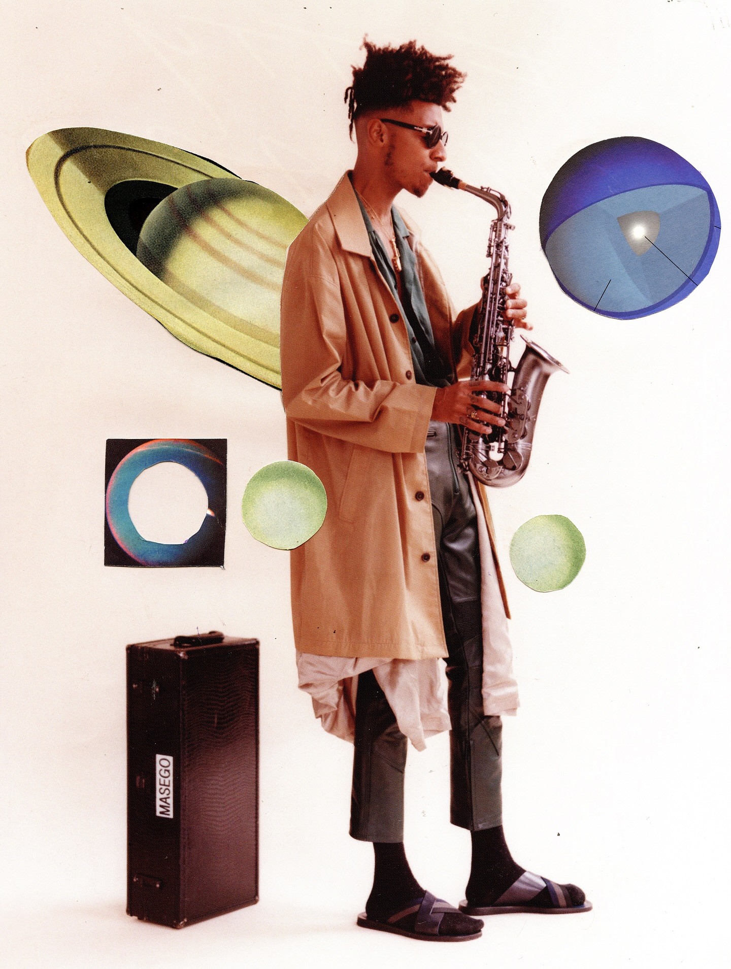
"I think the color comes after the music, when designing the branding and campaign for the visuals. I like using the music as a jumping off point for the graphic decisions and color stories."


What artists, musicians, or brands would you like to collaborate with on a future project?
"I’d love to work with Blood Orange, Aminé, Kaytranada, Kendrick Lamar, SiR"
What can we learn from Dewey's balanced use of color?
The world of color is complex, with infinite possibilities. If you'd like more from INFINITE COLOR SERIES, let us know by sharing and tagging @hoppn.
At Hoppn, we're leading the industry in color-based search for ecommerce. If you're curious, poke around our website! For more on all things color, visit our fun page for free creative tools and educational blog articles.


